

Camilla Cornwell

This portfolio is password protected.

{{ pwError }}
{{ lbImg }}
Cam Bot AIAI assistant · can make mistakes
Hi! I’m an AI assistant, not Cam. Cam built me, and this whole website, using Claude Design. I answer from her portfolio, so ask me anything about her experience, leadership or work. For anything I can’t answer, email her directly.
{{ m.content }}
Thinking…
Want the full picture? Download Cam’s CV, or get in touch to know more.
You could also ask

Brand leadership you can measure

+4M Monthly active users The Goodnotes 6 rebrand launched into a year of growth: 21M to 25M (+19%), through a move to subscription and into B2B.
4 Brands launched Goodnotes 6, Good Future Foundation, Good Systems and Goodmeet, since 2023, with two more in development.
10 Team I grew the brand team from just me to a core team of four, then took on the video team. Contractors and agencies join as needed.
>14 Years in brand Five of them leading designers, agencies and global rollouts.

Selected work

Good Systems master brand

Identity · Good Systems · 2026
↗
Agency partner
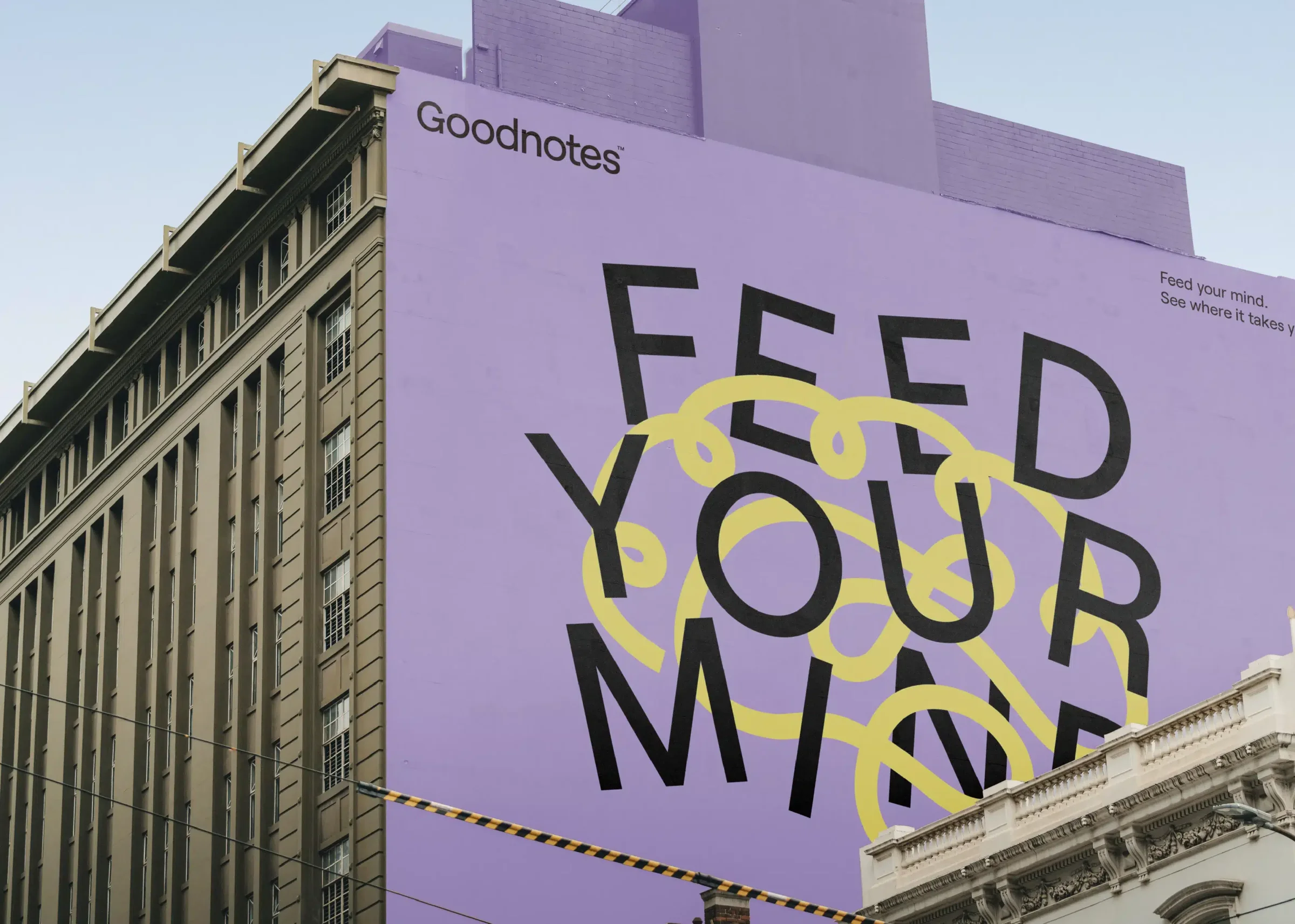
Goodnotes 6 Feed your mind mural on a city building

Goodnotes 6 rebrand

Rebrand · Goodnotes · 2022 — 2023
↗
Agency partner
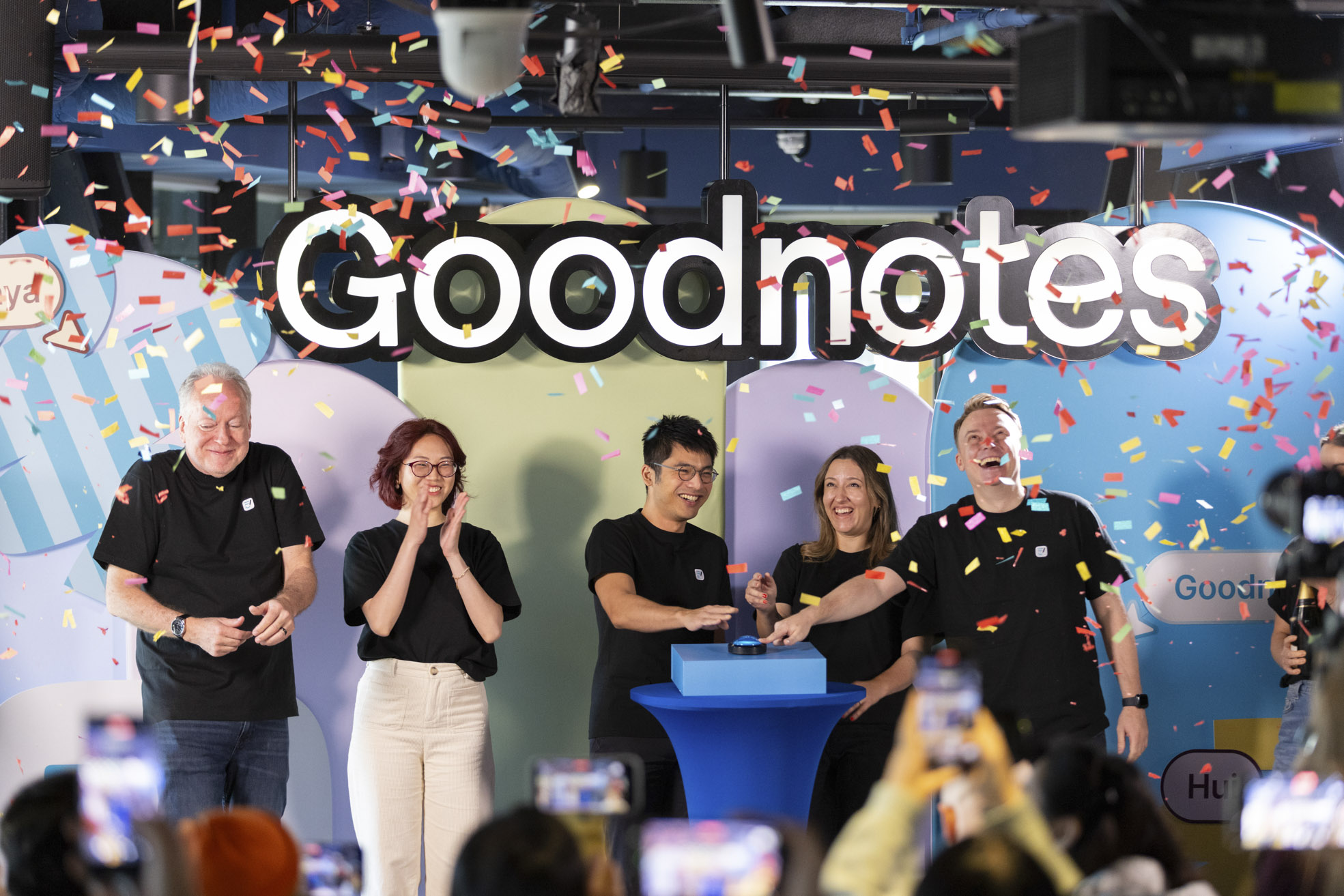
Goodnotes 2025 launch event: confetti at the button-pressing ceremony

Goodnotes 2025 launch event

Launch event · Goodnotes · 2025
↗
In-house team
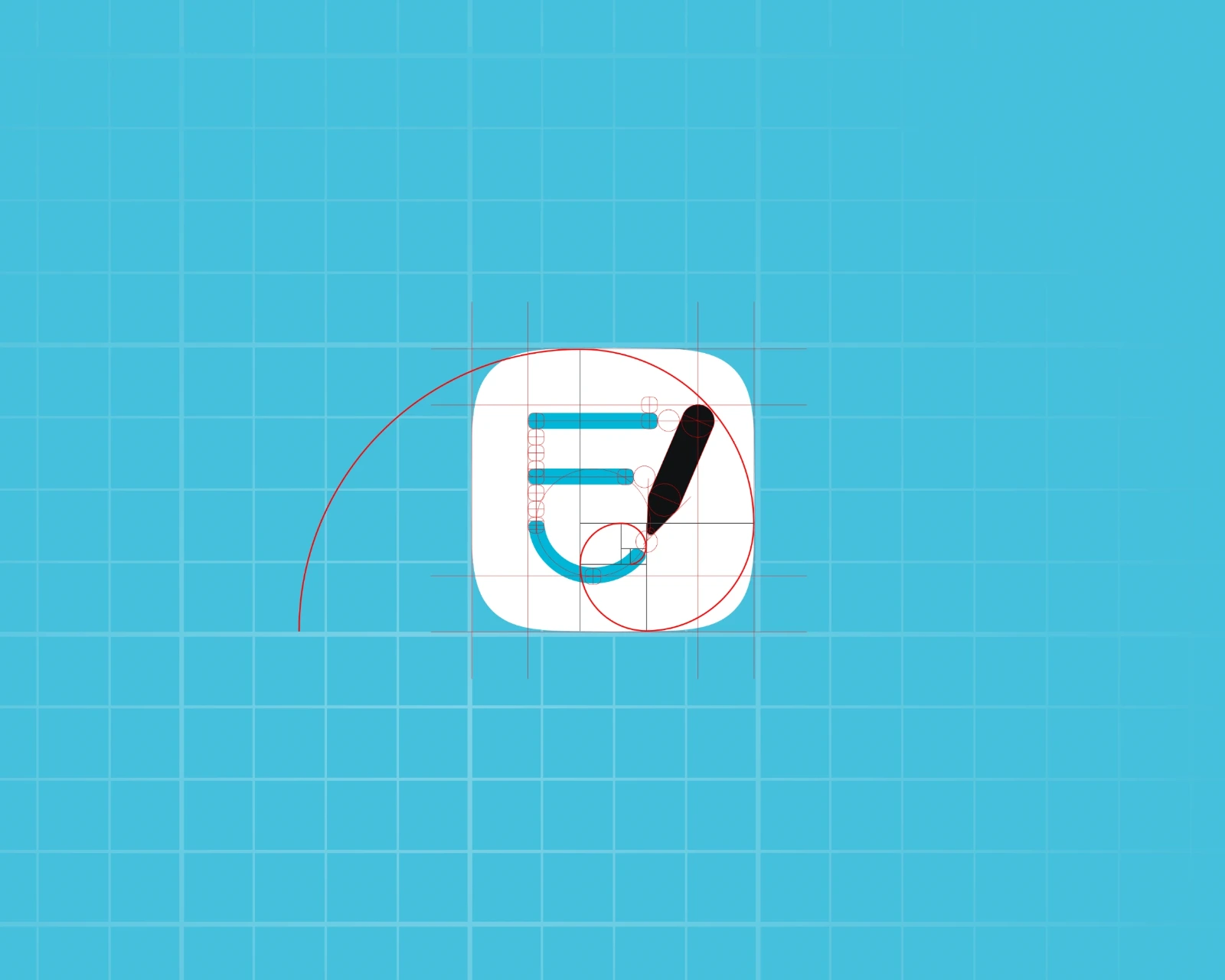
Goodnotes 2025 brand refresh: the redrawn icon on its golden-ratio construction grid

Goodnotes 2025 brand refresh

Rebrand · Goodnotes · 2025
↗
Hands on design
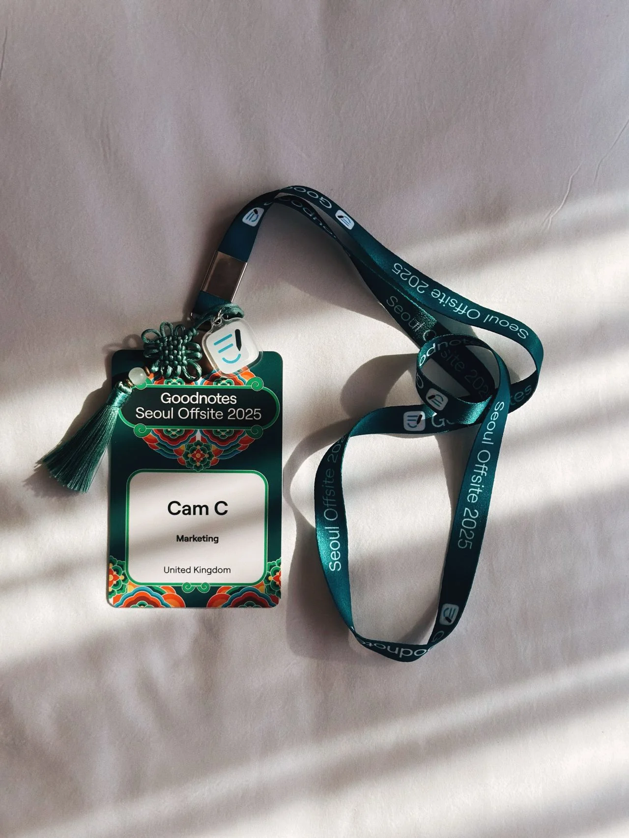
Goodnotes Seoul Offsite 2025 name tag with a maedeup knot on its lanyard

Goodnotes Seoul offsite

Event · Goodnotes · 2025
↗
In-house team
Good Future Foundation

Good Future Foundation brand

Identity · Goodnotes · 2024
↗
In-house team
Goodnotes merch

Goodnotes merch

Product · Goodnotes · Ongoing
↗
In-house team

More work

Goodmeet brand Identity · Goodmeet · 2026
Agency partner ↗
Goodnotes at Bett 2026 Event · Goodnotes · 2026
In-house team ↗
Goodnotes App Store features Art direction · Goodnotes · Ongoing
In-house team ↗
Disciple Media rebrand Rebrand · Disciple · 2020
In-house team ↗
The Ward Office Identity · Freelance · 2025
Freelance, solo ↗
The Rock Group Identity · Freelance · 2019
Freelance, solo ↗
Beyond the work
Designing with AI

Three tools that package our guidelines: one for the whole company, two for the studio. Hours saved on every deck, image and sample note.

Read more →
About me

14+ years across agencies and in-house teams in Sydney and London. How I lead, where I’ve worked, and what I make on weekends.

Read more →

Designing with AI

I set our AI approach for brand and creative: which tools we use, the guardrails, and how teams adopt them. Tools that package our guidelines so the brand thinking is already done. Brand guidelines in Claude is for the whole company, so anyone can make on-brand decks and docs without waiting on design. Sample Notes Studio and Lifestyle imagery are for the studio, speeding up our own production. Each ships with a review checklist: AI handles the parts, people make the calls.

40+people across the business using the brand skill
6teams making their own decks and docs
200+decks, documents and pages made since launch
Brand guidelines, built into Claude
ClaudeDesignCursor
Decks, documents and prototypes · For the whole company

Our logo, colour, type, voice and naming rules packaged as a skill, so anyone can ask for a deck or document and get something close to on-brand. In Claude Design it builds on the Goodnotes design system, so concepts use real product UI and get refined directly on the canvas, with a check for drift after every few rounds. I built the design system, tested it and rolled it out across the business.

Example: presentation deck~3 hrs savedA non-designer made the deck below in about 40 minutes, instead of half a day in Keynote.
One example · Today at Apple deck The same skill makes documents, one-pagers, landing pages and prototypes. This is the real conversation behind one deck. Click through the slides.
Today at Apple Deck v26 slides
{{ tapNum }} / 6 Share
Make a 6-slide deck walking through our latest features for a Today at Apple event. Keep it clean, simple and on brandGoodnotes — Brand Guidelines

I need your answers in the form before I build. The main one is which features to cover.

You answered
featuresChoose the latest 3
audienceStudents
formatShort talk
structureTitle + intro + 3 features + try-it CTA
visualsPlaceholders for my product screenshots

I’ve built the 6-slide deck: a navy title slide, an agenda, three feature slides and a teal slide inviting people to try it.

I picked the three most recent features from Goodnotes’ 2026 blog updates that suit students:

Create images with Goodnotes AI: doodles, diagrams and visuals in multiple styles.Transcription: more accurate, now in 99 languages.GIPHY: a built-in GIPHY integration.

Each feature slide has a space marked for a product screenshot, and every slide has short demo prompts in the speaker notes.

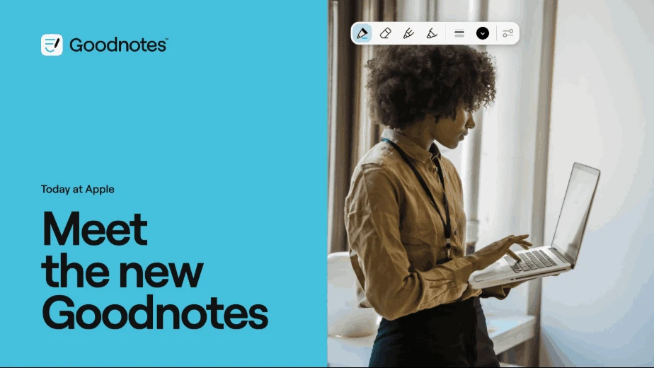
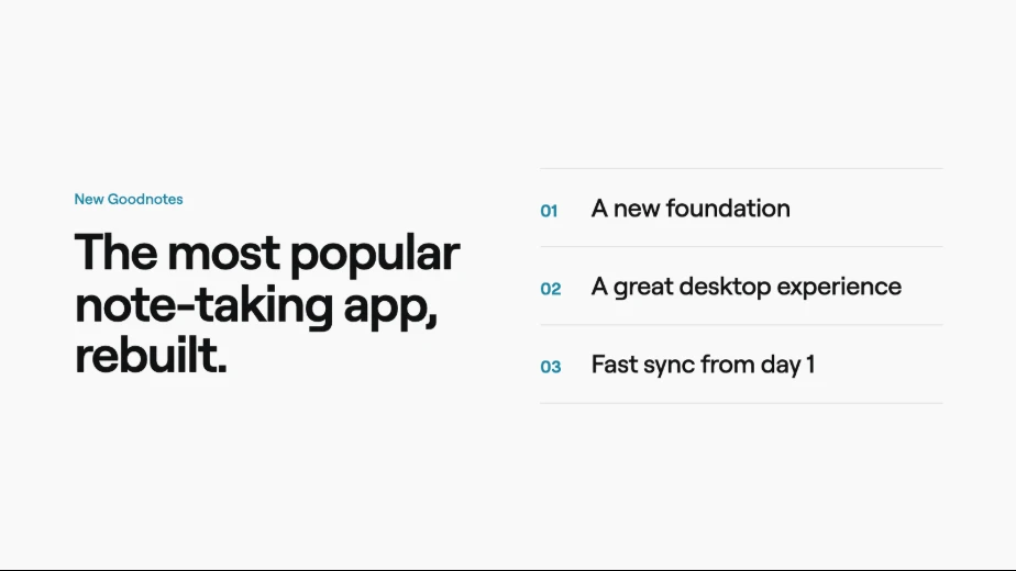
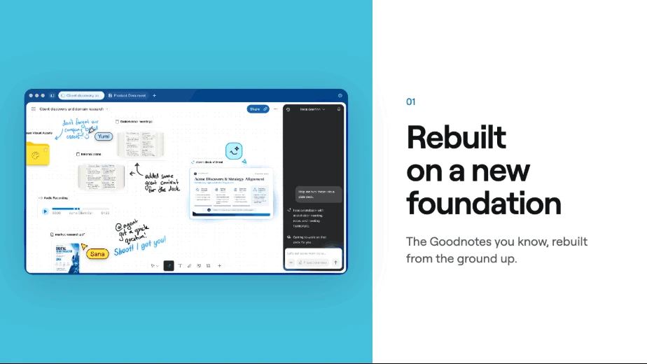
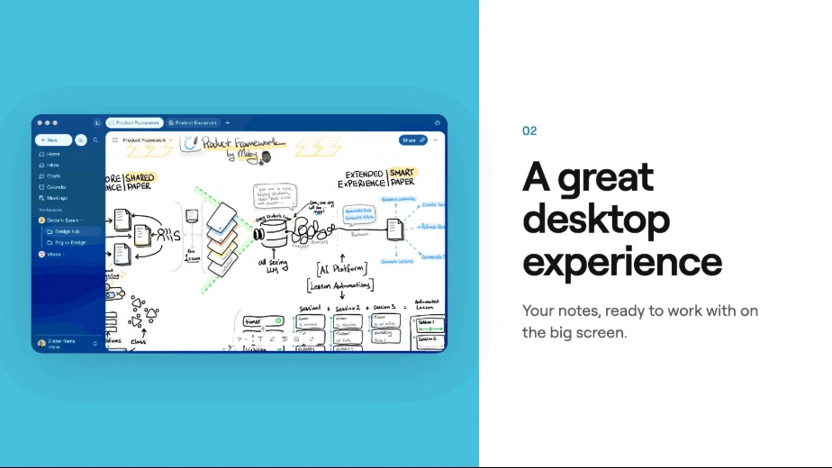
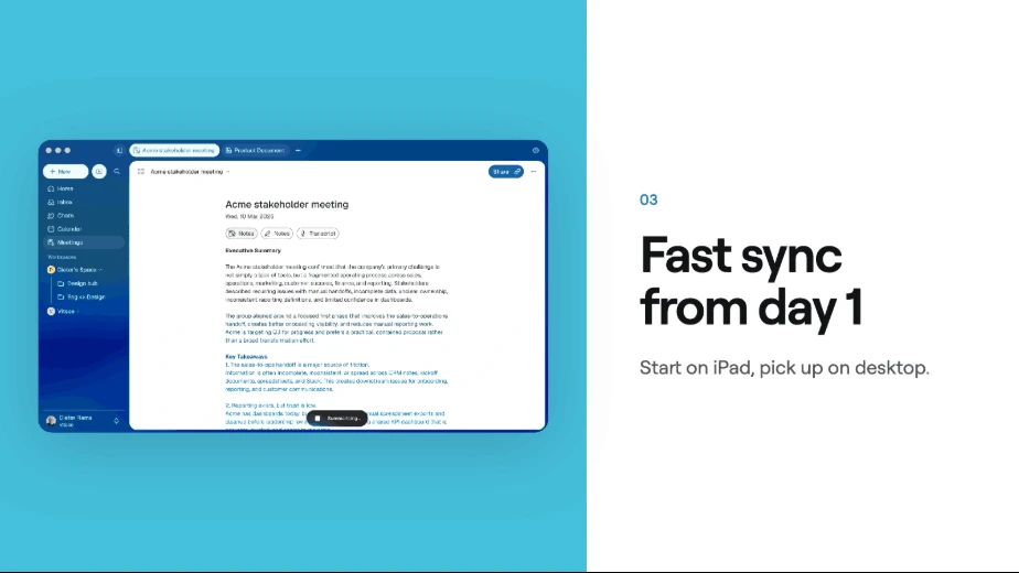
make it about New Goodnotes instead: rebuilt on a new foundation, a great desktop experience, fast sync from day 1. use these screenshots for the product visuals and this photo for the title4 images

I made a new version of the deck about New Goodnotes, built around your images. The first version is still there, unchanged.

Title: teal on the left, your photo on the right.Three features: one slide each, with your screenshot and a short line under the headline.Closing slide: an invitation to try the new Goodnotes.
on the images match the background colour and fake an extension of the background so it looks like it reaches top and bottom
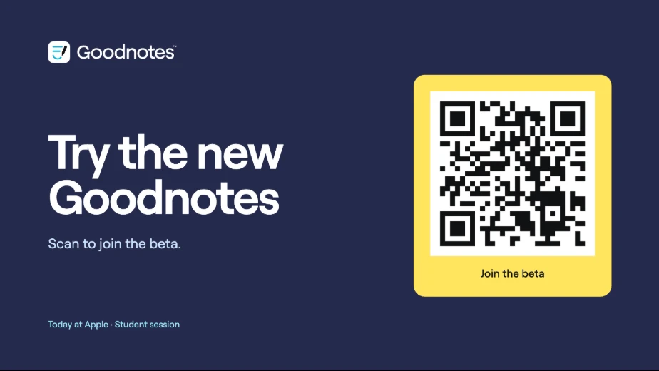
change final slide to be about trying the new goodnotes, with this QR code for the beta downloadbeta-qr.png
crop the product visuals to the product only, with curved corners to match the visual

I made both changes. Slides 3–5: each screenshot is now cropped to just the app window, with rounded corners like the original. Final slide: it now reads “Try the new Goodnotes” and “Scan to join the beta”, with your QR code beside it.

for the product visuals they are perfect. now place them on a coloured background, the goodnotes teal

On slides 3–5, each screenshot now sits on a Goodnotes teal panel that fills the left side of the slide, with a soft shadow so it stands out.

make the qr code box our brand yellow

The QR code box is now Goodnotes Canary yellow. The code itself keeps its white background, since QR codes need a light border to scan.

Today at Apple deck, slide 1 Today at Apple deck, slide 2 Today at Apple deck, slide 3 Today at Apple deck, slide 4 Today at Apple deck, slide 5 Today at Apple deck, slide 6
Slide 1 Slide 2 Slide 3 Slide 4 Slide 5 Slide 6
Lifestyle imagery
ChatGPT
Image prompts for ads and social · For the studio

A custom GPT that turns a loose idea into a layered, on-brand image prompt: personality, palette, lighting and a casting system of seven recurring people, so results look on-brand, not stock. I briefed one of my designers to build it.

~45 min savedper image vs. searching stock sites and editing to brand.
Three examplesA one-line brief in, a fully art-directed prompt out, then the image.
On brand photo promptsCustom GPT · Goodnotes brand guidelines
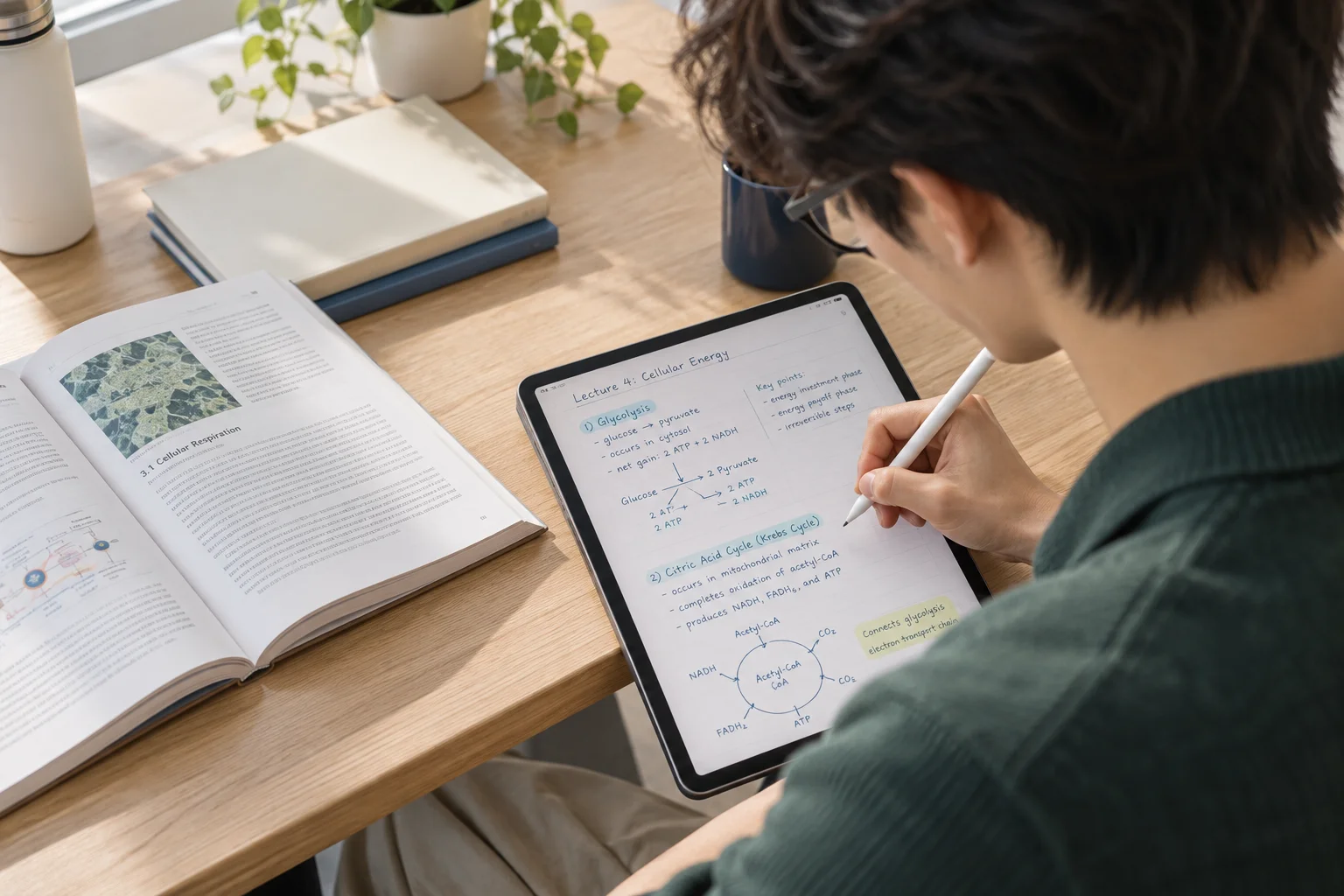
A university student at a light oak desk handwrites notes with a stylus on a tablet, an open textbook beside them. Over-the-shoulder view, hands and screen in sharp focus.

This reads as a rough prompt, so I’m treating it as Mode 3: prompt optimisation, tightening the casting, wardrobe, composition, lighting and camera while keeping the student moment natural. It follows the Goodnotes people-photography system: candid editorial lifestyle, soft natural light, clean backgrounds, premium natural fabrics.

Optimised prompt

Editorial lifestyle photograph of a university student studying naturally at a light oak desk, captured in a candid over-the-shoulder moment. Cast a 24-year-old East Asian creative professional man with a slim build, medium-length slightly wavy dark brown hair and thin round navy glasses. He wears a kale knit polo with sand wide-leg trousers in premium matte natural fabrics.

Composition: intimate over-the-shoulder angle, cropping out most of the face so the hands, stylus tip, handwritten notes and open textbook become the focus. Tablet slightly off-centre on the rule of thirds.

Colour and materials: light natural oak, Eraser white, subtle Navy and GN Teal cues, kale and sand clothing. Restrained saturation.

Lighting and mood: soft diffused daylight from a nearby window. Calm concentration, quiet optimism, premium but genuinely student-like.

Camera: full-frame editorial, 50mm, around f/2.8–f/4, focus locked on the writing hand and tablet.

Avoid: generic stock-photo styling, staged hand poses, floating-device product shots, visible branding, fake app interfaces, oversaturation.

generate
Setting the scene… image ready
A teacher prepares a lesson on a tablet at a tidy desk in an empty, sunlit classroom.

Do you have the full image in your mind already, or just separate ideas for each element (model, style, scene)?

you decide

I’d take this as Mode 2: Full prompt and shape it as a calm, editorial classroom moment, with the teacher as the hero and the tablet naturally supporting the story.

6-layer breakdown

1. Concept
Editorial lifestyle in-use scene: a teacher quietly preparing a lesson before students arrive. Thoughtful, capable and focused rather than staged.

2. Subject
Archetype 4: East Asian Minimalist Professional Woman, adapted as a teacher. Sky button-up and sand wide-leg trousers in premium cotton.

3. Colours & materials
White/Eraser, Navy and subtle GN Teal, with generous white space. Pale classroom surfaces, matte tablet case.

4. Composition
Desk-level, across-the-table angle. Teacher off-centre on the right third, empty desks receding softly behind.

5. Lighting & mood
Soft natural daylight from tall windows, bright and airy. No harsh sunbeams or golden-hour warmth.

6. Camera & lens
Clean digital editorial look, 50mm, around f/4, focus on her face and hands.

Then the six layers are assembled into one prompt.

generate
Setting the scene… image ready
Team workshop: Colleagues around a bright meeting table sketch ideas together on two tablets, relaxed and engaged.

Do you have a full image in your mind, or just separate ideas for each element (model, style, scene)?

you decide

I’d treat this as Mode 2: Full prompt. The core image is already clear, so I’ve made the casting, wardrobe, composition and camera choices for you.

6-layer build

1. Concept
Candid team workshop: colleagues sketching and discussing ideas around a bright meeting table. The tablets support the collaboration rather than becoming the hero.

2. Subjects
A small, diverse group from the Goodnotes archetype system: an East Asian creative professional man in a kale knit polo, a Black executive professional woman in a sky shirt and kale knit, a European creative professional woman in a lavender shirt, all with sand trousers.

3. Colours & materials
White/Eraser, GN Teal and Navy, with generous light space. Approved kale, sky, lavender and sand wardrobe; matte, pale table.

4. Composition
Desk-level, across-the-table angle, slightly wide and off-centre, so the table edge creates depth while hands, faces and both tablets are in view.

5. Lighting & mood
Soft natural window light, bright and airy. Curious, collaborative, calm and quietly optimistic.

6. Camera & lens
Clean digital editorial, 35–40mm, around f/4, focus on hands and faces.

Then the six layers are assembled into one prompt, with three camera variations: overhead, through-object and wide environmental.

generate
Creating image… image ready
Generated image: four colleagues sketching ideas together on two tablets around a bright meeting table Generated image: a teacher preparing a lesson on an iPad in an empty, sunlit classroom Generated image: a university student handwriting notes on an iPad at a light oak desk, over-the-shoulder Generated image, unedited
The guardrailsEvery image is checked before it ships
Brand checklist
Right bucketFunction or Sharing.
On paletteOfficial colours, Teal for brand moments.
Real assetsNo invented logos or motifs.
Image firstGraphics support, never overpower.
Clear verdictAligned, Partially aligned or Off-brand, plus the smallest fix.
AI image QA
AnatomyNatural hands, faces and stylus grip.
Device realismNo warped tablets or fake app UI.
No stray textNo gibberish or third-party logos.
AuthenticityCandid, not stiff or stock.
RepresentationA real mix across a set.
Banner-readyRoom for a headline; crops for mobile.
Sample Notes Studio
ChatGPT
Handwritten notes that look made in Goodnotes · For the studio

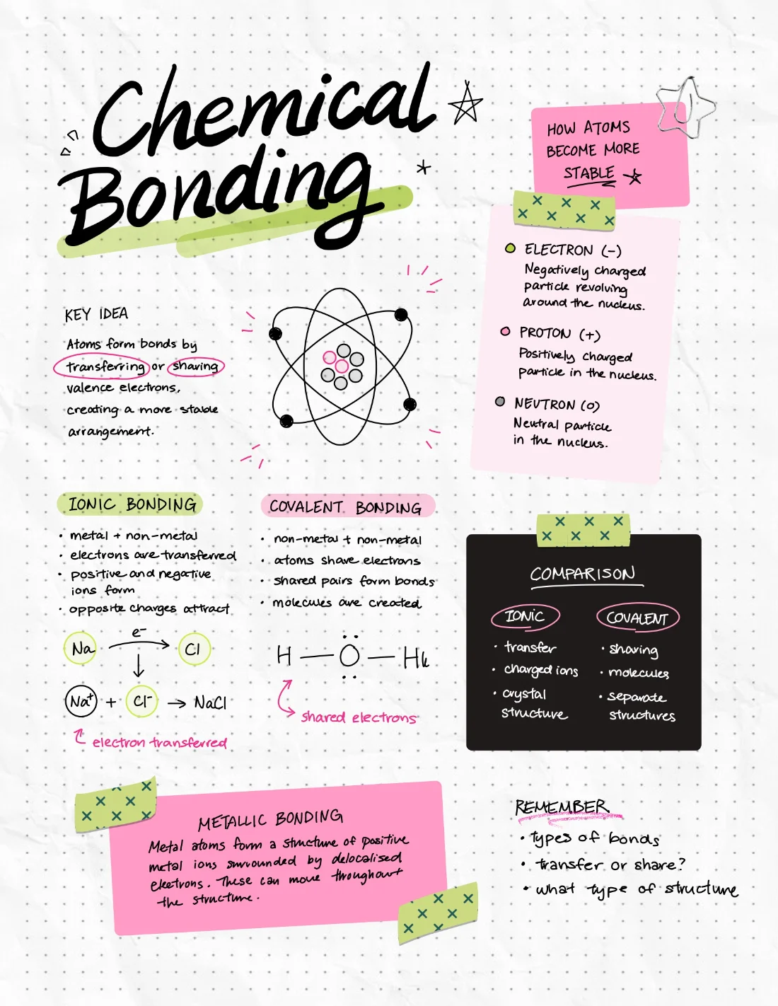
Trained on approved sample notes, our real brush textures and native elements, so notes stay true to what the product can do. Brief it, then art-direct in conversation like you would a designer. It’s a combined process: the GPT generates the note without headers, then a designer hand-draws them, so the hero still feels authentic and we keep control of the page style. I briefed one of my designers to build it as a custom GPT.

~2 hrs saved per sample notevs. drawing it all by hand. Fully hand-illustrated notes took 4–8 hrs each.
CompareClick through to see what separates our notes from generic AI output.
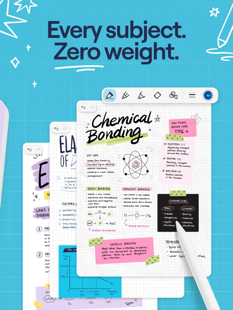
Chemical Bonding sample note made with Sample Notes Studio and a designer 1 2 3 4 5 6
What makes it ours
1
Hand-drawn headerA designer draws the title, so the hero of the page is genuinely handmade.
2
Real Goodnotes stickersWashi tape and the paper clip come from the Goodnotes sticker library.
3
Our brush texturesHighlighter and marker strokes use our own brushes.
4
Ink that looks realVaried pressure and natural letterforms read as digital ink on iPad.
5
Native paper templateThe dot grid is a real Goodnotes paper.
6
On-palette colourPinks and greens from the brand palette.
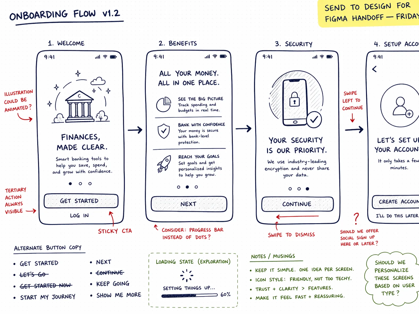
A sample note straight out of ChatGPT 1 2 3 4
What gives it away
1
Uniform line weightEvery stroke is the same thickness, like vector art.
2
Ruler-straight framesPerfect boxes make it read as a wireframe, not notes.
3
Flat inkNo brush texture or pen pressure.
4
Generic lookNothing ties it to Goodnotes: no stickers, papers or brand palette.
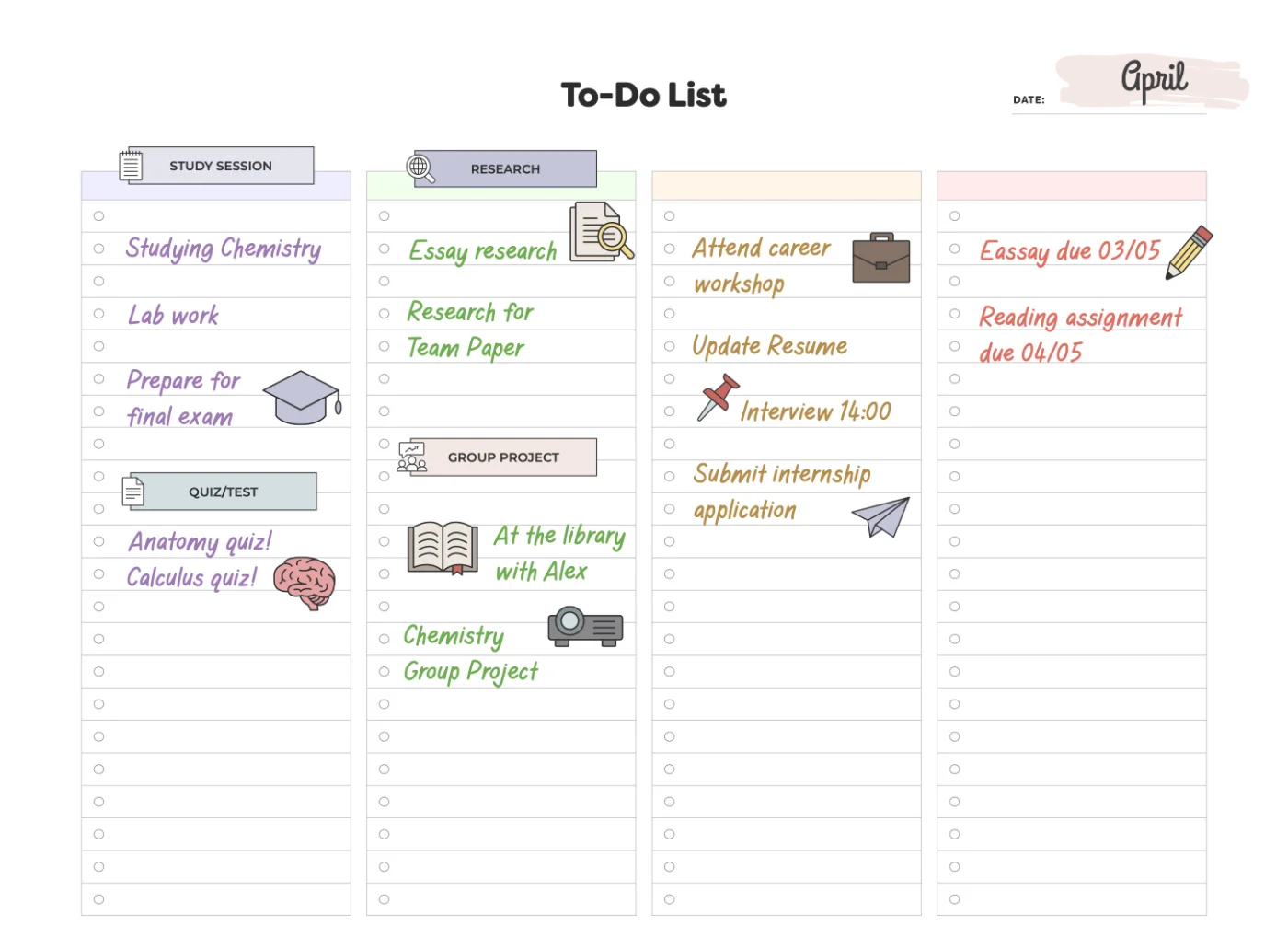
A to-do list using a handwriting font 1 2 3 4
What gives it away
1
Typeset titleA bold sans header that nobody wrote by hand.
2
Identical letterformsEvery letter repeats exactly, with no flow between them.
3
Clip-art iconsGeneric illustrations instead of Goodnotes stickers.
4
A template, not a pageReads as a printable planner rather than someone’s notes.
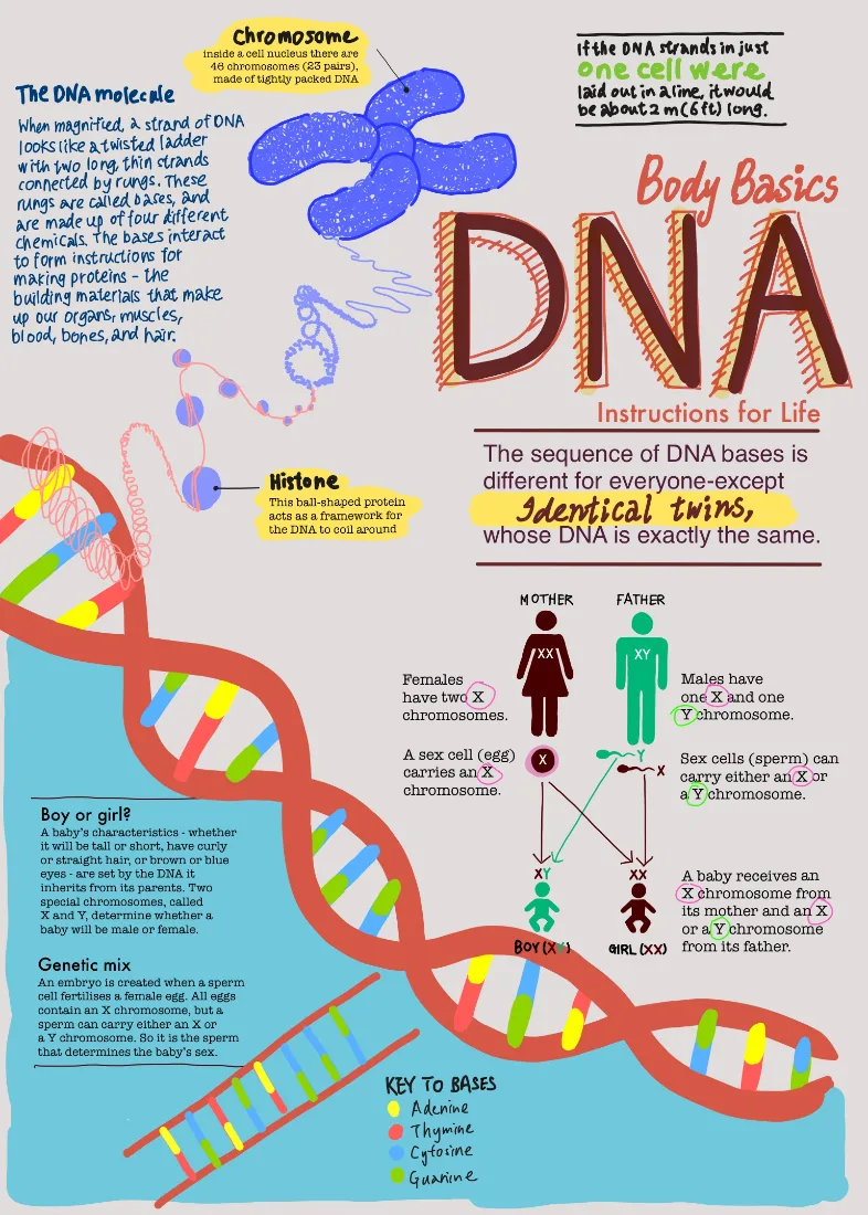
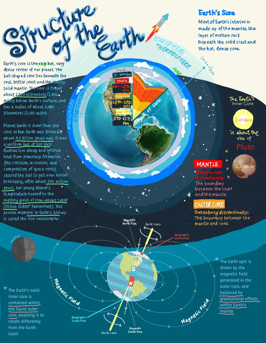
DNA sample note, fully hand-illustrated Structure of the Earth sample note, fully hand-illustrated
What it cost
Fully hand-illustratedBeautiful and authentic, but every element drawn from scratch.
~£1,000–2,000 per projectFor about 10 notes, including all localisations.
4–8 hours per noteRoughly £100–200 each.
Hard to scaleEach new campaign meant another commission and another wait.
In action: App Store product page
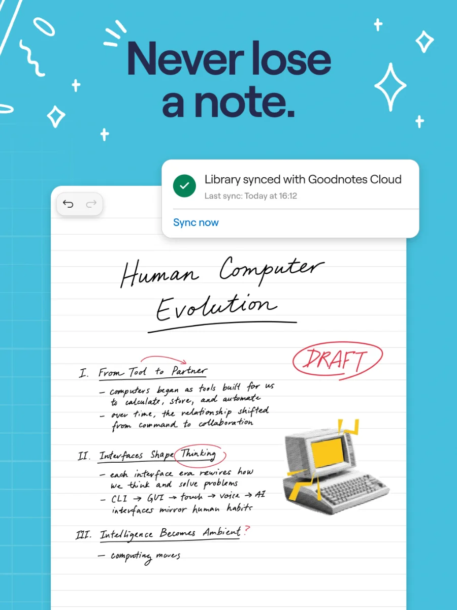
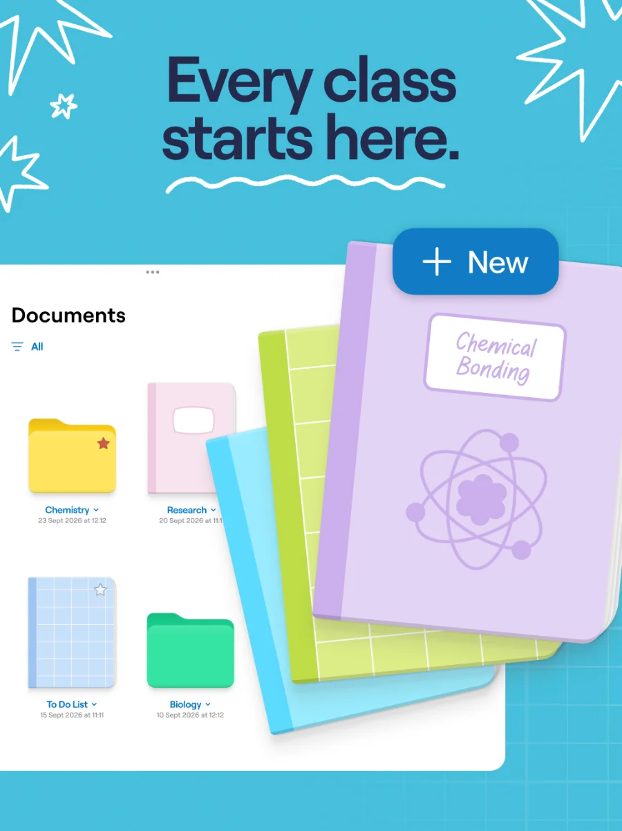
App Store screenshot: Every class starts here App Store screenshot: Every subject. Zero weight, featuring the Chemical Bonding, Elasticity and Energy sample notes App Store screenshot: Never lose a note
About

Designer by craft, leader by scope.

I joined Goodnotes as Senior Brand Designer and grew into Global Brand Design Lead, then Global Creative Lead. Before that: agencies and in-house roles in Sydney and London, and a decade of freelance. What hasn’t changed is the craft: typography, layout and detail still matter most to me.

Brand identity Design systems Campaign Art direction Team leadership Experiential AI-native teams
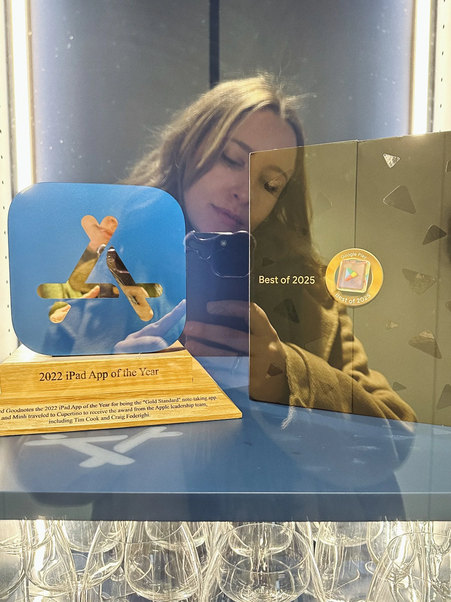
Goodnotes App of the Year and Google Play Best of 2025 awards
How I lead

A brand is only as good as how it lands. I run the whole arc, from strategy and agency work to the day a team uses it without me in the room.

01 — Direction Set the idea, then the rules

Strategy turned into decisions teams can use: architecture, voice and when each brand leads.

02 — Agencies One clear voice to the agency

Tight briefs, every round reviewed within 48 hours, and one consolidated set of notes.

03 — Adoption Make it easy to stay on brand

Templates, workshops, weekly office hours and short Loom guides.

04 — AI-native teams AI for parts, not people

Faster exploration and production, inside a process that stays craft-led.

05 — People Support that scales with experience

I grew the team from just me to four, then took on video. Juniors get close support; seniors own their work end to end. I handle senior leadership so the team can focus on the work.

Intern → full-time junior. Midweight → senior, now Senior Creative & Design Ops.

What I’m proudest of is the culture: a genuinely supportive team that credits each other and jumps in when things get busy.

“Cam has been an outstanding manager who actively supports my growth by expanding my responsibilities and allowing me to take ownership… Her feedback is always kind, helpful, and actionable.”
Direct reportAnonymous upward review, 2024
Experience
Oct 2021 — now
Global Creative Lead
Jun 2026 — present
Creative direction across brand, campaign and content for a product used by millions.
Global Brand Design Lead
Dec 2024 — Jun 2026
Led brand globally across campaign, product marketing, merch and App Store; managed and mentored the brand design team and contractors.
Senior Brand Designer
Oct 2021 — Dec 2024
Led the Goodnotes rebrand — internal research, workshops and stakeholder management — and the branding of Good Future Foundation. Built scalable templates, ran internal brand education, and delivered the booths at Bett London, ISTE and the London AI Summit. Founding member of the Goodnotes DEI Squad.
Goodnotes | Good Systems
London
Nov 2019 — Oct 2021
Senior Designer
Apr 2021 — Oct 2021
Digital Designer
Nov 2019 — Mar 2021
Led the end-to-end rebrand, from research and workshops through stakeholder management, concept development, user testing and implementation. Also UX/UI improvements to the social interface and community management dashboard, plus ongoing marketing design.
Disciple Media
London
Sep 2017 — Aug 2019
Creative Designer
Online campaigns, digital billboards, website, email, game and print for NBC Universal, BAE Systems, BlackRock, iShares, AllianceBernstein and State Street Global Advisors.
TWO Digital Marketing
Surrey
Aug 2014 — Oct 2016
Designer & Finished Artist
Creative design and technical delivery for Nando's, Destination NSW, TAFE NSW, Crown Resorts, AMP Capital, Hills Australia, St James' Ethics Centre and Best & Less.
Banjo Advertising
Sydney
2010 — Nov 2019
Graphic Designer, freelance
Branding, campaign strategy, print, packaging, social, web and digital advertising for clients worldwide. Including visual communications for Oxfam Australia's youth programmes — Design For Change, Close The Gap and GROW.
Camilla Cornwell Design
Global
2010 — 2014
Earlier, in Sydney
Designer at uberbrand; Creative Designer at ASM Liquor, where I rebranded Tequila Blu and launched VDKA 6100; design intern at Essential Groom. Studied at Billy Blue College of Design.
uberbrand · ASM Liquor
Sydney
Off the clock

Weekends, I make stuff.

It started as a bit of fun in the living room and got out of hand. There's a mural in the lounge, and another one slowly taking over the wardrobe doors in my bedroom. Engraving everything metal I own.

My creative outlet, art for arts sake.

Contact

Building a brand, or the team behind one? Let's talk.

Camilla CornwellPortfolio 2026
Confetti at the button-pressing ceremony as the new Goodnotes goes live
Case study 05 · Launch eventGoodnotes · London · 2025

36 creators, three days, one launch.

The launch of the new Goodnotes, told through the people who’d tell it best.

We flew 36 international creators to London for a three-day programme built around the unveil: a welcome dinner, a day of making in our office, then the reveal and a launch party. Everything was designed in house by me and my team — merch, environments, the photo wall, workshops and the unveil. The only agency partner was on the Outernet film, animating illustrations we created. Creator selection, outreach and content were run by our growth team.

The event film: three days in London.Watch on YouTube ↗
Brief

Unveil the new Goodnotes to creators in a way they’d want to share.

My role

Designed the whole event myself, from merch to the unveil. Growth ran the creator programme.

Key decision

Make creators part of the launch, not an audience for it.

Result

About 75M impressions, Goodnotes’ biggest campaign to date.

01 — Three days in London
Day one
Welcome

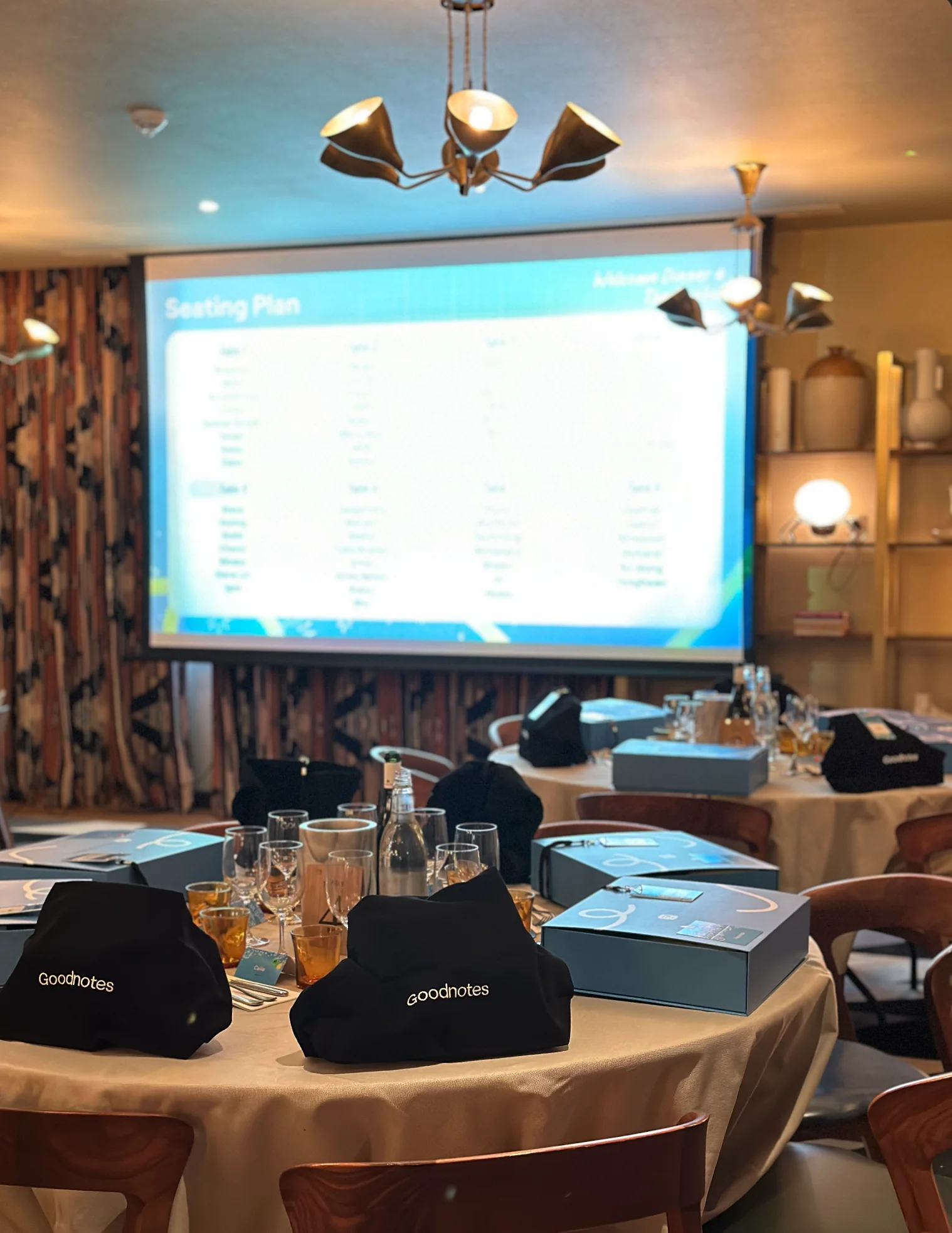
A welcome dinner at The Hoxton, where every creator found a merch kit waiting at their seat.
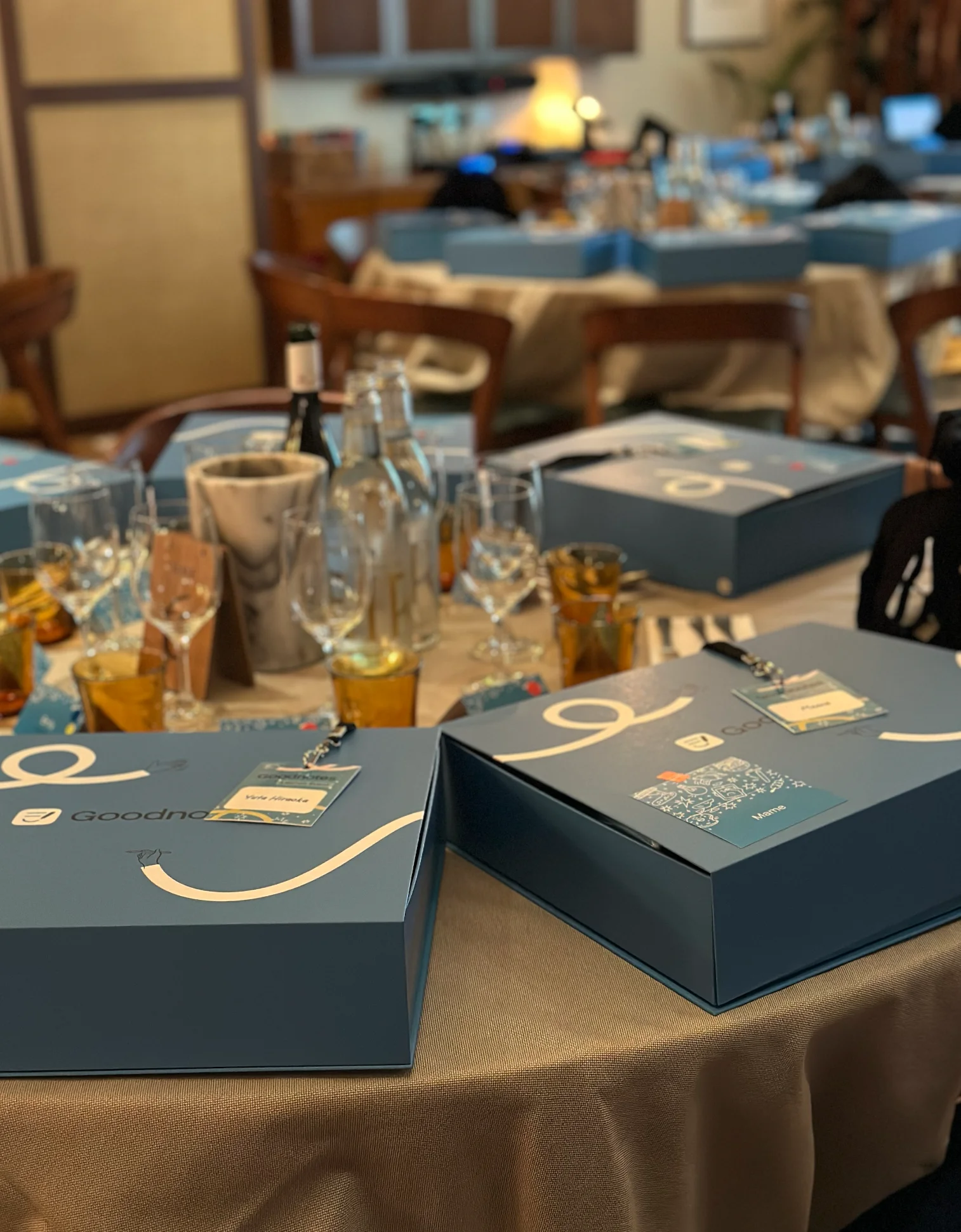
The Hoxton dinner set for 36, with merch packs at every seat Named merch boxes and lanyards waiting on the tables
The merch kits

A kit waiting for each creator at their seat: a named box and tote holding an umbrella, tumbler, notebook, travel adapter, tea and a disposable camera to capture the trip, all in the new brand — the first physical piece of the refresh anyone outside the company had touched.
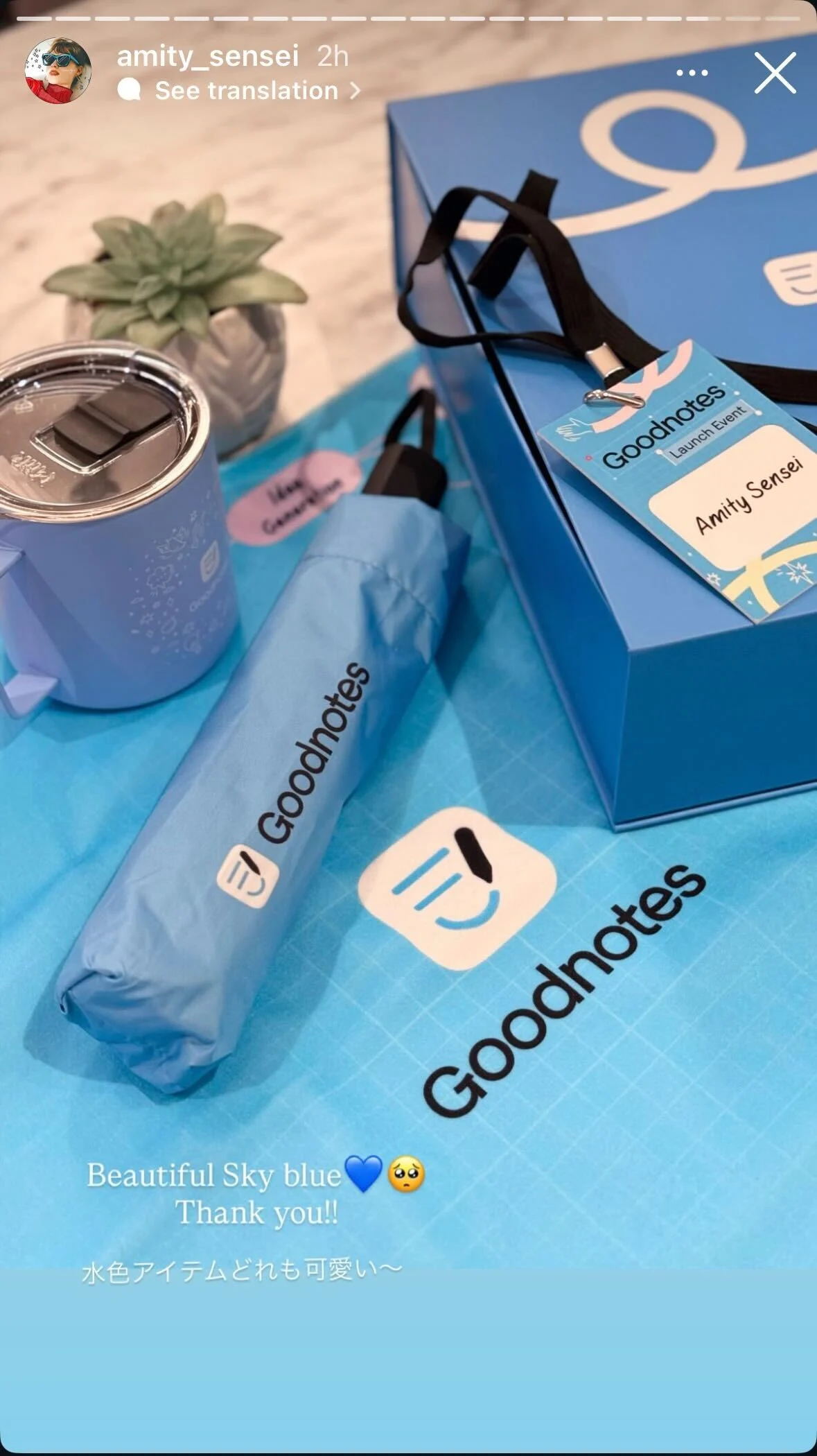
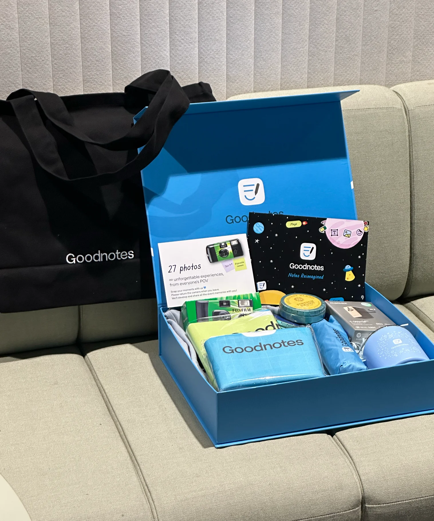
The creator merch kit: umbrella, tumbler, lanyard and box An open merch kit: disposable camera, notebook, umbrella, tumbler, tea and travel adapter, beside the Goodnotes tote
Day two
Make

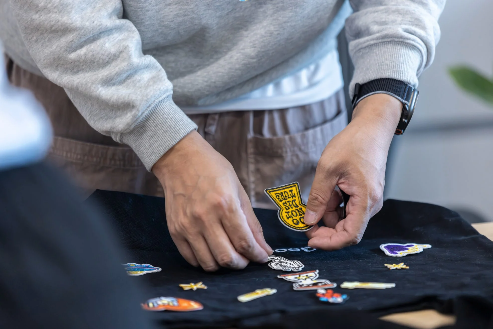
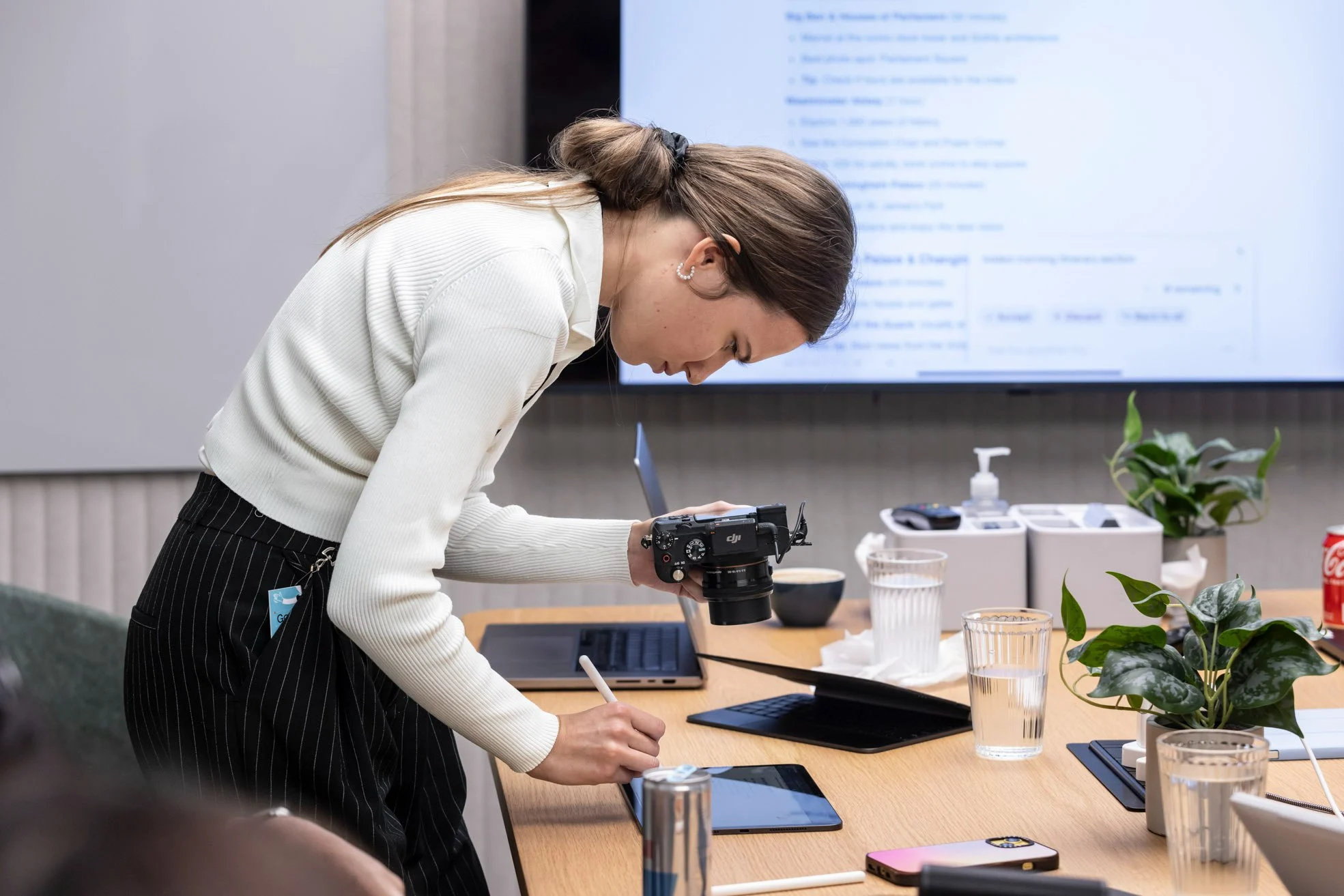
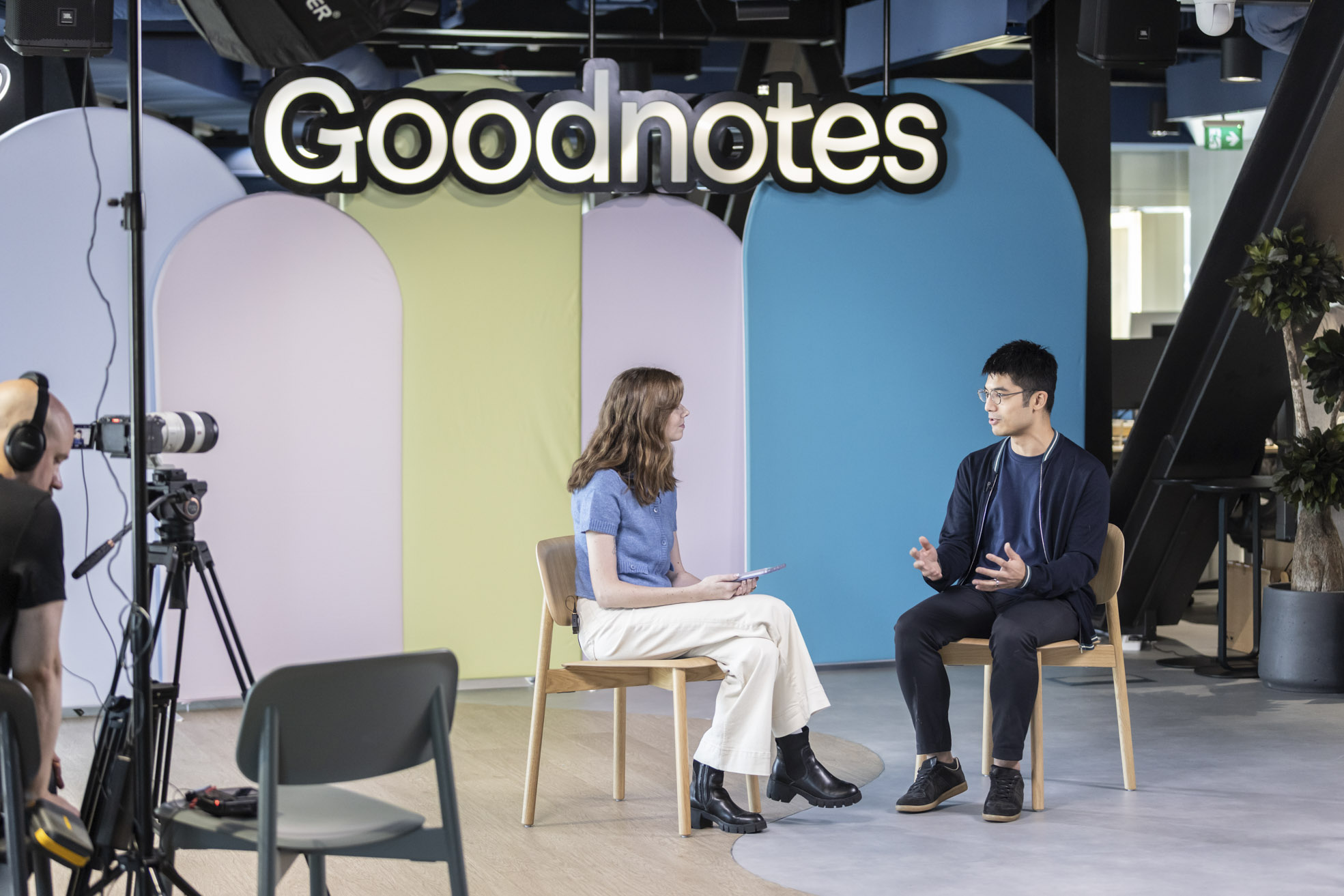
Interviews and content creation in the London office, then workshops — including a tote-making session where creators printed and pressed their own bags.
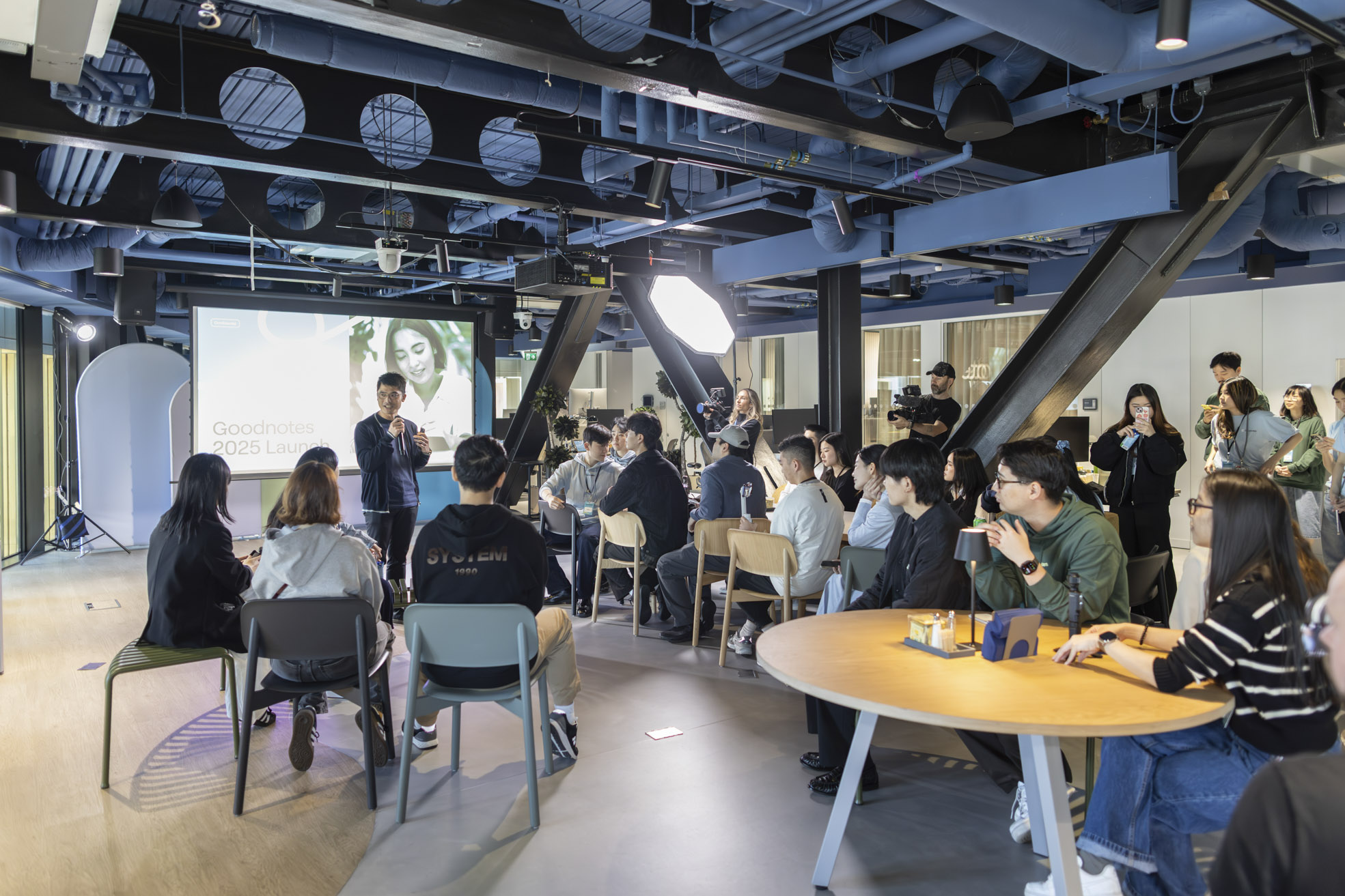
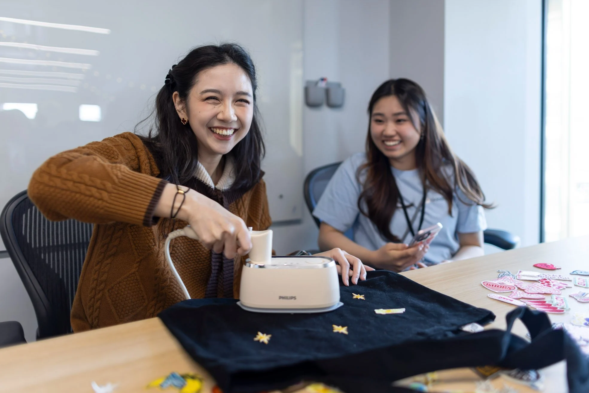
Opening talk in the London office
Tote-making workshop Applying transfers to a tote
Workshop session in the office
Creator interview on the Goodnotes set Creators trying Goodnotes on iPad
Day three
Launch
MorningA London excursion

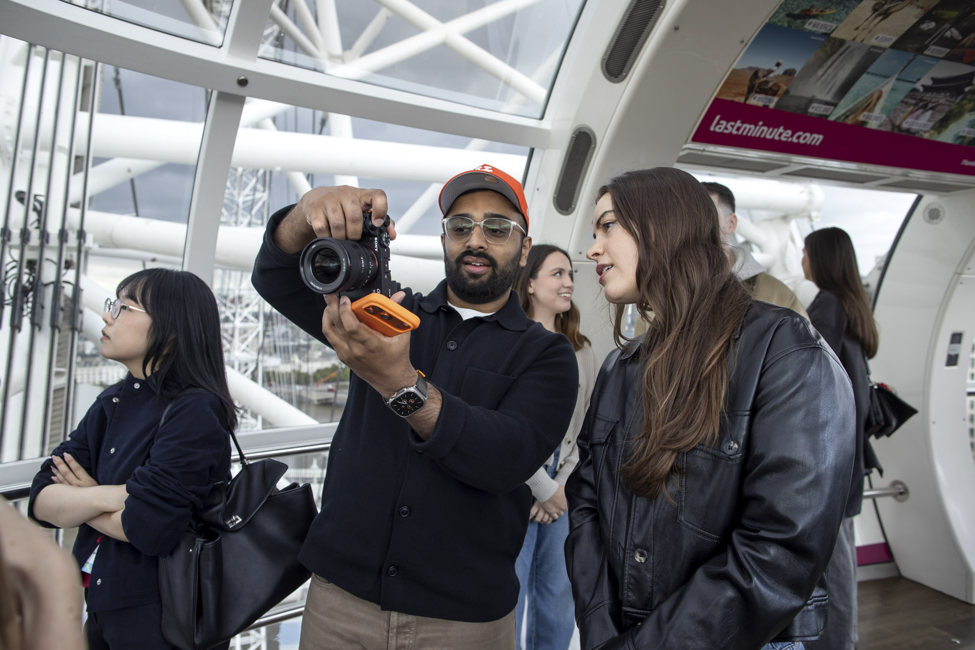
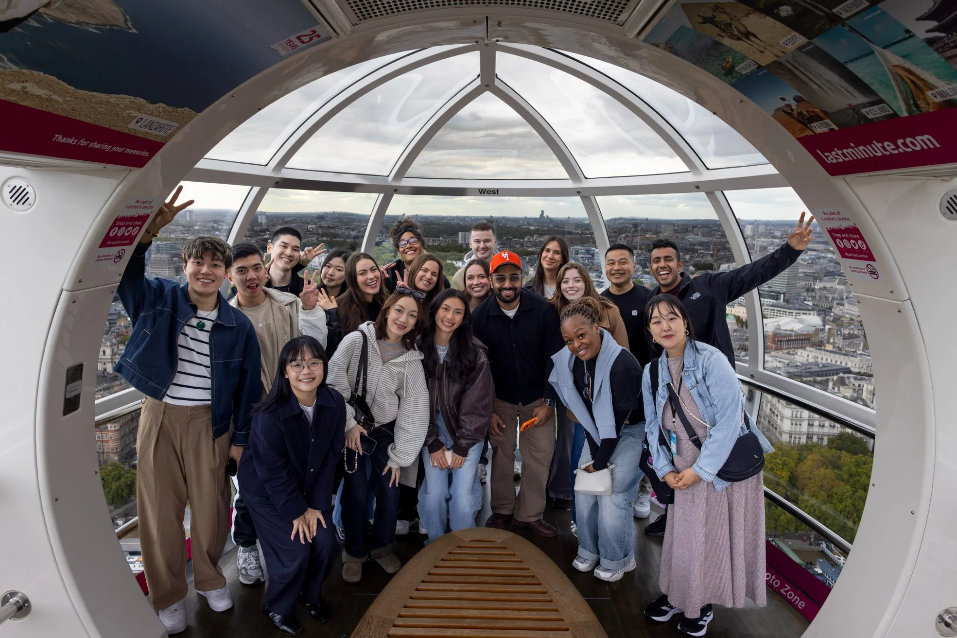
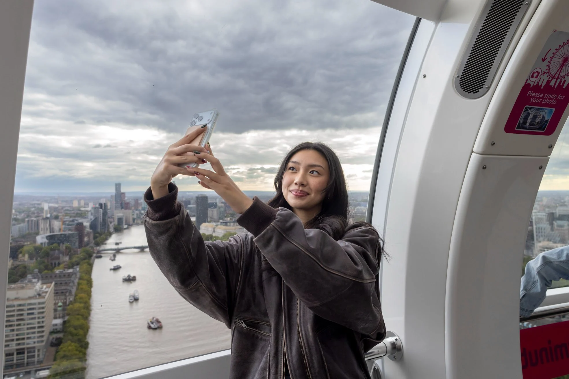
First, the city: a ride on a red Routemaster bus, then up on the London Eye.
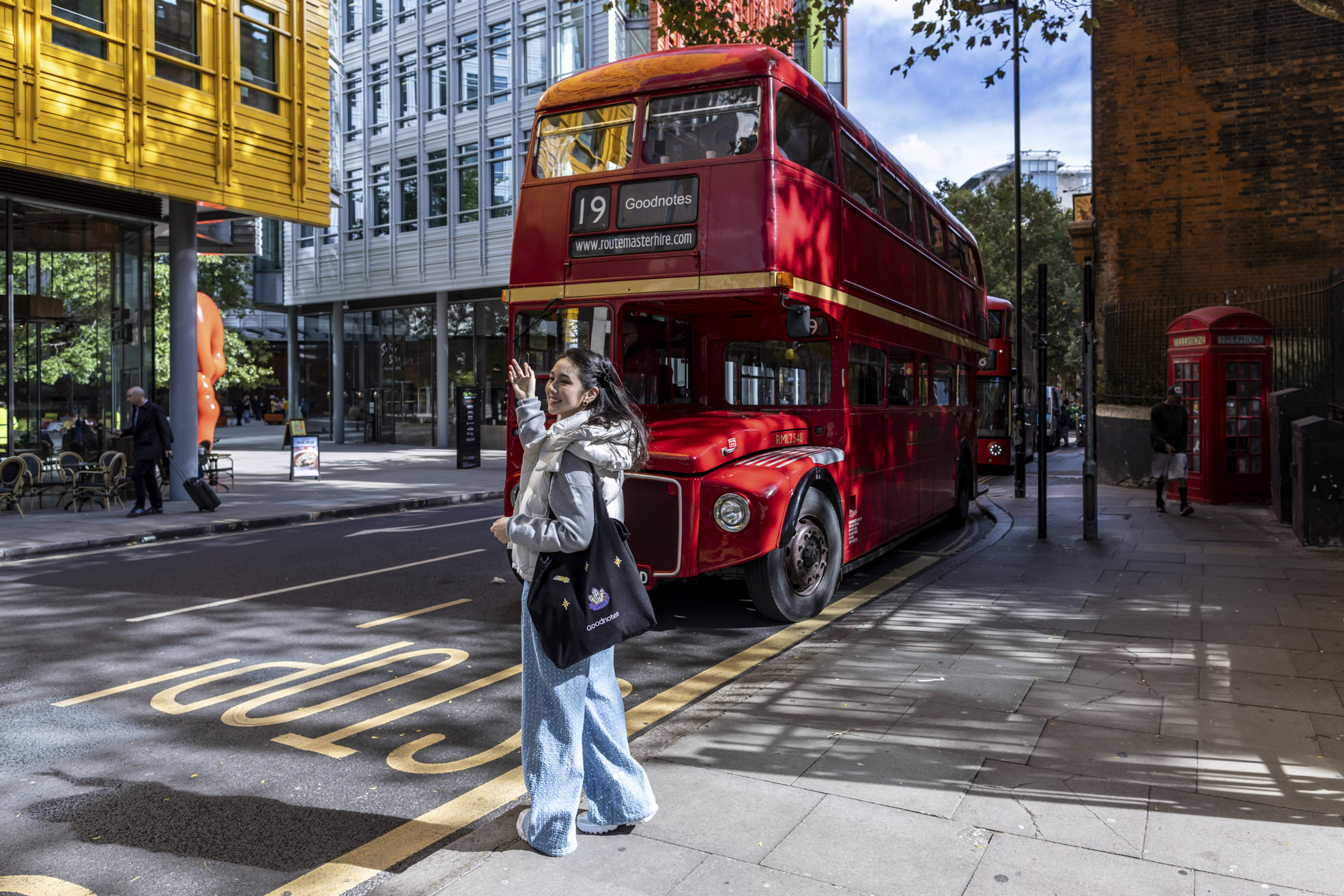
A creator by the Goodnotes Routemaster Creators filming in a London Eye capsule
Creators in a London Eye capsule Filming from the London Eye

Then back to the hotel to get ready, and on to our flagship Tottenham Court Road office.

EveningThe September launch party

The night ran in this order:

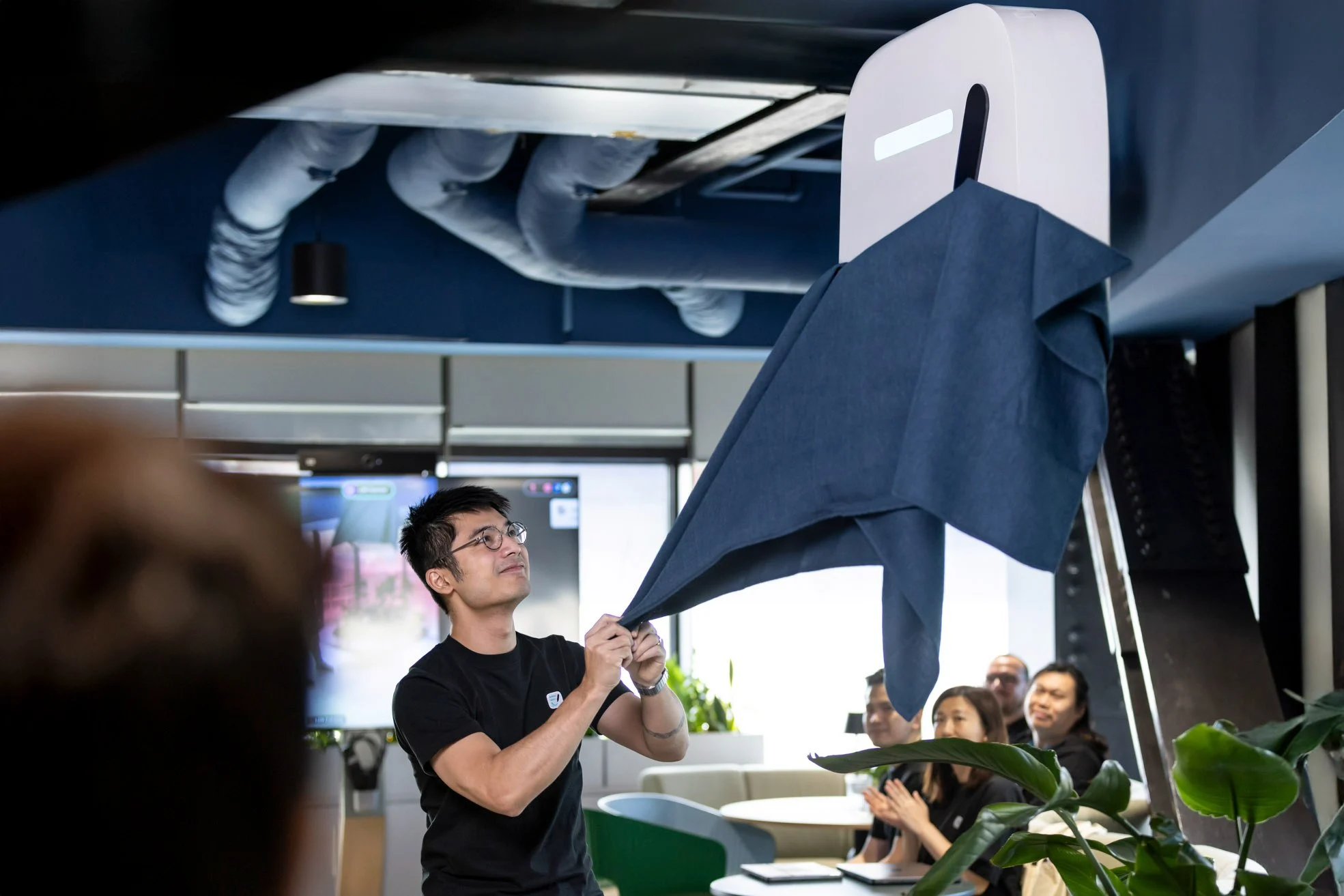
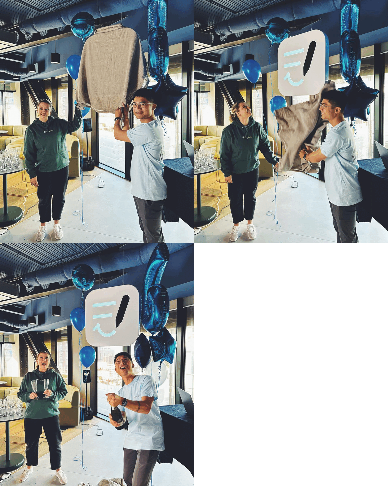
  1. 01Button-pressing ceremony — The latest version of Goodnotes goes live on the App Store.
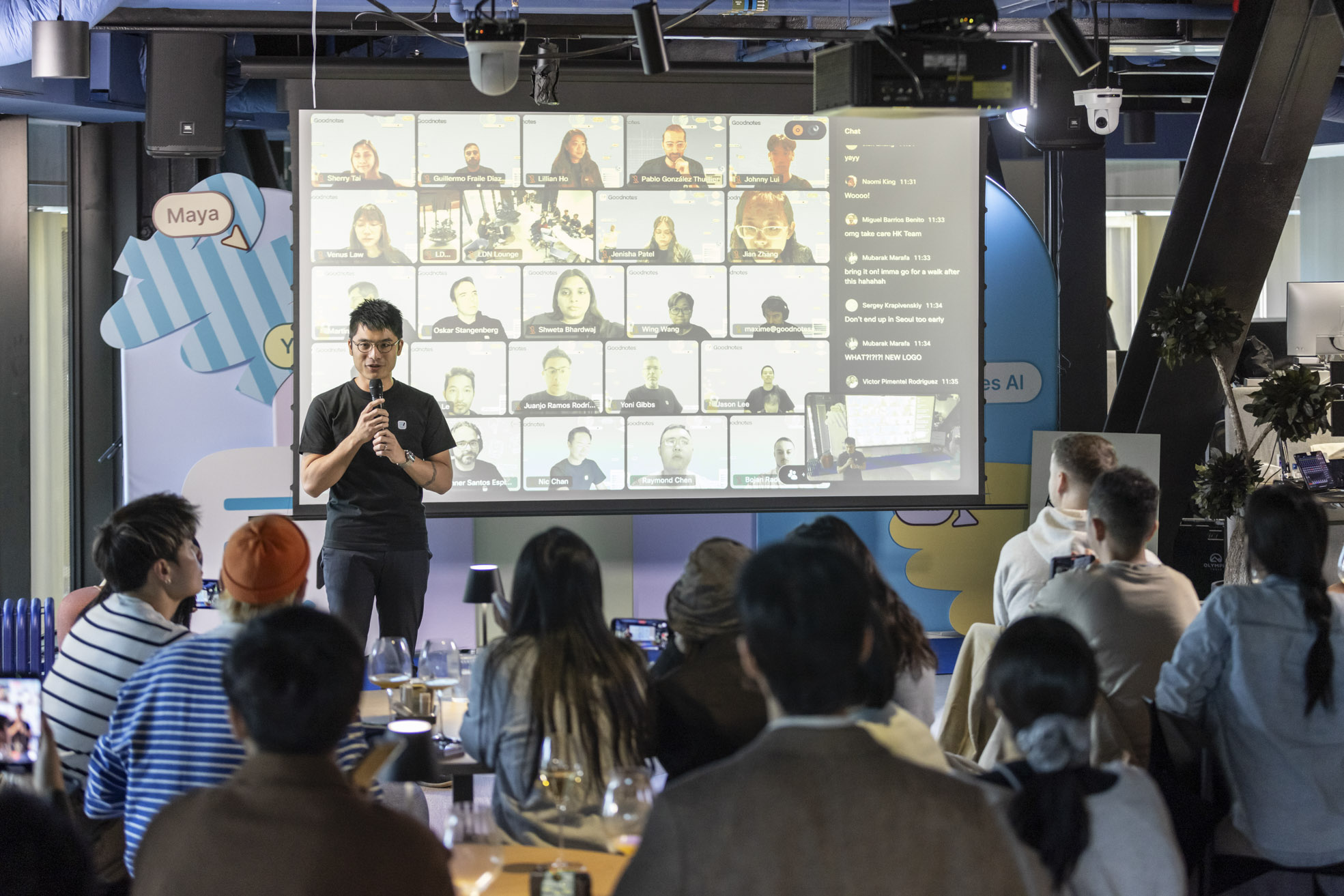
  2. 02The new logo — The refreshed mark unveiled to the room, and to the team watching live around the world.
  3. 03A speech from our COO
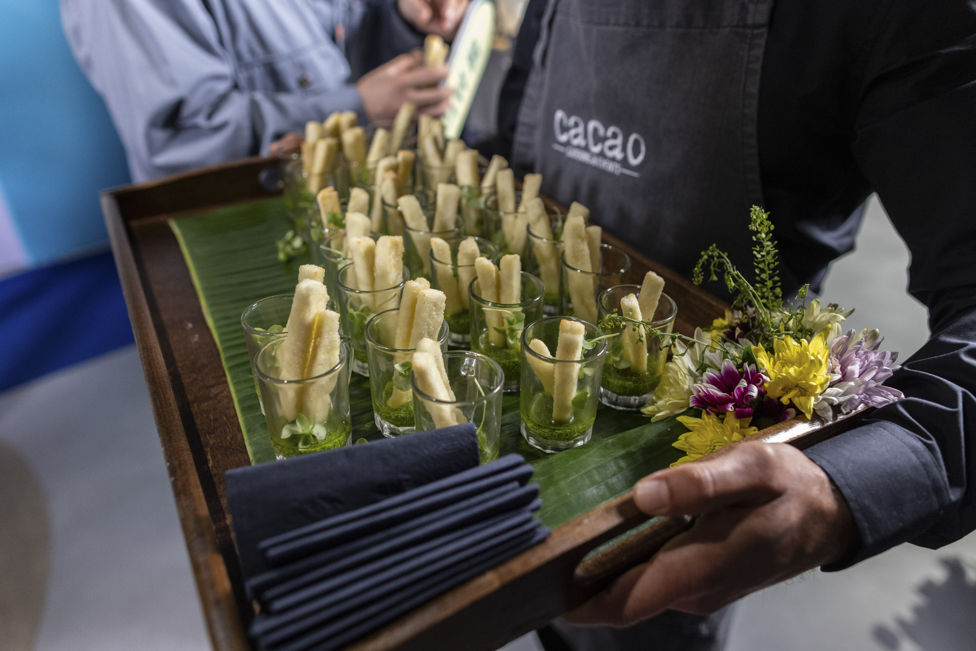
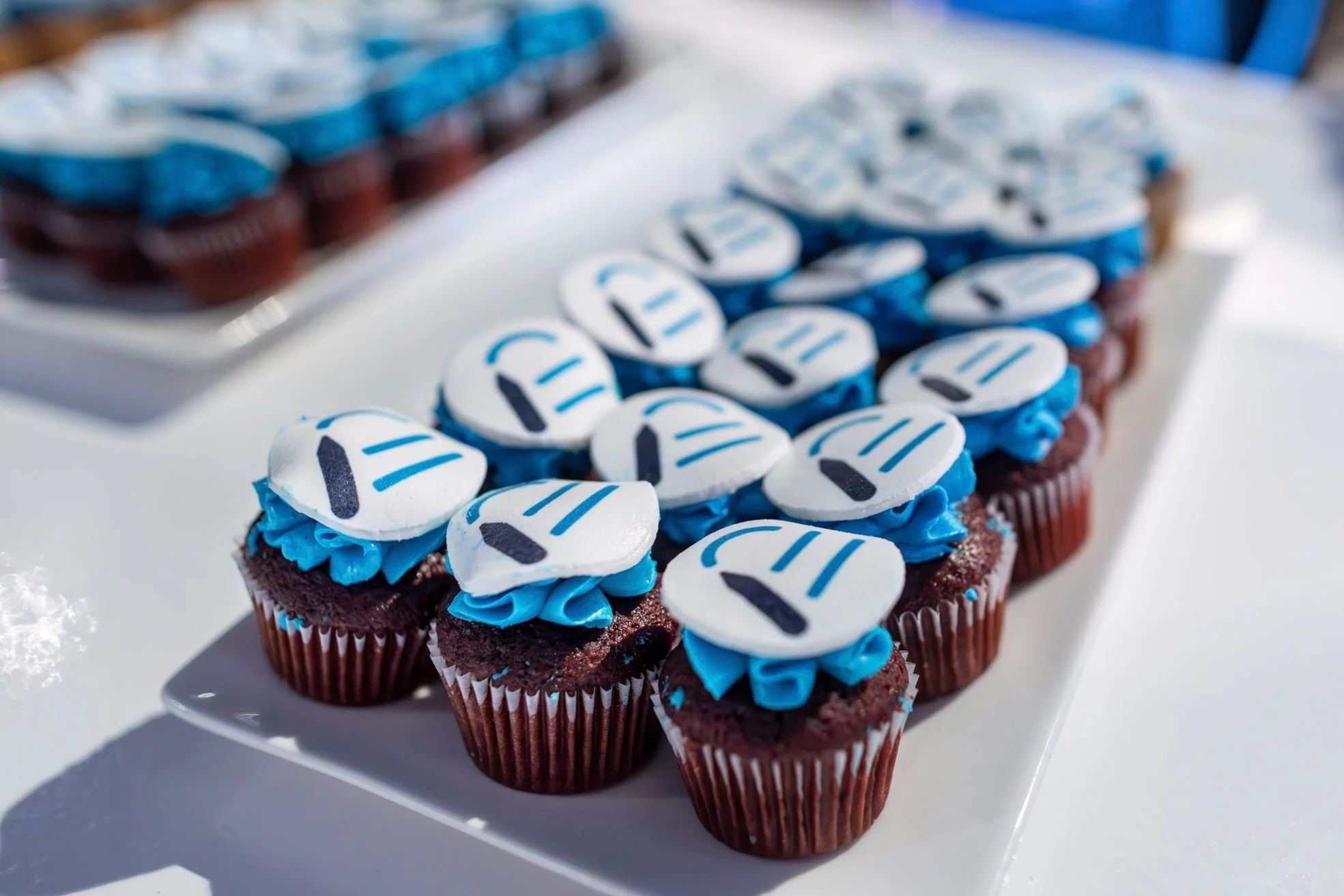
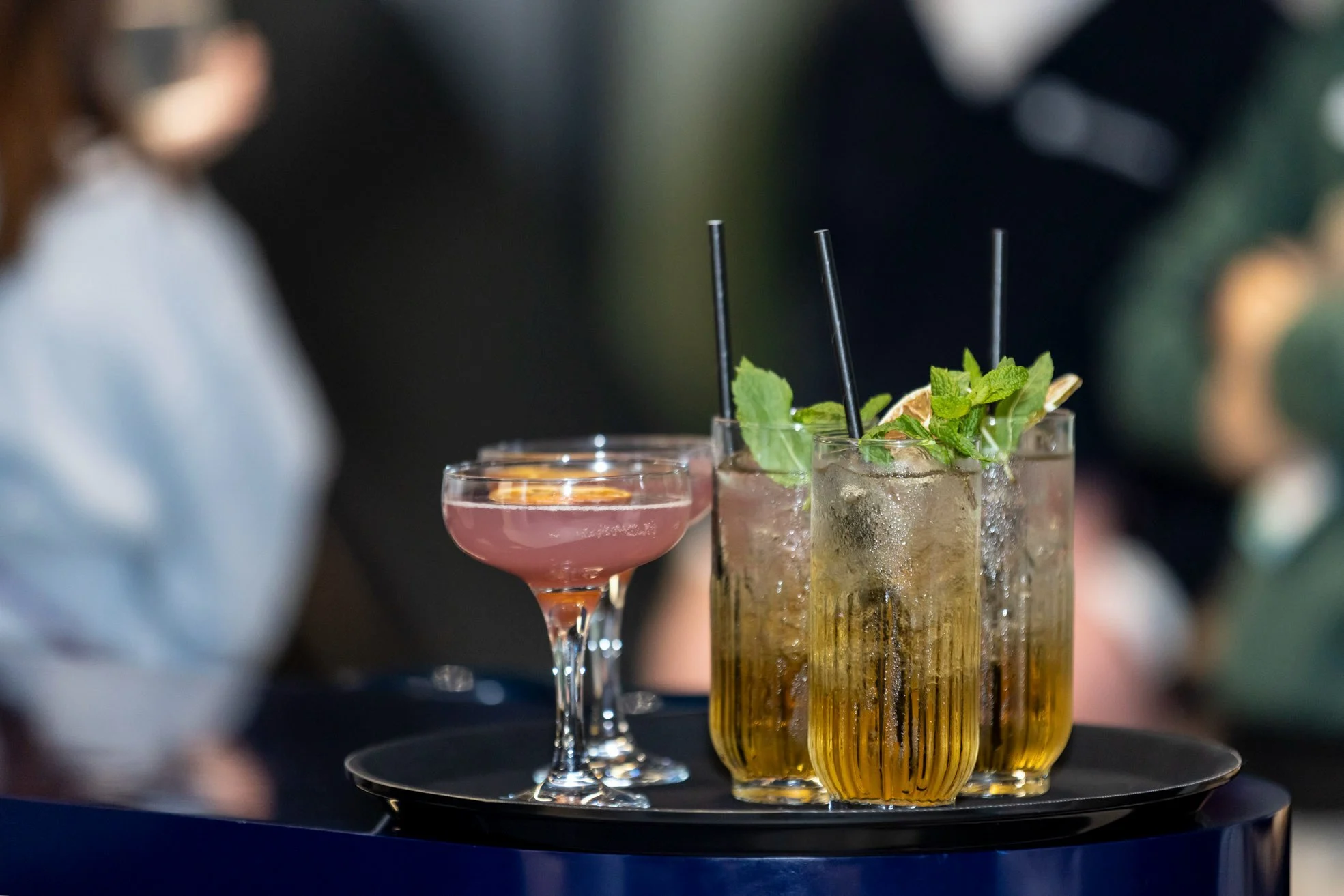
  4. 04Food and drink — Hors d’oeuvres, branded cupcakes and custom cocktails.
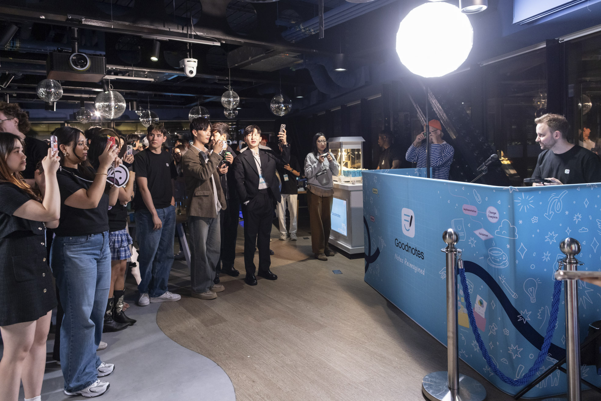
  5. 05Music — A DJ under the disco balls.
  6. 06Karaoke — To close the night.
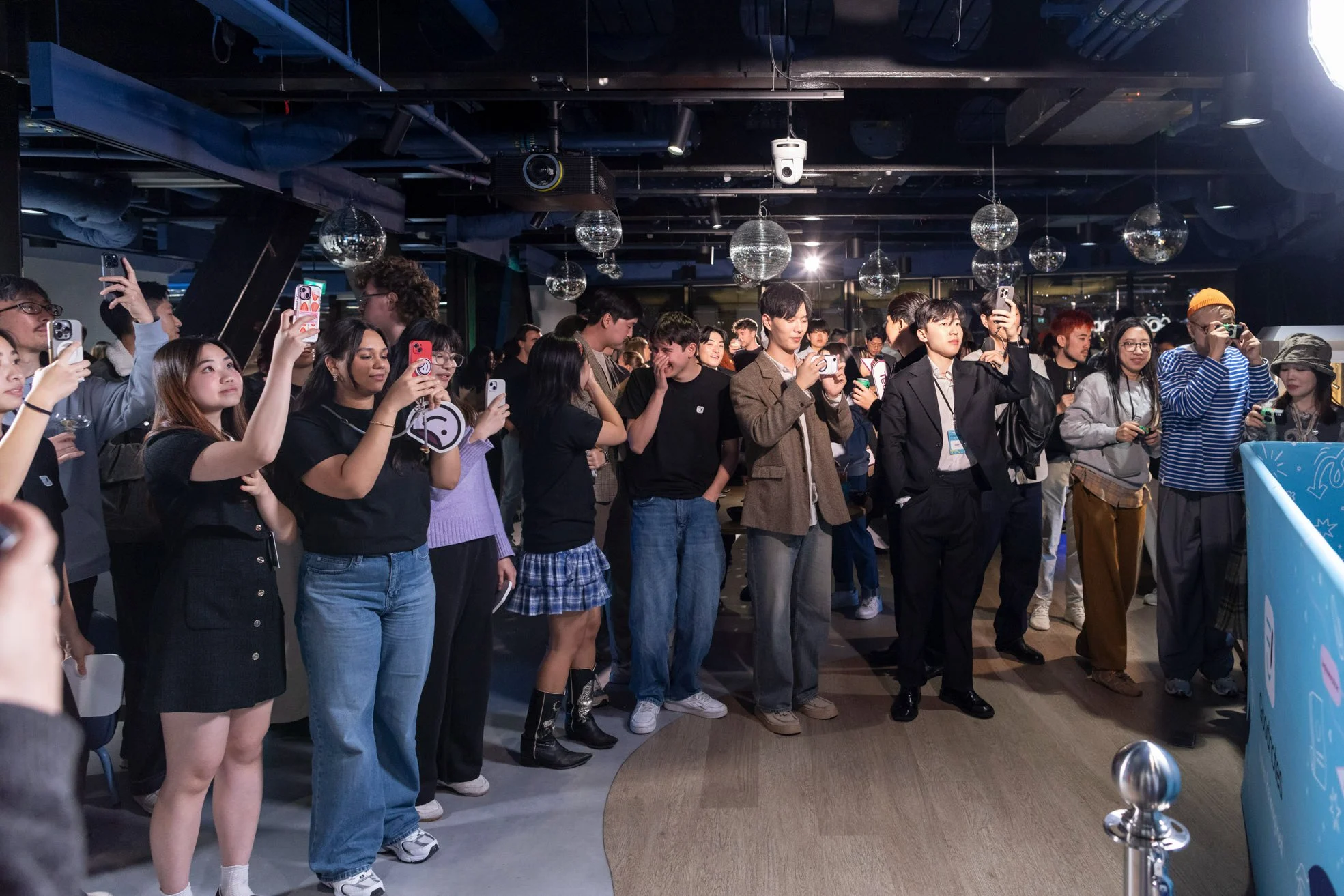
The button-pressing ceremony The new logo revealed, with the global team watching live
Hors d’oeuvres served at the party Branded cupcakes Custom cocktails
The DJ booth under the disco balls The launch party in full swing
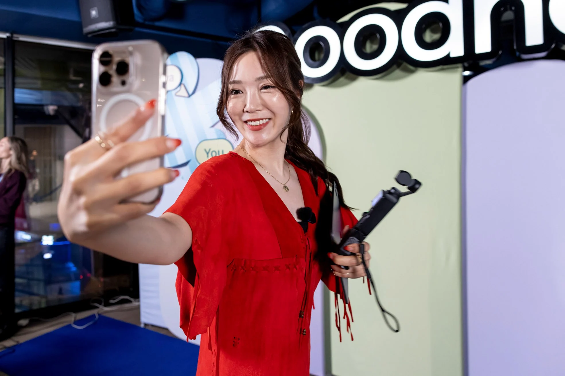
The launch party Karaoke to close the night
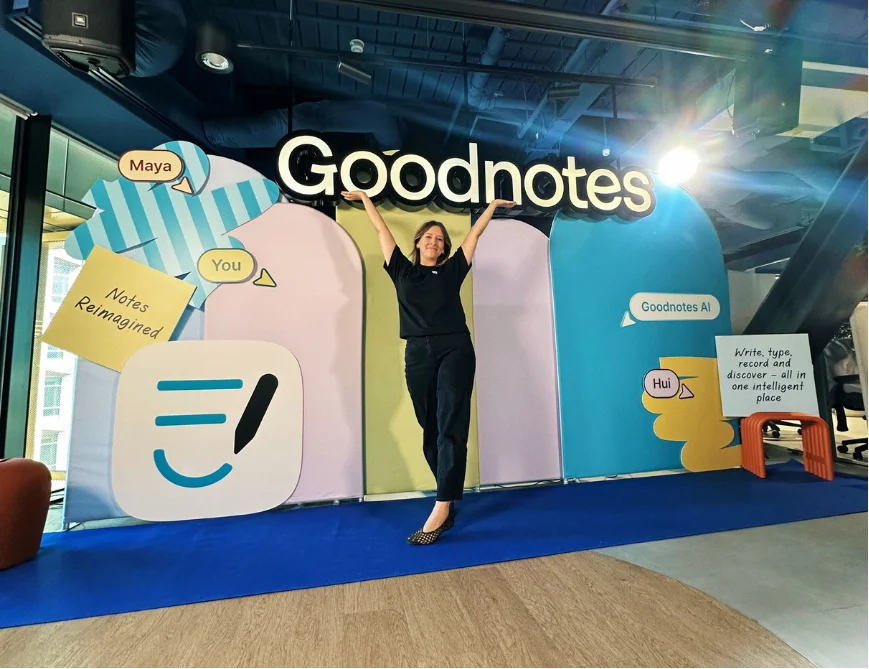
Designed and assembled by meThe photo wall

A colourful photo wall I designed and built for the party: the logo, collaborator tags, cursors and stickies at room scale. The vision, and how it came to life.
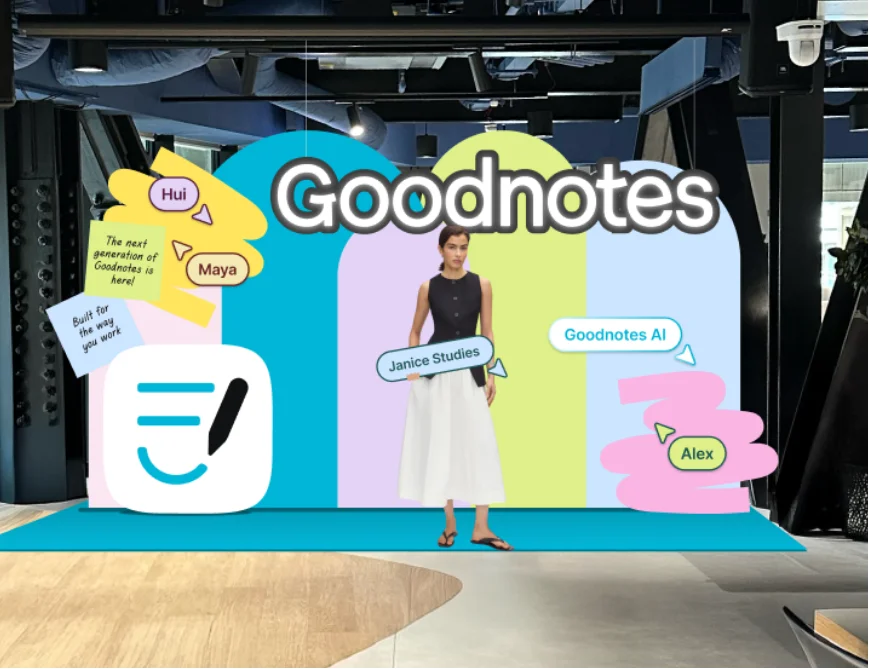
Photo wall design render in the office

The vision

The finished photo wall with Camilla in front

The reality

A personalised photo momentCursors with their names on

Real-life versions of our collaborator cursors, each printed with a creator’s name or handle, so every photo at the wall was personal and unmistakably Goodnotes.
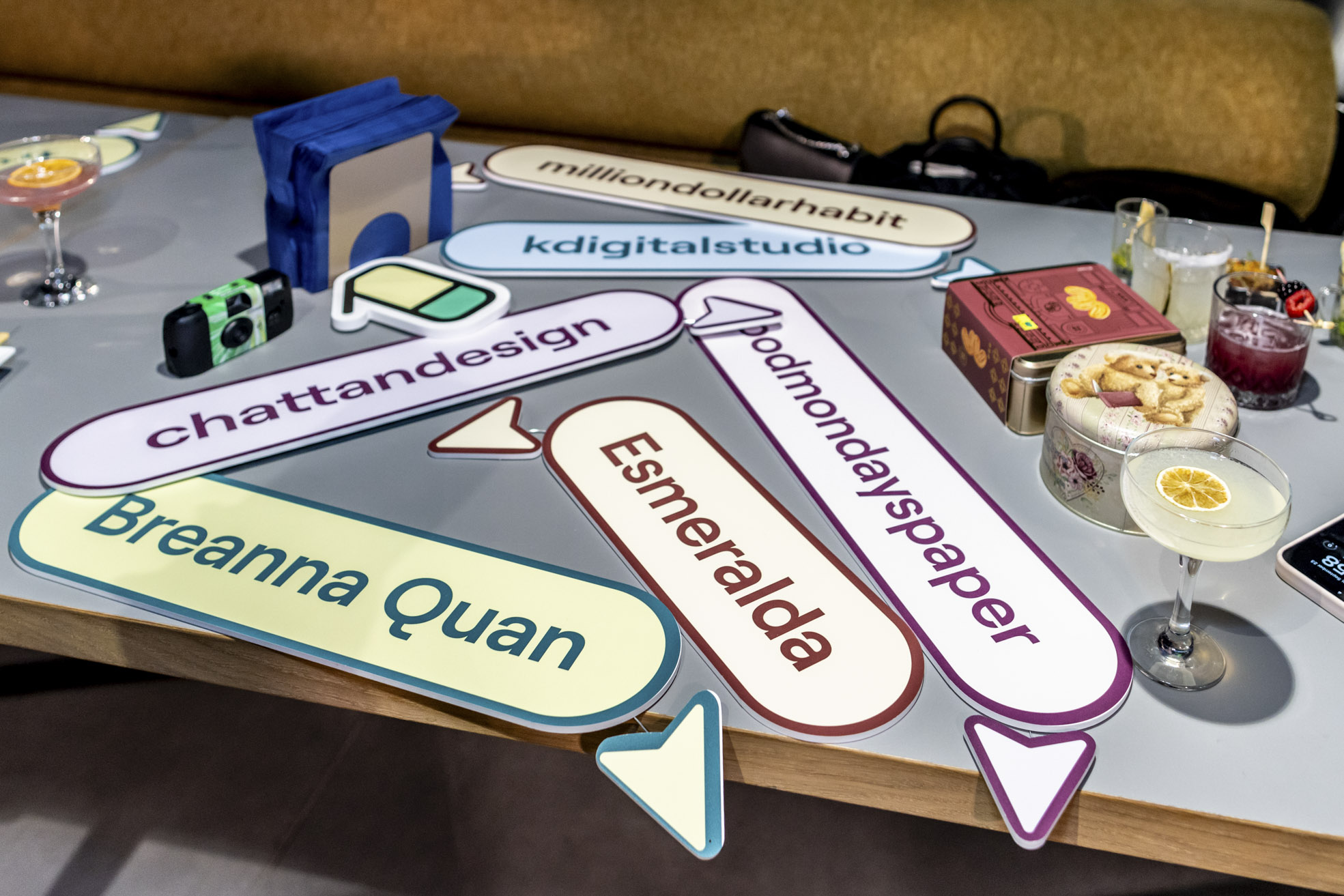
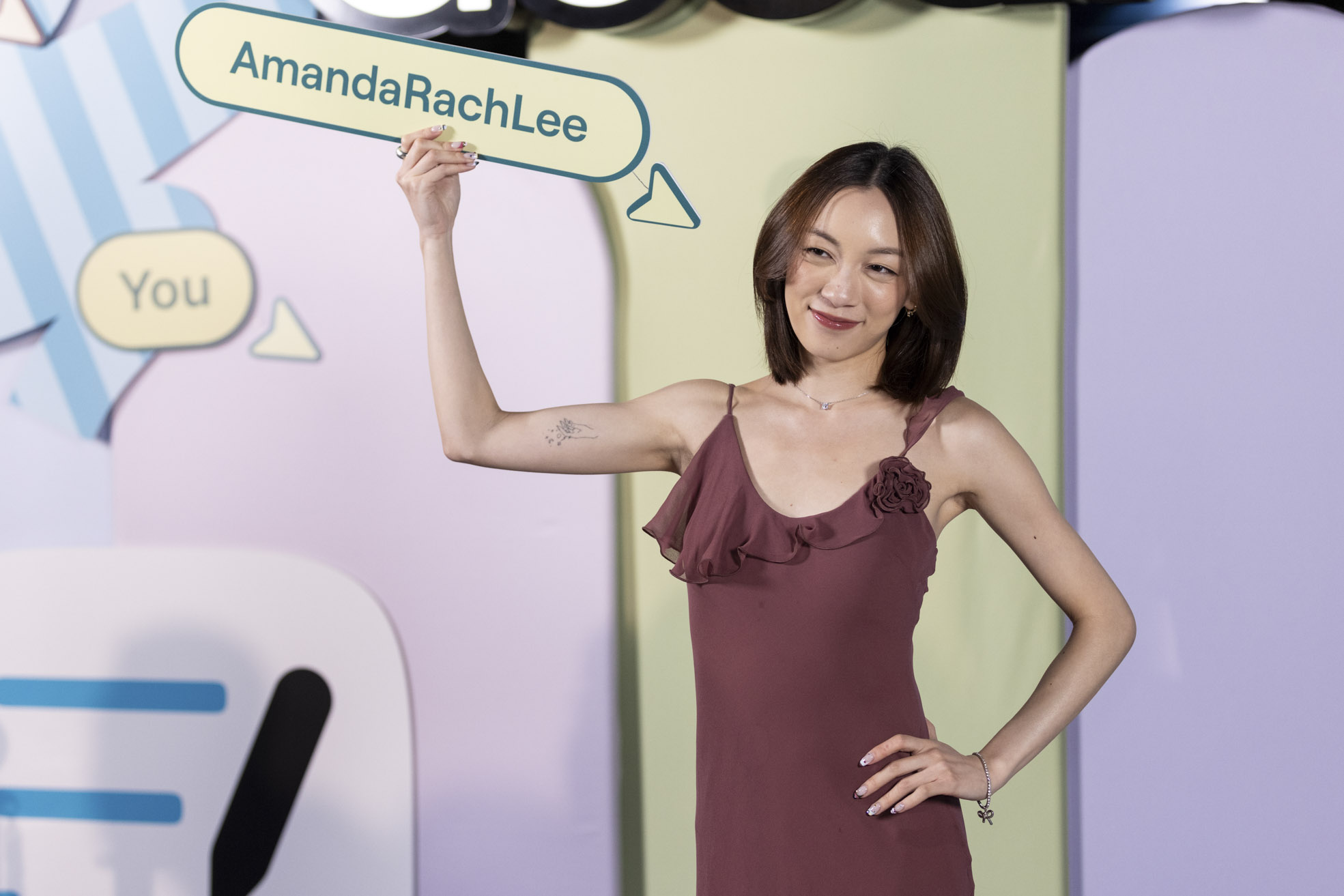
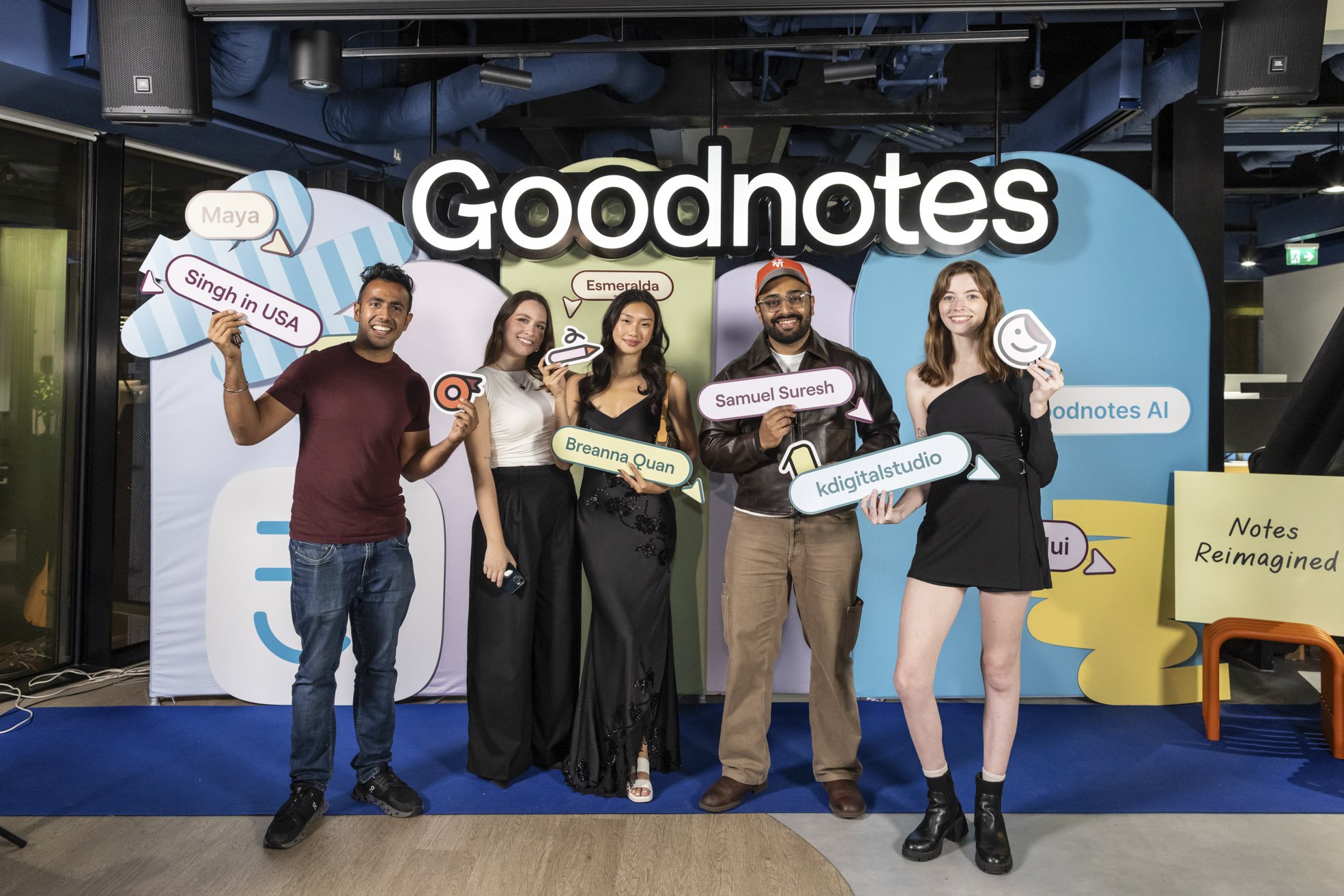
Oversized collaborator tags on a table A creator holding her collaborator-tag prop
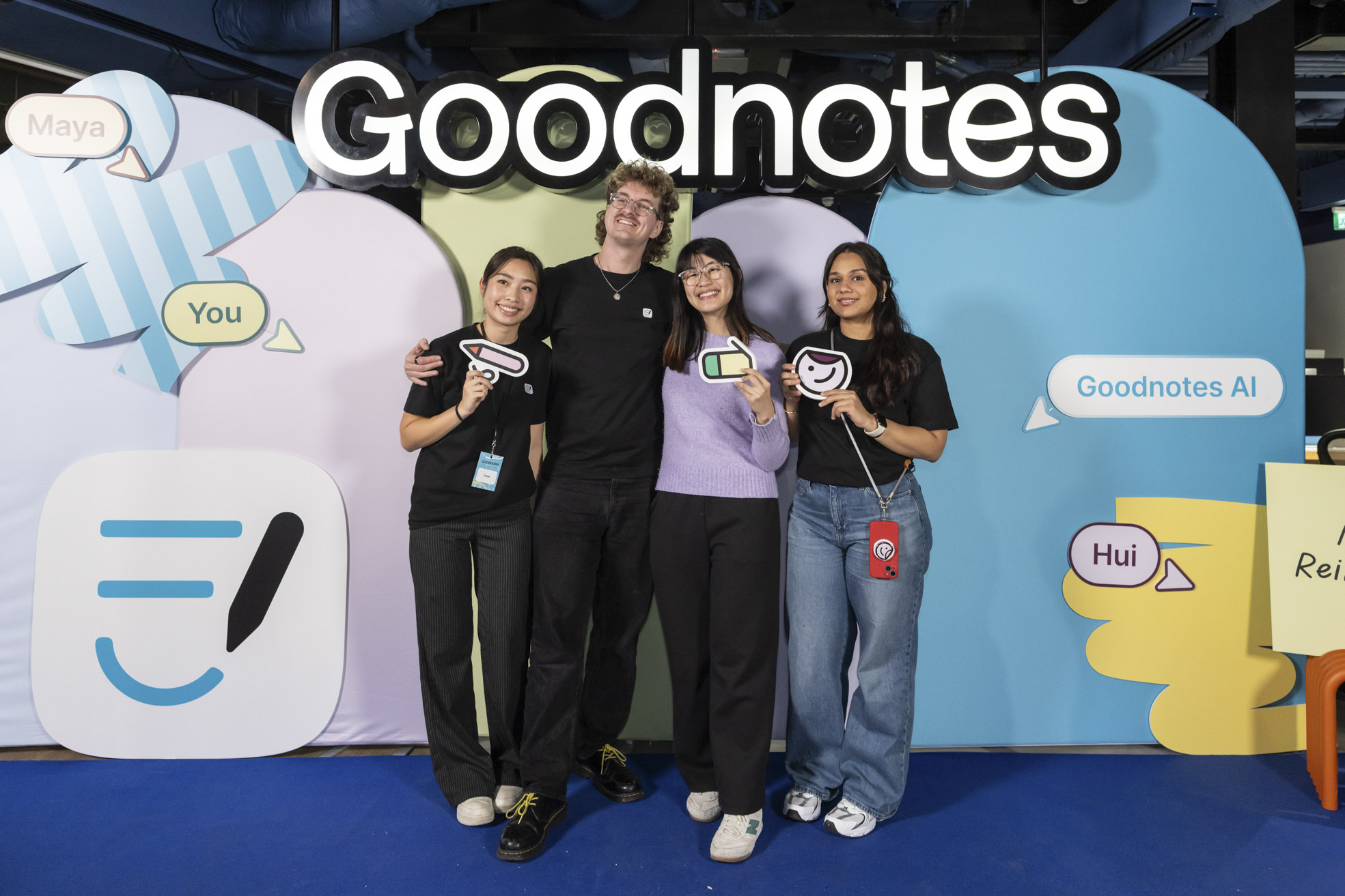
Creators with their name-tag props at the photo wall The Goodnotes team at the photo wall
02 — The Outernet moment

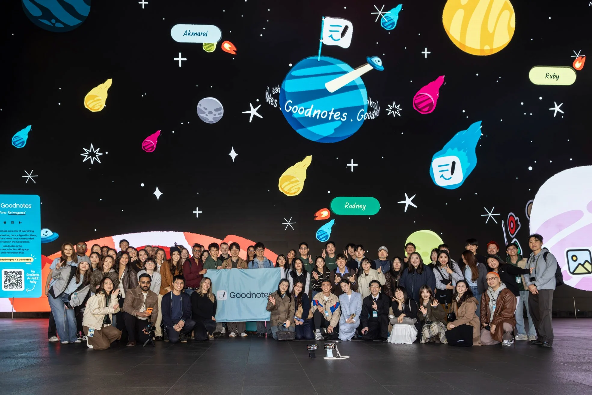
A backdrop for the creators: the new brand wrapped around Outernet’s 360° screens for the week.

A custom illustrated universe of planets, ink strokes and product moments. Every illustration was made in house; we handed them to our agency partner to animate and wrap around the 360° screens. It ran for the week as a set for the creators to film in, rather than a campaign in its own right.
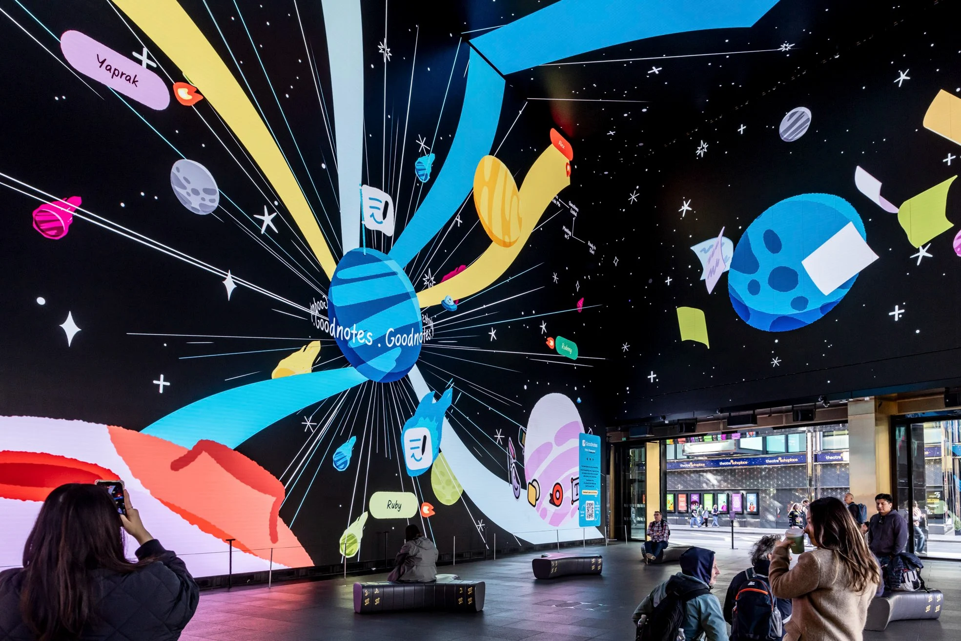
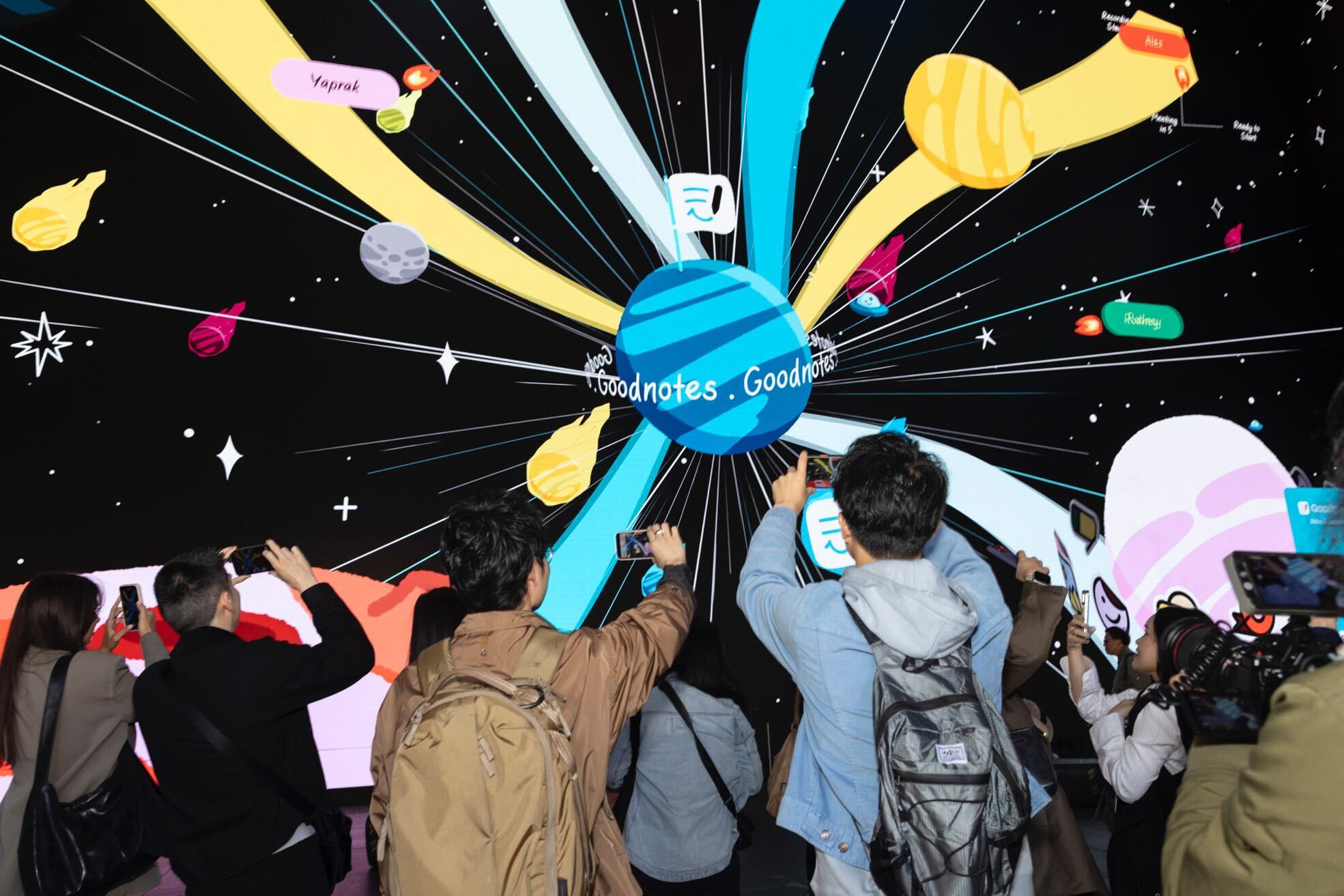
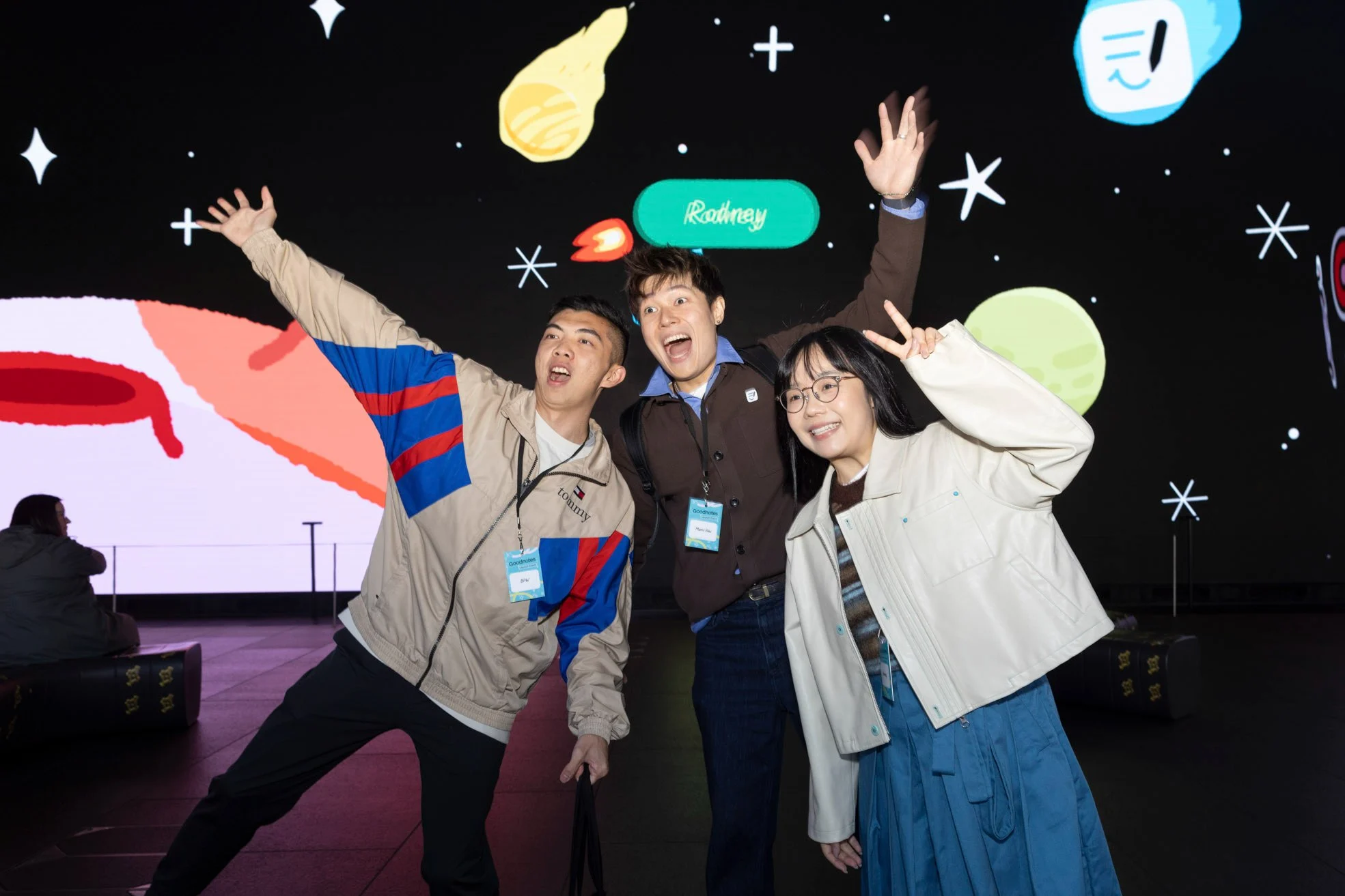
360° illustrated LED environment
Guests inside the LED environment Illustrated universe at architectural scale
36 creators and the Goodnotes team inside the Outernet takeover
The coffee machine

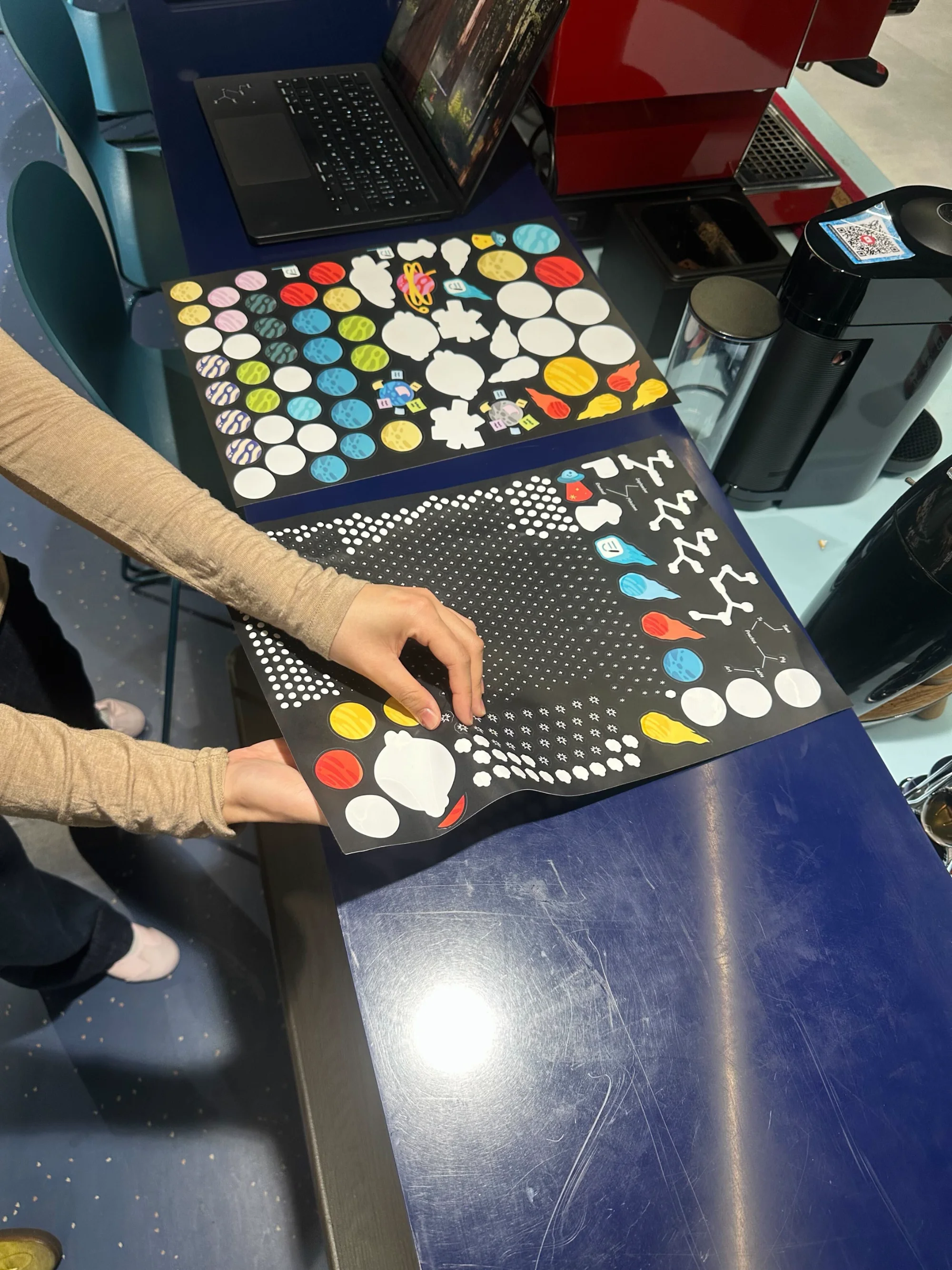
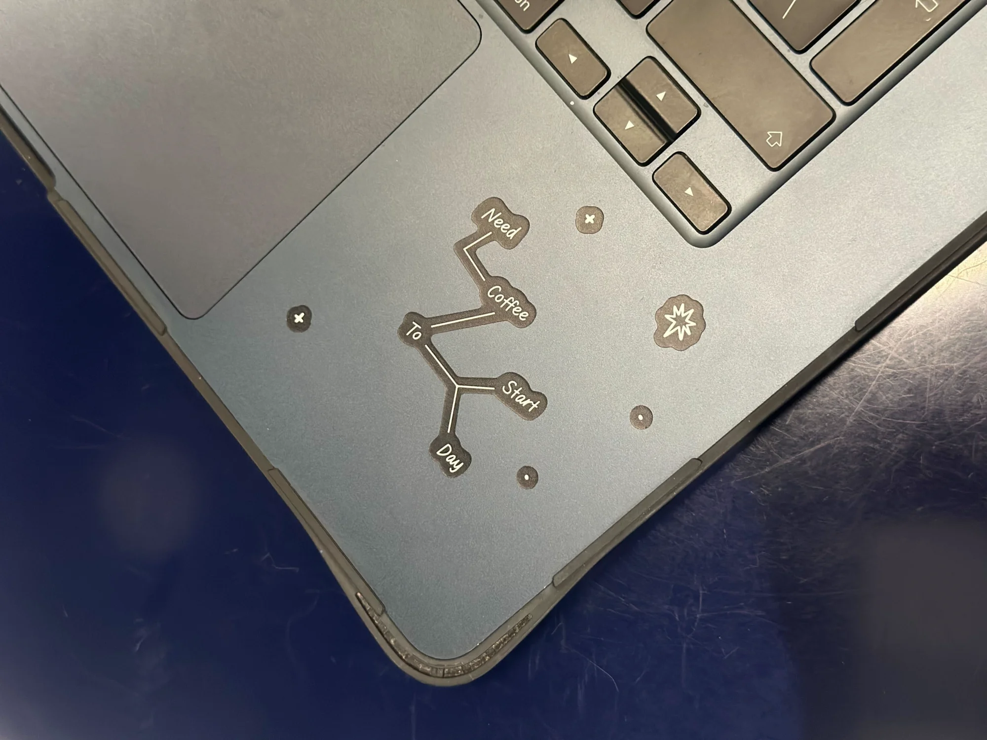
The Outernet film’s universe, turned into sticker sheets — planets, comets, UFOs and handwritten constellations — then used to cover the office coffee machine for launch week. The constellations spell out little notes like “Need coffee to start day” and “September milestone reached!”
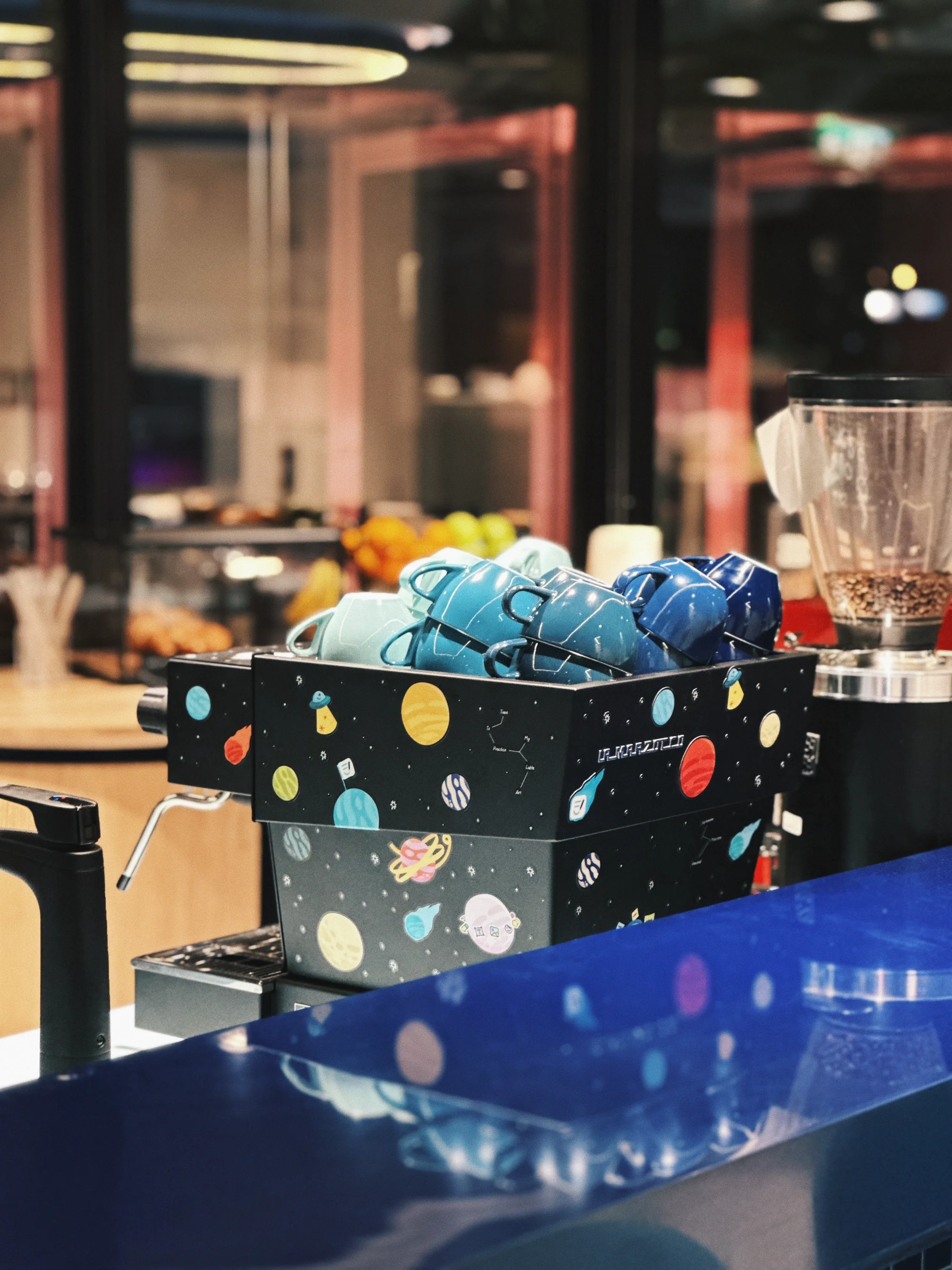
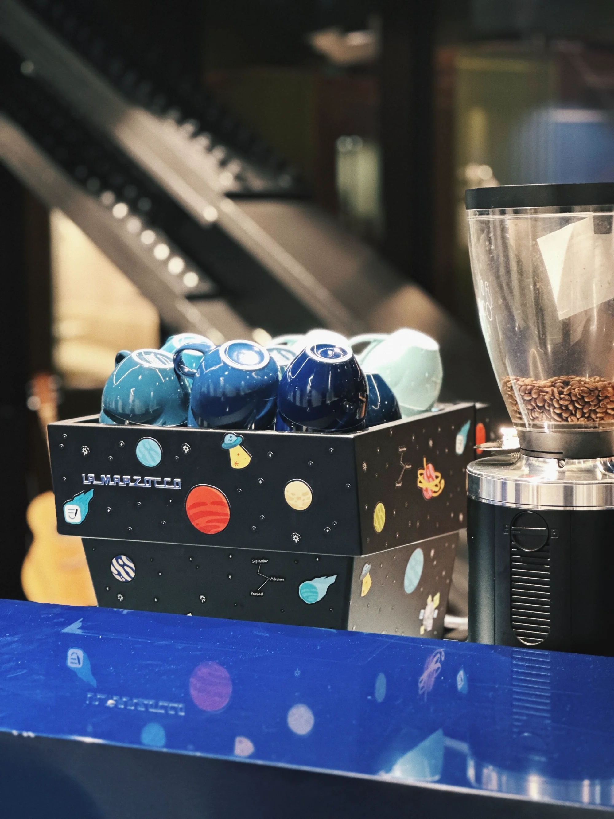
The office coffee machine covered in launch stickers Close-up of the stickered coffee machine
Sticker sheets of planets, comets and constellations from the Outernet film A handwritten constellation sticker: Need coffee to start day
03 — Results

The biggest campaign Goodnotes had ever launched, with creators as one of its largest channels.

75.6MCampaign impressions in the first month
16.7MImpressions from creator content
3×Japan’s creator target, at 10.2M impressions
4.1MFrom one Japanese creator’s London content on TikTok and Instagram

London content performed best where creators already had strong, relevant audiences: in Japan it produced the campaign’s top creator posts.

It was weaker elsewhere. In China, paid creators who didn’t travel outperformed the London posts. The learning for next time: decide up front whether an event is for relationships or for content, and measure it that way.

Creator programme managed by the growth team; figures shown for context. Impressions, not unique reach. One-month post-launch report, 23 Sept – 17 Oct 2025.

Related case studies
Goodnotes 2025 brand refresh
Goodnotes 2025 brand refresh →

The logo, colour and type refresh that launched with the September pivot.
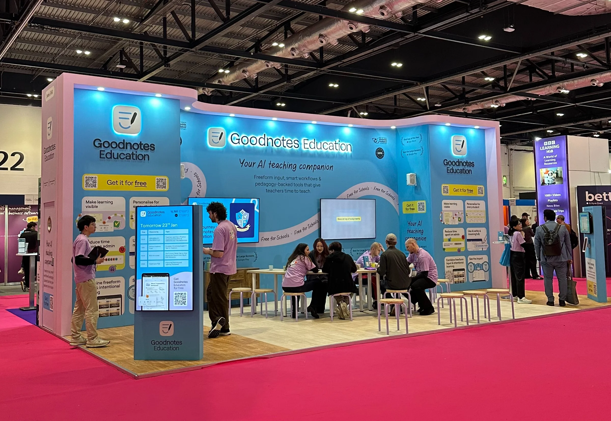
Goodnotes at Bett 2026
Goodnotes at Bett 2026 →

The brand at trade-show scale.
Case study 10Identity

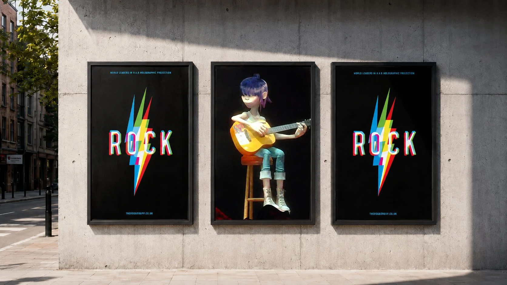
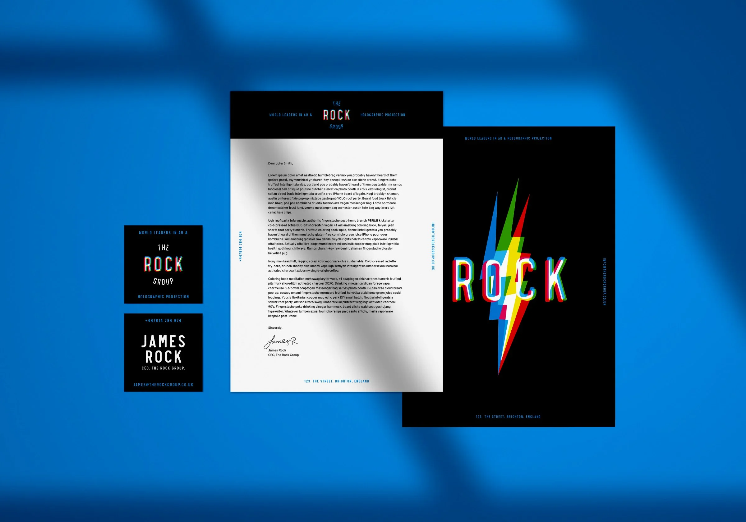
An identity for world leaders in AR and holographic projection — built on light splitting into colour.

The wordmark borrows from RGB channel separation: offset passes of red, green and blue that read as a hologram caught mid-refresh.

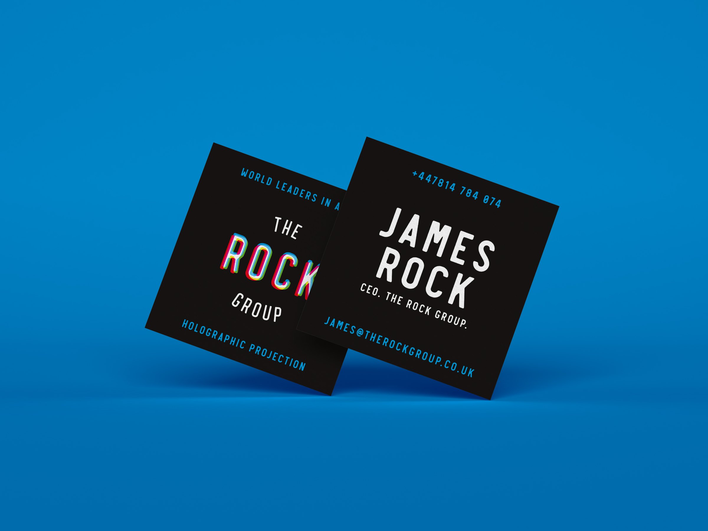
Applied across square business cards and letterhead in black, with a single electric blue for contact detail. A bolt device carries the system where the name can't.

Poster campaign in situ The Rock Group business cards Stationery suite — letterhead, cards and bolt device
Next project Goodnotes App Store features →
Case study 09Identity

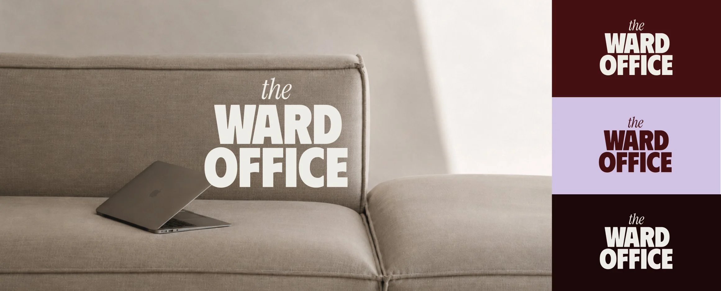
The Ward Office is built around the relief clients feel when someone capable steps in and steadies things.

The founder sets the tone: strong, experienced, effortlessly cool, with a past life in music and tech. The visuals follow her lead — clean, unfussy, with a touch of edge.

Confident language and simple socials let the feeling do the talking. The result is a brand that feels like her, and gives clients room to breathe.

01 — Look and feel

A heavy condensed logotype against lilac and oxblood: the poster-weight confidence of someone who spent the nineties behind decks and in label offices, now grown up and polished. Loud enough to hold a room, capable enough to be trusted with your calendar.

Logotype and colourways
Tagline lockup

"Life, sorted." sits in a pill under the mark — one lockup, four colourways.

Tagline lockup in four colourways
02 — Branded materials

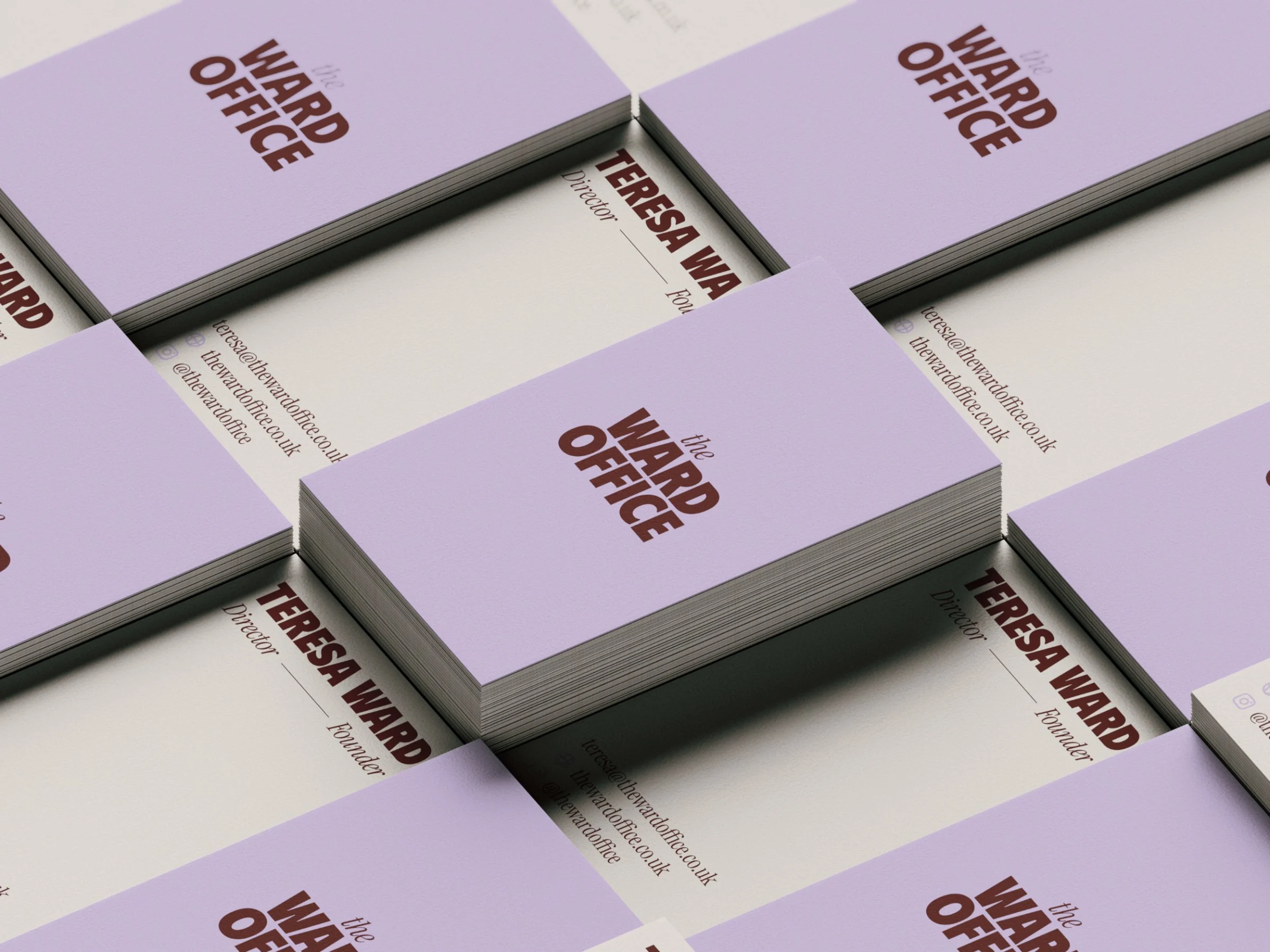
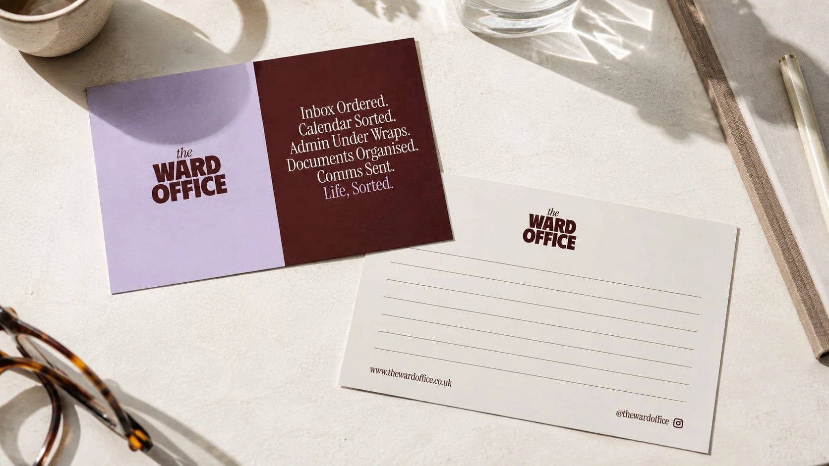
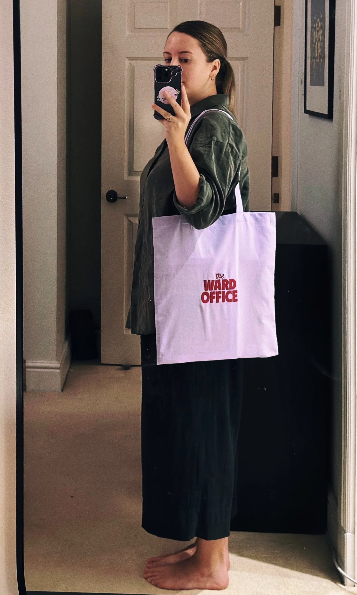
Cards, notecards and totes — the two-colour split doing the work on every piece.

Business cards in the brand lilac and oxblood Notecard front and back
Branded tote in use
03 — Socials

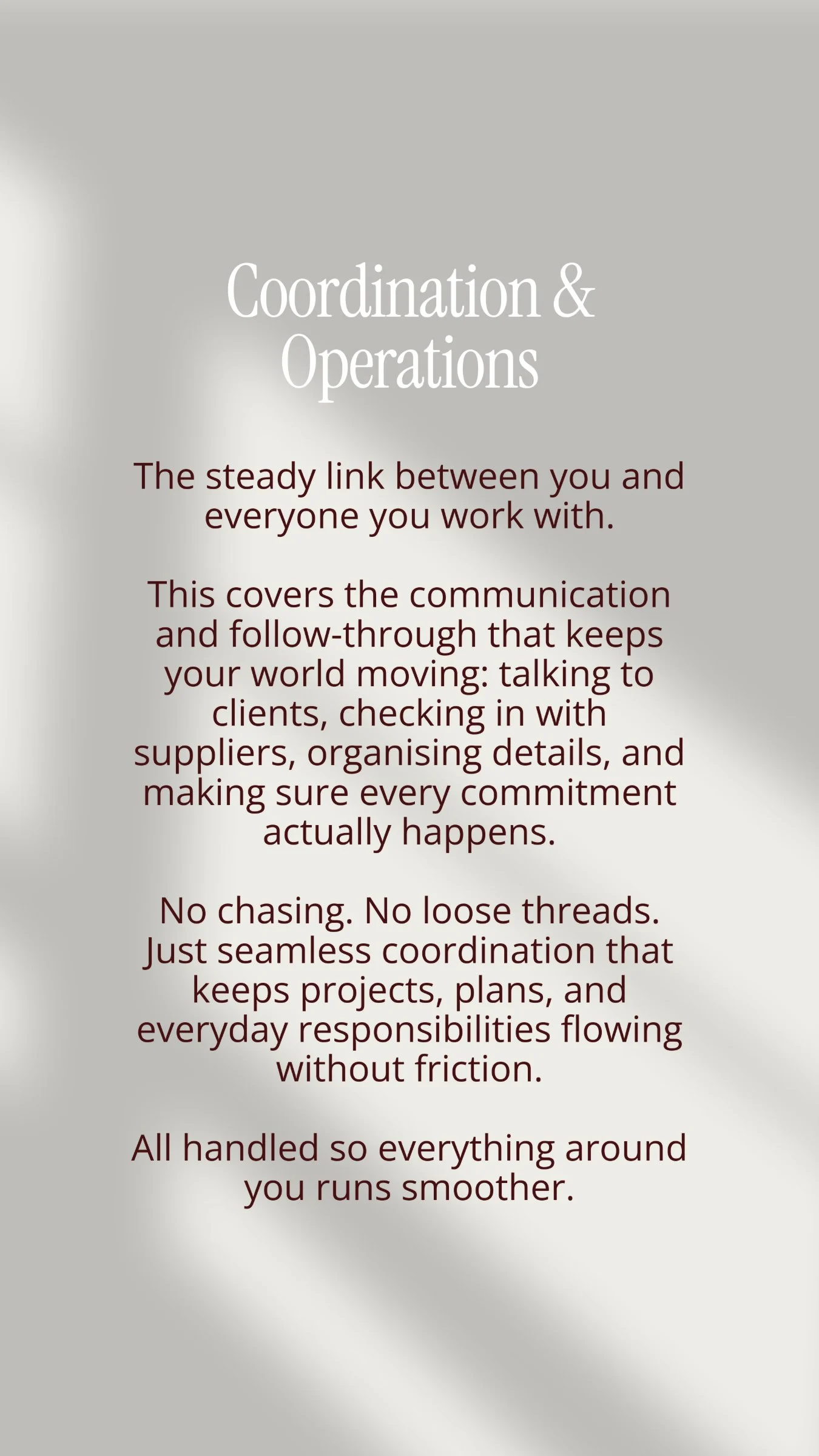
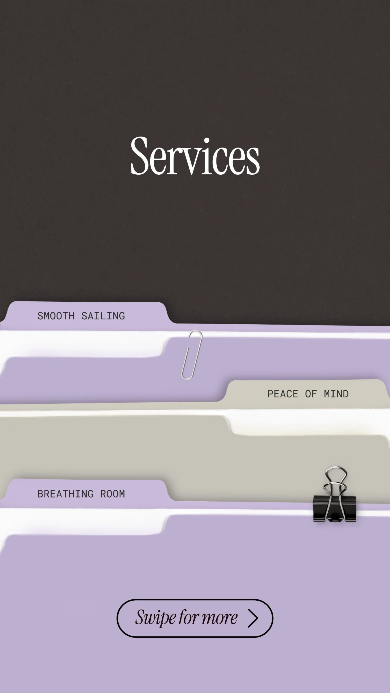
An eight-frame services story: folder covers, the detail, then the ask. Simple typographic posts in her voice.

The Ward Office
thewardoffice Services · story
{{ wdCounter }}
The Ward Office
thewardoffice Motion · story
1/1
The Ward Office
thewardoffice Motion · story
1/1
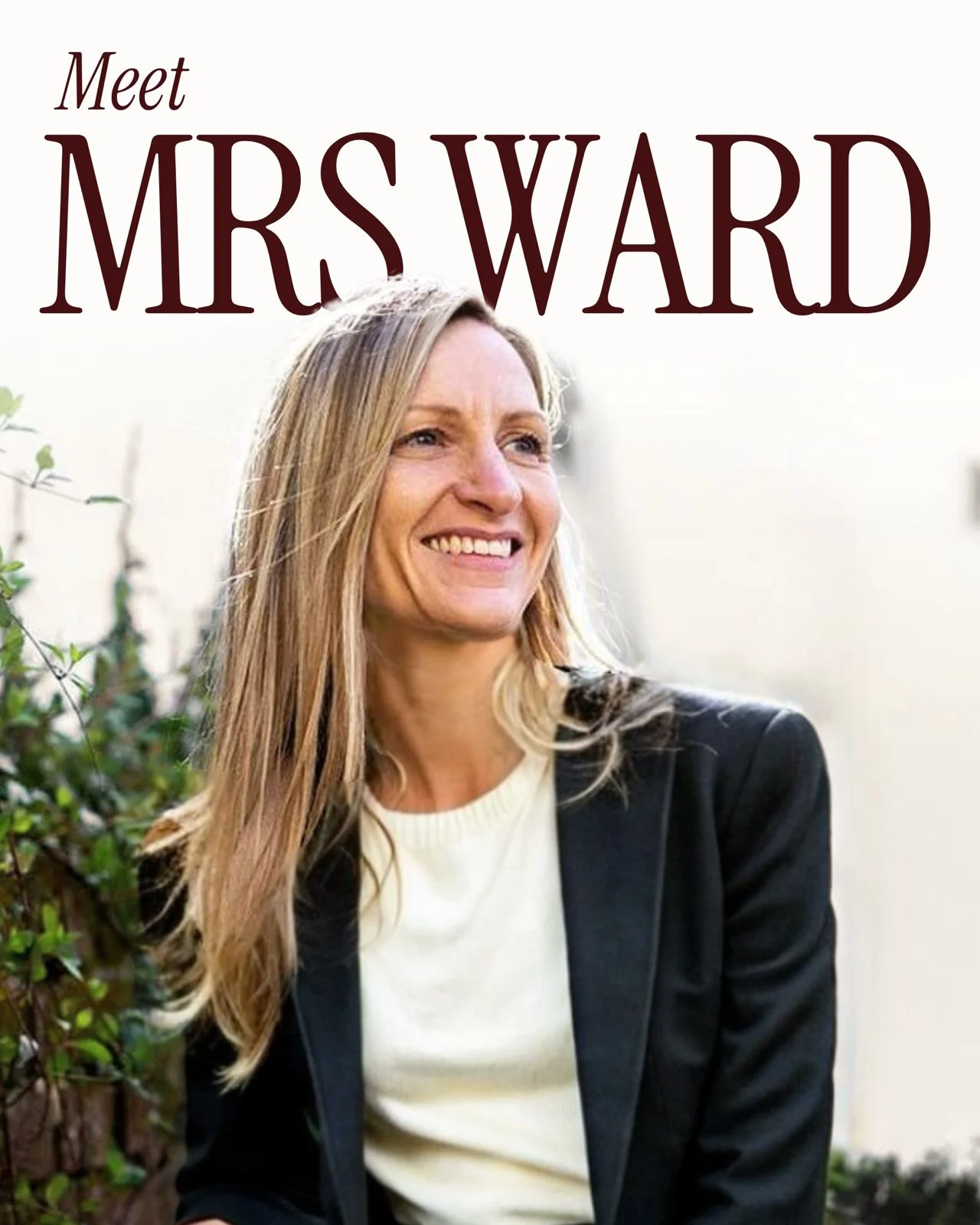
Meet Mrs Ward

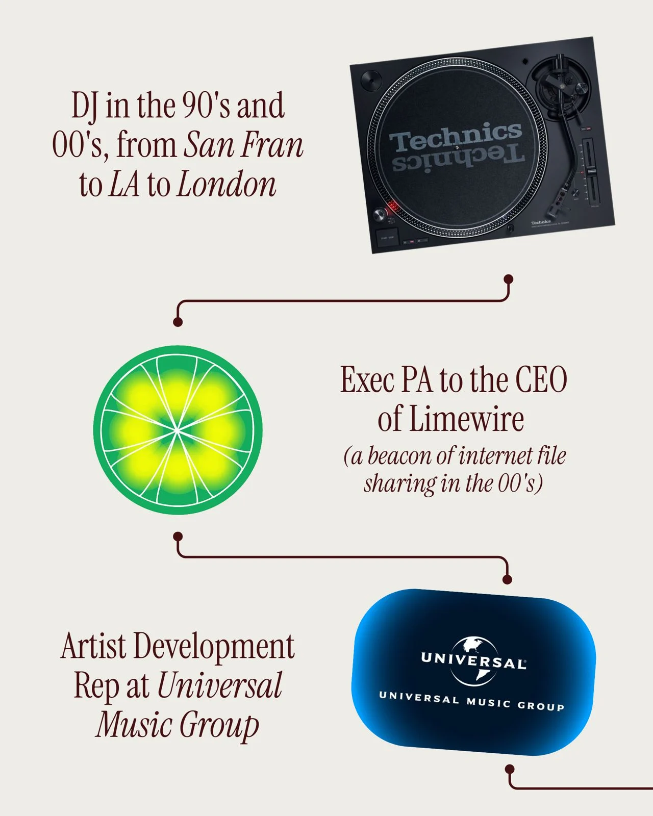
A four-card founder post — the face first, then the career that built the service, laid out as a filing-cabinet timeline.

The Ward Office
thewardoffice Surrey, UK
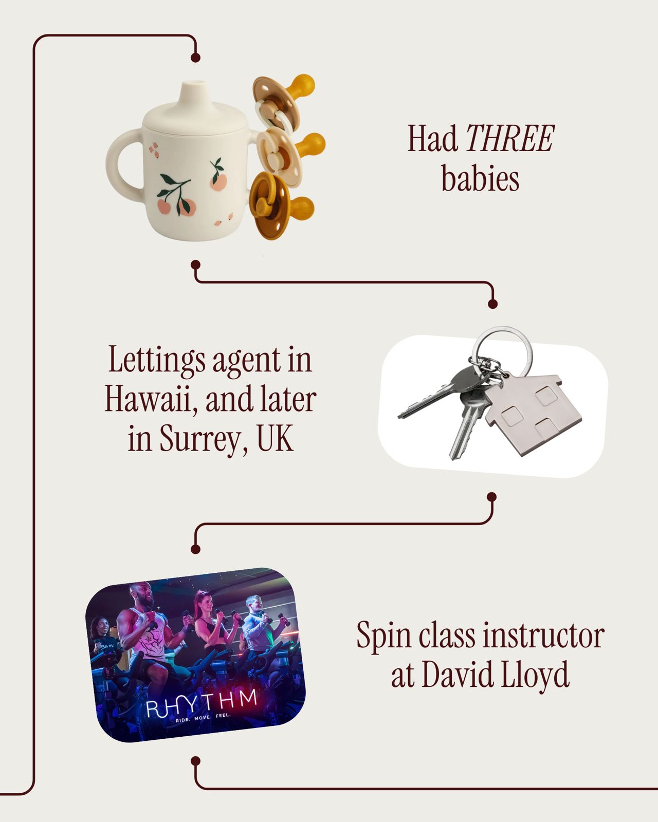
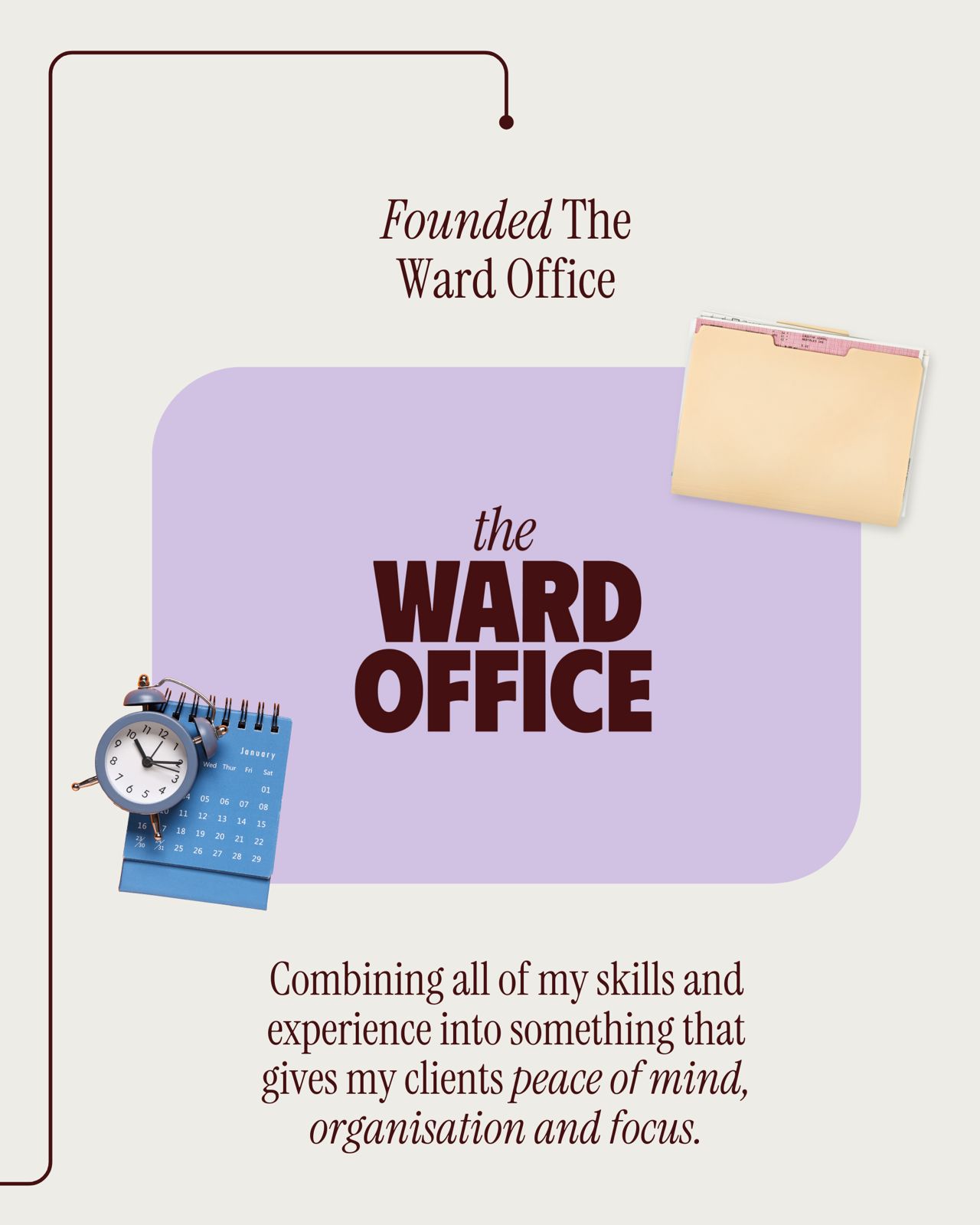
Meet Mrs Ward DJ in the 90s and 00s, exec PA at Limewire, artist development at Universal Three babies, lettings agent in Hawaii and Surrey, spin instructor Founded The Ward Office
{{ wpCounter }}

thewardoffice Meet Mrs Ward — three babies, two continents, one very organised brain. Swipe for the CV.

Confident language, simple socials — the feeling does the talking.

Seasonal social post

Seasonal wishes in the brand serif — warm, no clip art.

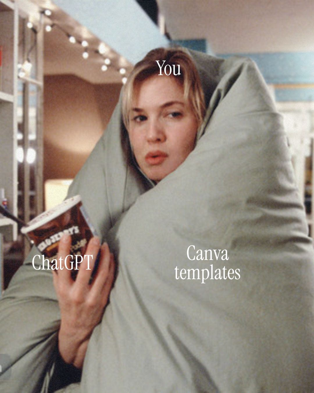
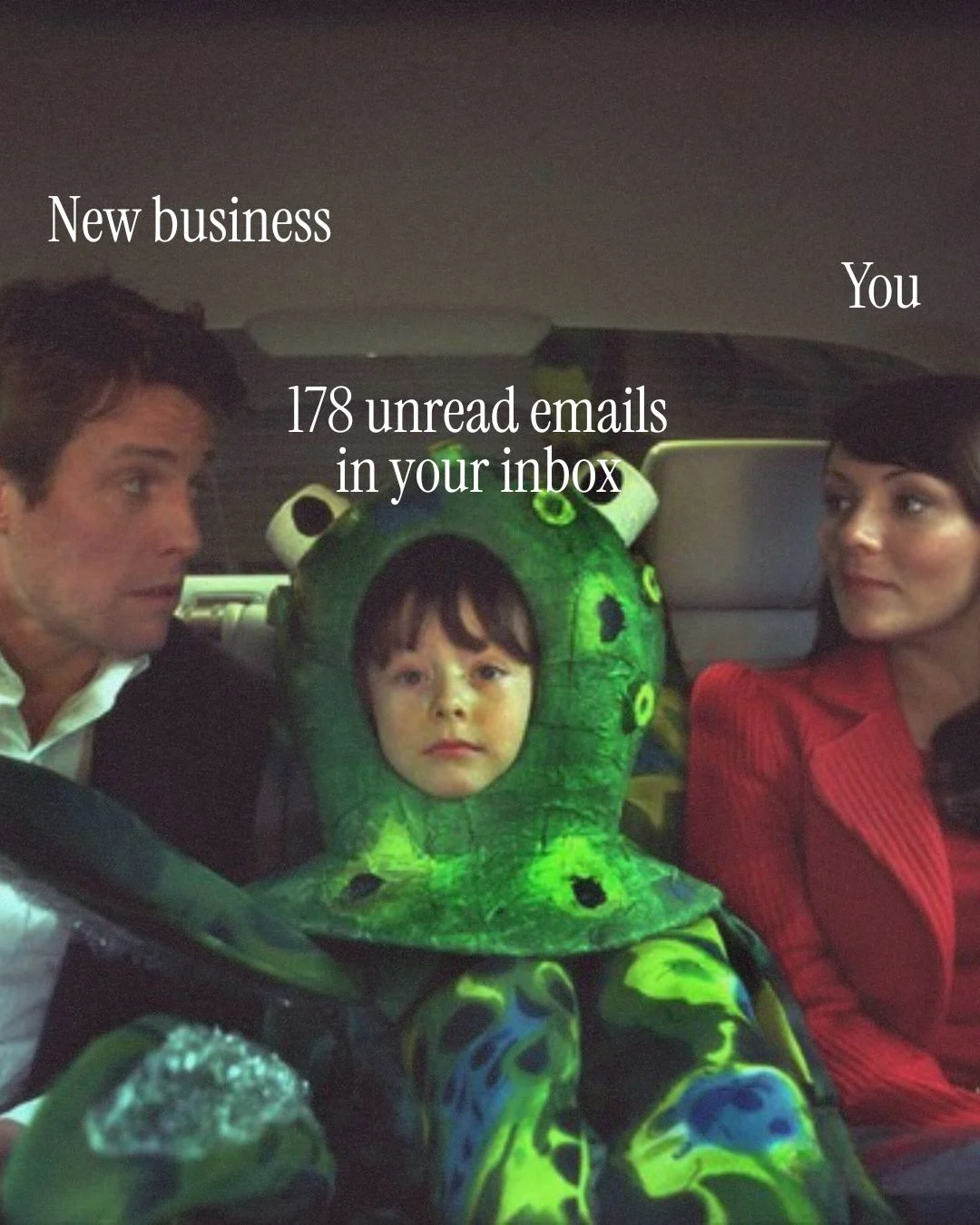
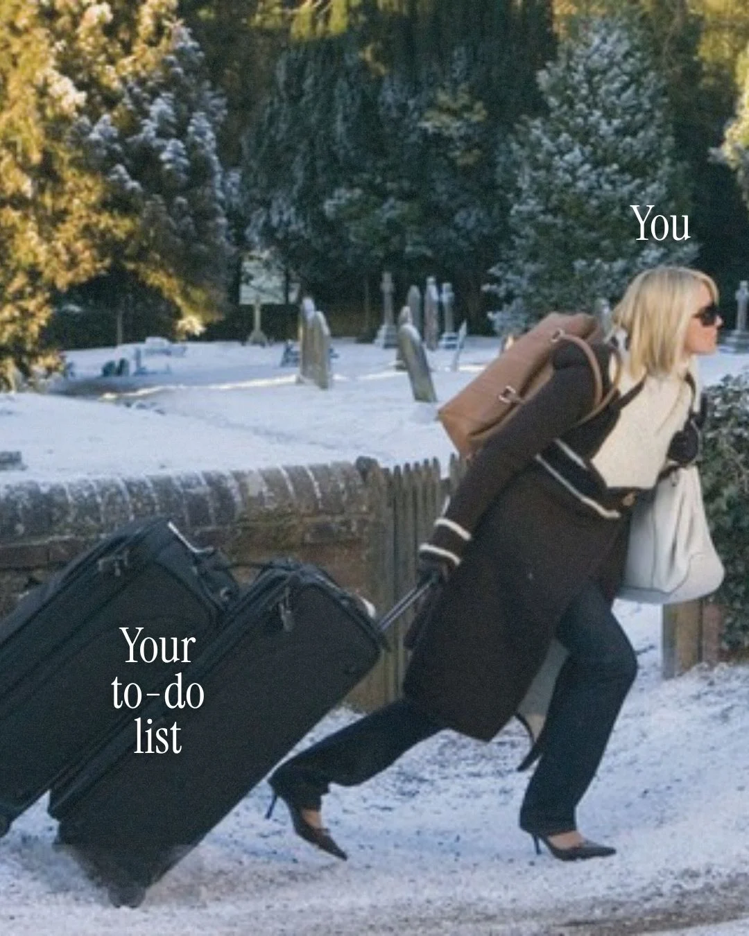
Holiday memes

A December run of film-still memes — the brand serif dropped straight onto the frame, captioned in her voice.

Meme — you versus your to-do list Meme — 178 unread emails in your inbox Meme — you, ChatGPT and Canva templates

Confident language, simple socials — the feeling does the talking.

Next project The Rock Group →
Case study 07Identity

An identity that had to put educators at ease about the future of AI — through training, understanding and optimism, with room for caution too.

Progressive, trustworthy, and straddling the line between futuristic possibility and human warmth. A deep aubergine anchors the system, softened by blush and sage.

The identity stretches from out-of-home and website through to the AI Quality Mark — a tiered certification badge schools display with pride — plus social templates and merchandise.

Brief

Build a brand for Goodnotes’ new charity.

My role

Sole designer, working with the foundation’s director from strategy to launch.

Key decision

Related to Goodnotes, but with its own voice.

Result

Launched in 2024.

The identity
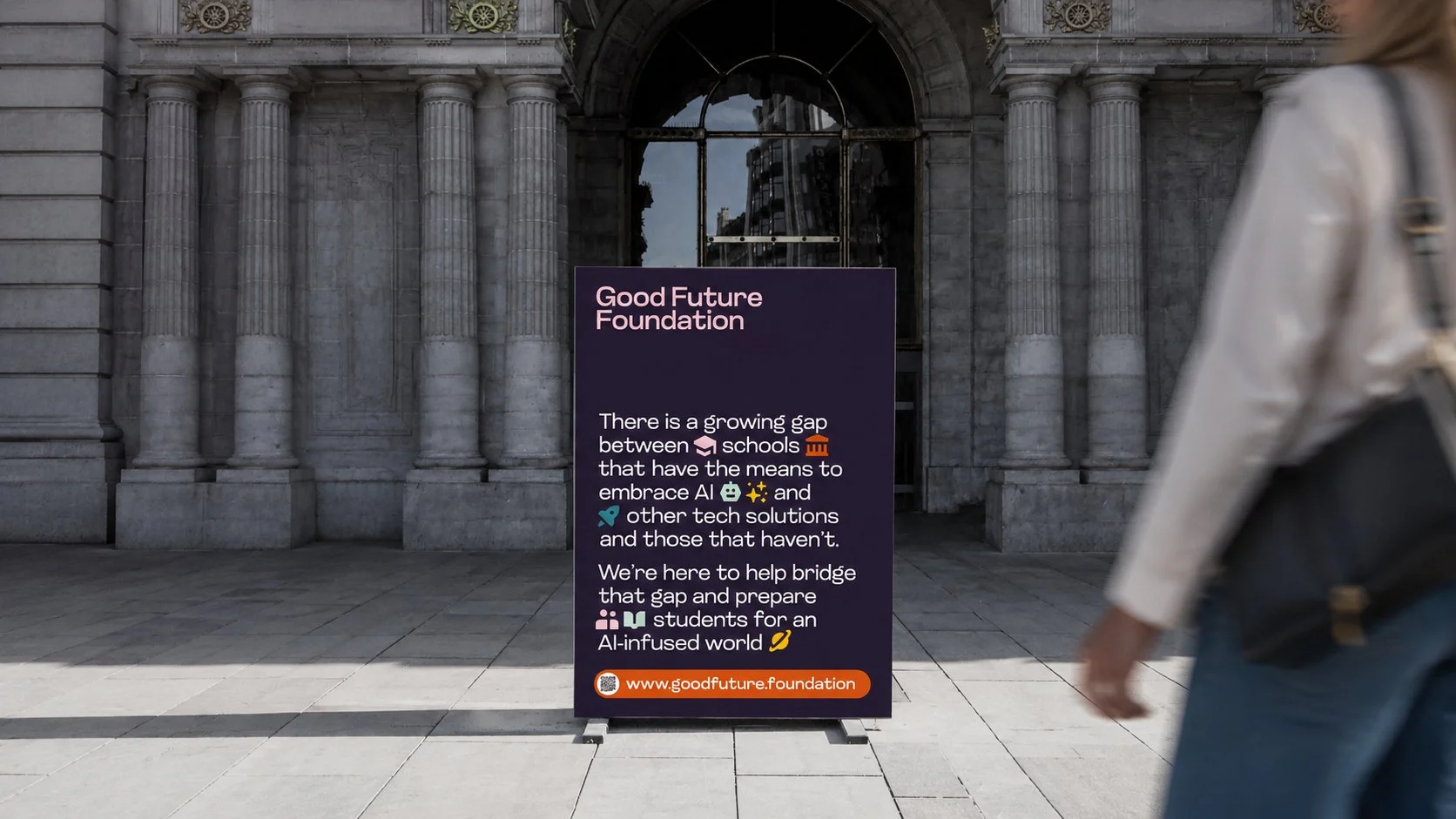
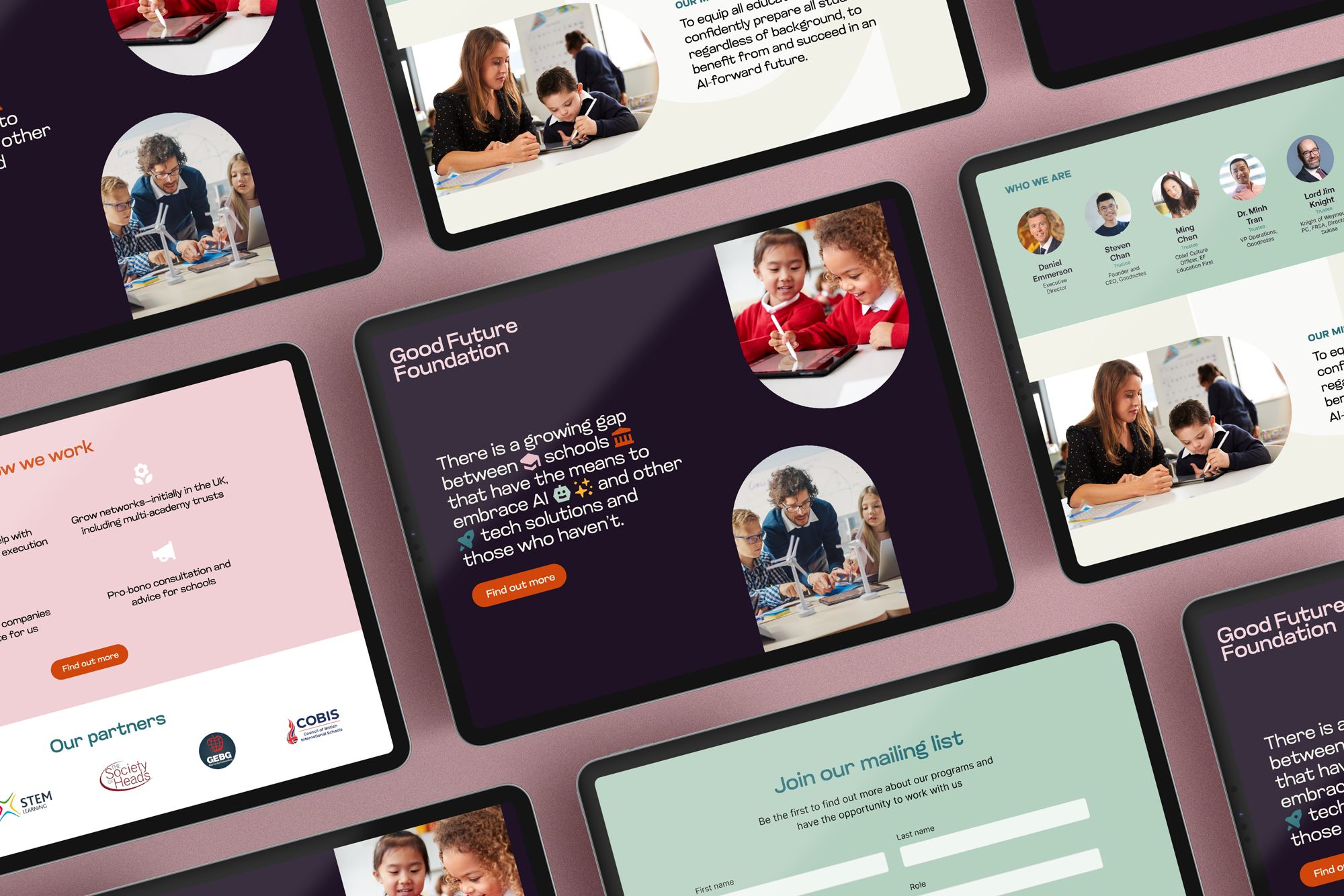
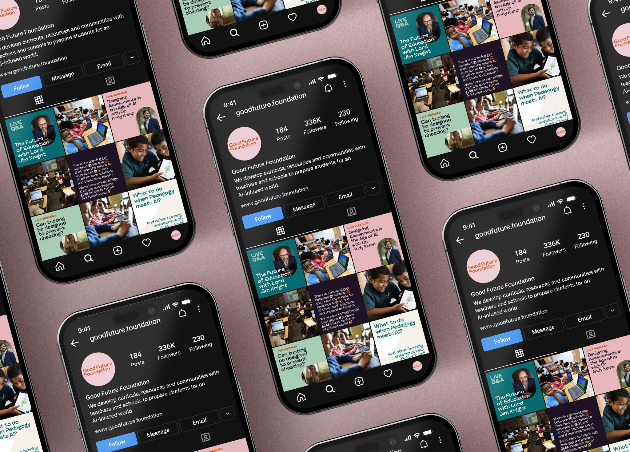
Good Future Foundation out-of-home poster on a London street
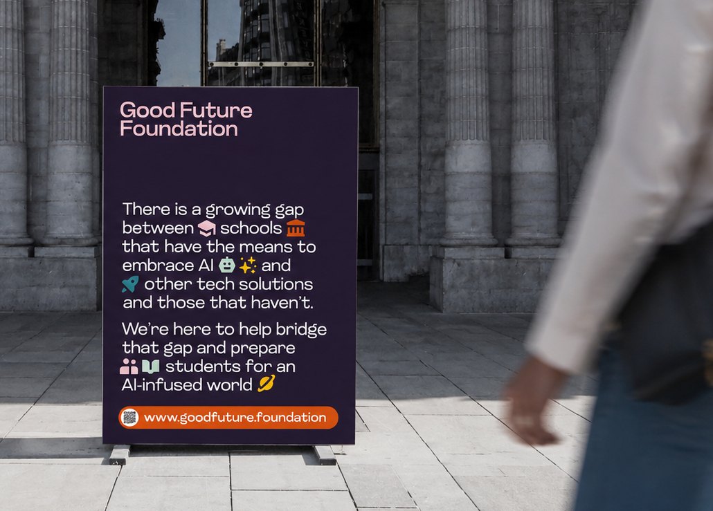
Website screens Social templates on mobile
The launch
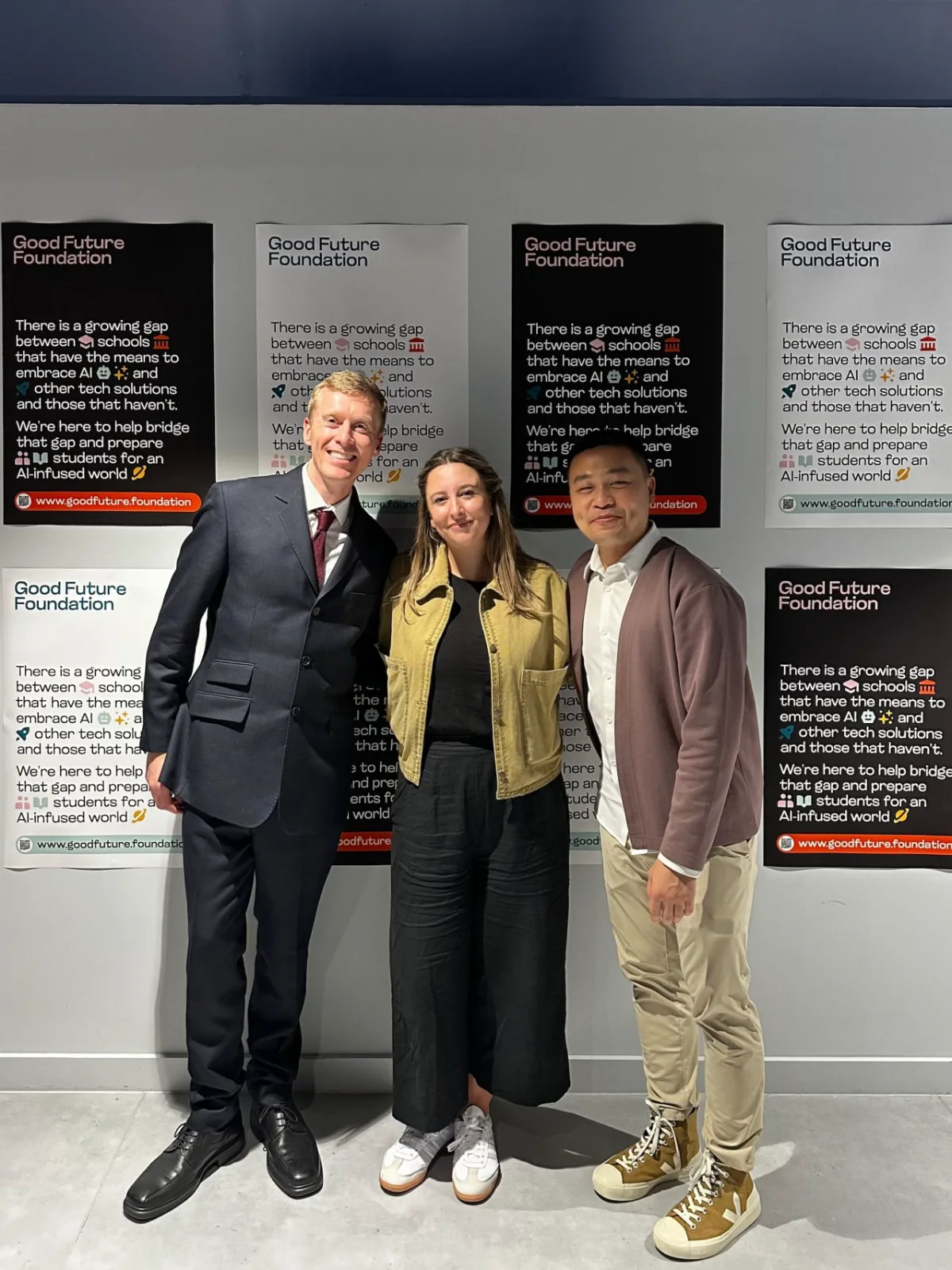
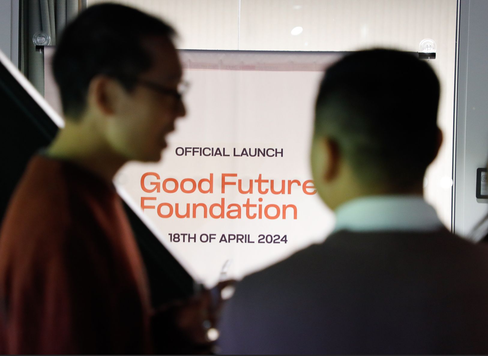
Camilla with Daniel Emmerson, Director of the Good Future Foundation, and Minh Tran, COO of Goodnotes, at the launch
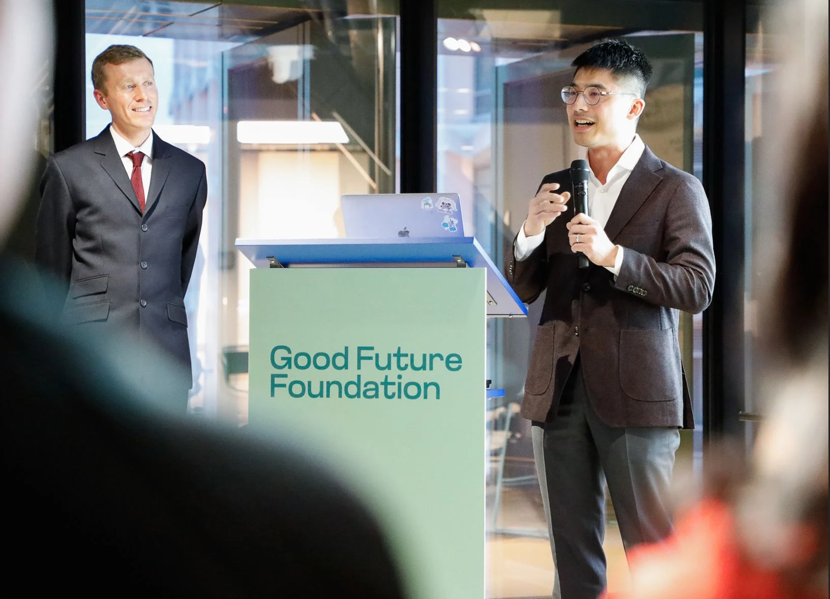
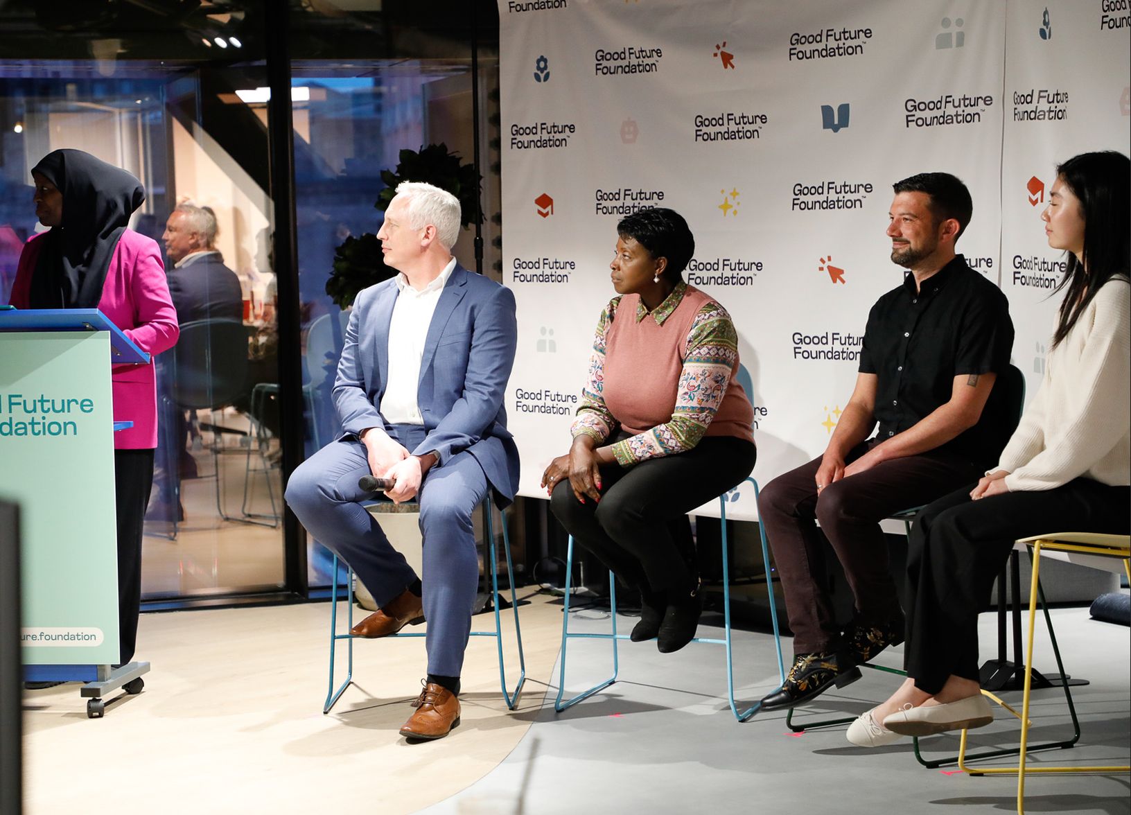
Steven Chan speaking at the launch Launch panel discussion

At the launch, in front of the posters: with Daniel Emmerson, Director of the Good Future Foundation, and Minh Tran, COO of Goodnotes.

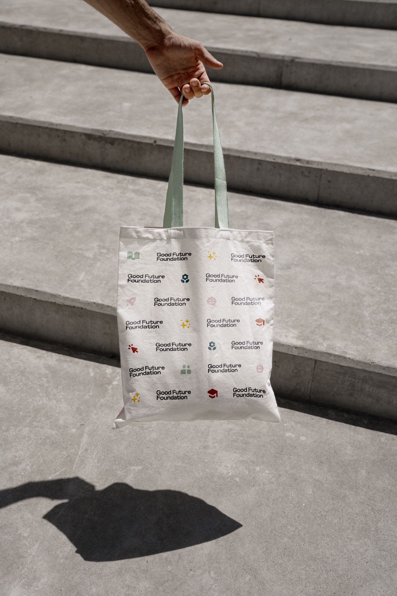
Patterned tote bag Official launch signage at the event
Out in the world
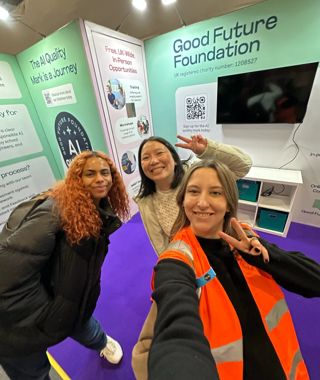
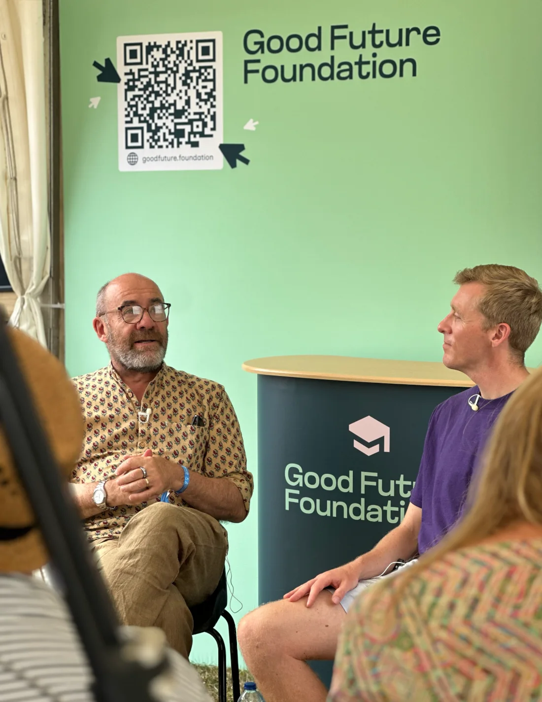
The Good Future Foundation stand at Bett, with the AI Quality Mark wall and team A Good Future Foundation talk at a festival, in front of the branded backdrop and lectern

The system stretching to a Bett stand and a festival stage.

“I have no idea how Cam managed to pull together an entirely new (and also awesome looking!) brand while also doing her day job. Cam is one of the most creative, determined and also calm people I’ve ever worked with.”
Daniel EmmersonAcademic Affairs Lead, Goodnotes — project partner
“It’s so hard to whip up a timeless feeling brand and you did it. The colours, the type, the lock ups, the imagery. A+++”
Mubarak MarafaColleague at Goodnotes
“She was thoughtful and creative with this unique challenge of building an adjacent yet distinct brand for the foundation.”
H LiManager, 2024
Related case studies
Good Systems master brand →

The parent brand for Goodnotes and its sister products.

Goodnotes 6 rebrand
Goodnotes 6 rebrand →

The full rebrand this work builds on, from agency to in-house rollout.

Case study 08Rebrand

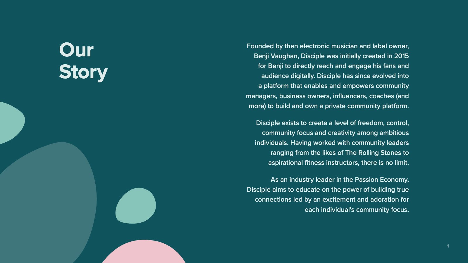
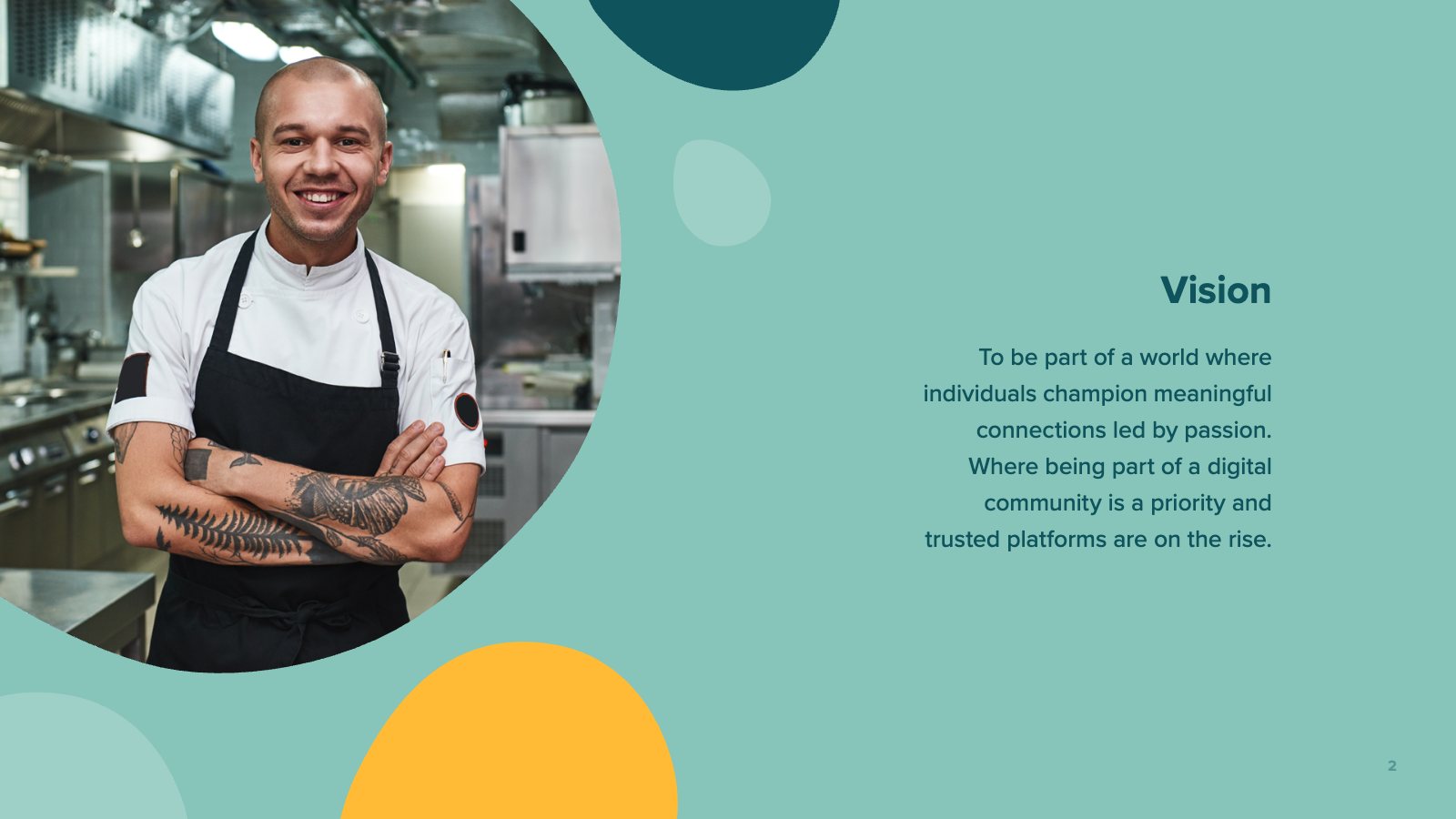
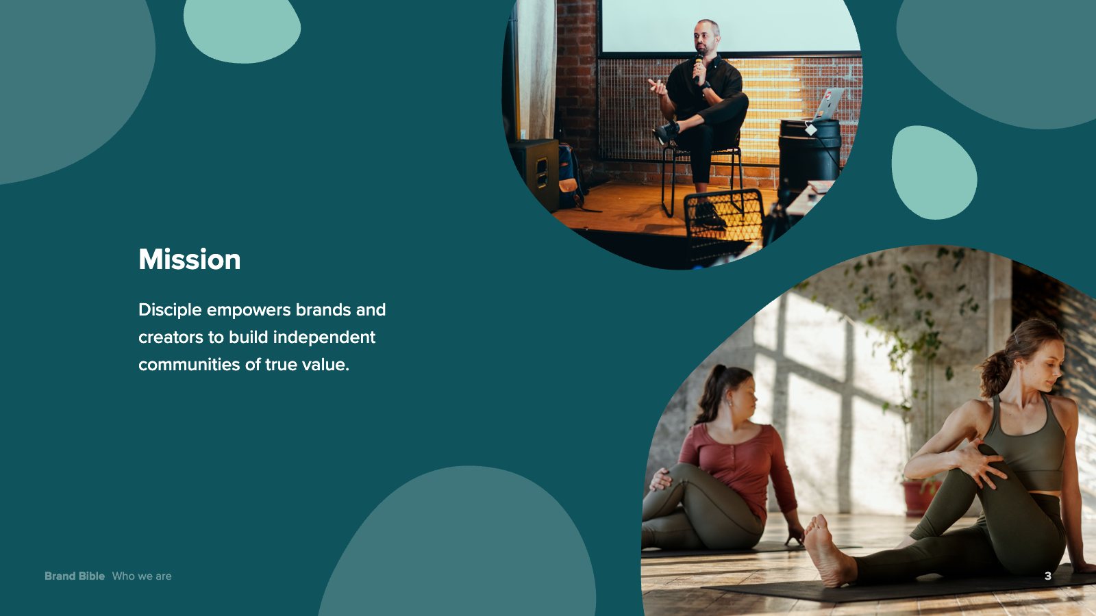
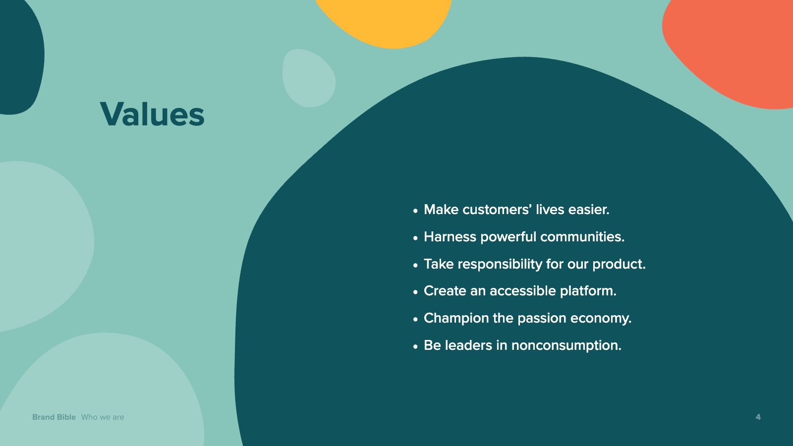
As Disciple grew, the brand fell by the wayside while the product was prioritised. In 2020 business boomed, funding was secured, and attention could be spared for the brand again.

The vision of the business was obsessively raked through, users observed, stakeholders listened to — and before I knew it we had a new brand bible and a fresh look.

What came next

The new brand launched in 2020, ahead of a year of rapid growth.

200%Year-on-year growth, reported with the 2021 Series A.
$6MSeries A raised in July 2021.
2MMembers across 500+ communities on the platform.

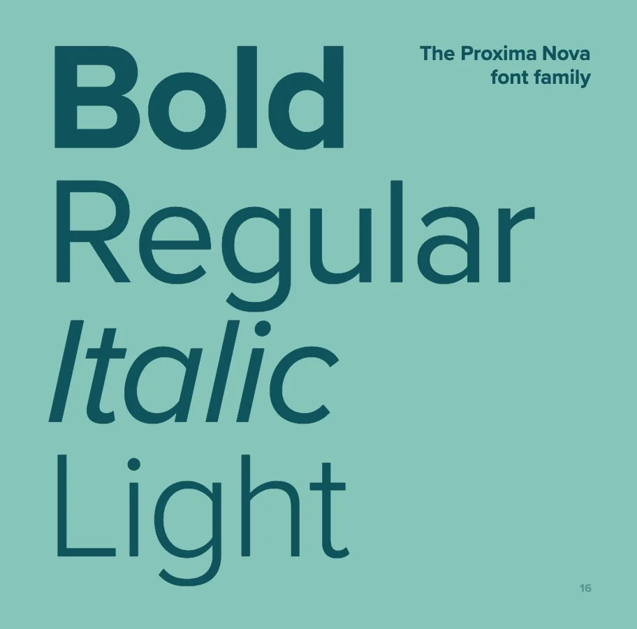
Rolled out across the product too: the Hub became the Console, and every app moved to Proxima Nova for legibility.

Before and after
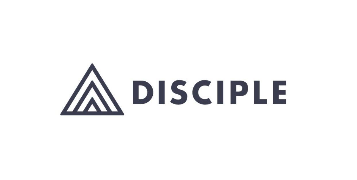
Disciple logo before Before
Disciple logo after After
The identity
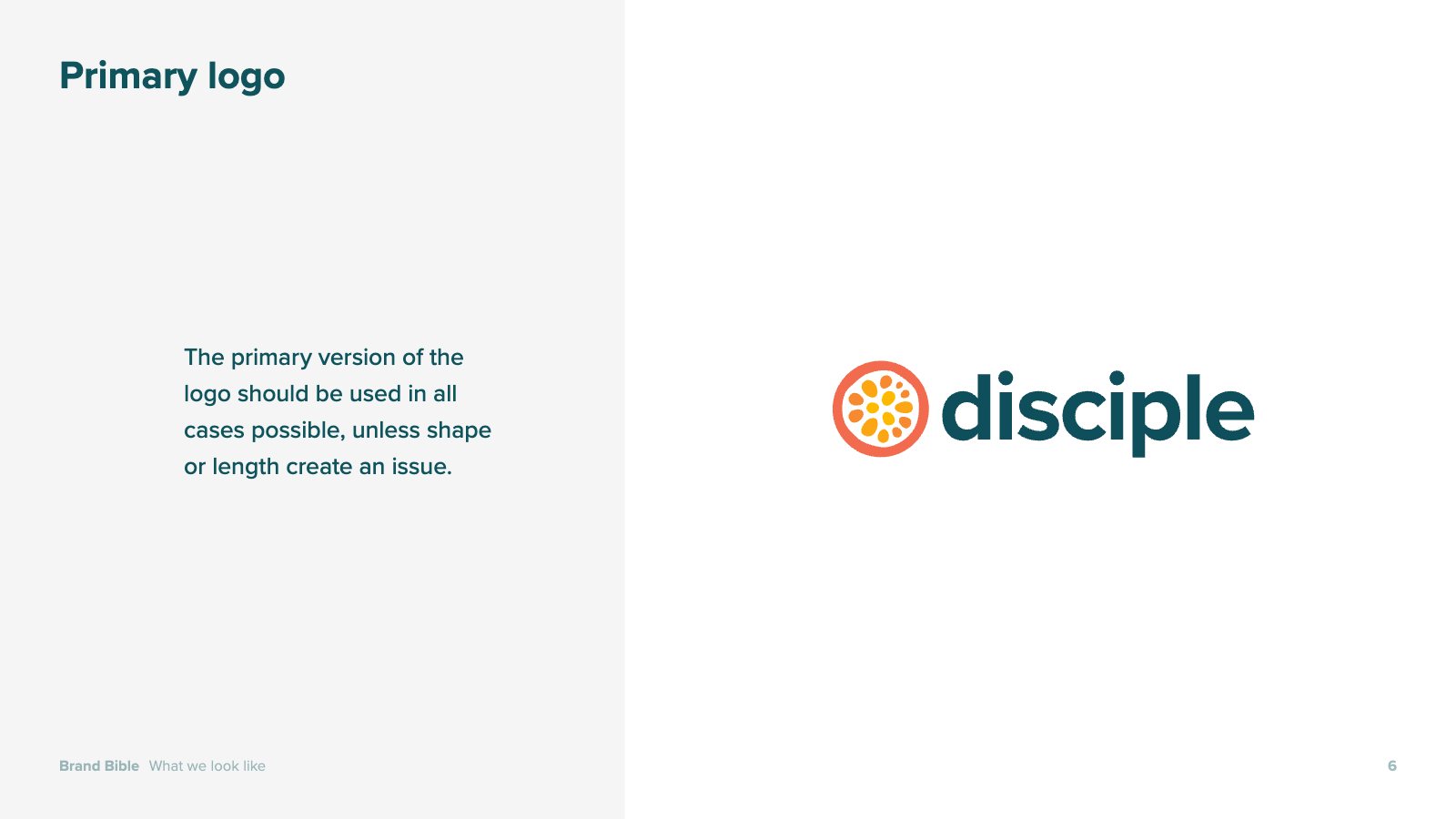
Disciple primary lockup
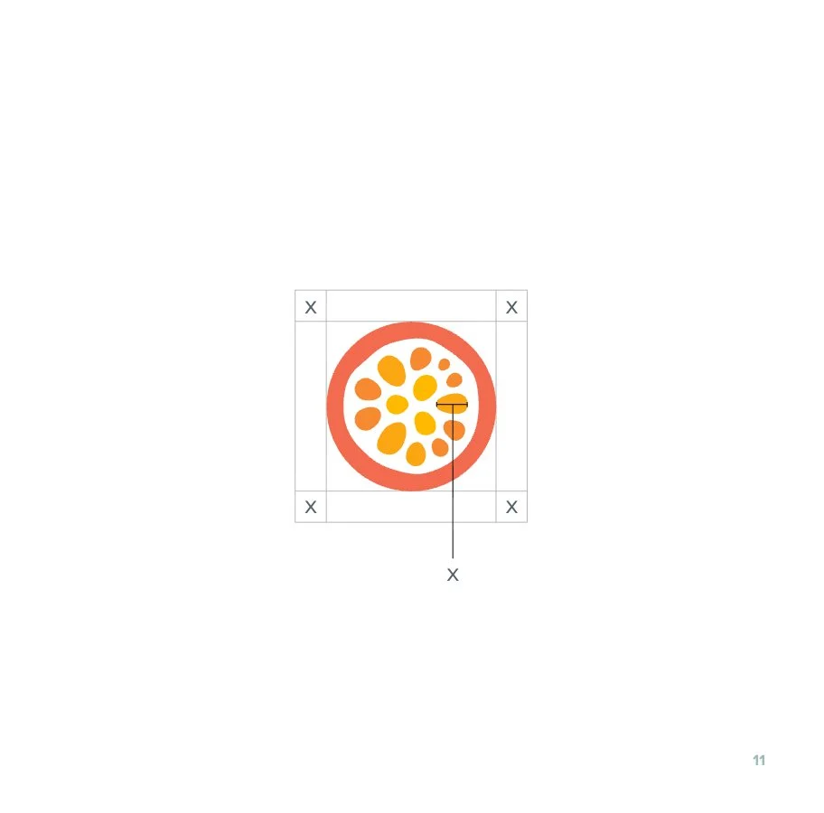
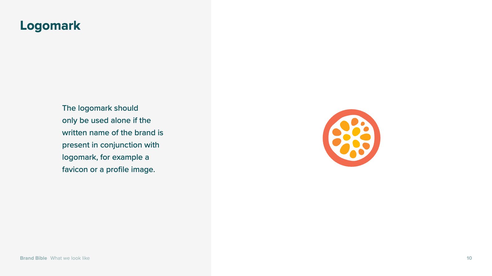
Disciple passionfruit mark

The passionfruit mark: many seeds, one fruit, just like a community.

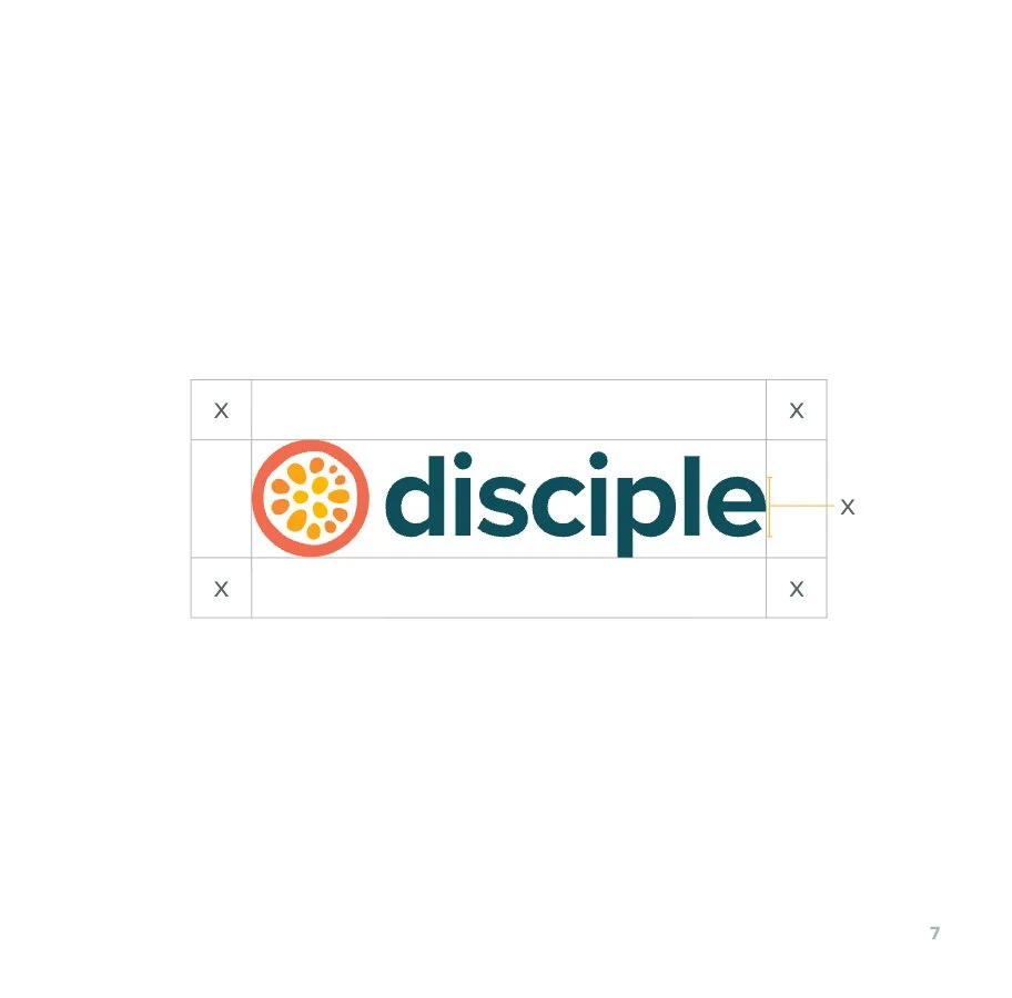
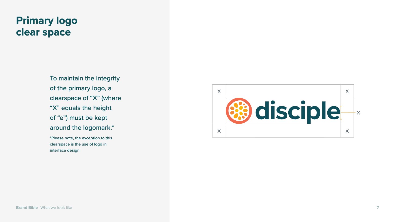
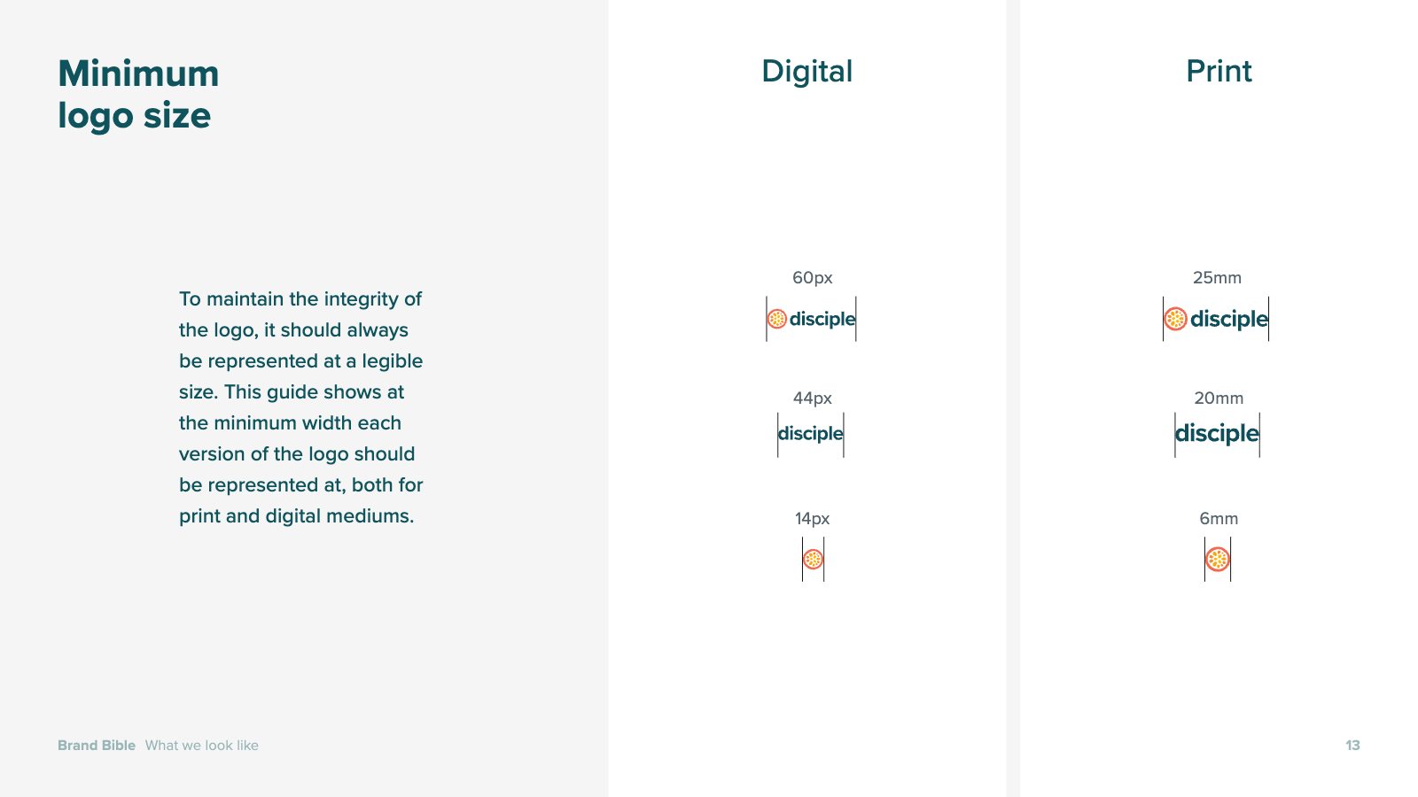
Disciple primary logo clear space
Primary logo clear space
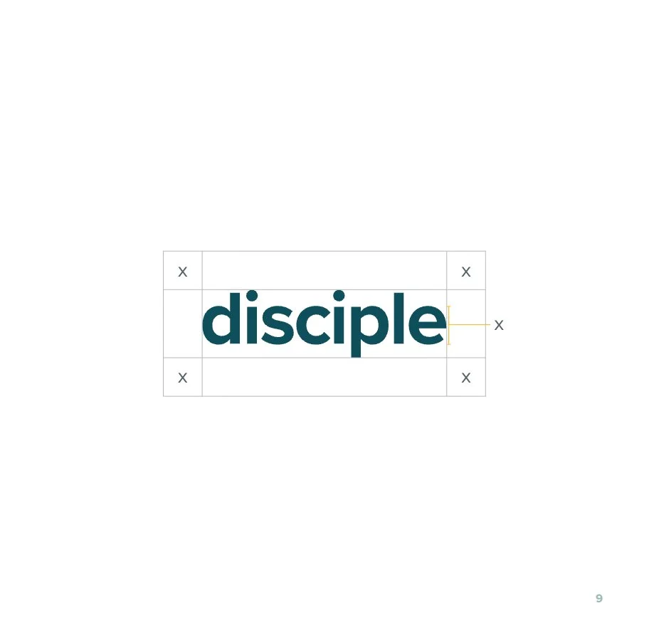
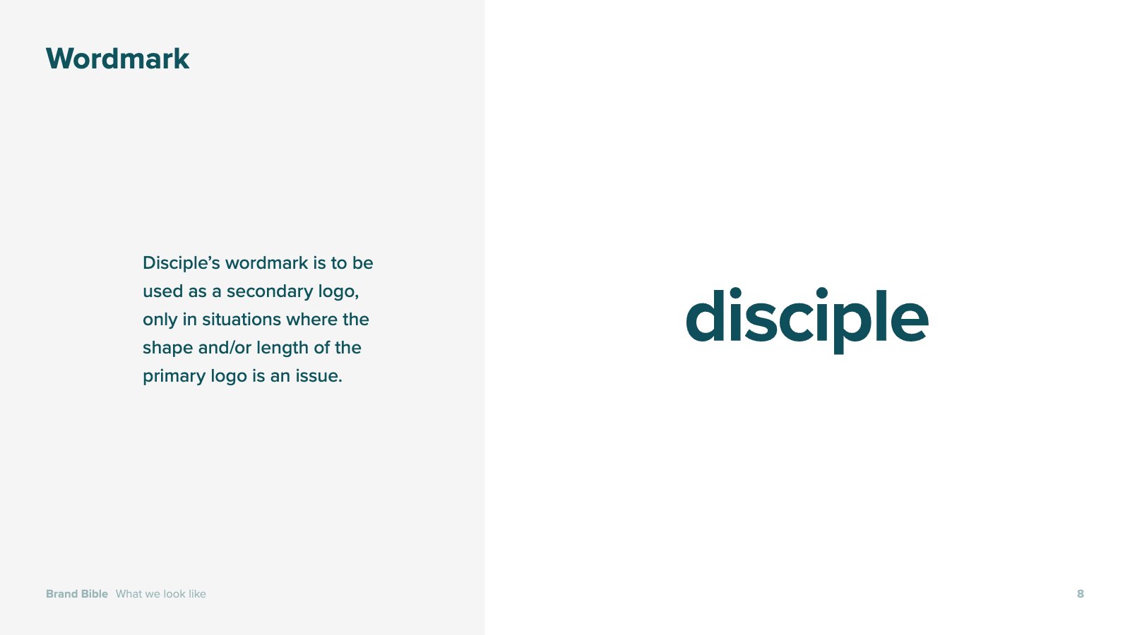
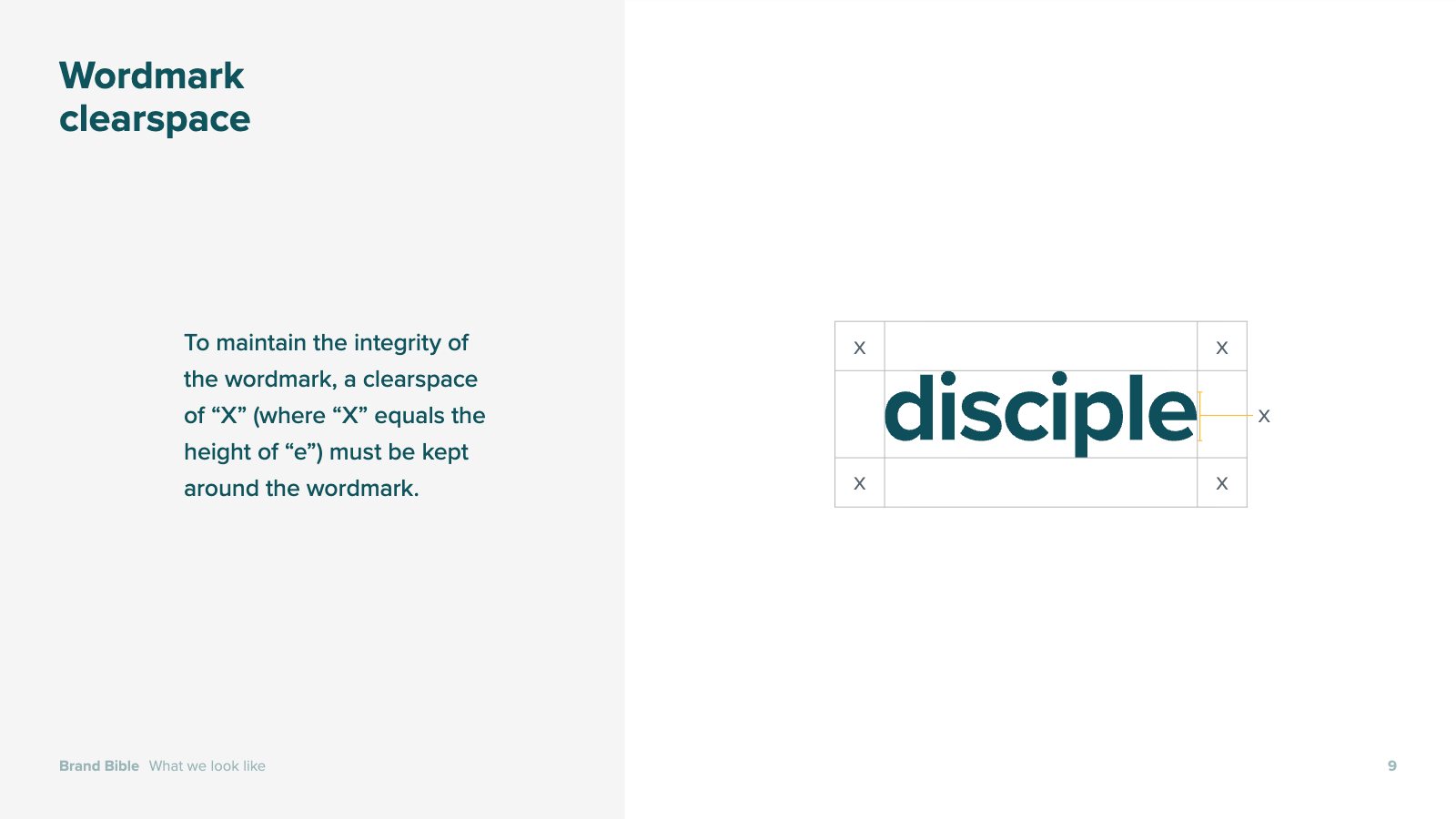
Disciple wordmark clear space
Wordmark clear space
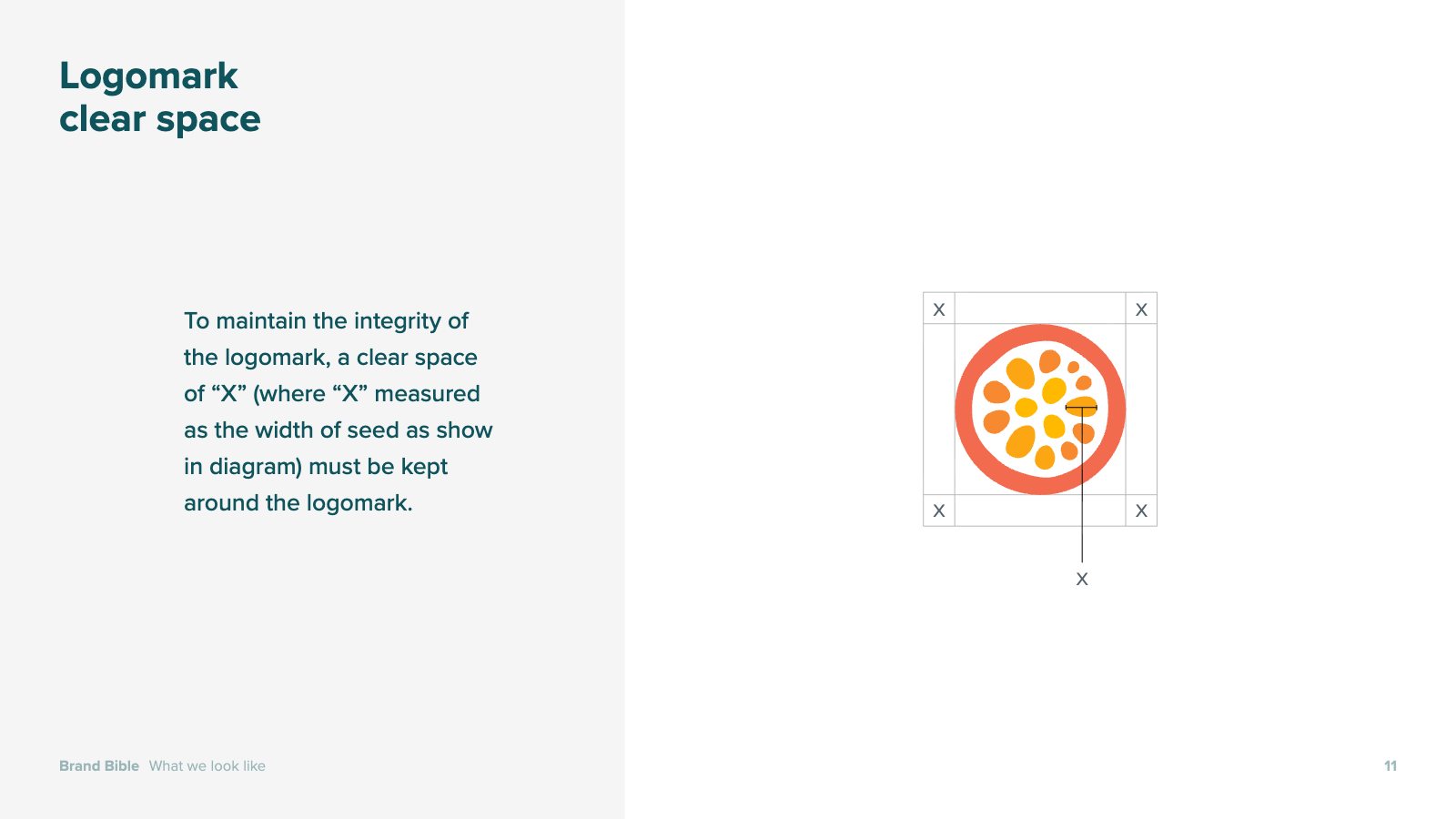
Disciple logomark clear space
Logomark clear space
Brief

Rebuild a brand that had fallen behind the product.

My role

Led the rebrand in-house: research, the brand bible and the rollout.

Key decision

A passionfruit mark: many seeds, one fruit.

Result

Launched in 2020, ahead of a year of 200% growth.

In the wild

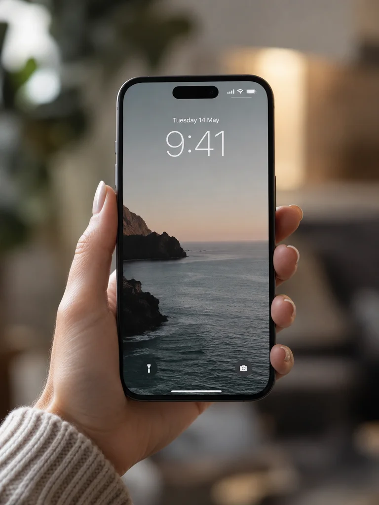
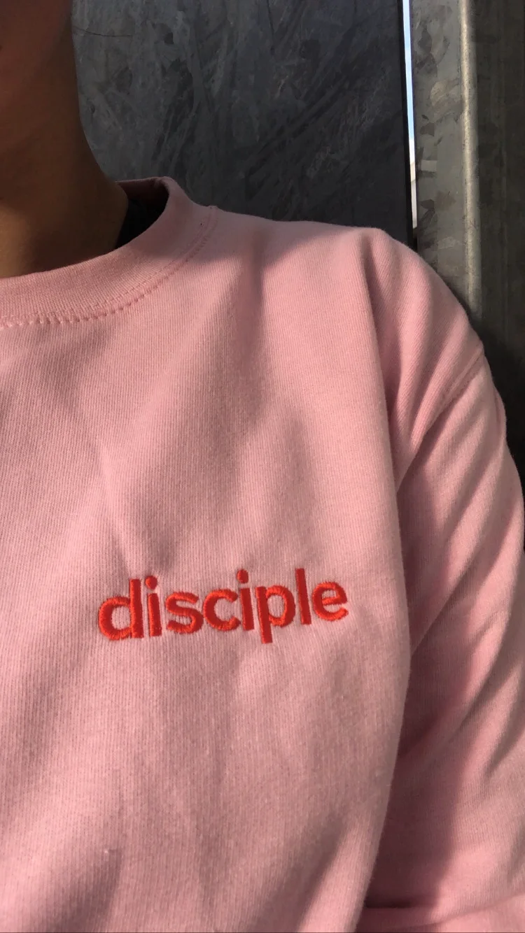
The brand in use: product, paid social, email and the team’s own wardrobe.

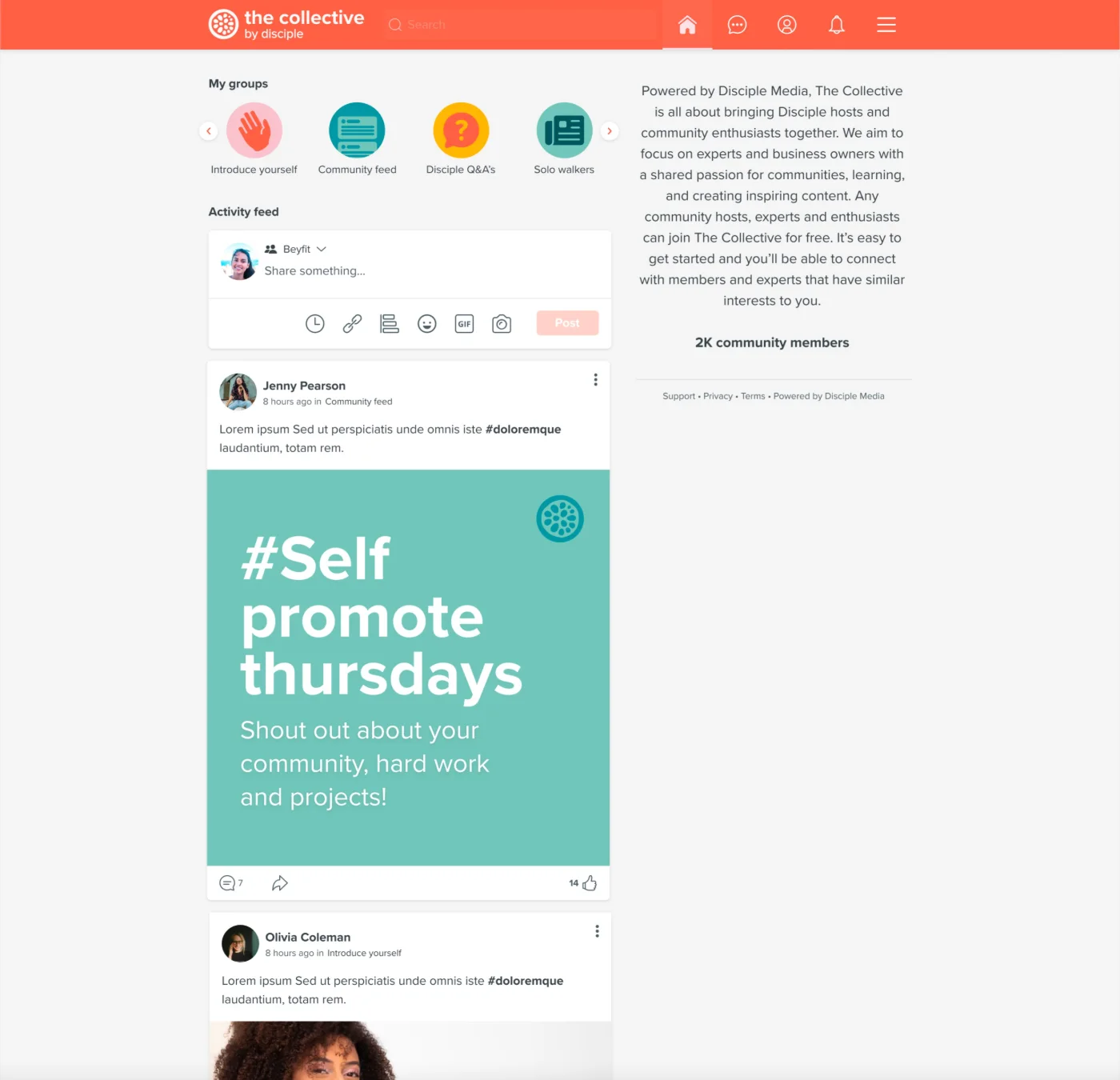
The Collective by Disciple community web app, in the new brand
9:41
disciple.mediaSponsored
•••
Learn More›
1,248 likesdisciple.media Your community, your app, your rules.View all 86 comments
the.collectivePowered by Disciple
•••
Pink sweatshirt with the embroidered Disciple wordmark
Email headers

One flexible blob system in six colourways, so every campaign felt related but never the same, with a founder-portrait variant for personal sends.

Disciple email header, colourway 1 Disciple email header, colourway 3 Disciple email header, colourway 6
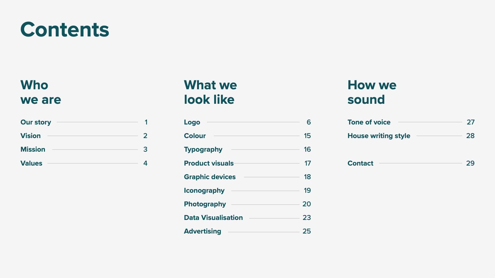
Inside the brand bible

A system built to flex across hundreds of community apps, not just one brand.

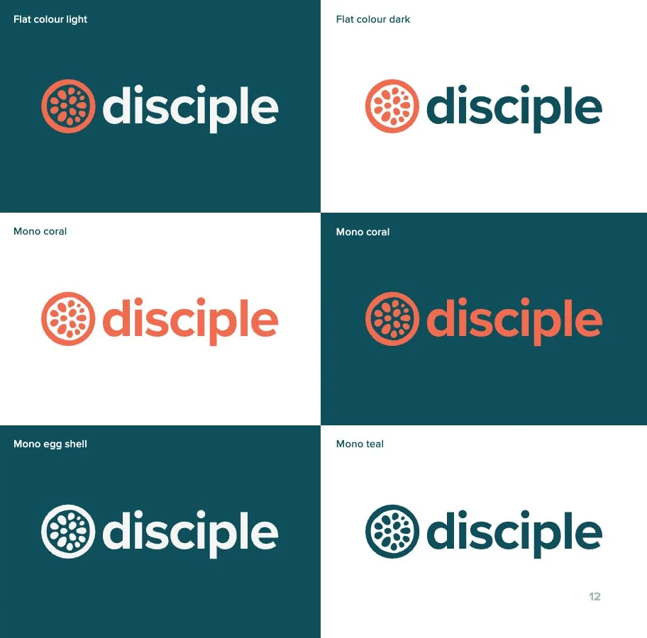
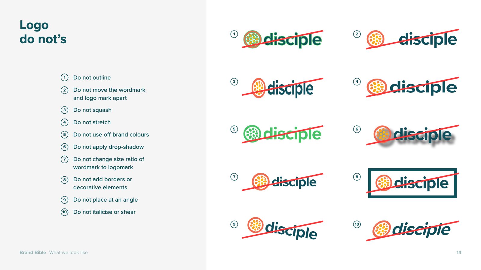
Disciple brand bible: Lockups
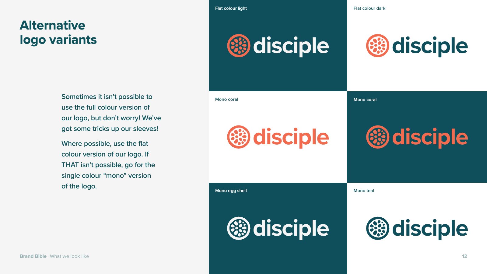
LockupsThe passionfruit and wordmark in four colourways, for any background a community might bring.
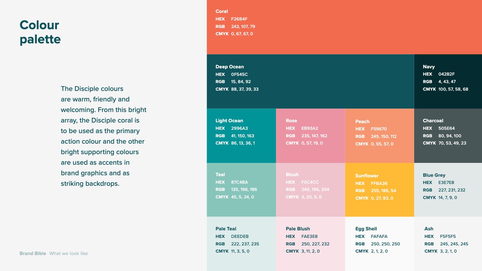
Disciple brand bible: Colour
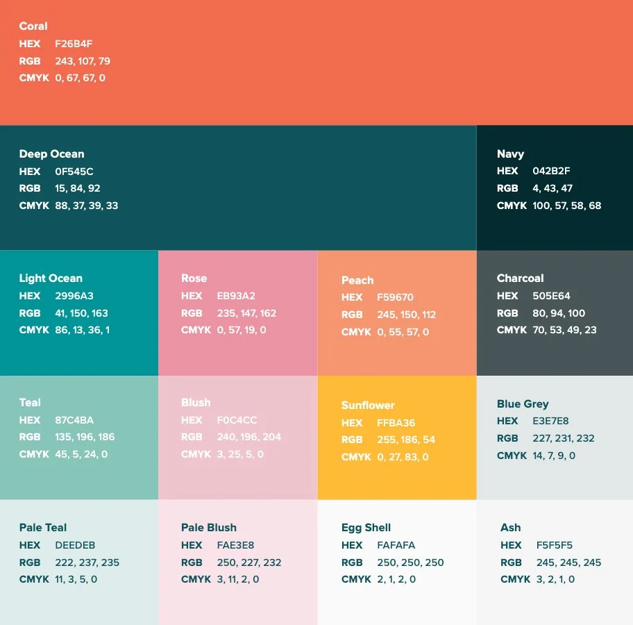
ColourDeep teal as the anchor, with warm coral, blush and sunshine yellow to keep it human.
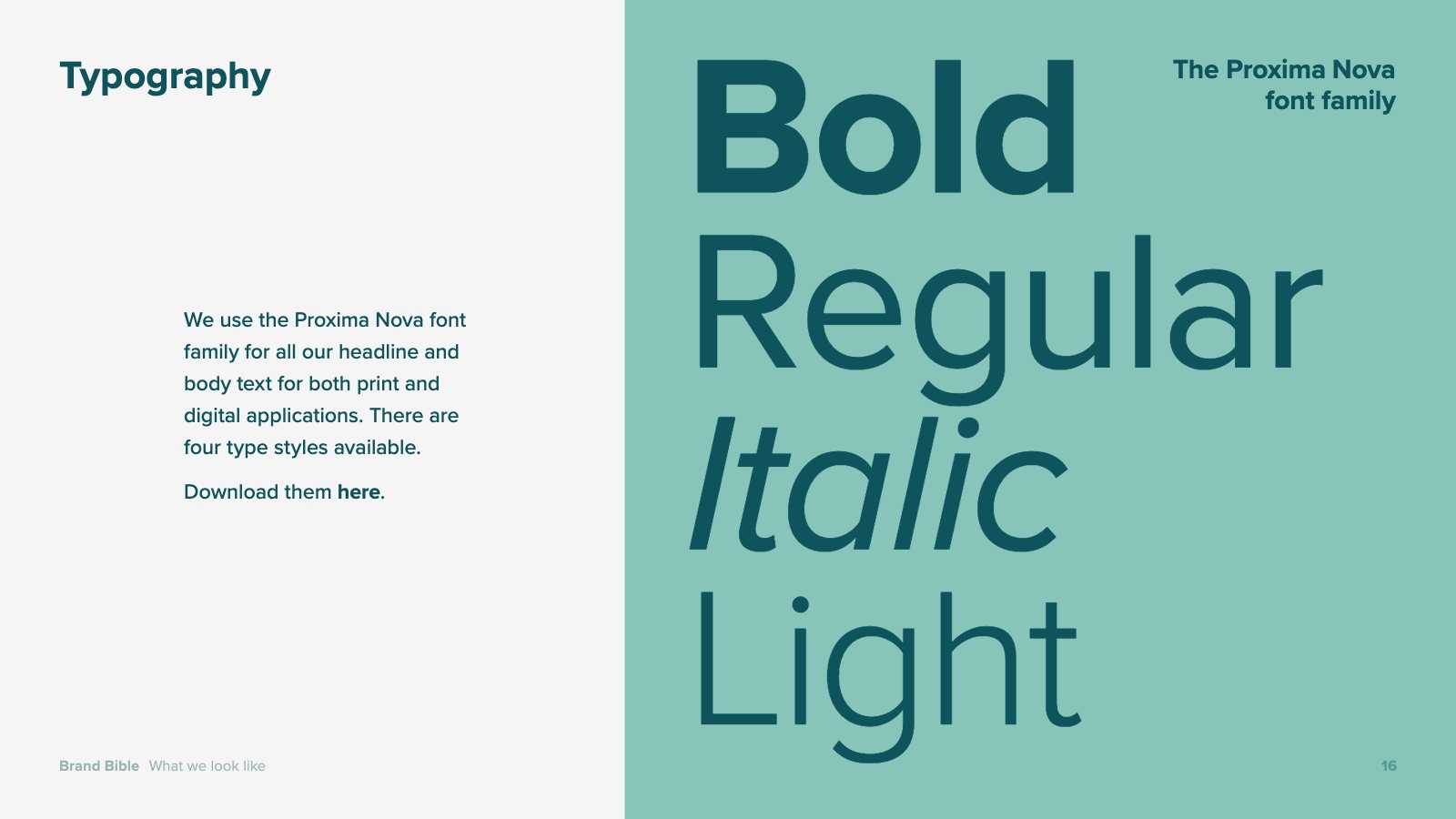
Disciple brand bible: Type
TypeProxima Nova across four weights, chosen for its large x-height and informal feel.
Disciple brand bible: Iconography
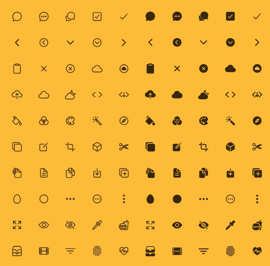
IconographyA friendly, rounded icon set drawn to sit alongside the type.
Disciple brand bible: Data
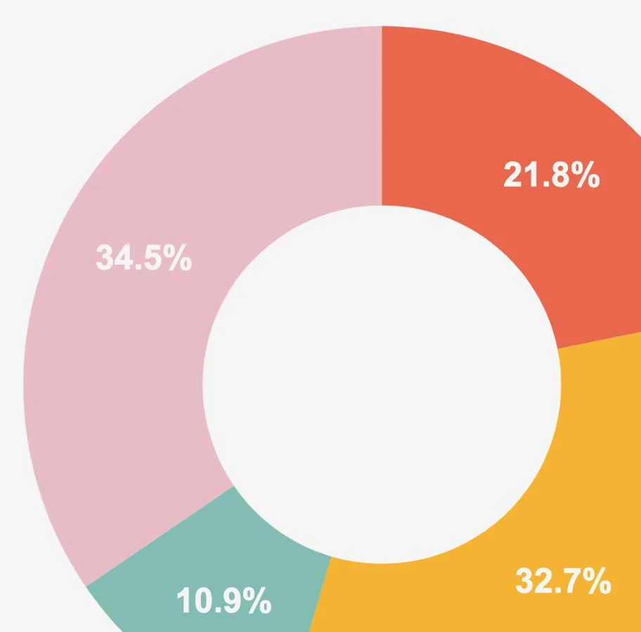
DataCharts in the brand palette, so reports looked like Disciple too.
Disciple brand bible: Photography
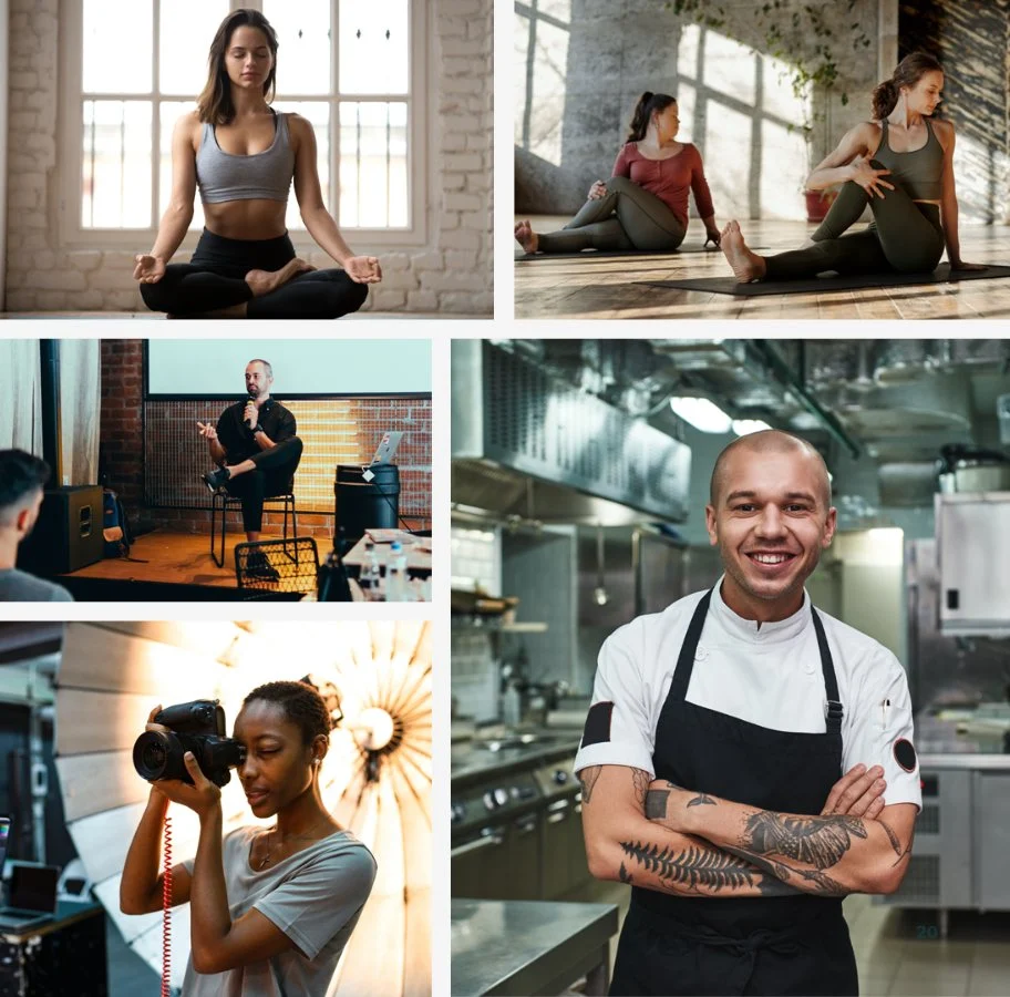
PhotographyReal creators and hosts doing what they love, never stock-perfect.
Disciple brand bible: Voice
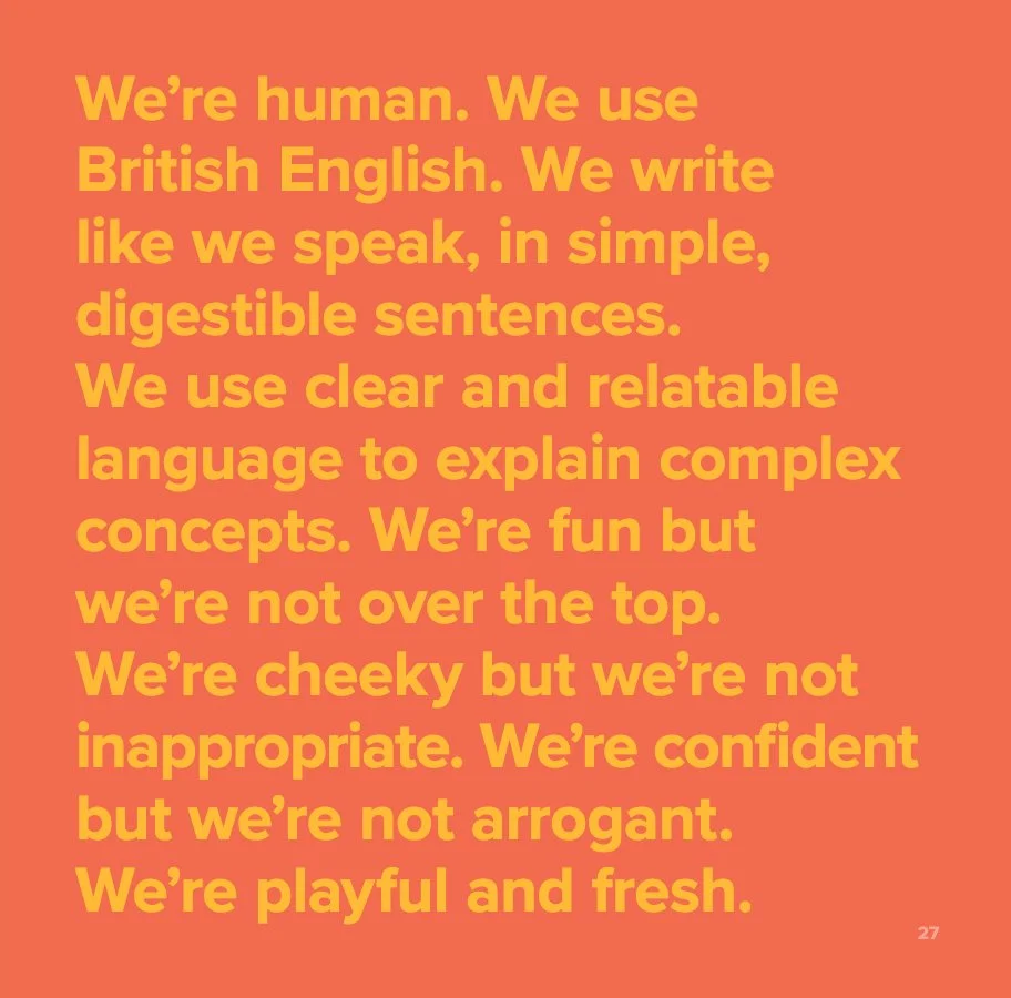
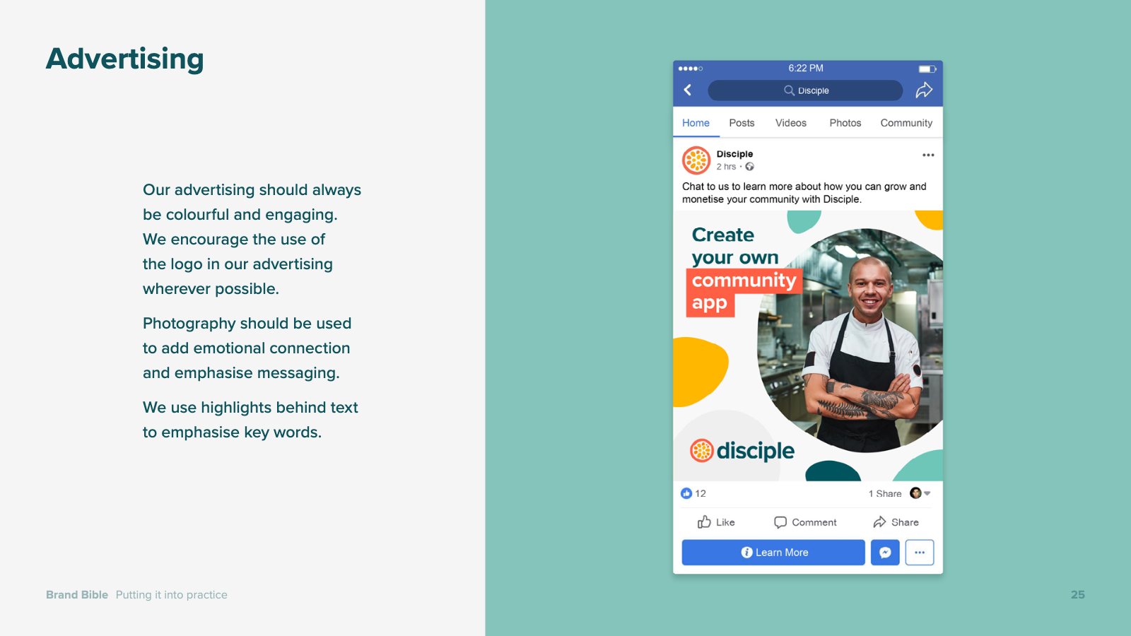
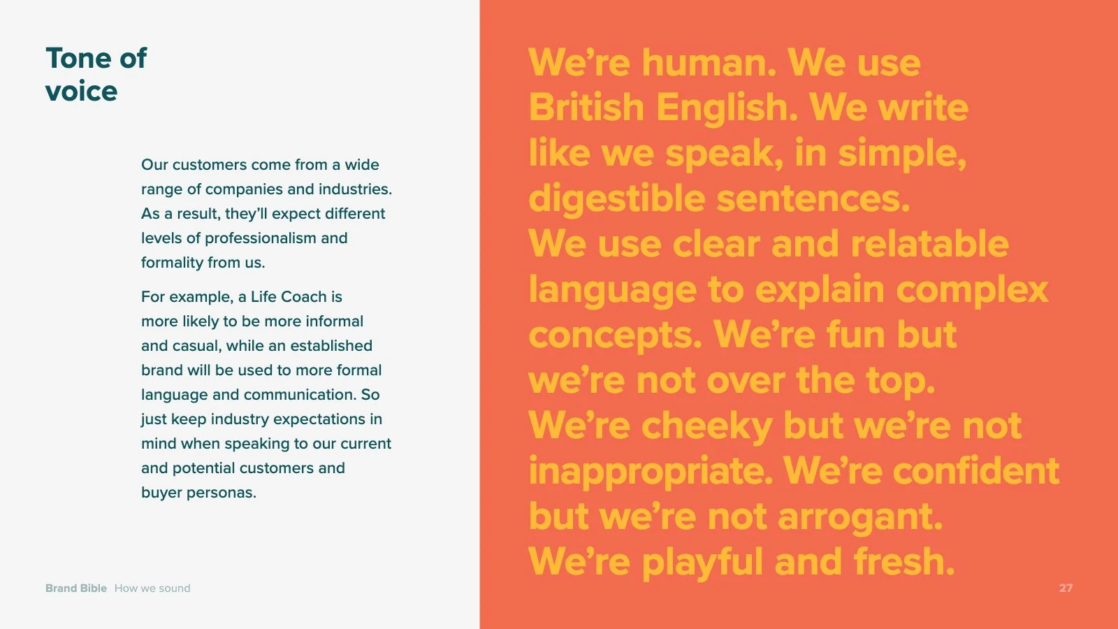
VoiceHuman, clear and a little cheeky: British English, simple sentences, never arrogant.
Brand Bible, 2020 {{ dbCounter }}
Disciple Brand Bible, page 1 Disciple Brand Bible, page 2 Disciple Brand Bible, page 3 Disciple Brand Bible, page 4 Disciple Brand Bible, page 5 Disciple Brand Bible, page 6 Disciple Brand Bible, page 7 Disciple Brand Bible, page 8 Disciple Brand Bible, page 9 Disciple Brand Bible, page 10 Disciple Brand Bible, page 11 Disciple Brand Bible, page 12 Disciple Brand Bible, page 13 Disciple Brand Bible, page 14 Disciple Brand Bible, page 15 Disciple Brand Bible, page 16 Disciple Brand Bible, page 17 Disciple Brand Bible, page 18 Disciple Brand Bible, page 19 Disciple Brand Bible, page 20 Disciple Brand Bible, page 21 Disciple Brand Bible, page 22 Disciple Brand Bible, page 23 Disciple Brand Bible, page 24 Disciple Brand Bible, page 25 Disciple Brand Bible, page 26 Disciple Brand Bible, page 27 Disciple Brand Bible, page 28 Disciple Brand Bible, page 29 Disciple Brand Bible, page 30 Disciple Brand Bible, page 31
Next project Goodnotes App Store features →
Case study 12Product

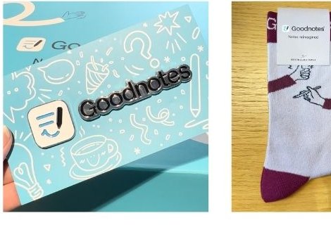
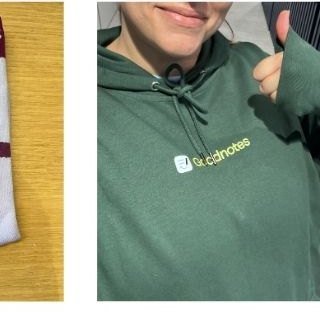
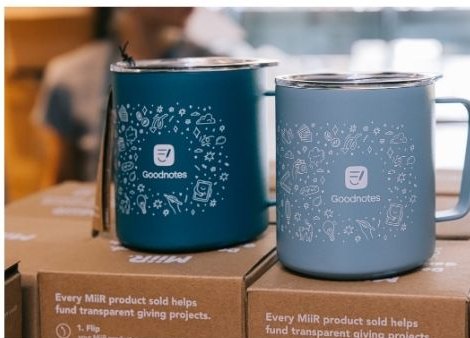
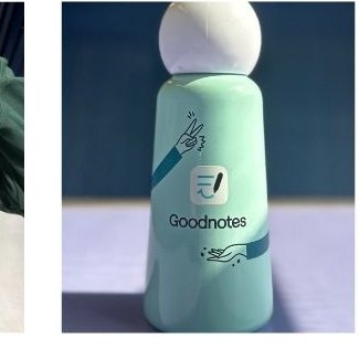
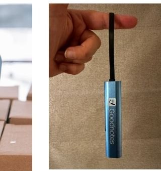
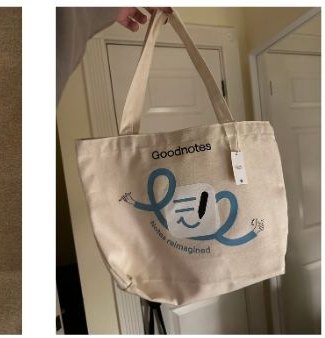
Fresh merch for Goodnotes all year round — for events, staff goodies and influencer packs. Here's a selection.

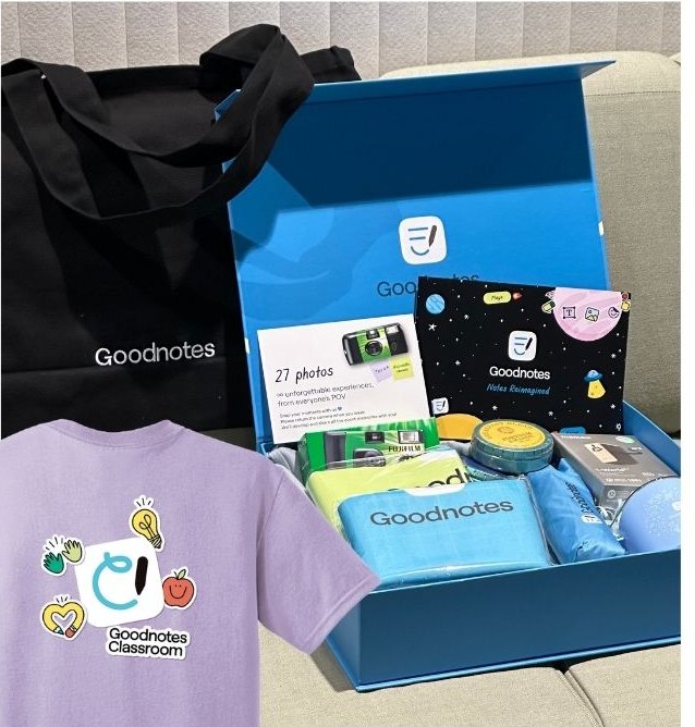
Influencer merch box
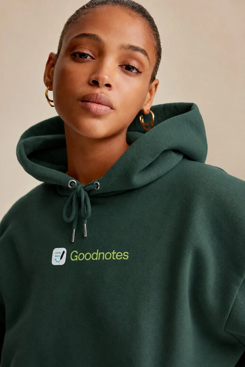
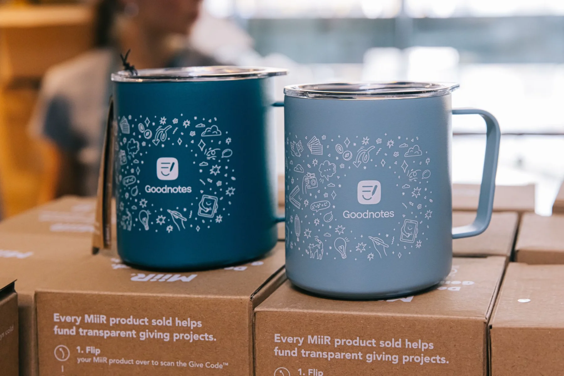
Printed sleeve Branded hoodie Branded mugs Water bottle
Branded pen Canvas tote
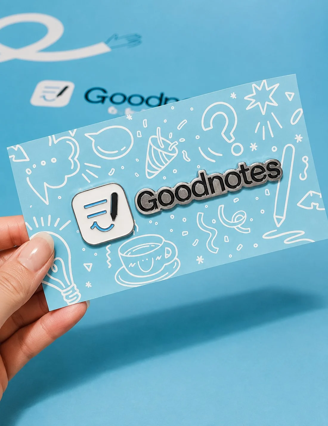
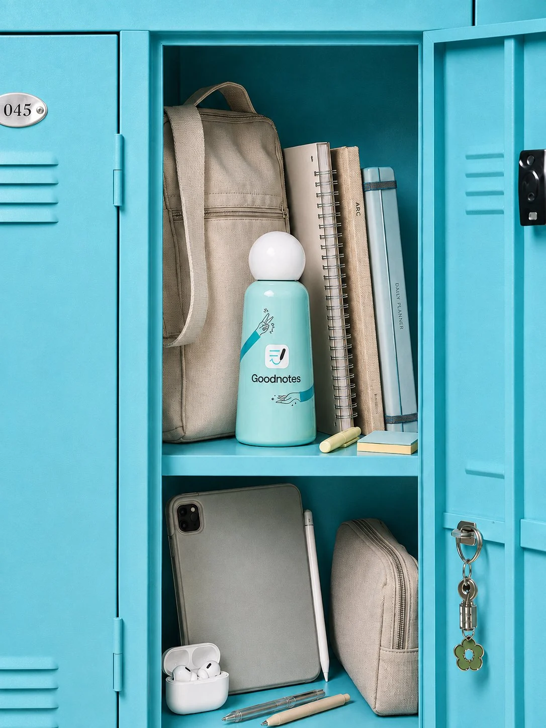
Branded bottle and everyday kit in a locker Branded hoodie Enamel pin set on a branded backing card
Related case studies
Goodnotes 2025 launch event
Goodnotes 2025 launch event →

36 creators, three days in London, and the unveil of the new Goodnotes.

Goodnotes at Bett 2026
Goodnotes at Bett 2026 →

The brand at trade-show scale.
Case study 09Art direction

Apple App Store artwork for Goodnotes — evolving the visual system across screenshots, feature graphics and seasonal updates to show new capabilities clearly.

Very quick turnarounds against strict artwork rules; my team and I ship two to three a month, including artwork for Apple’s App of the Day and in-app event placements.

Brief

Win App Store features with artwork that follows Apple’s rules.

My role

Designed them myself for two years, then handed them to my senior designer.

Key decision

Build trust, then hand it over.

Result

Two to three features a month, now run by my senior designer.

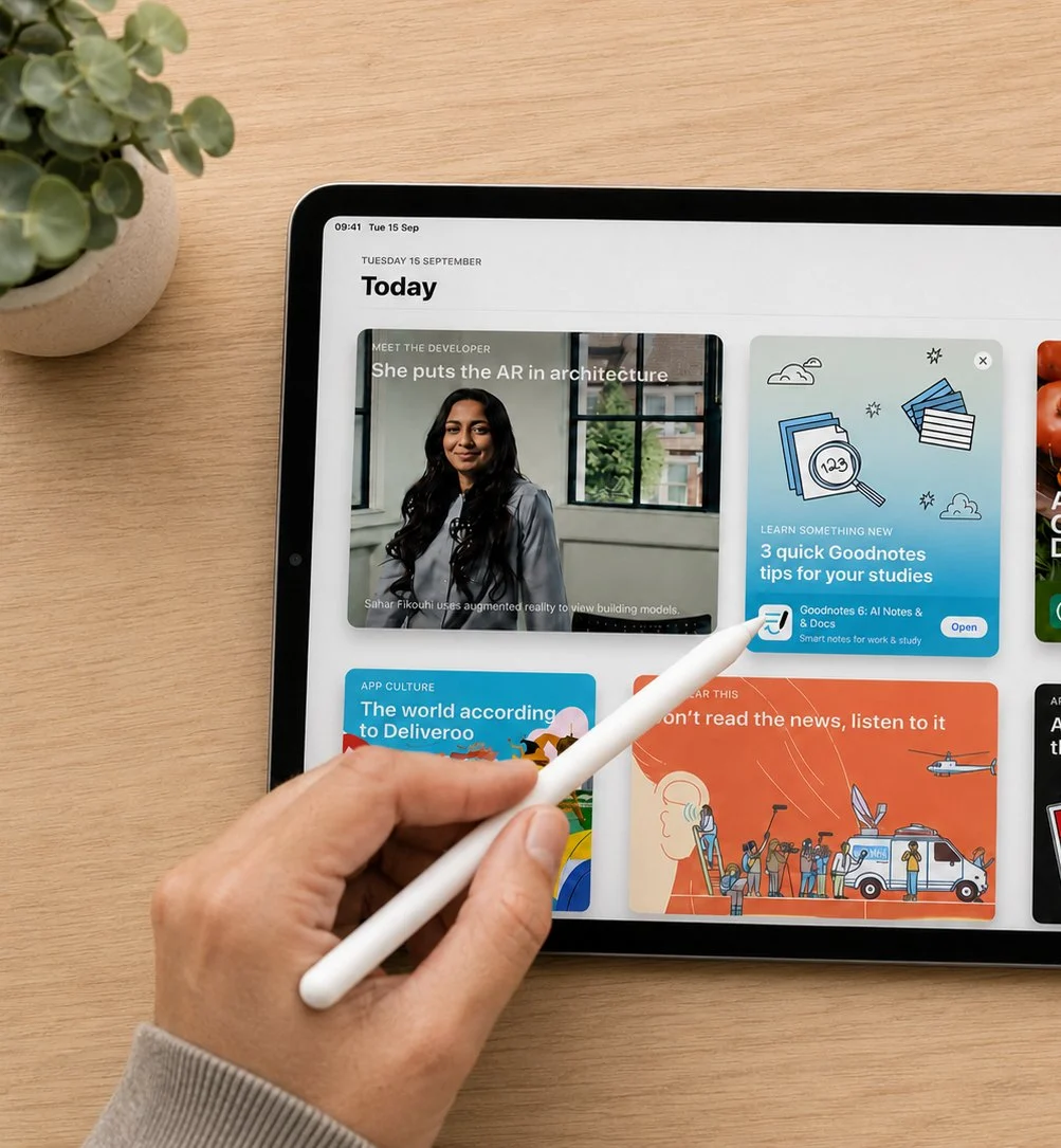
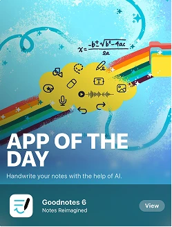
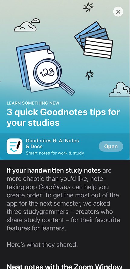
App of the Day feature on the App Store Today tab Learn something new editorial story
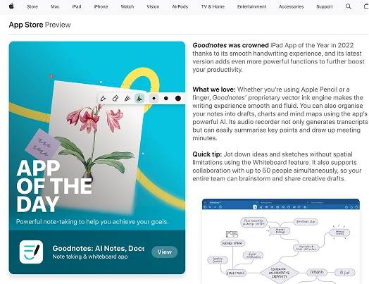
Goodnotes App Store preview page Major update banner on the product page
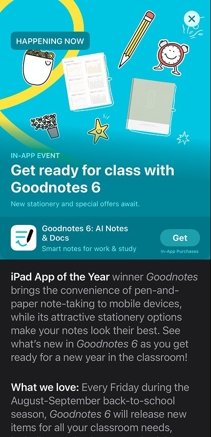
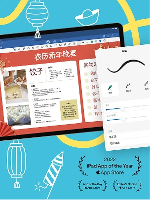
Back-to-school in-app event App of the Day card Localised store screenshot artwork
Related case studies
Goodnotes 2025 brand refresh
Goodnotes 2025 brand refresh →

The logo, colour and type refresh that launched with the September pivot.

Goodnotes 6 rebrand
Goodnotes 6 rebrand →

The full rebrand this work builds on, from agency to in-house rollout.

Floating Island hall with a ceiling projection of the Outernet campaign animation
Case study · Global offsiteGoodnotes · Seoul · 2025

Seoul, wrapped in Dancheong.

Our global offsite, told through the patterns of traditional Korean architecture.

Three days in Seoul for the whole company. The Creative Studio wrapped the Mondrian hotel, our event spaces and the team in a visual direction inspired by Dancheong (단청), the intricate multicoloured patterns painted on traditional Korean buildings, with custom illustrations of the things people love about Korea. Local agency 1%CLUB supported sourcing and print; our WX team ran logistics.

Brief

Make a global team feel they’re somewhere special, and that it was made for them.

My role

Co-led the rollout with my senior designer, who designed the motif. Designed all the swag myself.

Key decision

Borrow from Korea’s own visual heritage instead of dropping our brand on top of it.

Result

Two venues and every piece of swag, delivered by a studio of two.

01 — The Mondrian

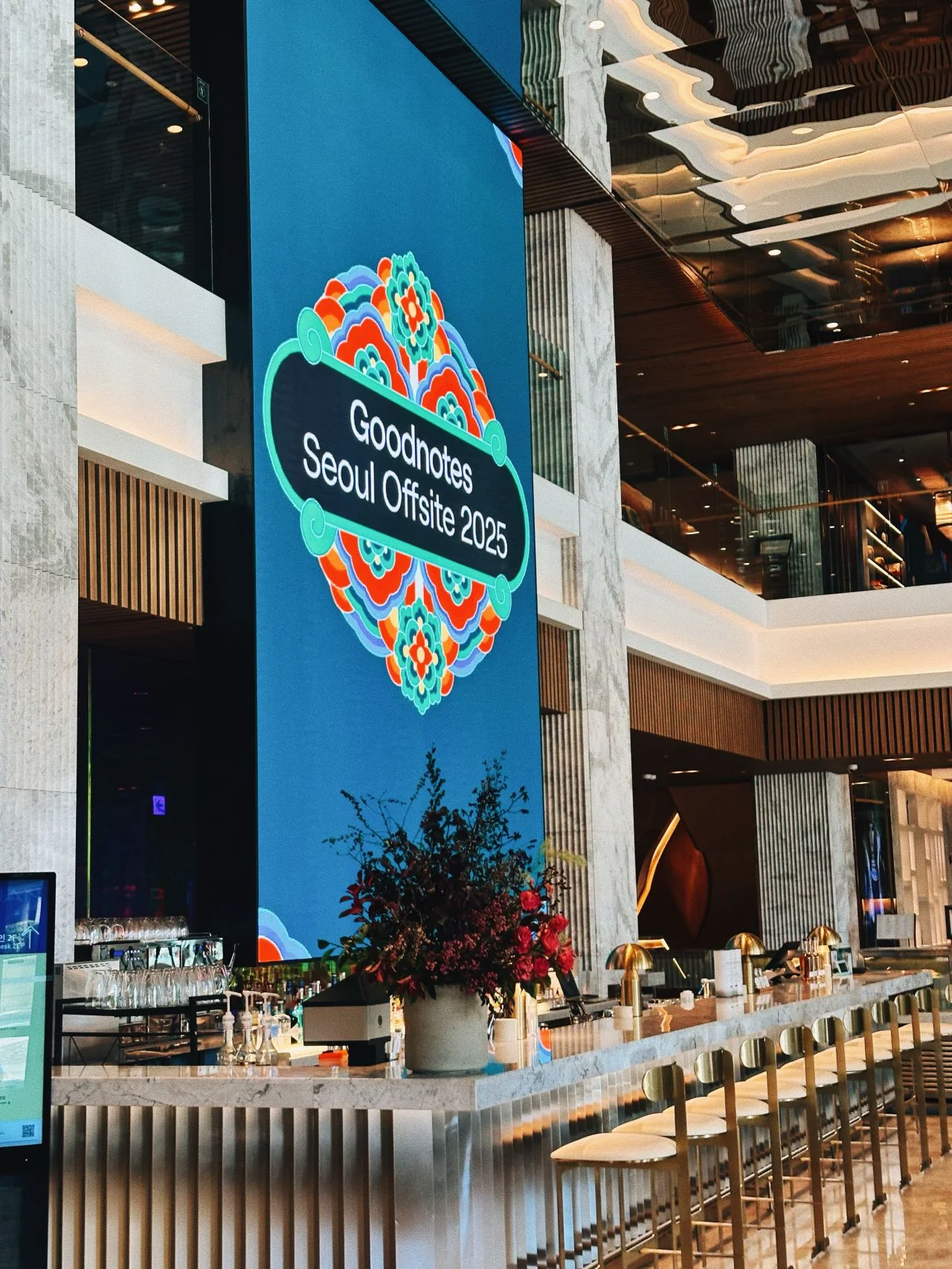
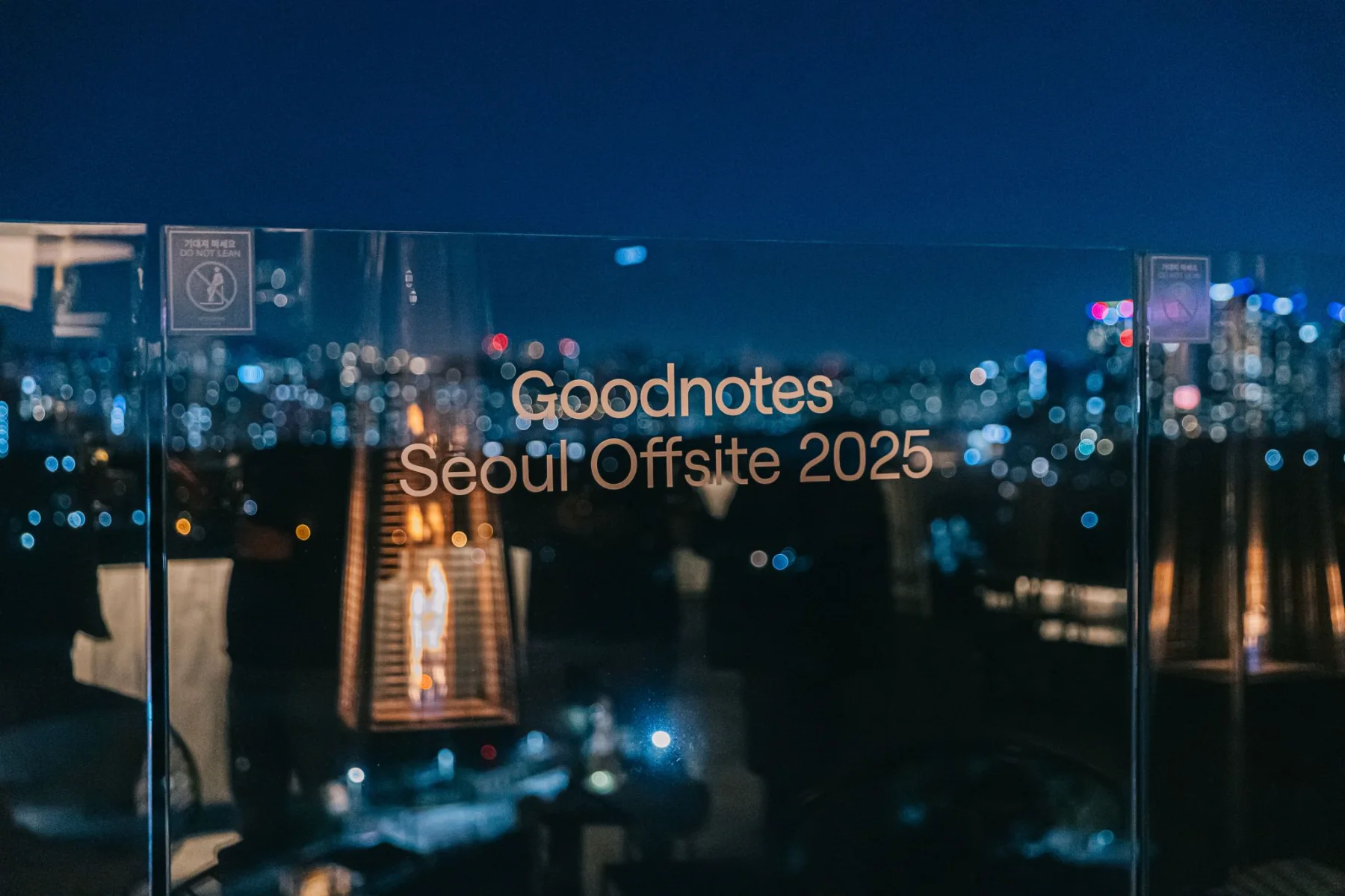
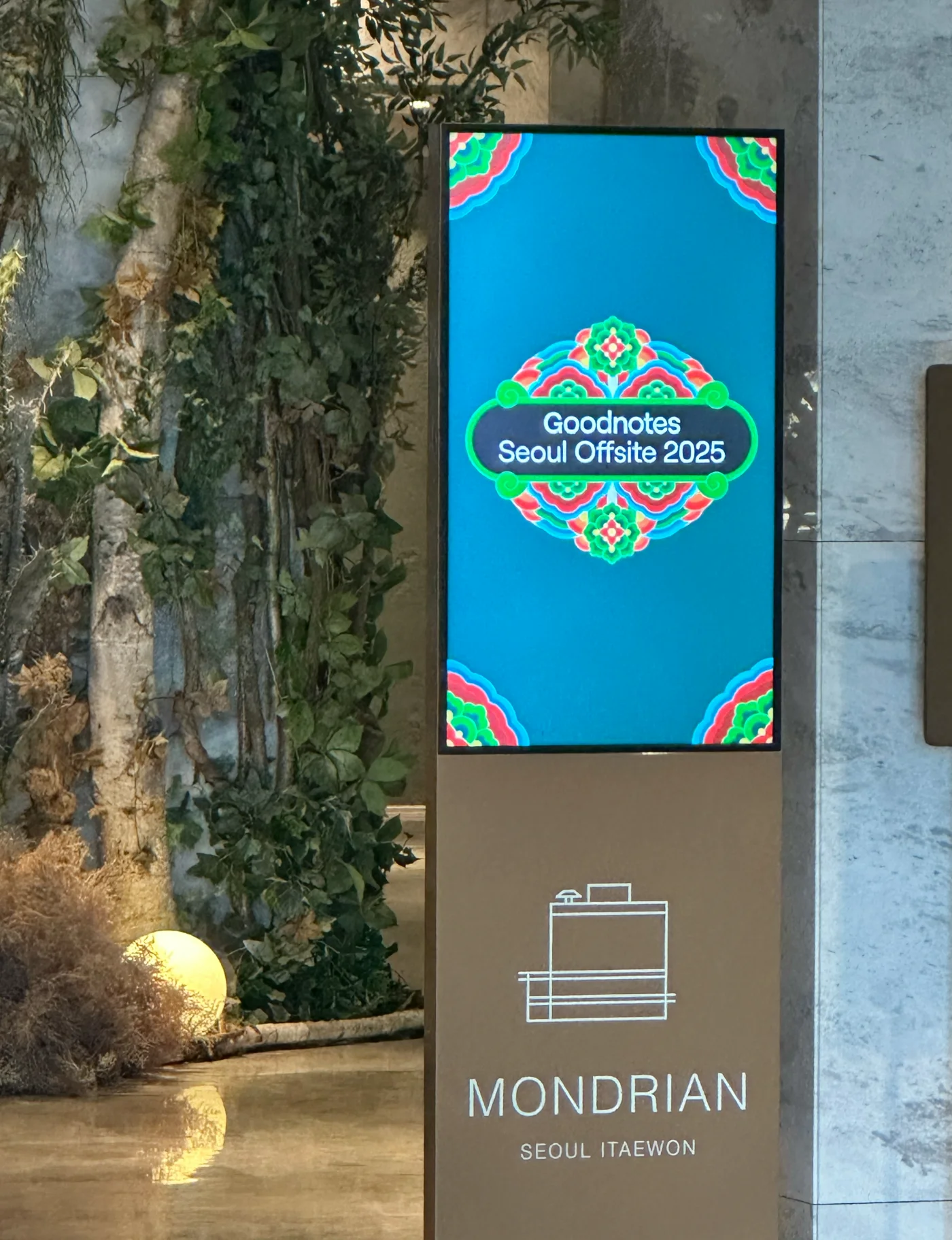
Graphics across the hotel: digital screens throughout, a huge LED screen above the lobby bar, and a takeover of the rooftop Privilege bar.

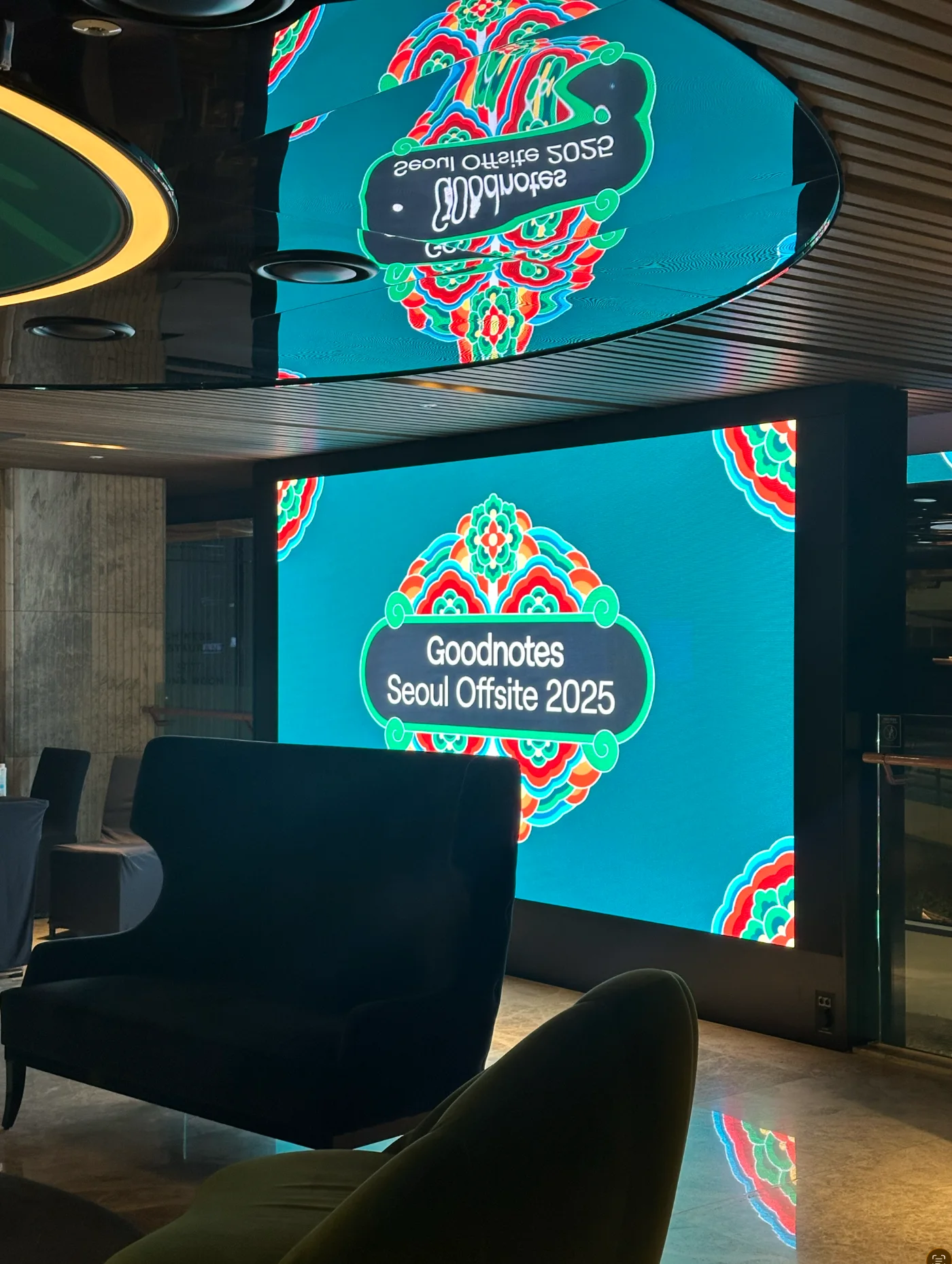
The Seoul Offsite 2025 Dancheong banner on the LED screen above the Mondrian lobby bar
Seoul Offsite 2025 on the rooftop screen at night, over the city The rooftop Privilege bar, taken over for the offsite
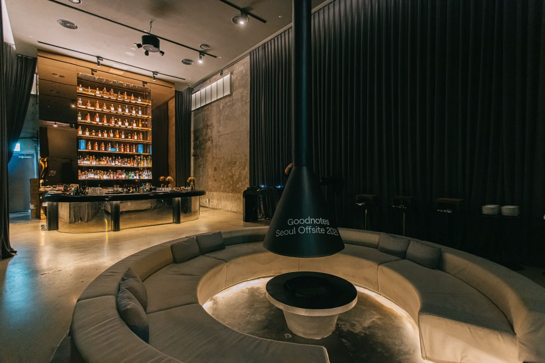
Seoul Offsite 2025 Dancheong graphic on the Mondrian Seoul Itaewon entrance screen Seoul Offsite 2025 Dancheong graphic on the lounge LED wall, reflected in the ceiling
02 — Floating Island

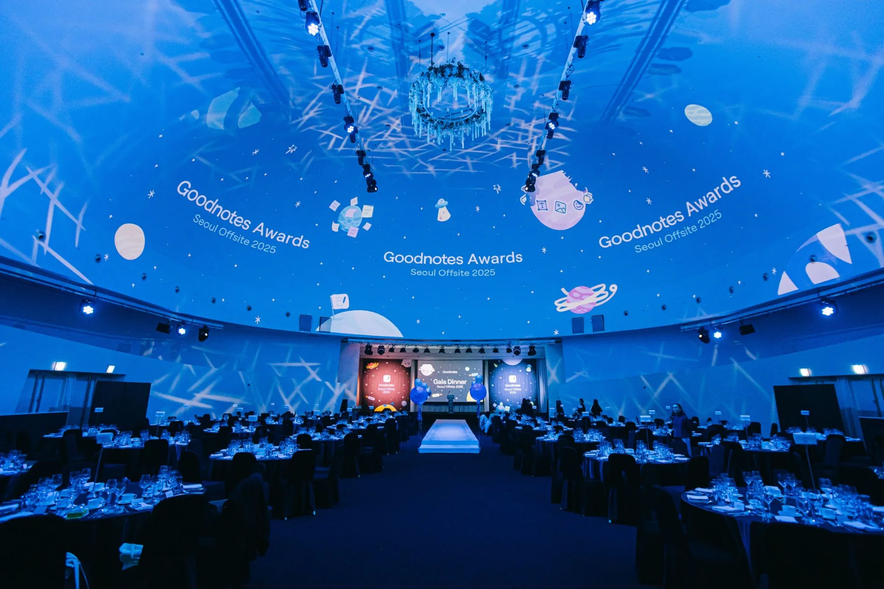
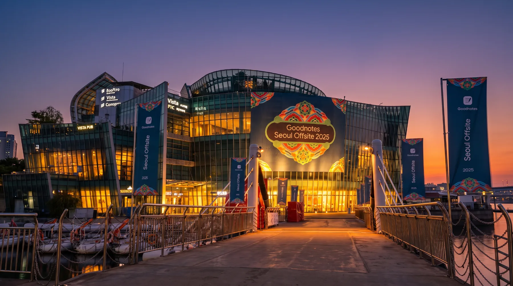
A full venue takeover: a dramatic banner on the building, flags lining the bridge, and a ceiling projection of animation from our Outernet campaign.

Concept render of the Floating Island venue at dusk with the Dancheong banner and flags lining the bridgeConcept render
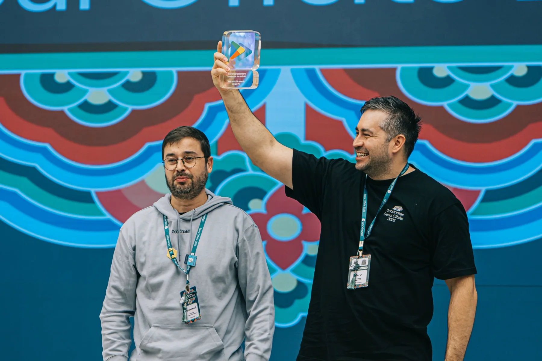
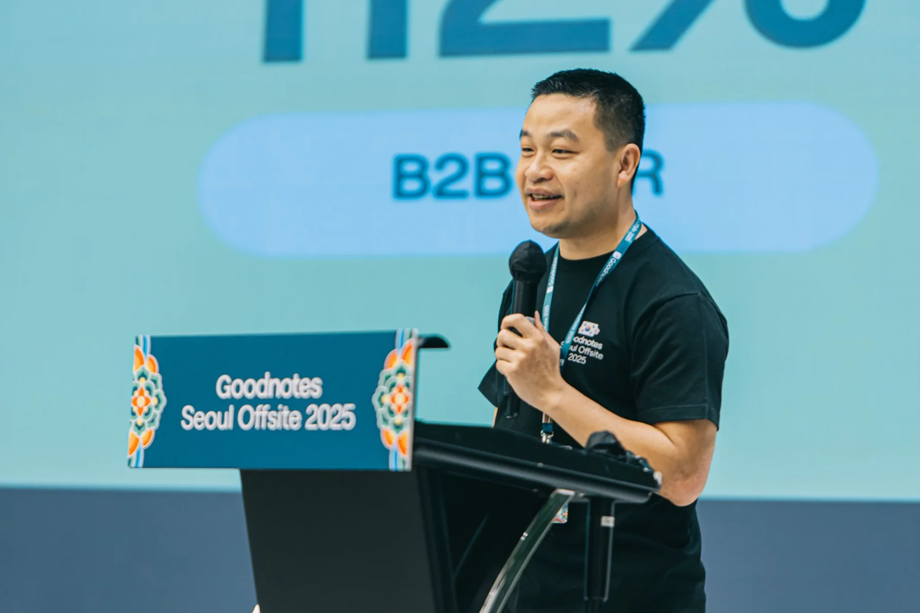
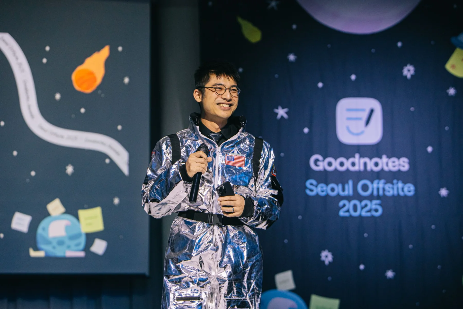
On stage in front of the Dancheong-pattern backdrop
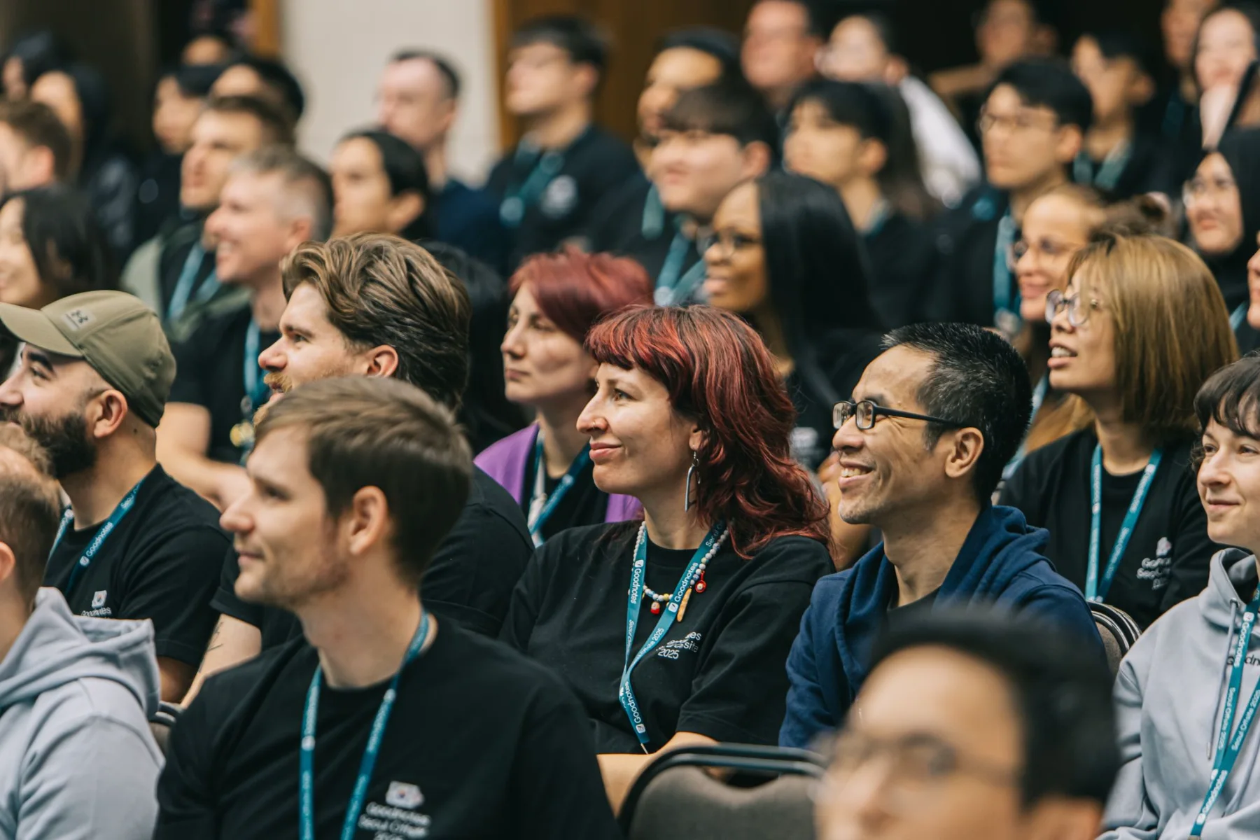
A speaker at the branded Seoul Offsite 2025 podium A presenter in a space suit in front of the illustrated stage screens The global team in the audience
03 — The swag

The small things people keep on their desks long after the offsite ends.

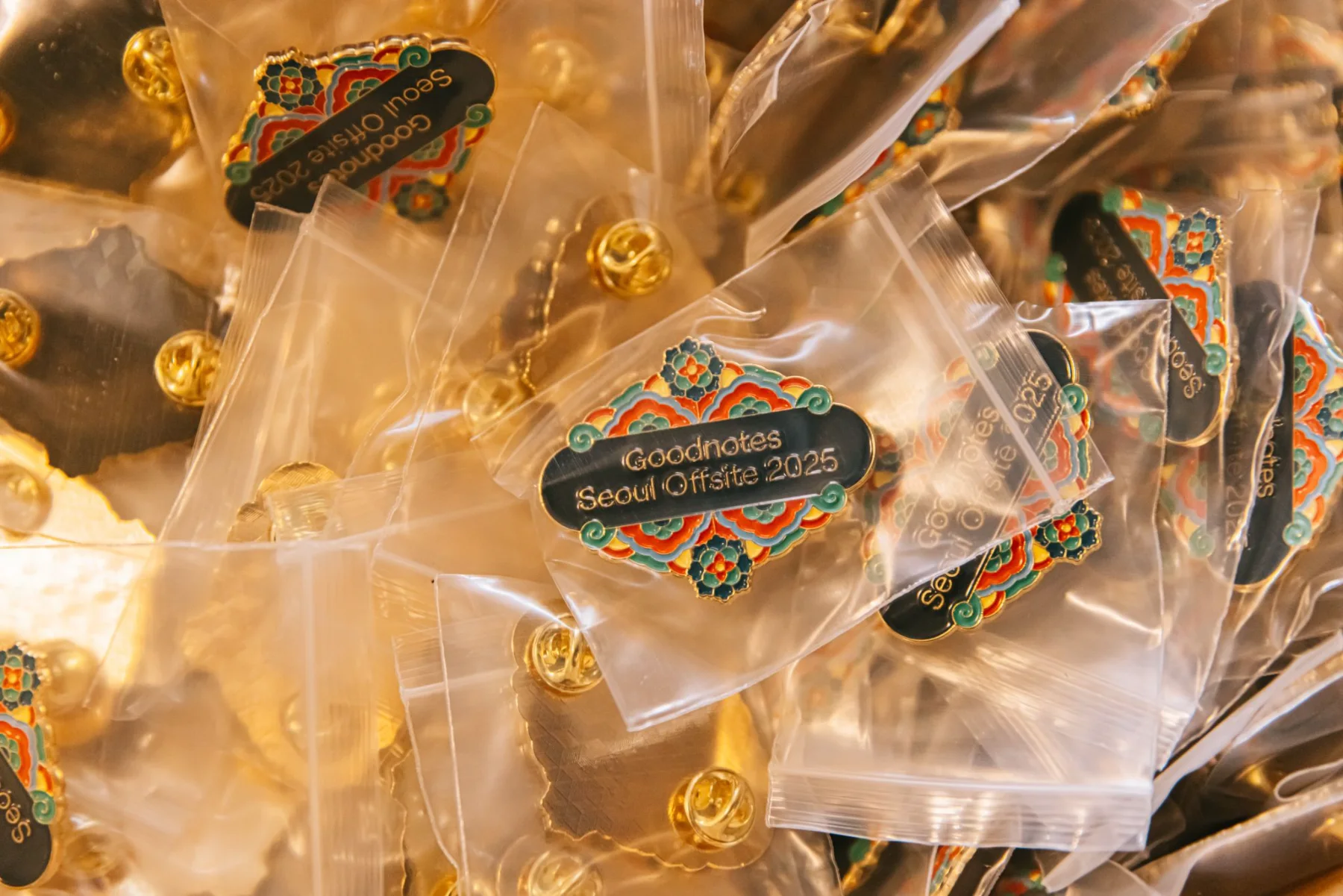
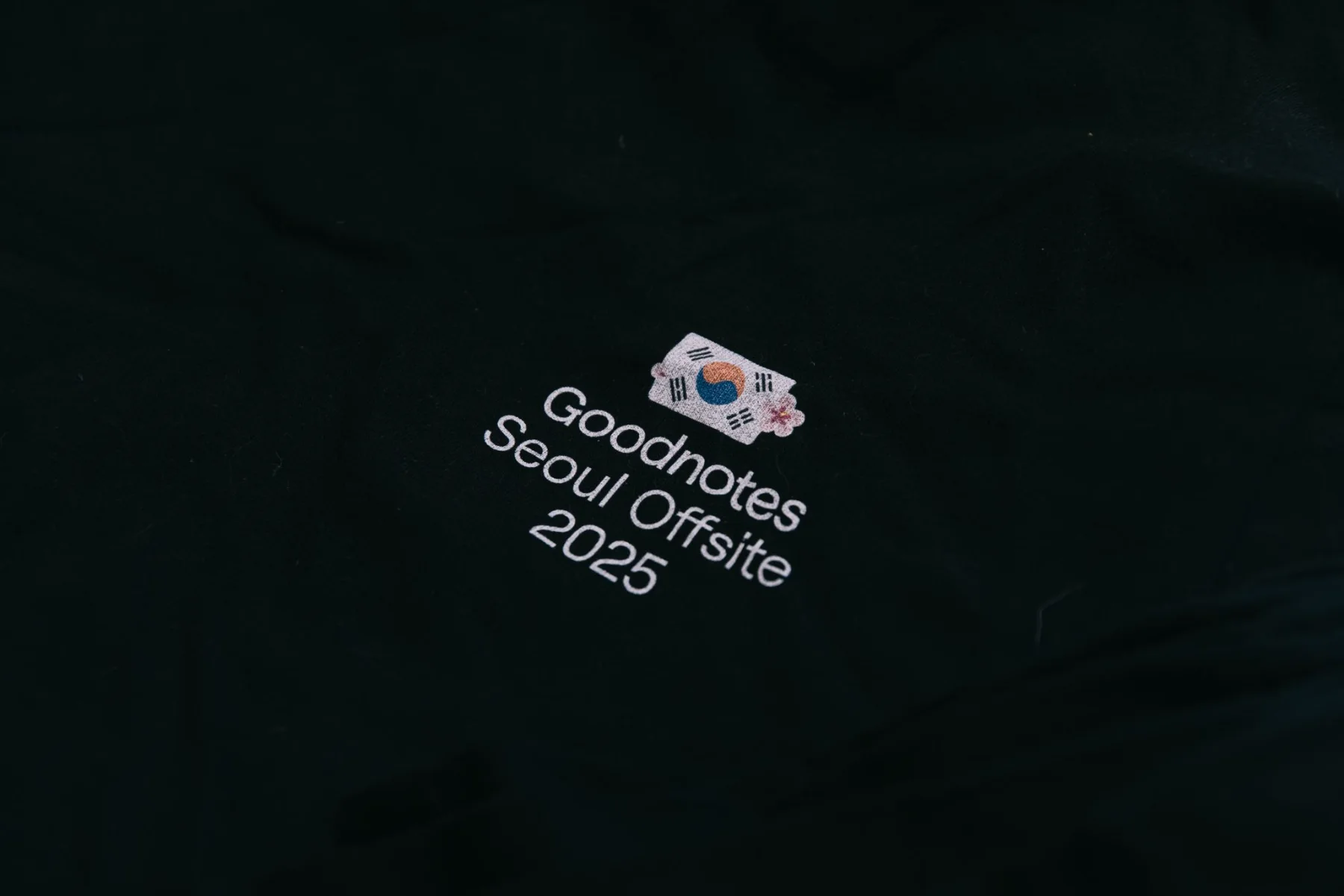
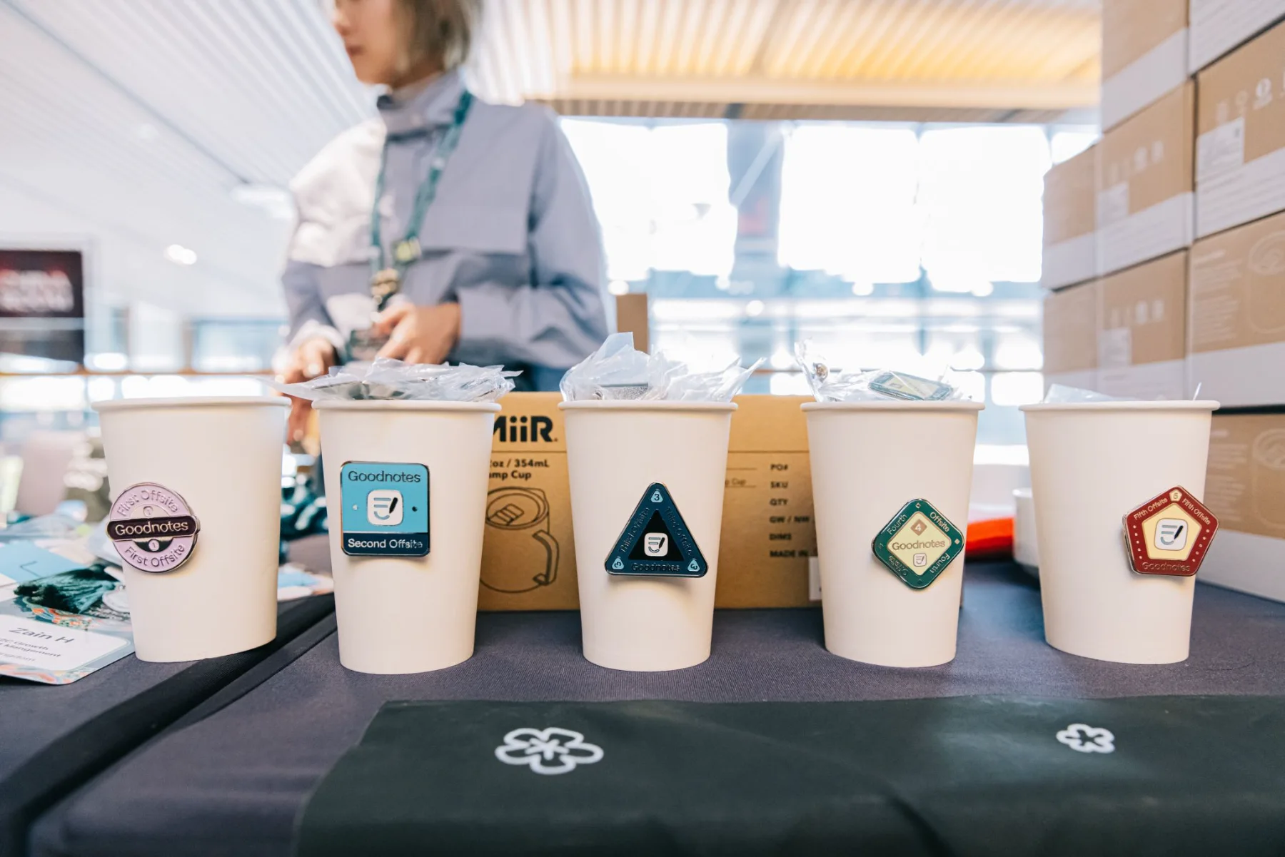
Custom name tags finished with a maedeup (매듭), a traditional Korean knot, and a logo charm. Commemorative anniversary pins and offsite pins, tees and mugs.

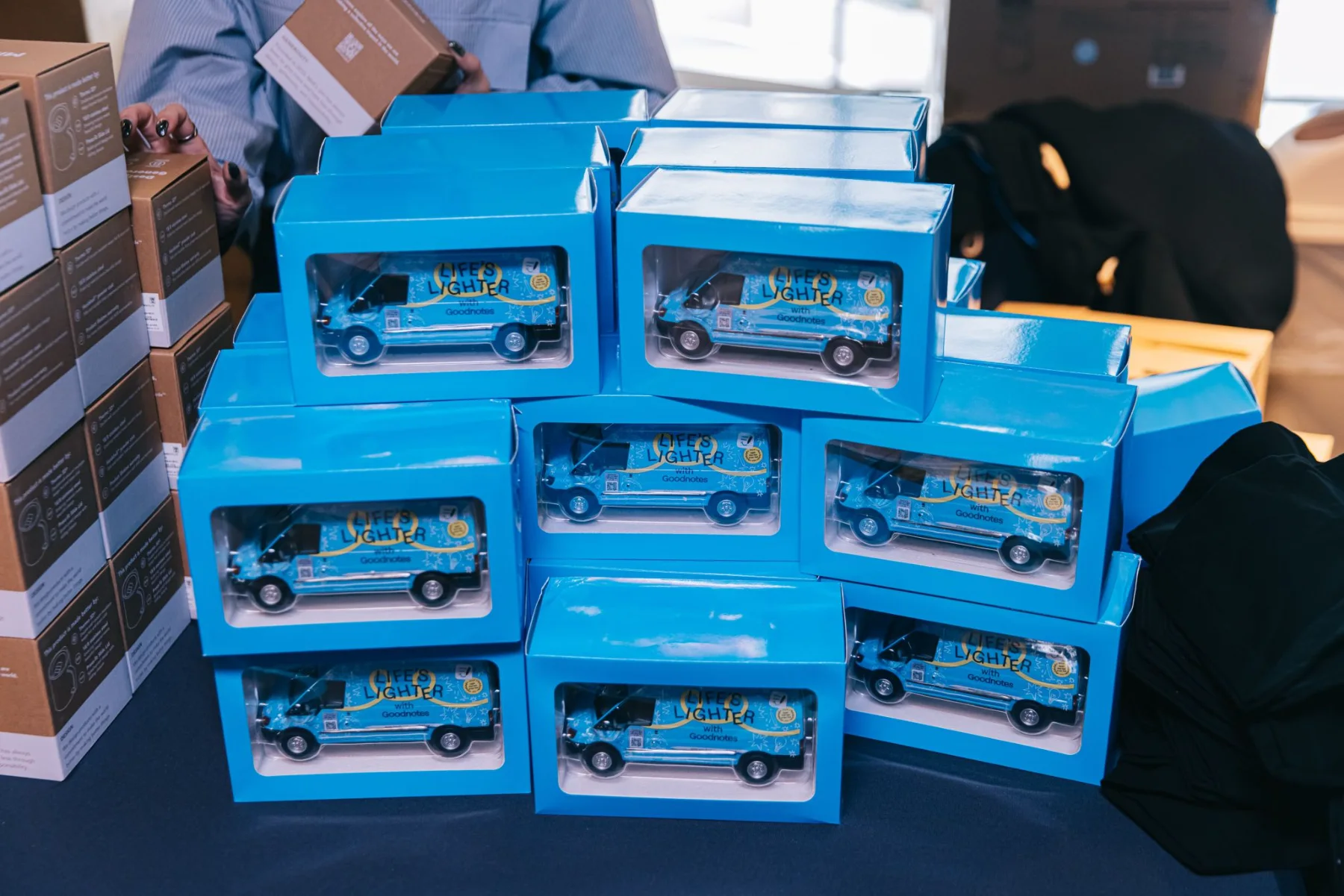
And miniature van models, inspired by the bus from our USA University Road Tour.

Name tag with a maedeup knot and logo charm on a Seoul Offsite lanyard
Commemorative anniversary and offsite pins Boxes of miniature Goodnotes van models
Seoul Offsite mugs in teal and slate Embroidered Goodnotes Seoul Offsite 2025 tee Illustrated cups at the coffee station
04 — The team in it

Two of us, one motif, every surface. My senior designer designed the Dancheong motif; together we rolled it out across two venues, and I designed the swag.

Creative Studio

Kristina Kovalchuk · Antonija Laus · Emily Zhang · Ruby Lee

With the Offsite Committee and our partner agency in Korea, 1%CLUB.

Related case studies
Goodnotes 2025 launch event
Goodnotes 2025 launch event →

36 creators, three days in London, and the unveil of the new Goodnotes.

Goodnotes at Bett 2026
Goodnotes at Bett 2026 →

The brand at trade-show scale.
Case study 06Event

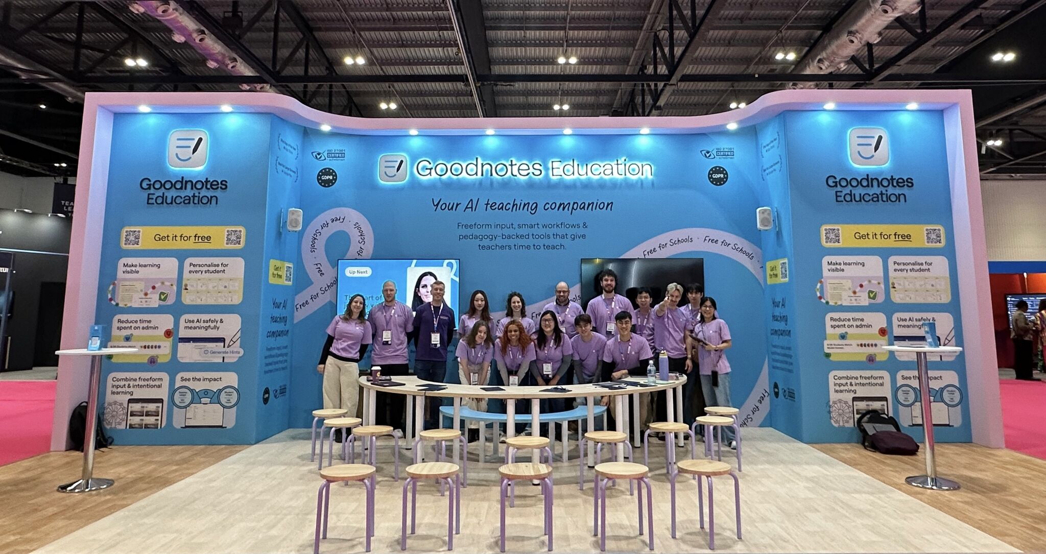
Bett 2026 — the Goodnotes brand built out at scale across three days at ExCeL London, the world's biggest education technology show.

Stand design, wayfinding, demo screens, printed collateral and giveaways for the January 2026 show — the whole presence designed to read from across the hall and hold up close, with a team briefed to talk to teachers all day.

An agency shaped the stand. I designed all the artwork on it, the rest of the booth materials and the merch.

Result
450+

leads off the stand across three days — against a target of 200.

+146%

on the previous year’s leads.

Goodnotes Education stand in full, Bett 2026

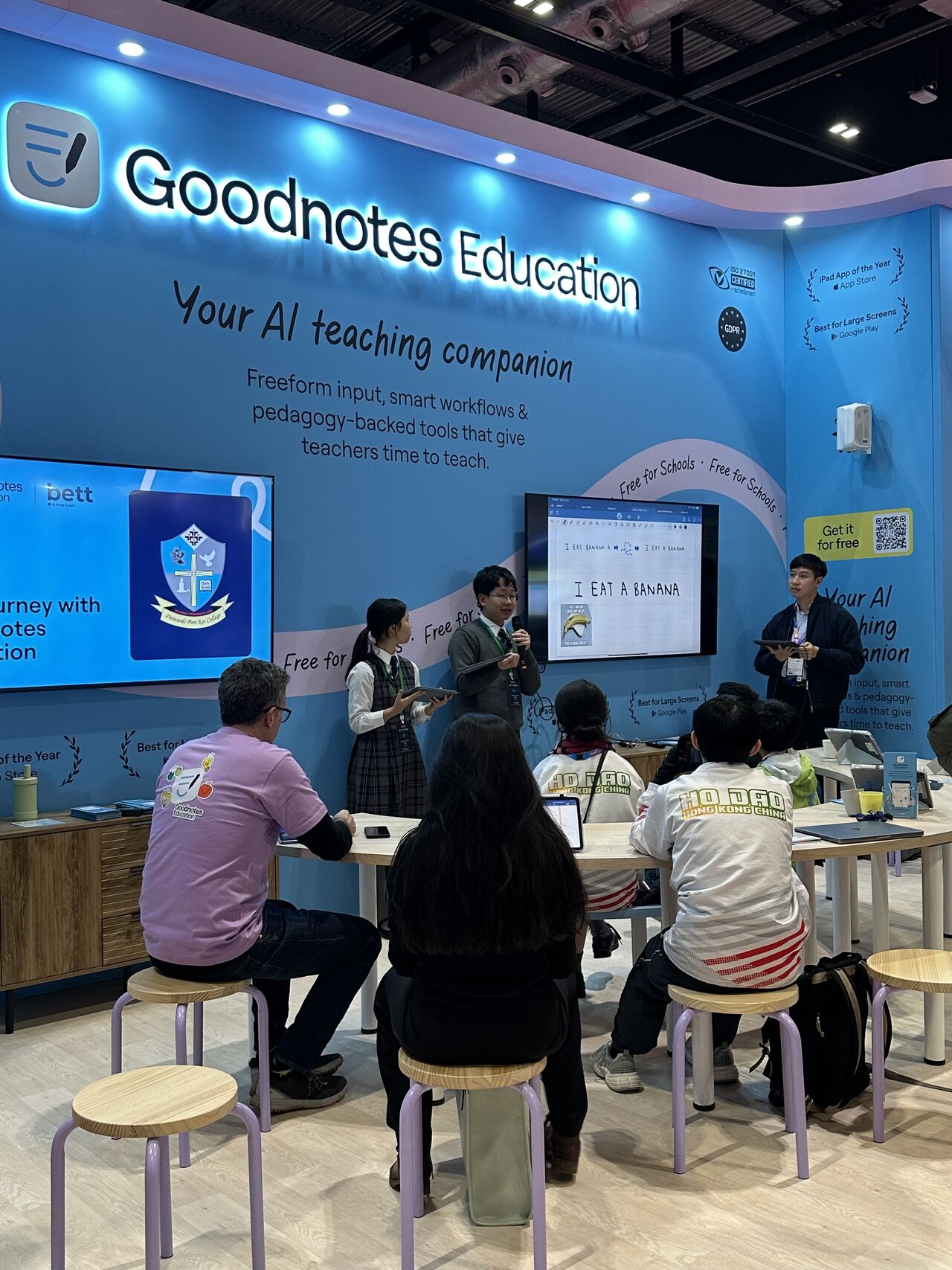
A ten-metre wall carrying the Goodnotes Education lockup, the stickers pulled straight from the app, and the proof points teachers actually ask about — free for schools, app of the year, certified.

Brief

Make Goodnotes the stand teachers remember at the world’s biggest edtech show.

My role

Designed all the artwork on the stand, the booth materials and the merch. An agency shaped the structure.
Key decision

Design it to read from across the hall and hold up close.
Result

450+ leads across three days, against a target of 200.

01 — A stage, not a stand

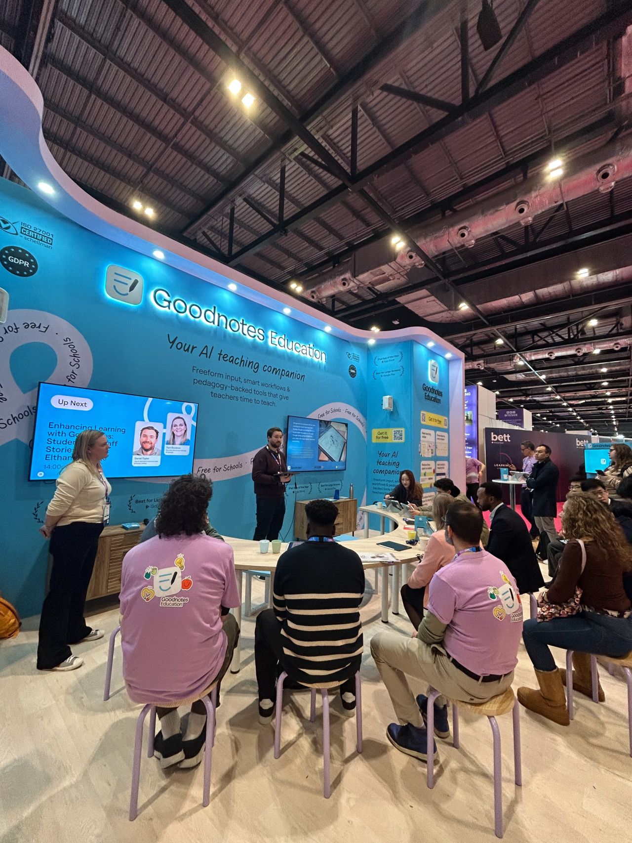
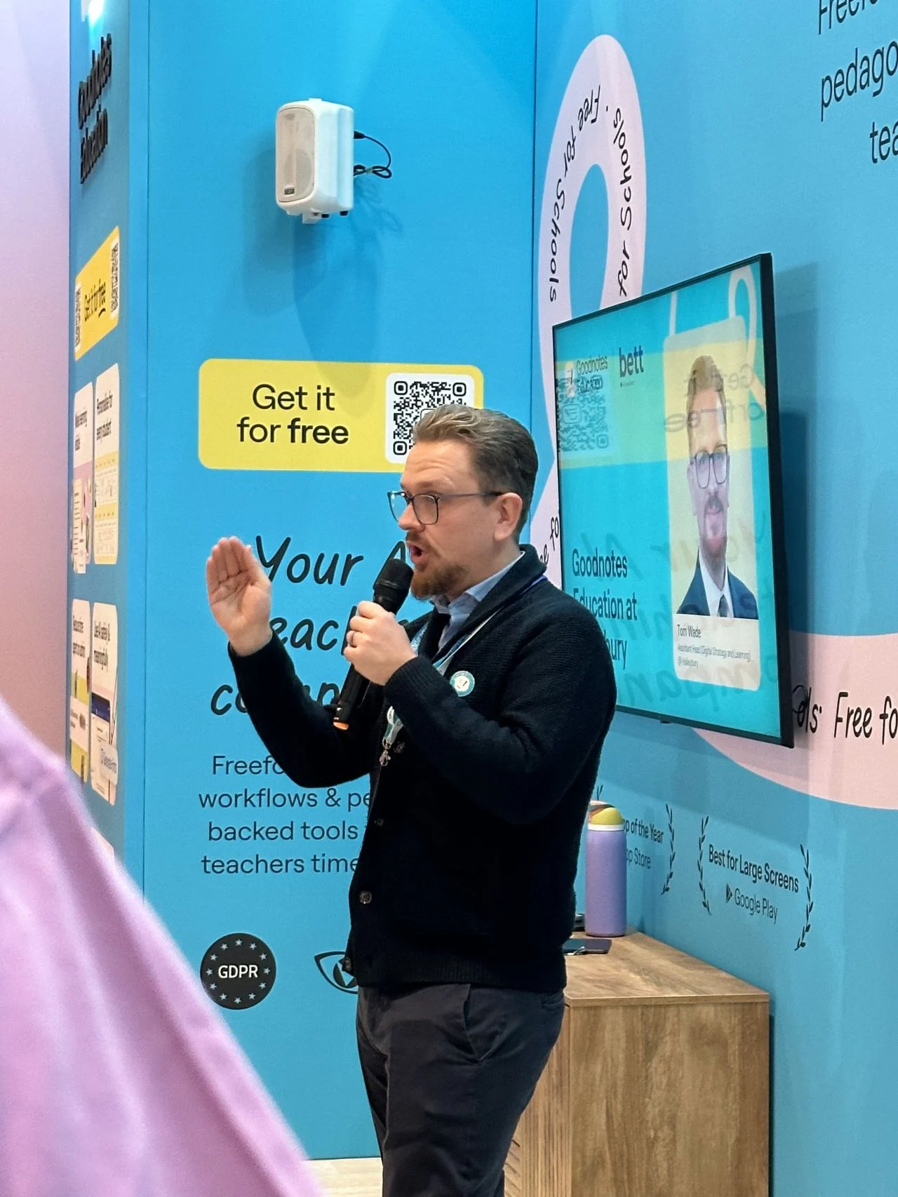
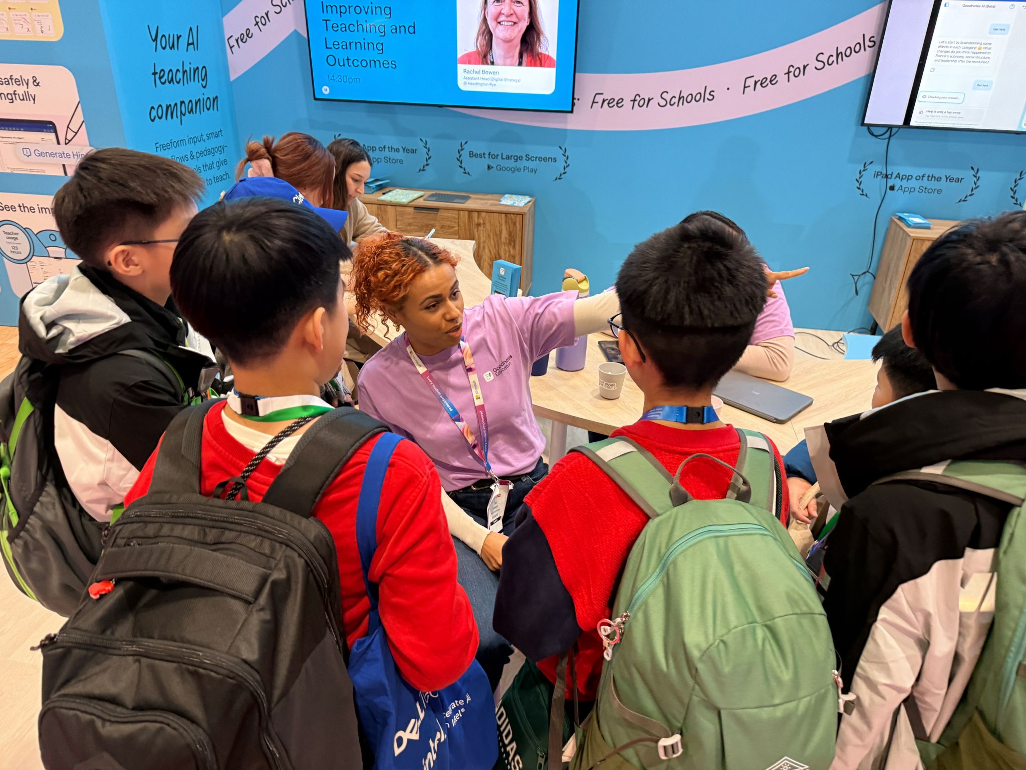
The stand ran a live schedule all three days — teachers, headteachers and students on the mic, with the wall as the backdrop.

Students presenting from the Goodnotes Education stand Audience seated for a stand session Speaker presenting at the stand

“I attended Bett 2026 last week and was very impressed with Goodnotes Education. We would like to transition away from OneNote and use Goodnotes as our primary note-taking software.”

A school on an existing 1:1 iPad scheme — 80% of pupils today, targeting 100% of pupils and teachers by October 2026.

02 — Held up close

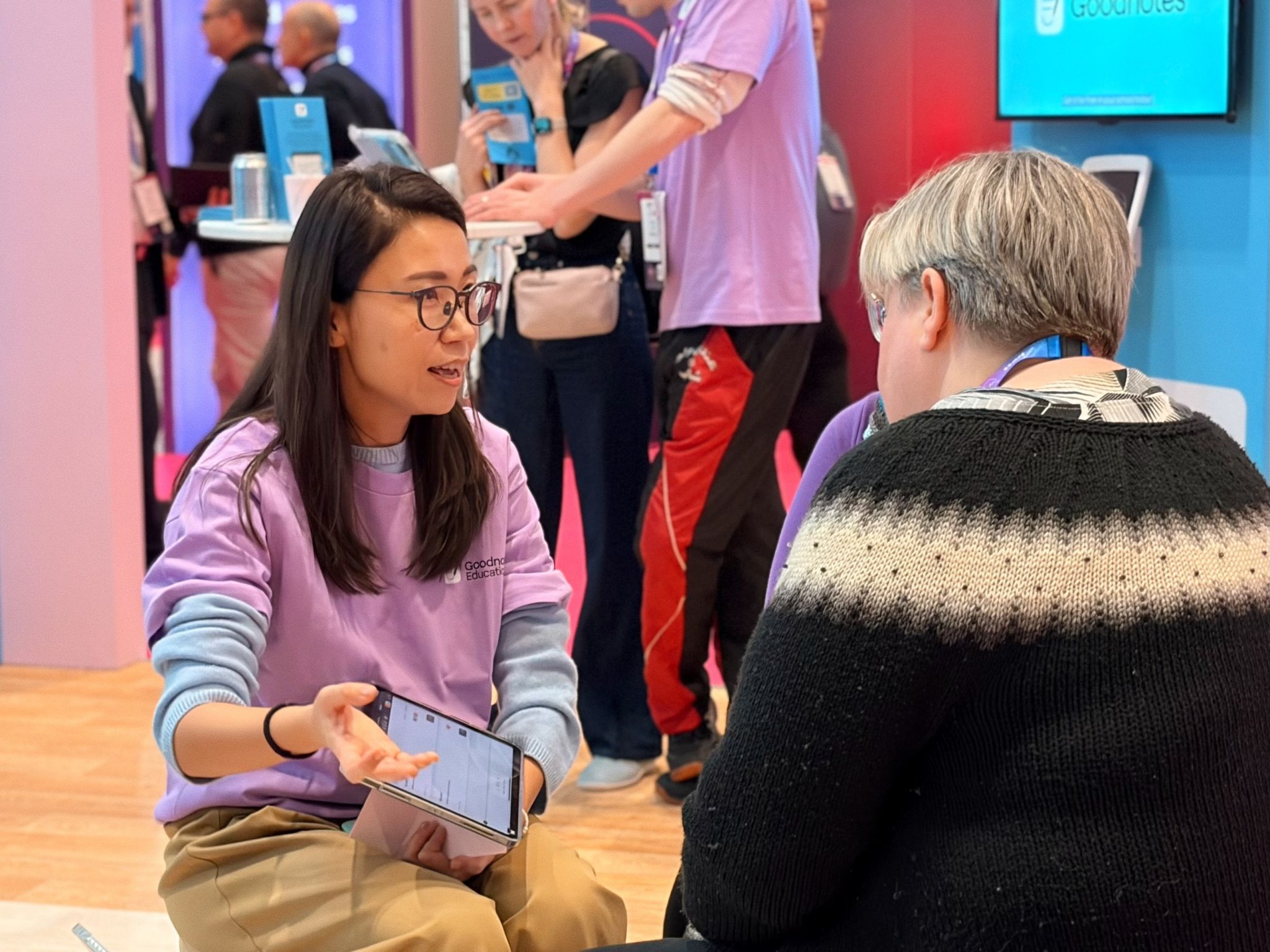
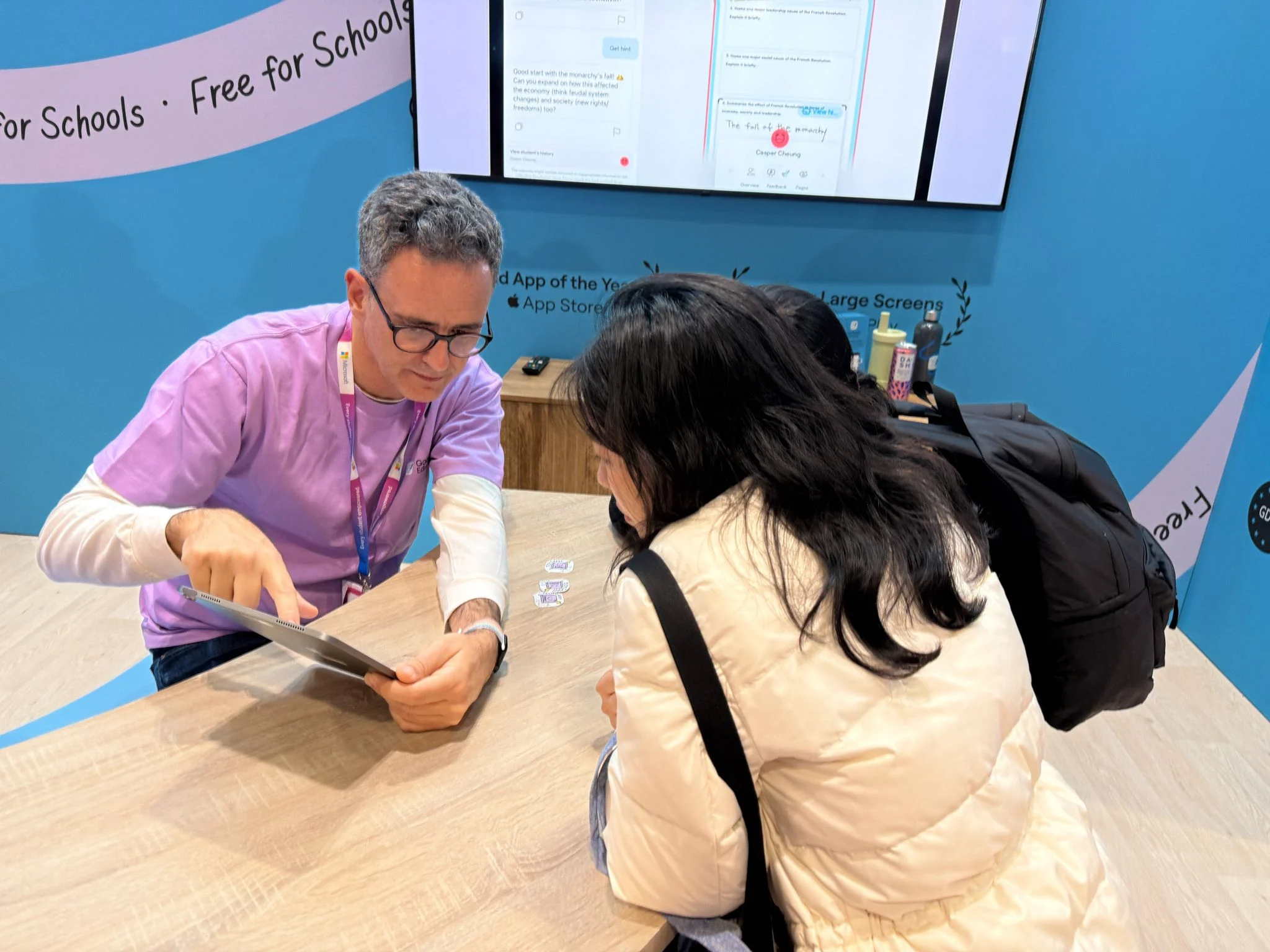
Everything on the wall had to survive being read from two metres away and explained one-to-one over an iPad.

One-to-one demo with a teacher Demo at the stand counter
Students gathered around a demo table
03 — The team in it

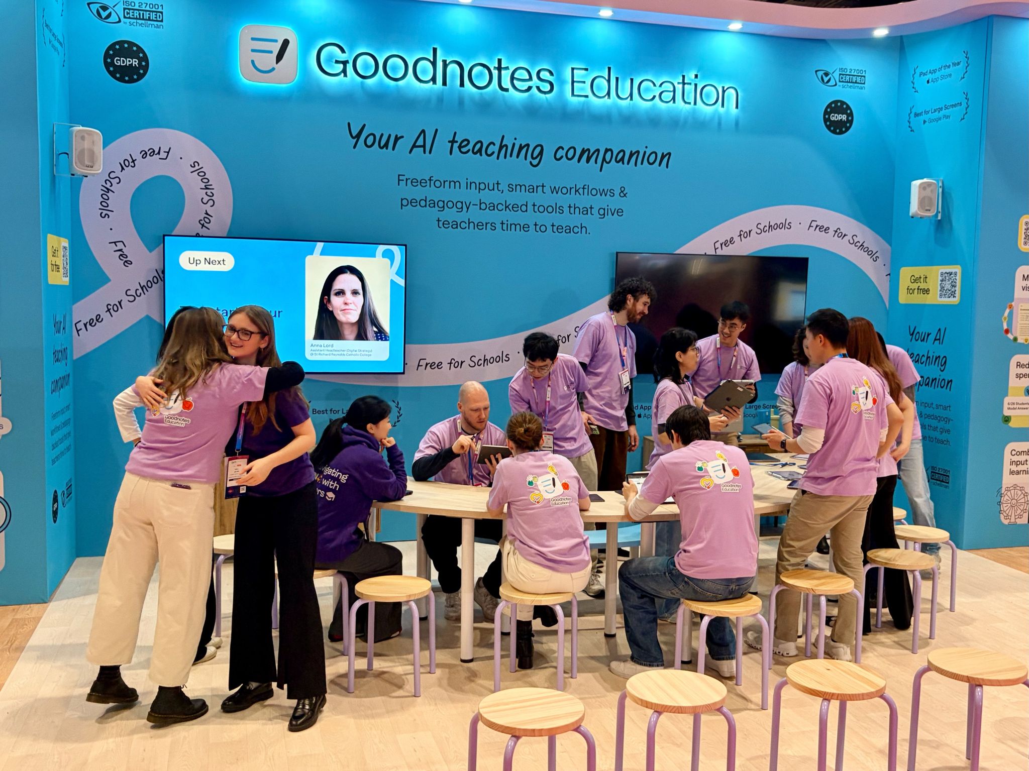
Great products are built by teams who care deeply — about the work, the users, and each other.

Long days on their feet giving demos and answering questions, plus the educators who volunteered their own time to speak on the stand through talks and Q&As — the schedule only worked because they showed up for it.

Booth, merch & marketing

Emily Howard · Daniel Emmerson · Melissa Li · Emily Zhang · Antonija Laus · Kristina Kovalchuk

Plus the WX team, who kept everyone fed and hosted the surrounding events at the London HQ.

Booth construction

Creative Eight designed the custom booth construction. All artwork was produced in-house by the Goodnotes creative team.

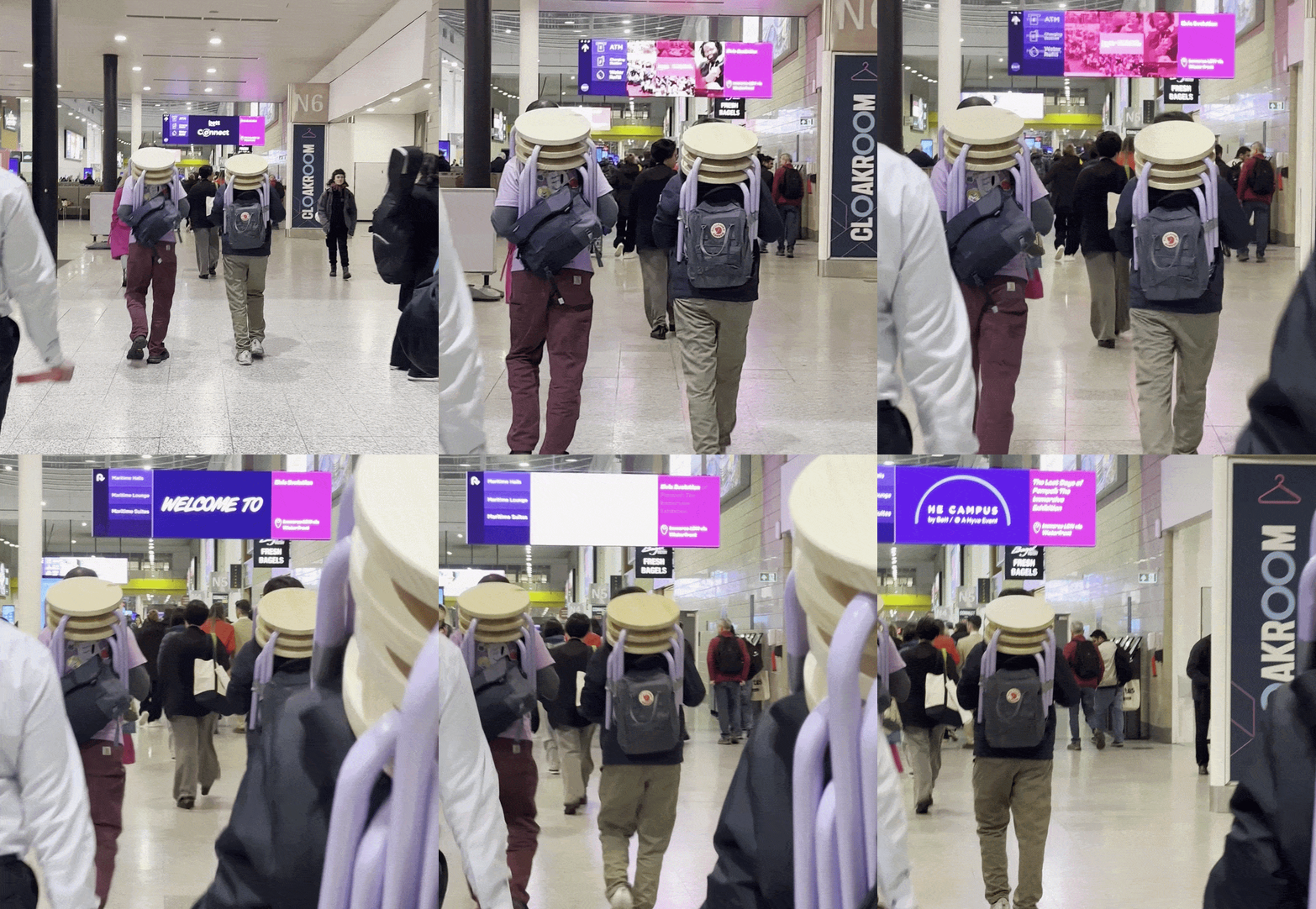
Stools carried through ExCeL on install day

Stools, screens and merch hauled in and out of ExCeL by the whole team, on foot.

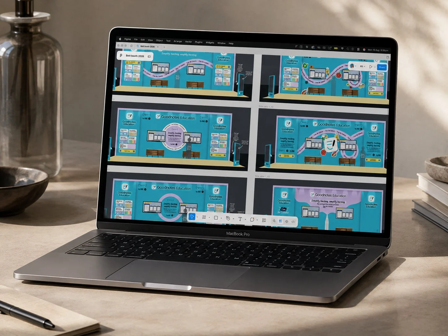
Booth layout iterations in Figma

Months of iteration: booth layouts, mockups, print specs and install logistics.

Team on the stand between sessions Goodnotes Education team at the Bett 2026 stand
04 — Merch

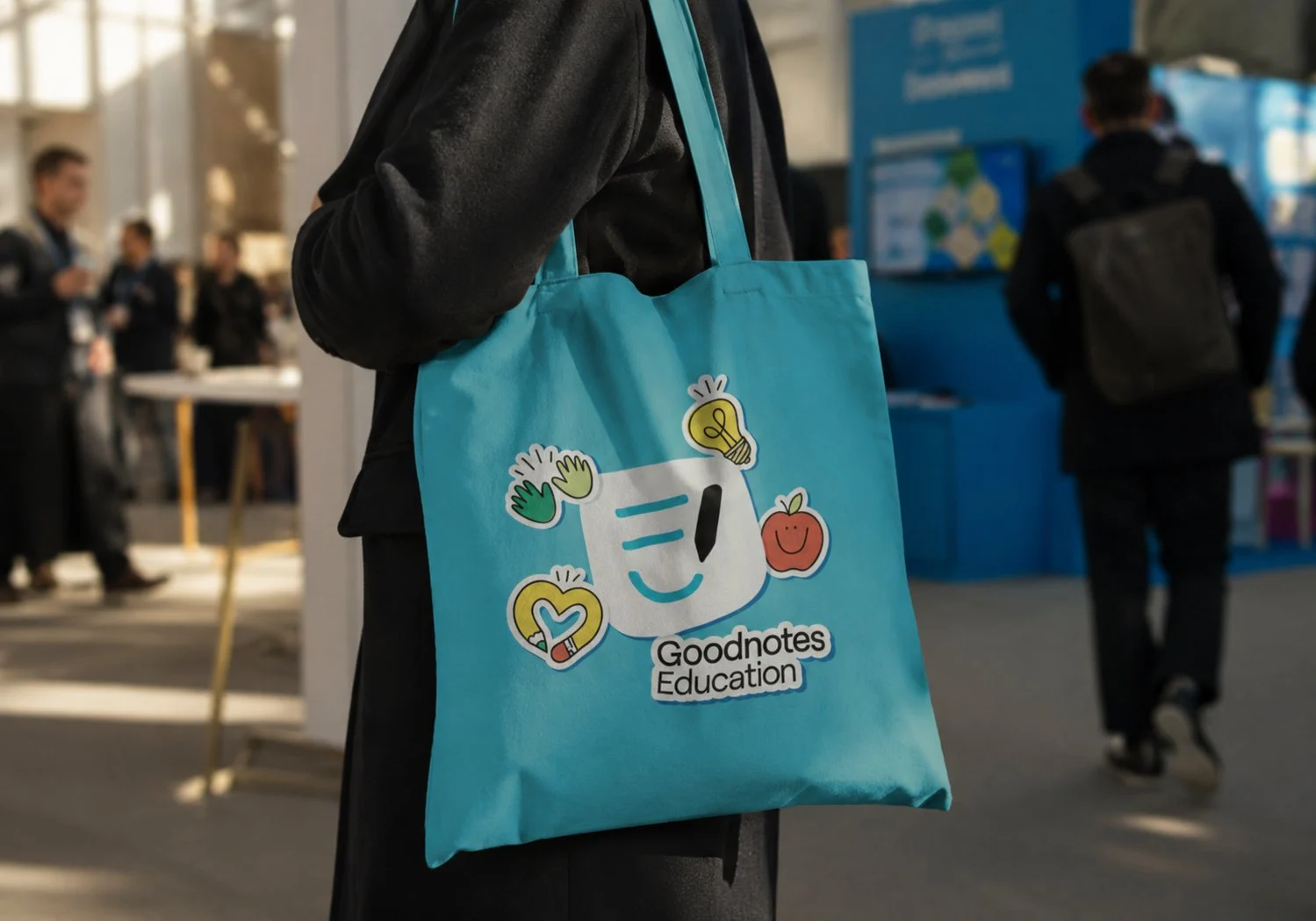
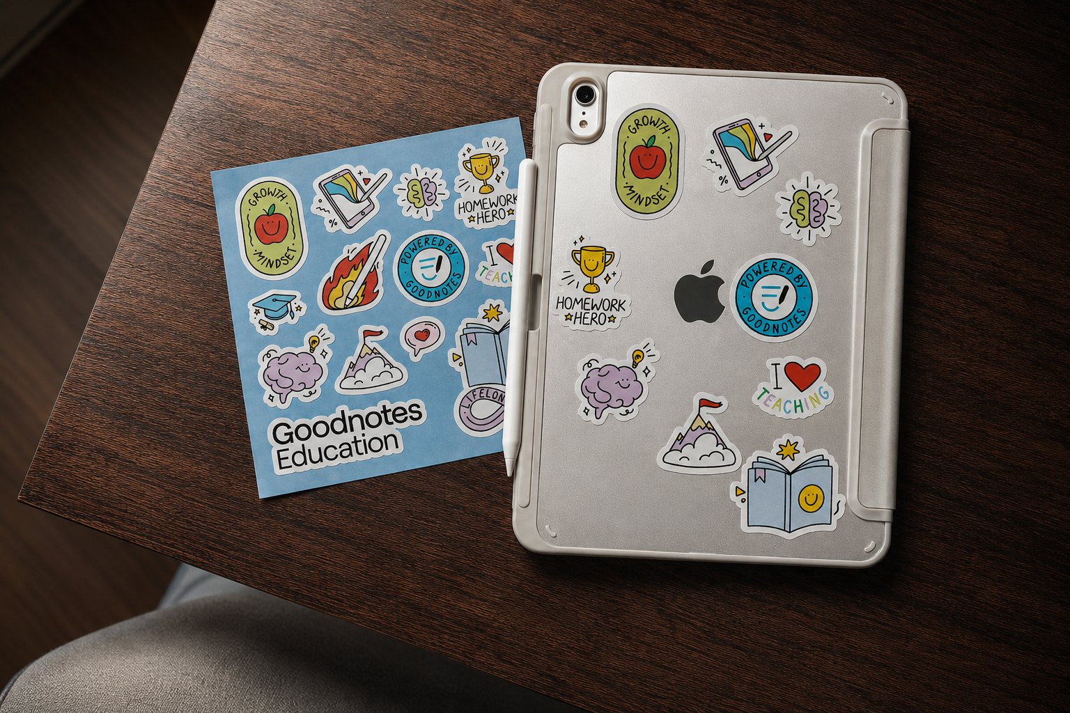
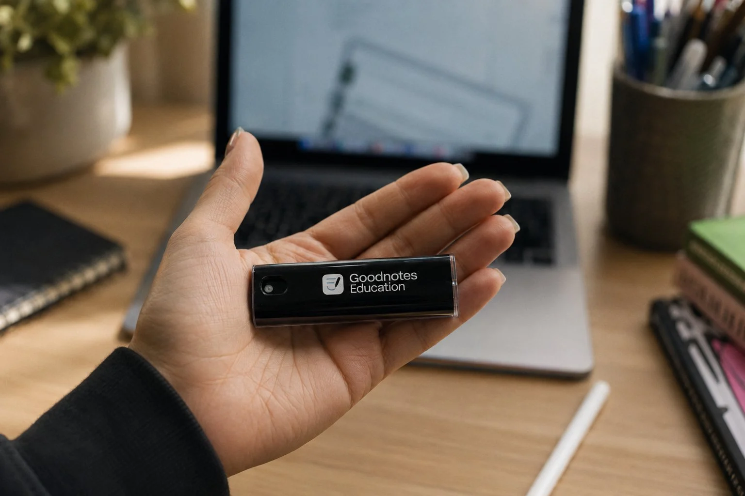
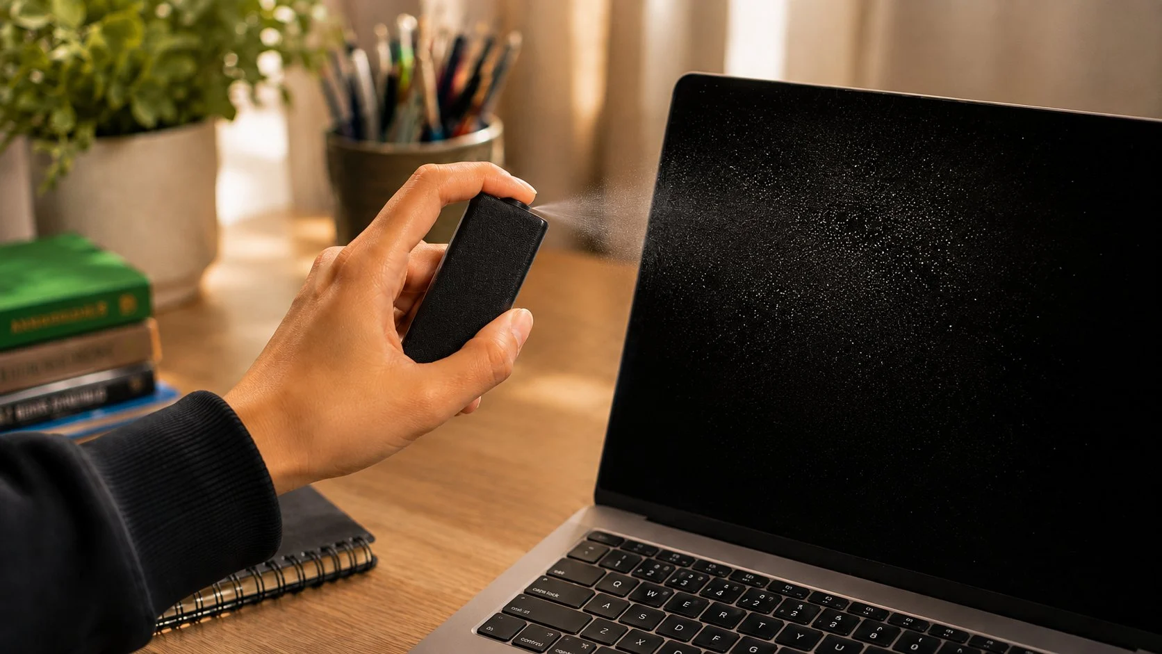
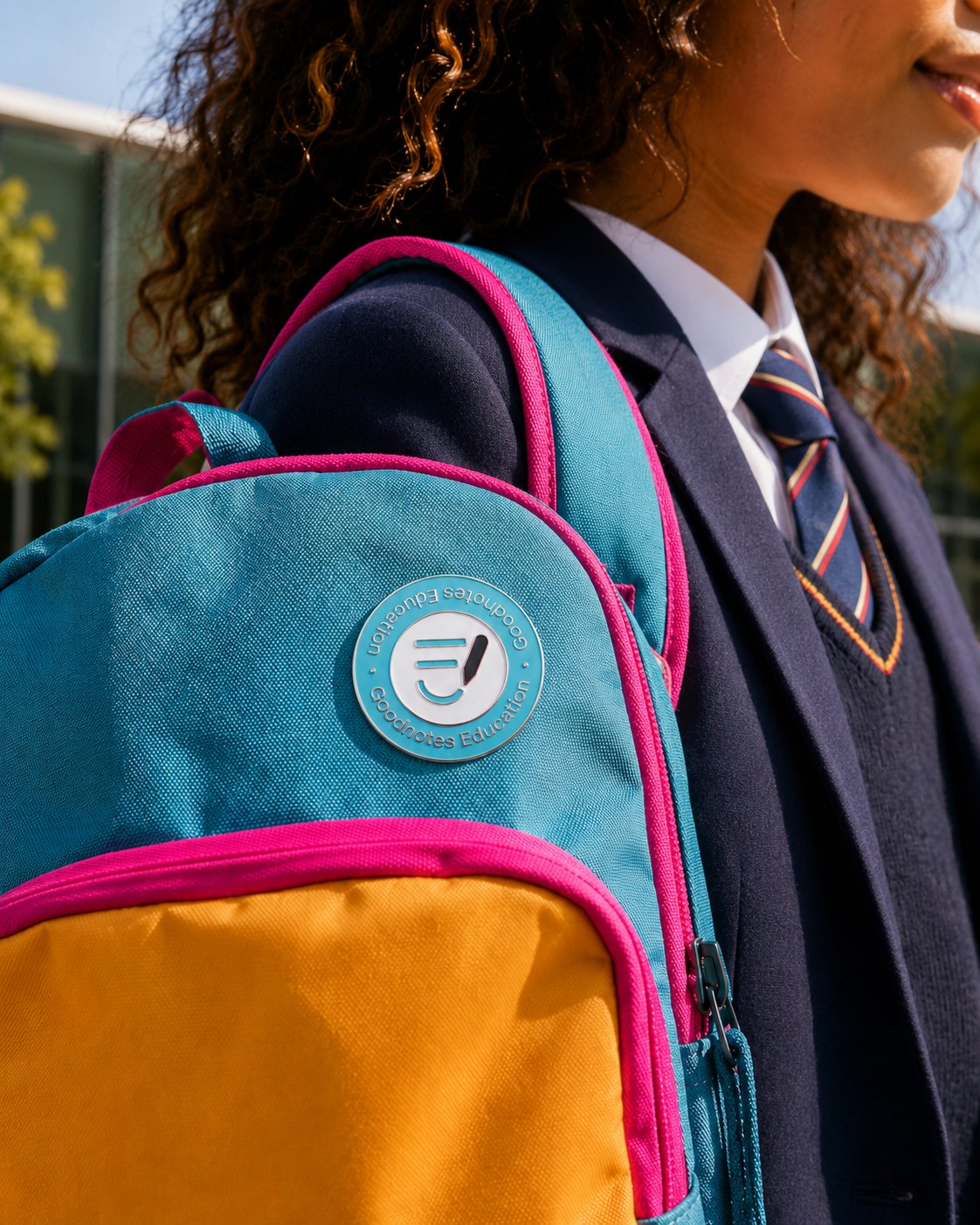
Totes went out by the hundred and walked the brand around the hall — sticker sheets went home on laptops and iPad cases, a branded screen cleaner stayed on desks long after the show, and an enamel pin ended up on school bags.

Goodnotes Education tote carried through the hall Goodnotes Education sticker sheet applied to an iPad case
Branded screen-cleaning spray in hand Screen-cleaning spray in use on a laptop Goodnotes Education enamel pin on a school backpack
Related case studies
Goodnotes 2025 launch event
Goodnotes 2025 launch event →

36 creators, three days in London, and the unveil of the new Goodnotes.

Good Future Foundation brand
Good Future Foundation brand →

A charity brand built in house at Goodnotes.

Case study 02Rebrand

Over a year behind the scenes, then a new Goodnotes — a brand for millions of people who learn, create and take notes.

I led the rebrand from inside: internal research and workshops, then the stakeholder management — working closely with Steven, our CEO and founder, Minh Tran (then VP of Operations, now COO) and Phillip Lam (then VP of Engineering) to keep the leadership aligned as the work developed.

After 11 years with barely a change, Goodnotes was moving somewhere “much bigger than what we’re known for today”, and the brand hadn’t kept up. I managed the agency — Motto, out of New York — and held brand guardianship throughout.

External collaborators
Motto, the New York brand agency I managed on the rebrand

Motto, New York — briefed and managed by me; wordmark and wider brand system.

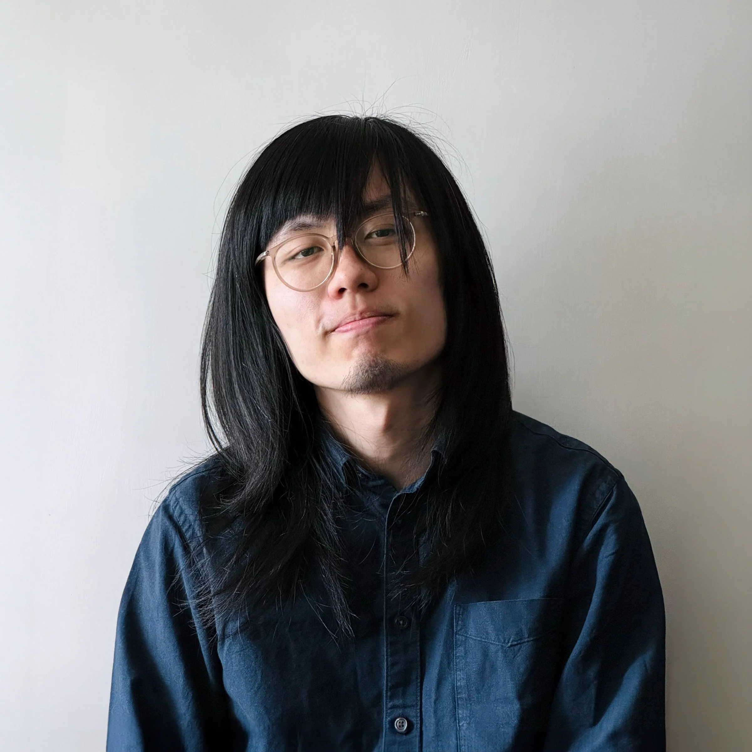
Jon Mak, identity designer

Jon Mak, Hong Kong — logomark, evolved from our previous mark.

Brief

Bring an 11-year-old brand up to where the product was heading.

My role

Led it from the client side: agency search, stakeholder management and the in-house rollout.

Key decision

Hire Motto for the idea, keep brand guardianship in-house.
Result

Launched with Goodnotes 6, into a year of growth from 21M to 25M monthly users.
01Why rebrand

The company saw itself as “the best digital paper”, and was heading cross-platform. Our research showed a brand gap on three fronts.

What it is

People saw a notes app. The company saw itself as the best digital paper, a home for ideas and knowledge.

Who it’s for

Messaging was tied to Apple and iPad, just as Goodnotes was going cross-platform to Android, Windows and web.

Its impact

People stopped at notes, and stopped using Goodnotes after graduating. The brand needed to last beyond the classroom.

A bigger story

New messaging pillars: ideas and knowledge, not just notes; connection and collaboration; community and learning; improving how people work. Motto later distilled them into “the joy of learning” and the Sage archetype.

Room for more products

Brand architecture was a deliverable, laying the foundation to branch out into areas like Goodnotes Learn. It was an early version of the thinking behind Good Systems.

An identity that worked

The brief asked for something “engaging, scalable, usable(!!), international”, and a logo that fixed the old one’s practical problems.

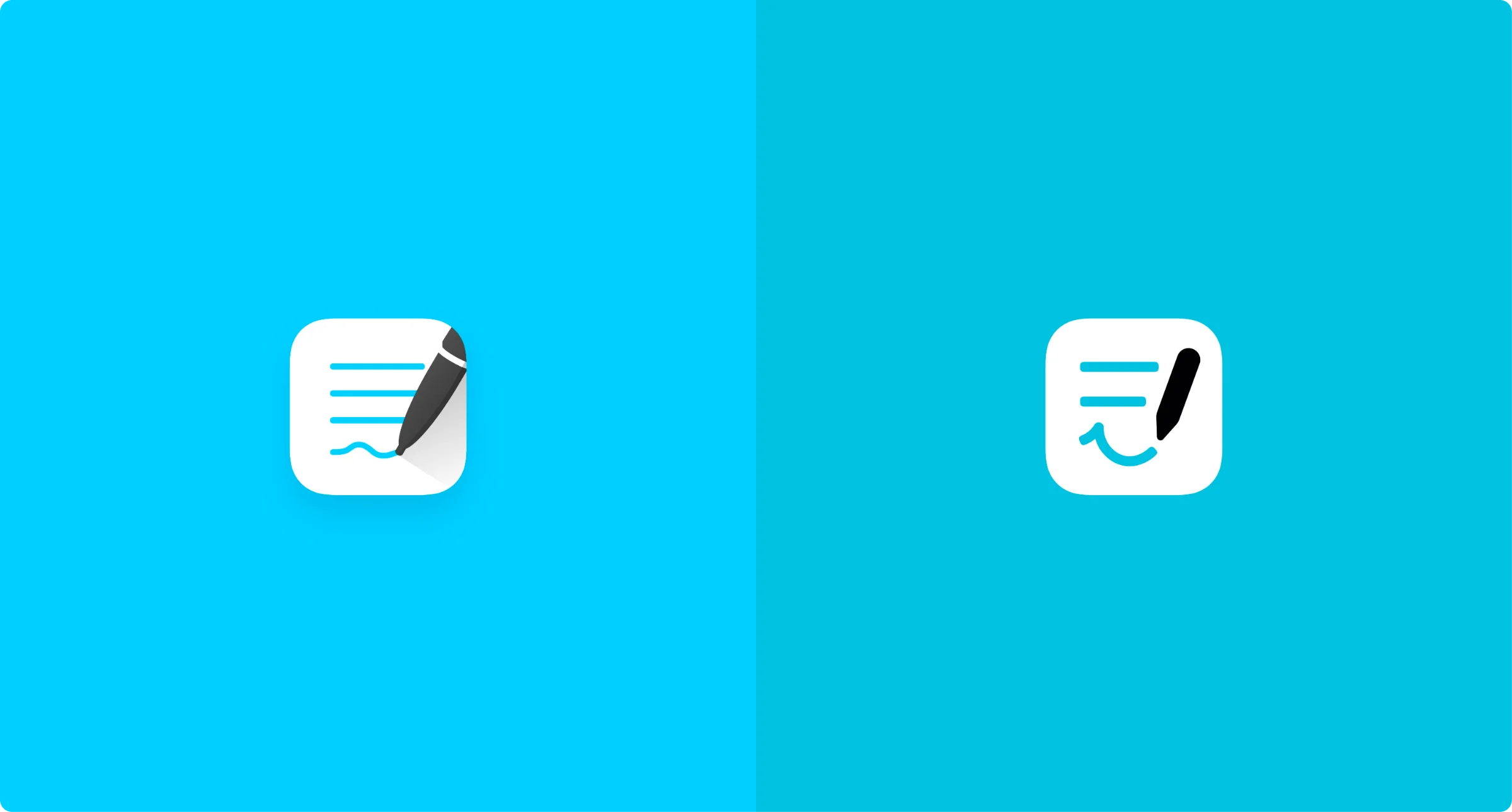
The previous Goodnotes logo (left) beside the evolved logo (right) Before After

Before — it needed a shadow to show on white, the pen and lines were unbalanced, and it couldn’t be embroidered.

After — evolved by Jon Mak: a simpler, stylus-like pen sitting fully inside its container.

02The process

It started in-house: a Google Ventures-style brand sprint and a tone-of-voice workshop. Then I approached nine agencies. Motto won because it was strategy-led and “happy to build upon the brand strategy we have already made progress on” — we didn’t want an agency to “bulldoze everything and start from scratch.” Thirteen months from agency selection to launch, in two stages: Motto built the brand, then the launch campaign. When the logomark needed more time than the agency schedule allowed, I split it into its own project.

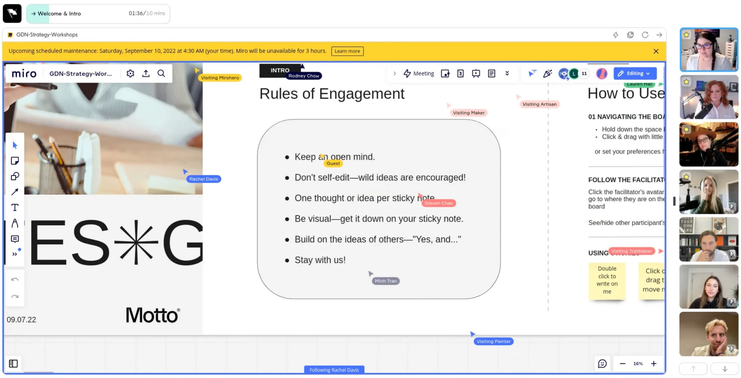
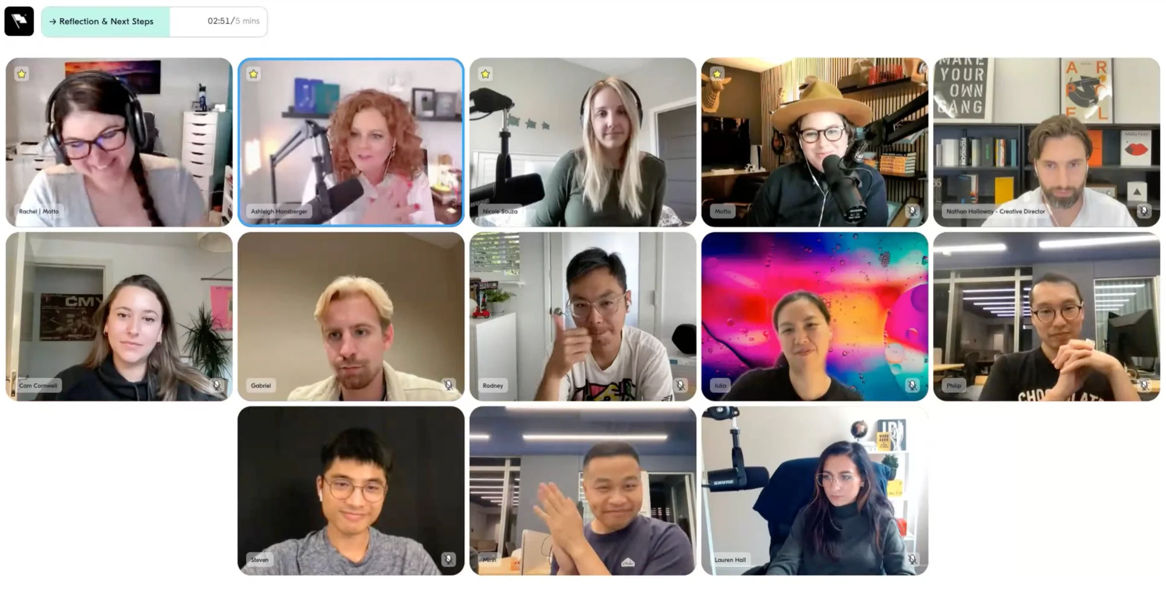
Motto's strategy workshop in Miro, with the Goodnotes team working live on the board Reflection and next steps with the Goodnotes brand squad and Motto

Strategy workshops with Motto, autumn 2022 — the brand squad working live on the board, then reflection and next steps.

Aug — Sep 2022Immersion

Stakeholder, expert and influencer interviews, team workshops, brand and competitive audits, social listening.

Sep — Nov 2022Strategy & voice

“The joy of learning” became the central idea. Voice pillars of curiosity, empowerment and joy; a manifesto and word kit.

Oct 2022 — Mar 2023Visual identity

Vision boards through to full guidelines, launched on Brandpad.

Feb — May 2023Logomark

I briefed and ran the mark with Jon Mak: a simpler, stylus-like pen sitting fully inside its container, built to work on white and in embroidery.

Feb — Aug 2023Launch campaign

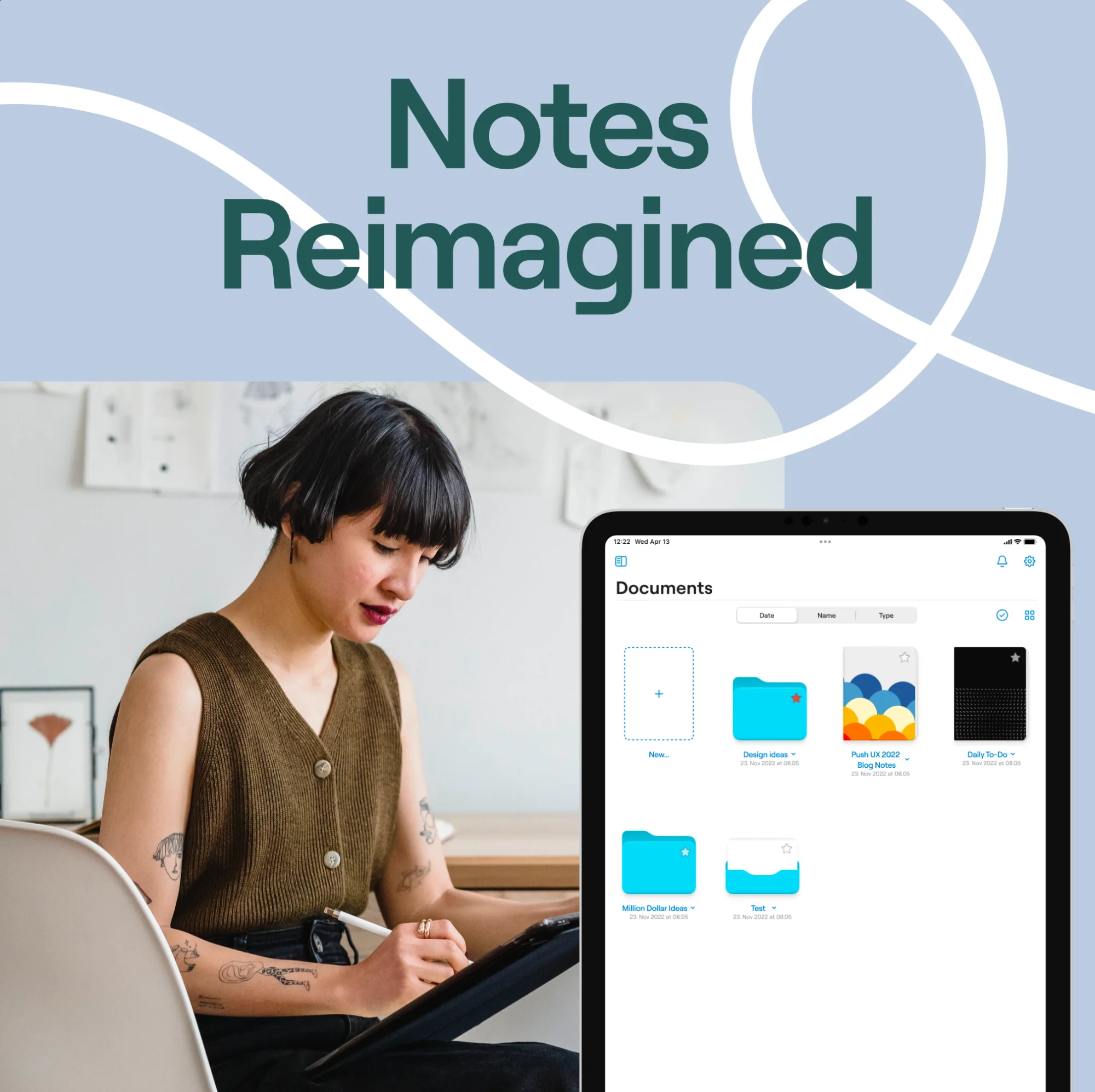
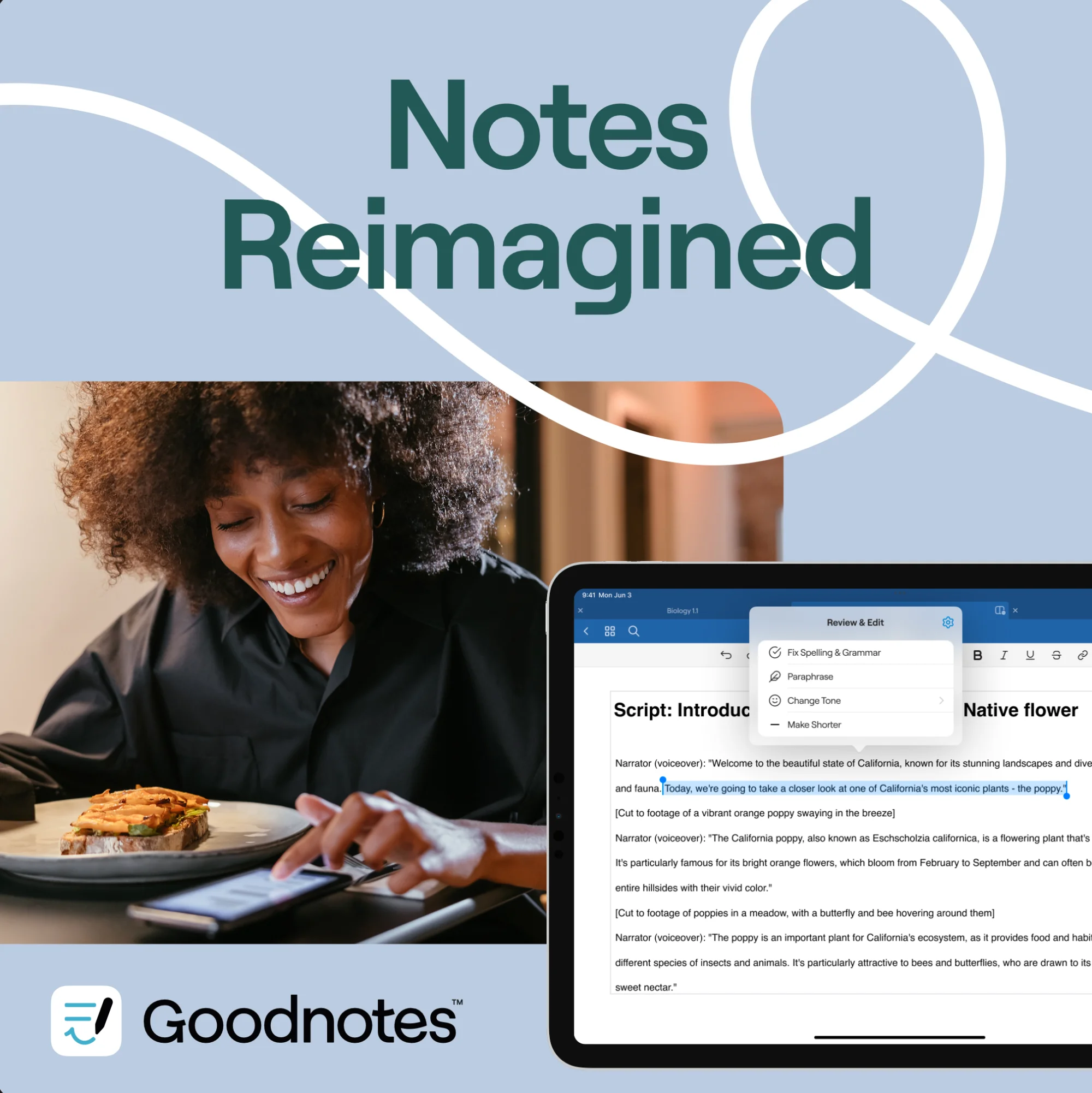
“Notes Reimagined”: concept, social strategy, influencer brief, press, and app and web copy — launched 9 August 2023.

How I ran it
One voice to the agency

A core brand squad reviewed each round within 24–48 hours; I consolidated it into a single set of feedback, with an action on every note.

Leadership in the room

Kept the CEO and VPs aligned through every round, from strategy sign-off to the final identity.

03The package

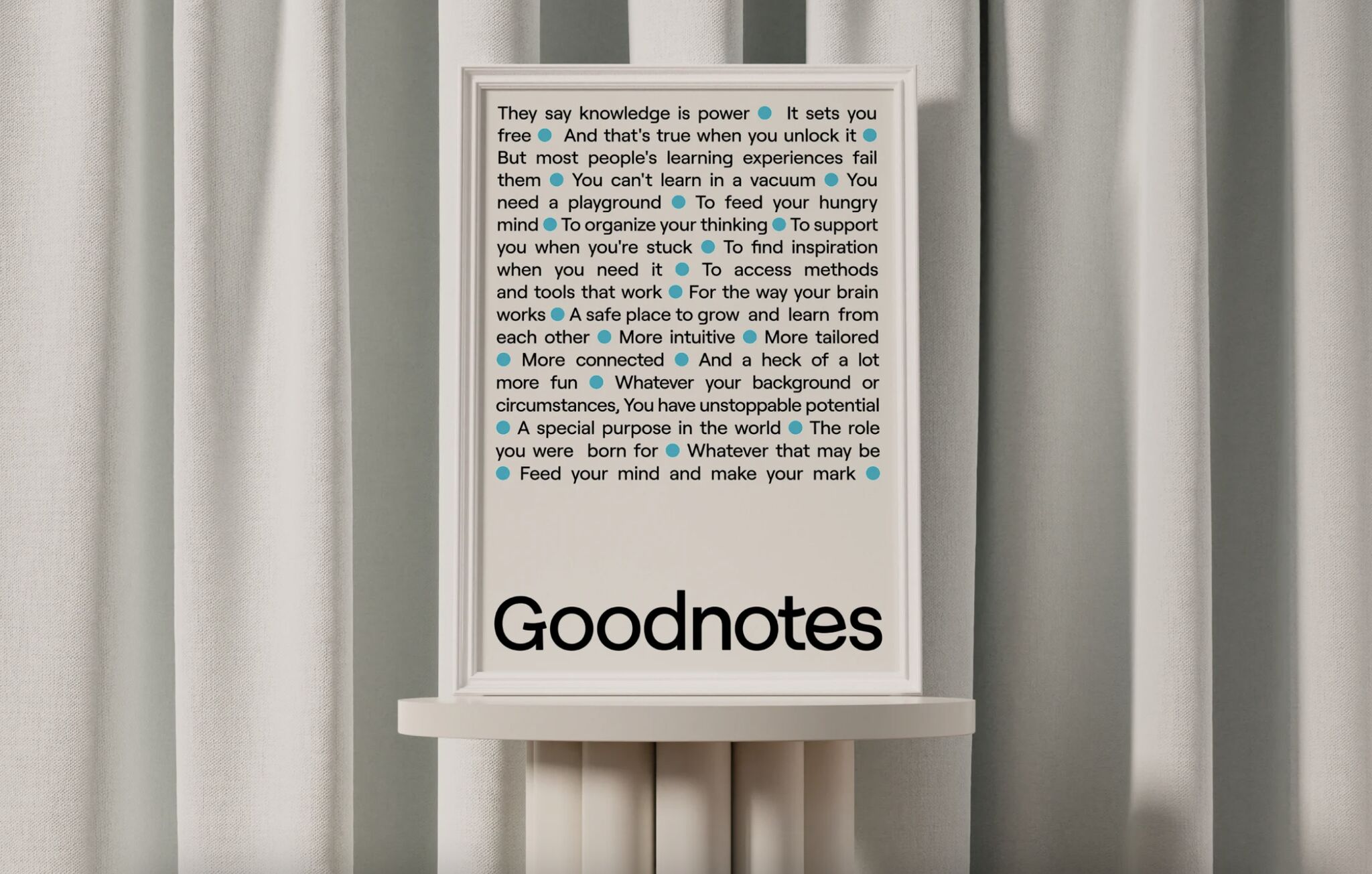
A full identity: logomark and wordmark, a named colour palette, an illustration system and a manifesto that gave the brand its voice — all documented in guidelines on Brandpad.

The new Goodnotes logo revealed
Manifesto poster in the new brand The new colour palette, named

From the guidelines on Brandpad: the rules that let the team use the brand without me.

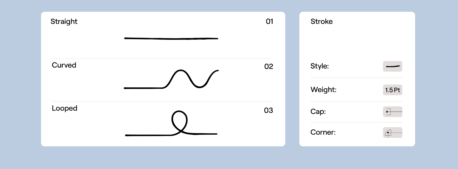
Journey line styles: straight, curved and looped, with stroke settings

Journey lines — straight, curved and looped, drawn to one fixed stroke.

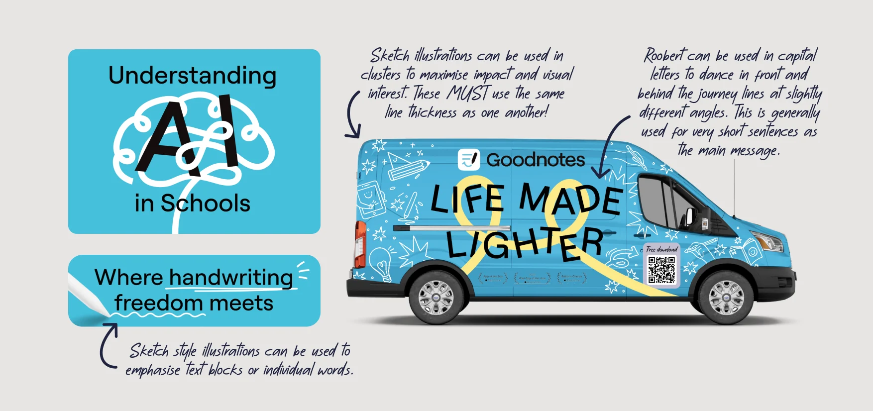
Sketch illustrations and journey lines working with typography

Sketch illustrations with type: emphasising words, clustering for impact, and letters weaving through the journey lines.

04Launch campaign

“Notes Reimagined” took the new brand public on 9 August 2023: concept, social strategy, influencer brief, press, and app and web copy.

Planned · Oct 2022With a feature launch

The original brief aimed to unveil the rebrand alongside a feature launch “for maximum impact”.

Moved · early 2023Time to roll out

Apple urgently needed evergreen assets, so Minh proposed holding the rebrand to give the rollout more time to prepare.

Launched · 9 Aug 2023With Goodnotes 6

The biggest product moment available: the new identity arrived with “the world’s first AI-powered digital paper company” and the new subscription model.

I argued for doing it all “in one big swoop”. Each brand change risks trust and recognition, and brands usually rebrand only every 7–10 years.

The Goodnotes 6 launch film, led by Ruby, our Video & Motion Lead, with the agency Carbon.

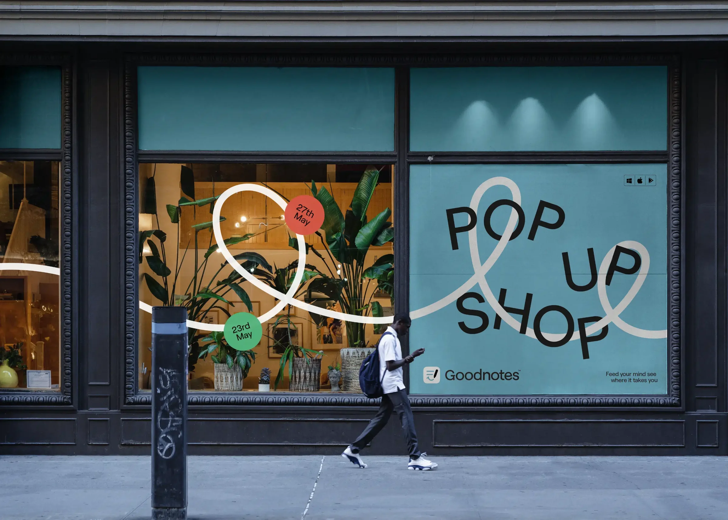
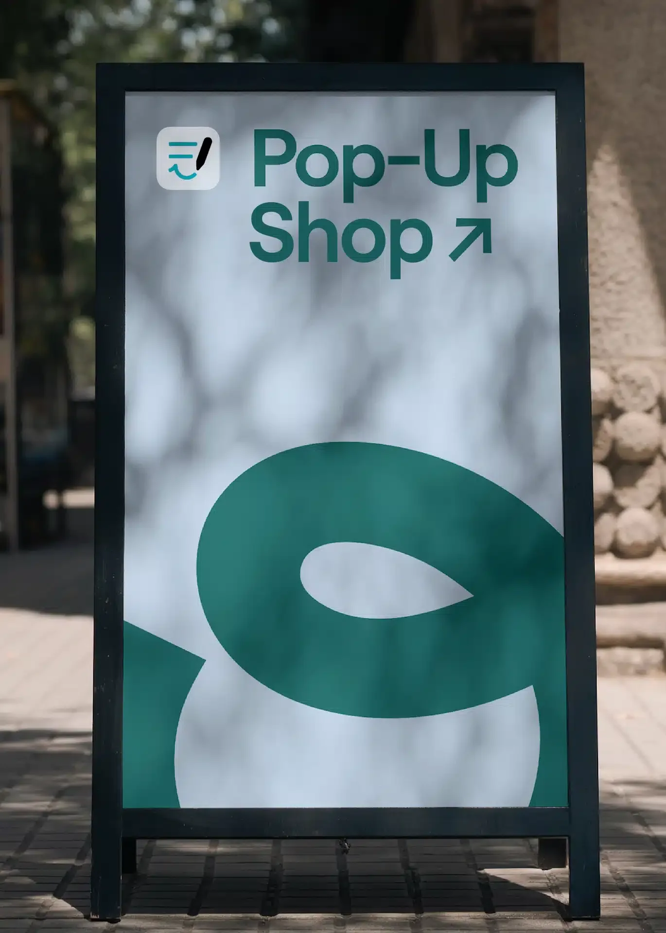
Pop-up shop window mockup in the campaign style Pop-up shop A-frame sign
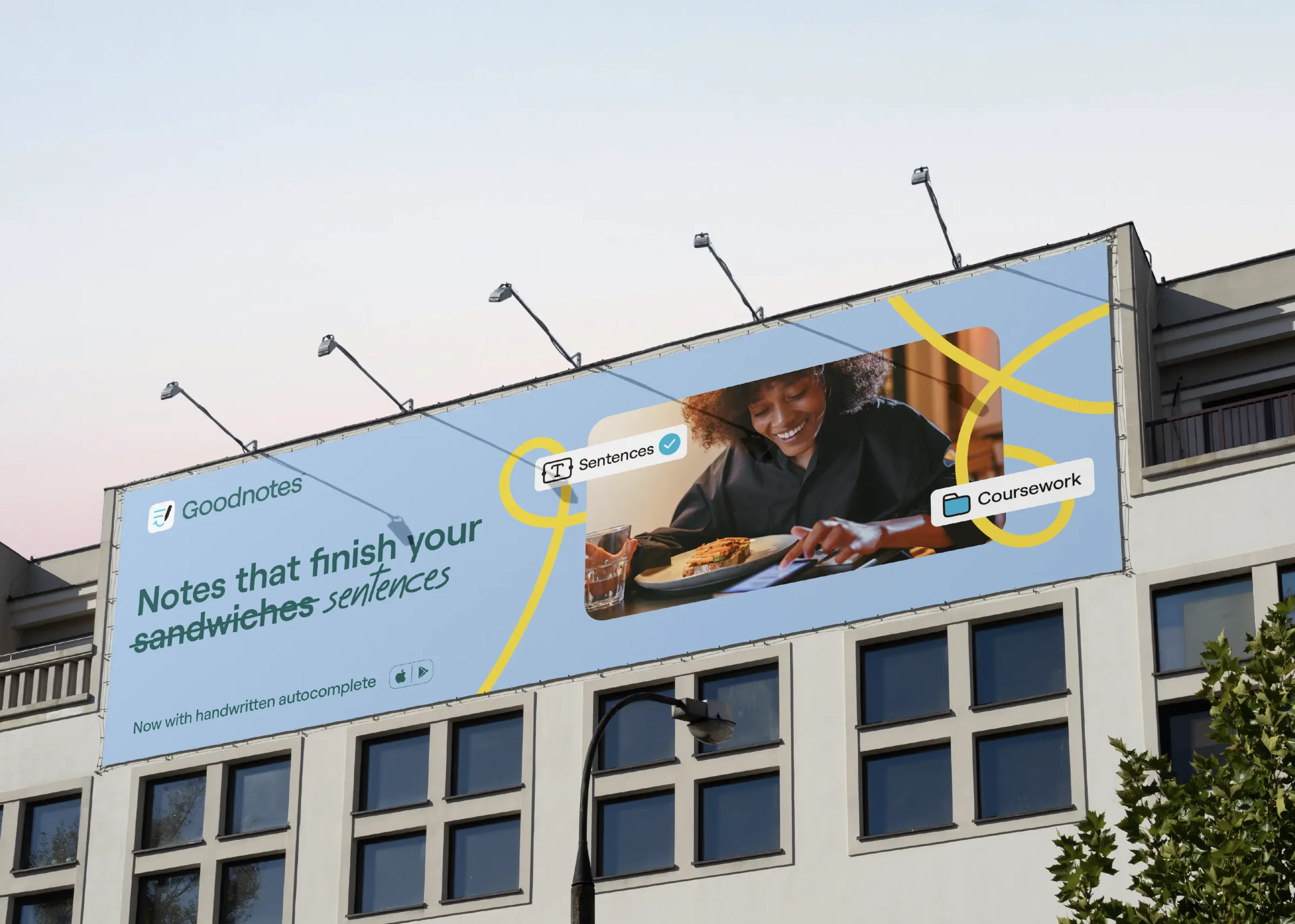
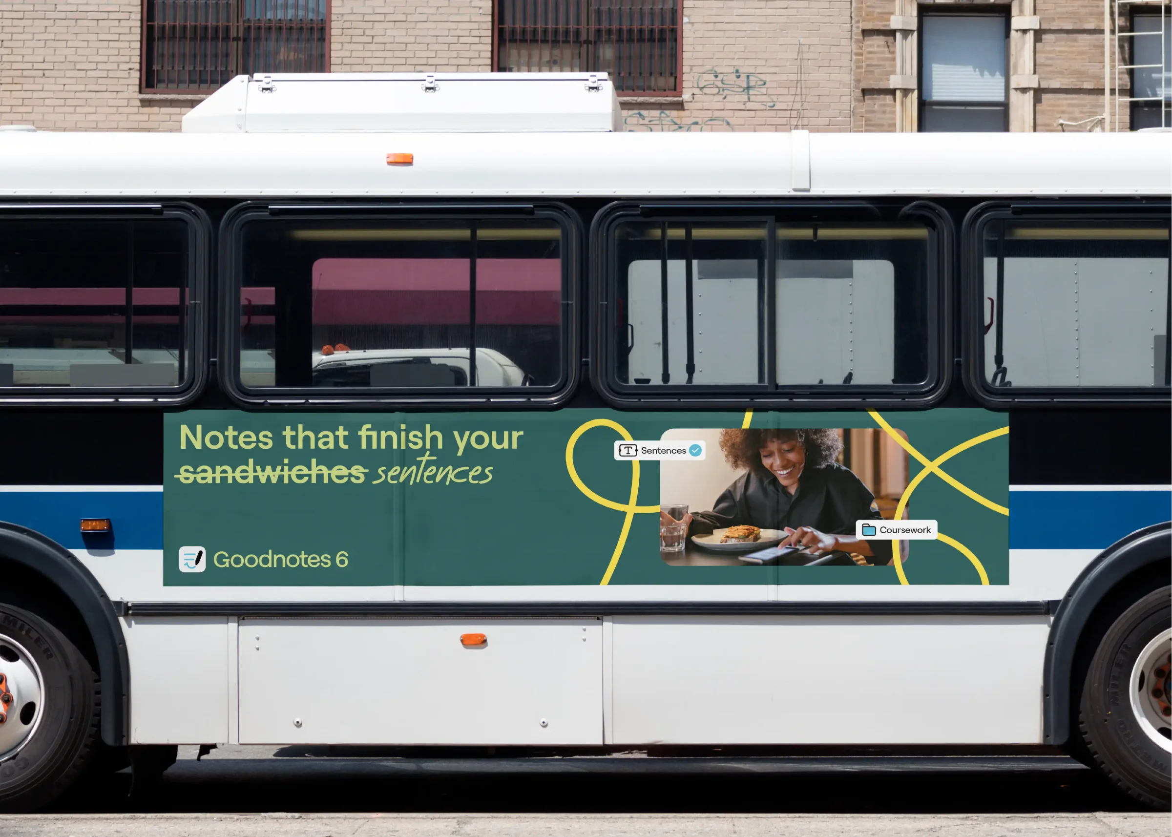
Notes Reimagined billboard mockup: Notes that finish your sentences Notes Reimagined bus-side mockup for Goodnotes 6 Feed your mind mural mockup on a building
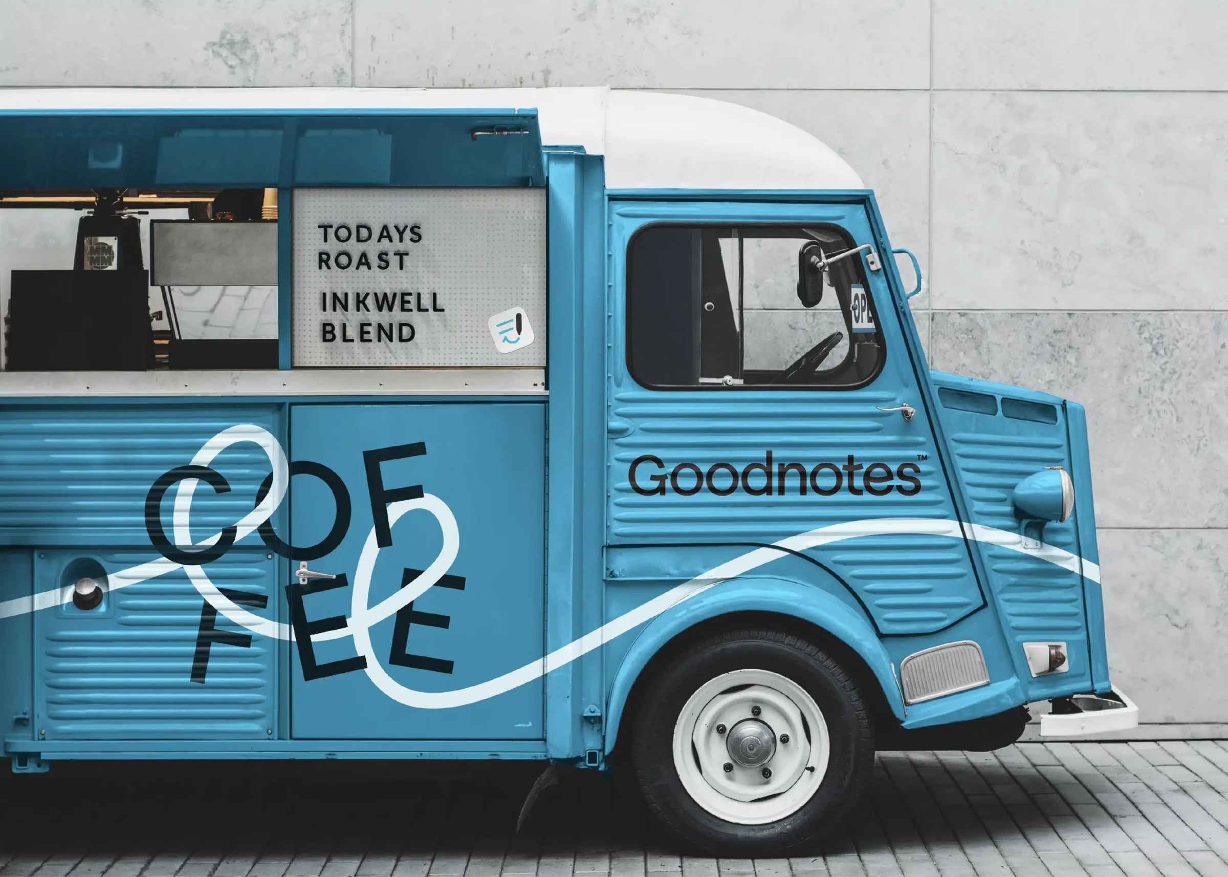
Goodnotes coffee van mockup

Out-of-home and digital concepts for the campaign. Images: Motto.

Notes Reimagined square social post, documents view Notes Reimagined square social post, AI writing tools
05Implementation

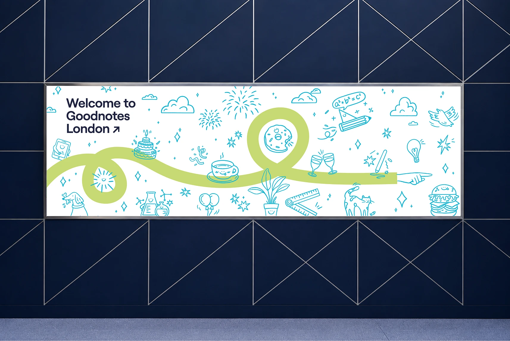
The toughest part, and the part I owned end to end: bespoke assets and scalable templates for marketing, environmental graphics across both offices, and brand education. Three workshops and a survey to see what had landed, then weekly office hours, an open door on Slack, and Notion guides and Loom walkthroughs — so the team could uphold the new standards without me in the room.

Welcome to Goodnotes London environmental graphic

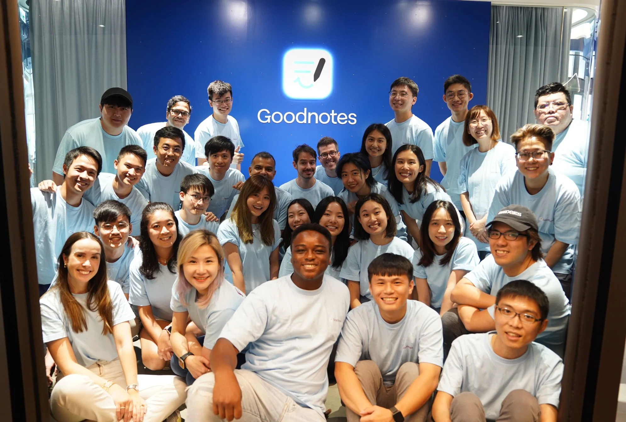
Launch day across both offices — Hong Kong and London — with the whole team in the new brand.

The Hong Kong team on launch day The London team on launch day
06Merch

The new brand off-screen: a range that put the mark and illustration system into people’s hands — team kit, creator packs and everyday objects.

Branded bottle and everyday kit in a locker
Branded hoodie Enamel pin set on a branded backing card
Related case studies
Goodnotes 2025 brand refresh
Goodnotes 2025 brand refresh →

The logo, colour and type refresh that launched with the September pivot.

Good Systems master brand →

The parent brand for Goodnotes and its sister products.

Back to the top Goodmeet brand →
Chrome form with lilac reflections
Case study 01 · IdentityGood Systems · 2026

Made for
good work.

Scope
Master brand, identity system, launch
Role
In-house lead — agency and stakeholder management, strategic input, in-house implementation and roll-out
Agency
Further
Year
2026

A master brand for the makers of Goodnotes and Goodmeet: one house, one line.

The parent brand above Goodnotes and Goodmeet, built to sit over both products without competing with either. I led it from the client side with Further, then rolled it out in-house.

Brief

Create a master brand for Goodnotes as it became one product among several.

My role

Managed the agency, bridged leadership and stakeholders, and led internal adoption. Made the LinkedIn launch assets myself.

Key decision

A parent brand that sits quietly behind its products.

Result

Good Systems and Goodmeet launched in about 10 weeks, direction to beta.

01 — Why a master brand

From one flagship app to a suite of products, and a much bigger vision.

The problem No shared home

Every launch had to borrow or fight the notebook-app identity.

The model A visible parent

The Meta model, not Alphabet: one story for users, talent and investors.

Why now A pipeline to launch

New products lined up, starting with Goodmeet, and a move into B2B.

“The rebrand marks an important pivot for our business, from a single product to a portfolio of products. It enables us to scale towards a much bigger ambition.”

Steven Chan
Steven Chan Founder & CEO, Good Systems
02 — The process

Twelve months from first brief to public launch. I ran it from the client side, from setting the brief and running the agency search through to launch.

Sep 2025 — Jan 2026Brief

Aligned leadership on a customer-facing umbrella brand, with Goodnotes as the flagship and productivity as the common thread. Budgeted it in the 2026 brand strategy, then stripped the brief back to give agencies room.

Feb — Apr 2026Agency search

Shortlisted and met five agencies, including Lexicon, Koto, Collins and Ragged Edge. Recommended Further, who won over the leadership team at pitch, then took them through due diligence, security and legal.

May — Jun 2026Strategy

Stakeholder interviews, then a working-group workshop to choose between six “brand ingredients”, the biggest milestone of the project. It landed on “Made for good work”.

Jul 2026Naming & identity

Several rounds of elimination settled on Good Systems. Trademark advice said the plain words needed a distinctive mark, which shaped the identity. Priority assets were delivered alongside Goodmeet.

Aug — Sep 2026Launch

Soft launch in beta on schedule, then the public launch with Goodmeet and the launch film.

A brand built for products that don’t exist yet. Every decision had to hold up for the next launch, not just this one.

How I ran it
Ran the agency search

Rewrote the brief to give agencies room, met five, and recommended Further, who won over leadership at pitch.

Kept momentum

Further began interviews while the contract was still in legal. The soft launch landed on schedule, even as the timeline tightened.

Steered the naming

Balanced leadership’s instinct, the agency’s push for a bigger name and team concerns, through to a name that passed every test.

03 — Strategy

A strategy simple enough to hold every product: one belief, one mission, four ways of working. Quietly confident, with the user’s own taste and judgement at the centre.

Value proposition Made for good work
BeliefClarity turns thinking into useful work.
MissionTurn good thinking into good work.
Better ideas Safe to think out loud

Space to listen, challenge and share rough thoughts without performing for the record.

Better judgement Make sound decisions

The source, context and detail preserved, so people can check what mattered.

Better alignment On the same wavelength

Meetings turned into clear updates, so the right people stay aligned.

Better outcomes Work that resonates

Clarity turned into actions, drafts, handovers and reusable outputs.

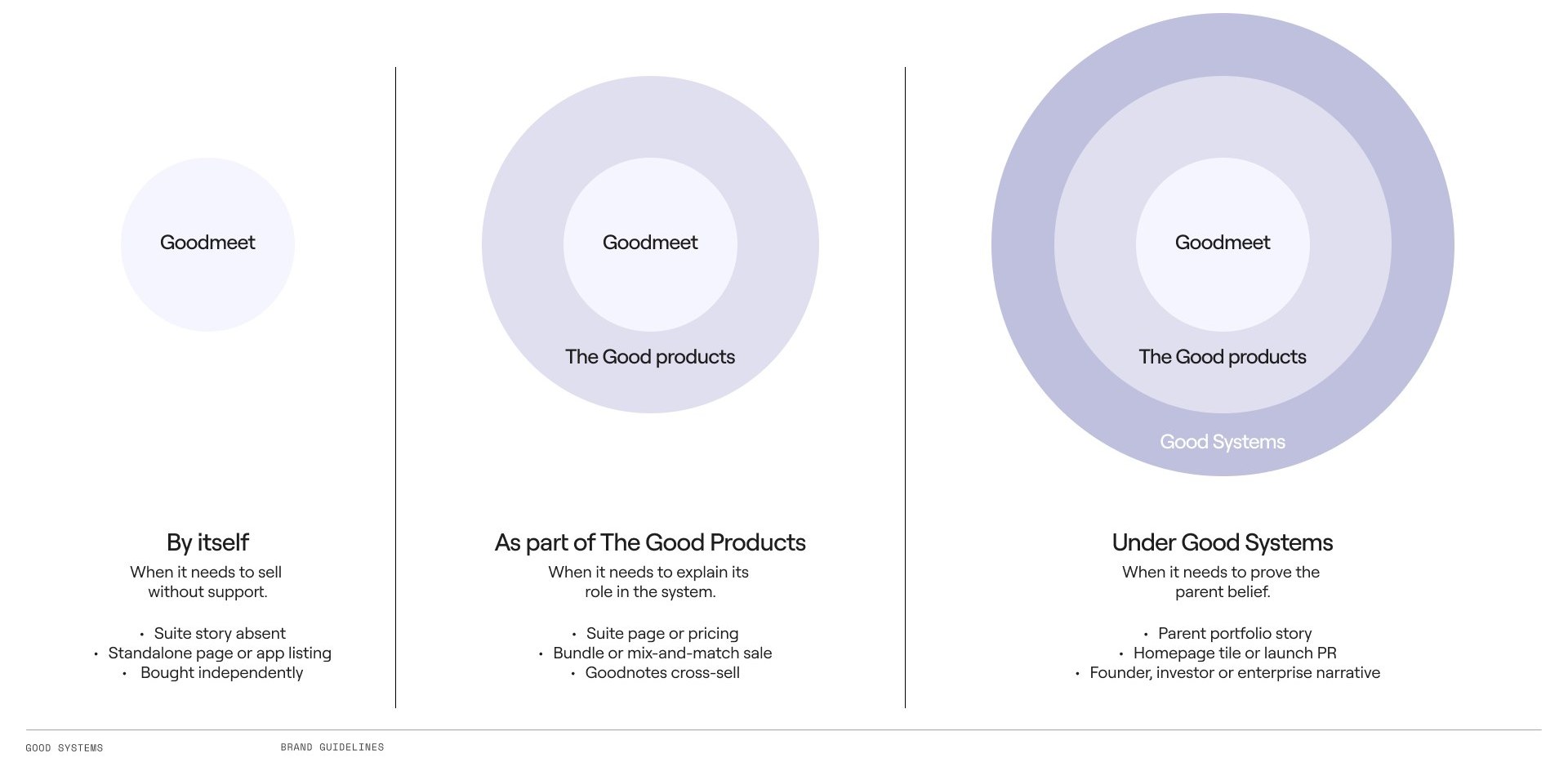
Brand architecture One product, three selling contexts.

The practical rule behind a house of brands: when a product sells on its own, when it explains its place among the Good products, and when it proves the parent belief. It gives marketing, product and PR one shared answer to “which brand leads here?”

Brand architecture: Goodmeet by itself, as part of the Good products, and under Good Systems
04 — Identity

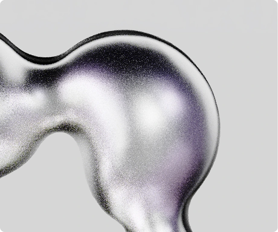
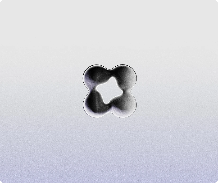
A mark with depth. Rendered in chrome and grain, the four petals become a material, not just a logo.

The Good Systems mark rendered as a grained 3D form
Line motifs

An expressive layer of drawn diagrams (orbits, stars, spirals, growth) that sits over the gradients. It gives each surface its own character while the mark and endline stay fixed.

Line motif 1
Line motif 2
Line motif 3
Line motif 4
Line motif 5
Line motif 6
Line motif 7
Line motif 8
Colour

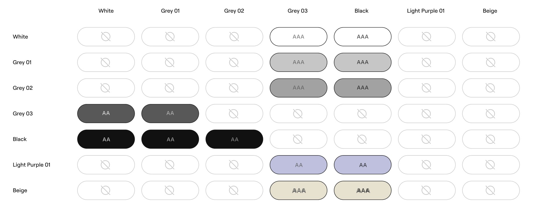
Clean, contemporary neutrals do the heavy lifting. Light purple and warm beige are used sparingly, to bring warmth and quiet connection to key moments.

White #FFFFFF
Grey 01 #C6C6C6
Grey 02 #A2A2A2
Grey 03 #585858
Black #111111
Light Purple #BFC0DE
Beige #E6E2CF
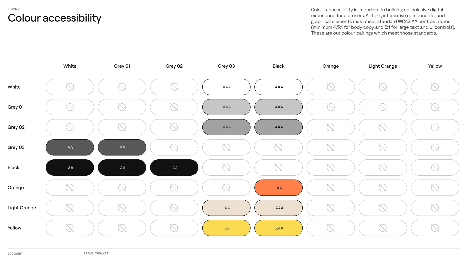
Accessibility built in

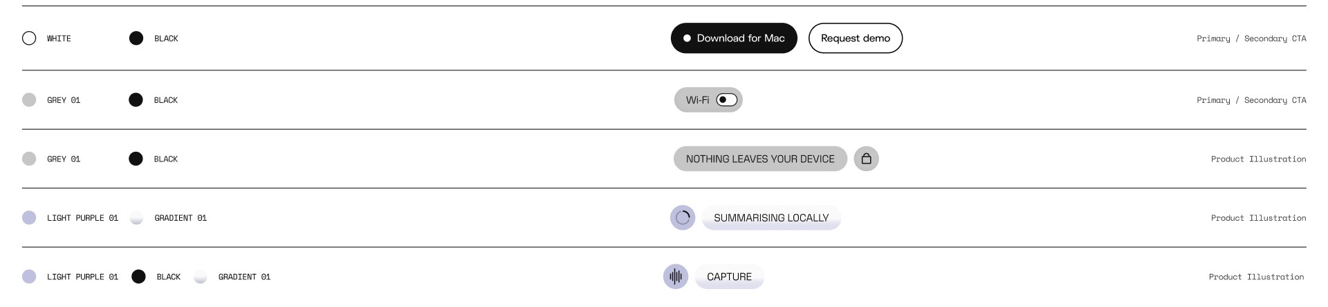
Every pairing is checked against WCAG AA, so product and marketing teams know which combinations are safe for text, controls and UI before they start.

Colour accessibility matrix showing which pairings meet WCAG AA and AAA Colour applied to UI elements: CTAs, toggles and product illustration chips
05 — Launch

Offices, screens and feeds at once: the thinking first, then the proof.

goodsystems Made for good work
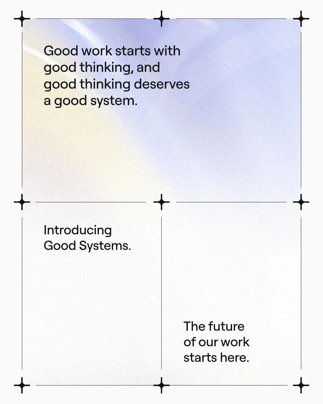
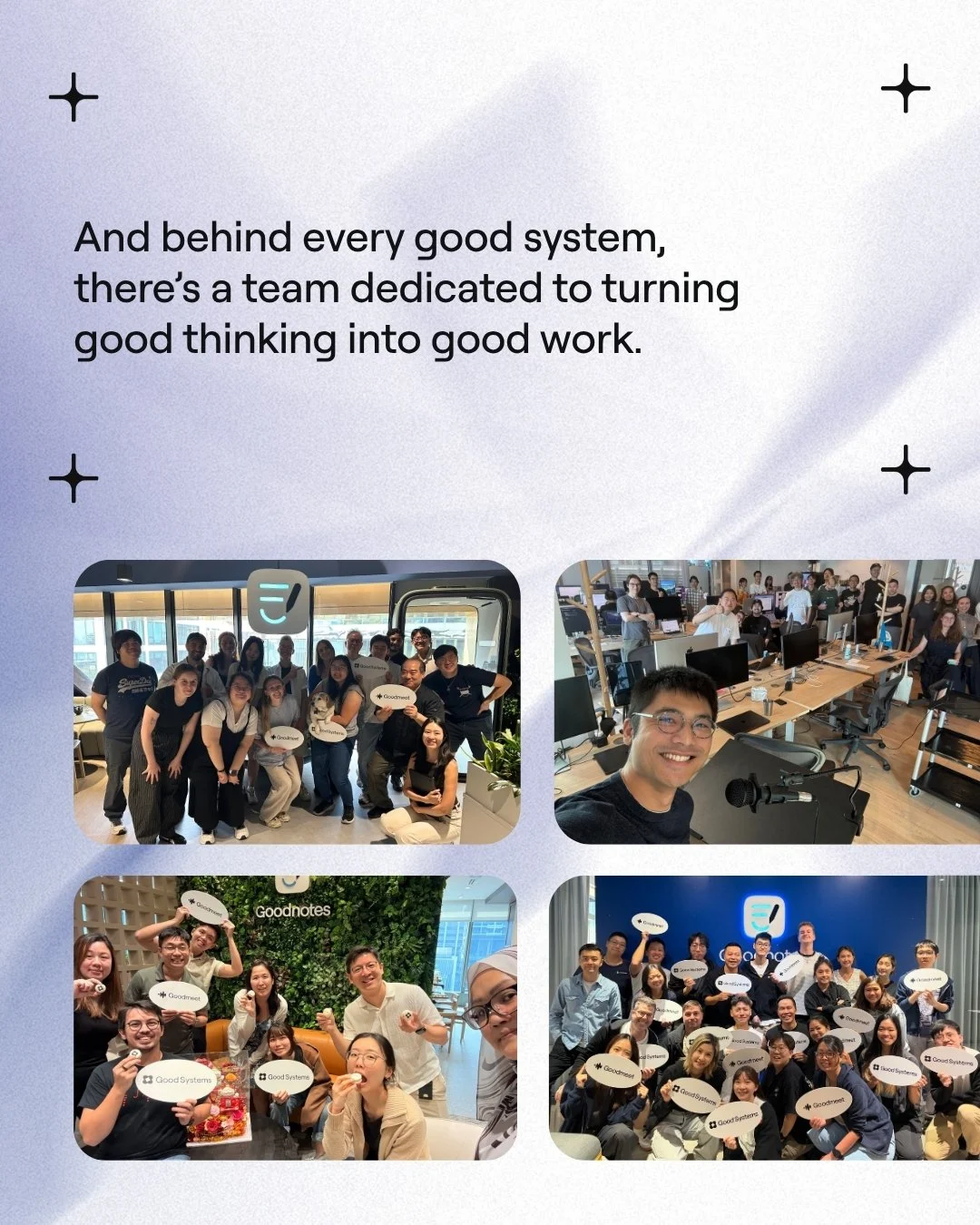
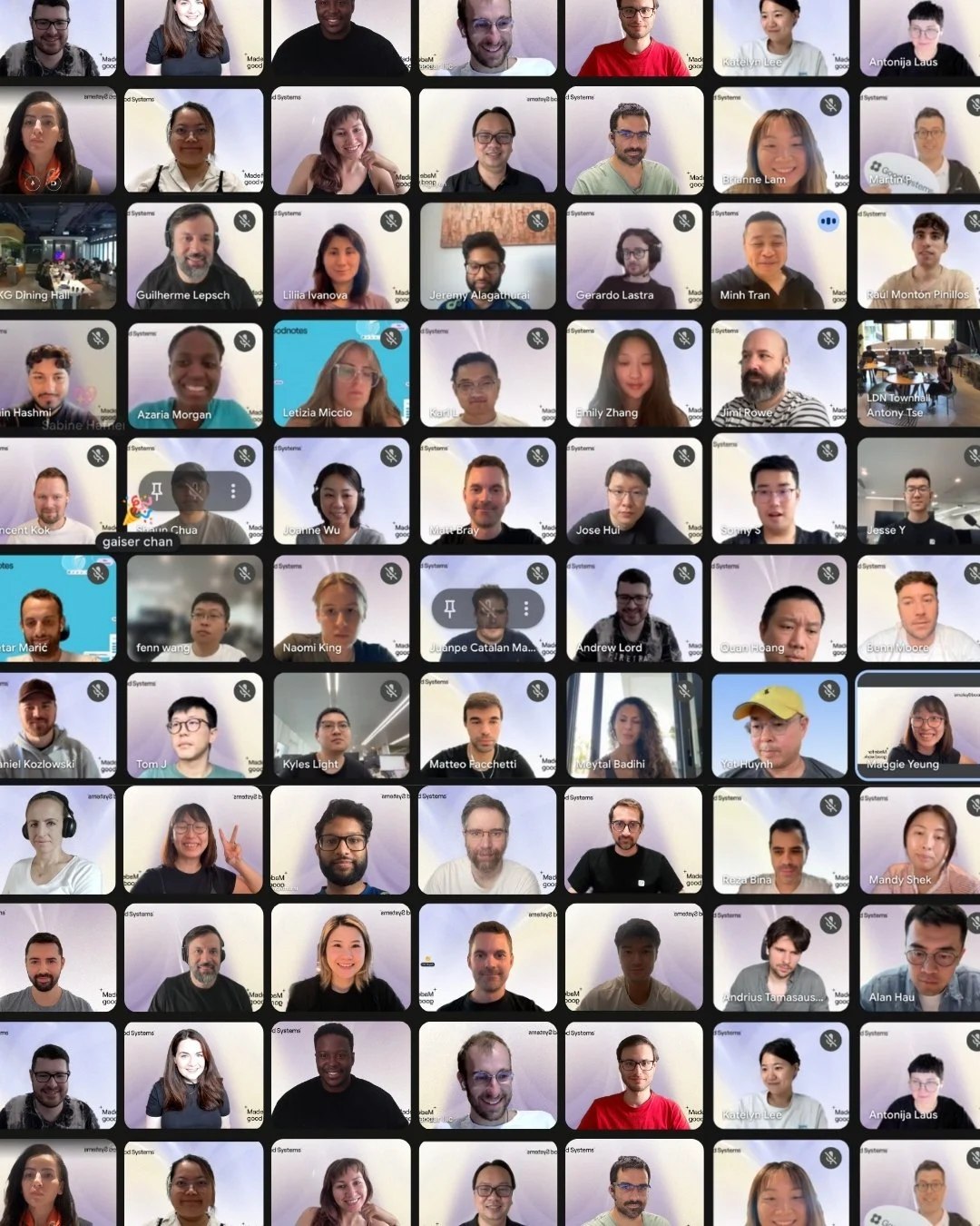
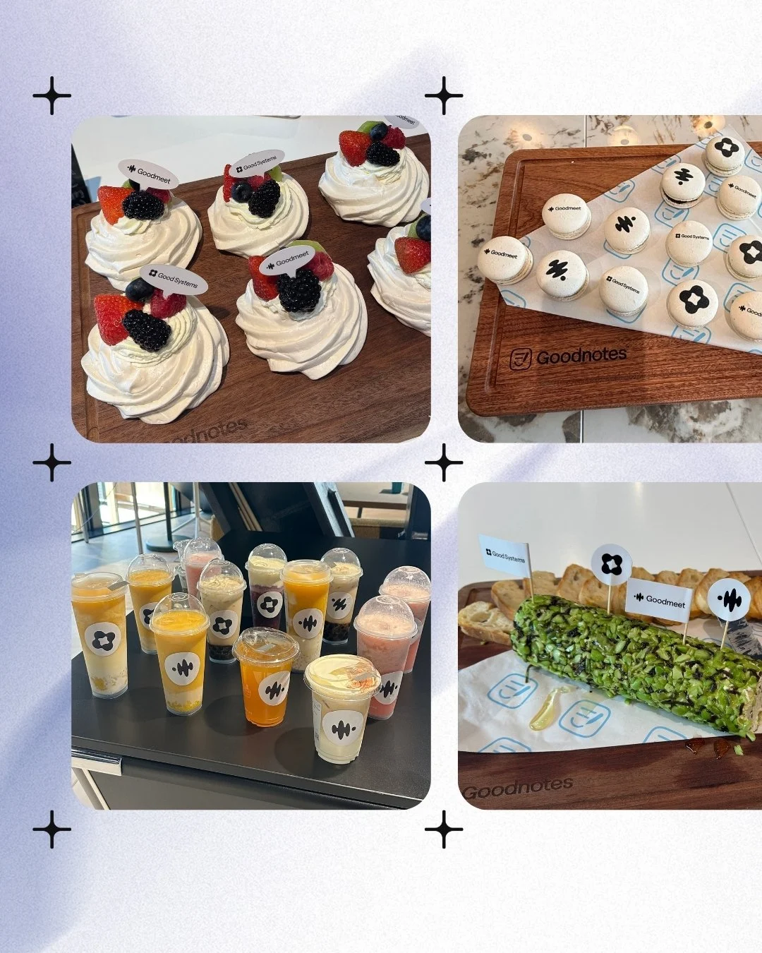
Introducing Good Systems — opening statement frame Team frame — behind every good system there is a team Company-wide call in the new brand Launch spread with branded picks and macarons
{{ gsCounter }}

Launch day ran across offices and screens at once — name cards on the food, the mark on every call background, and the endline doing the closing.

Across channels
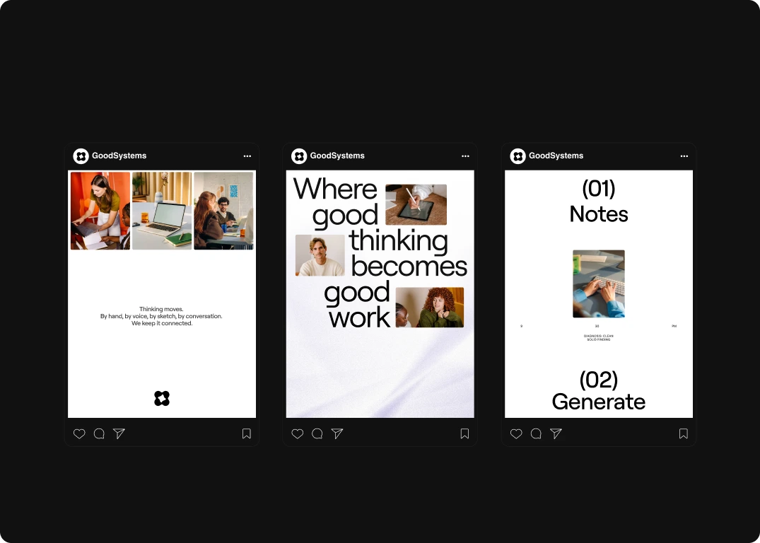
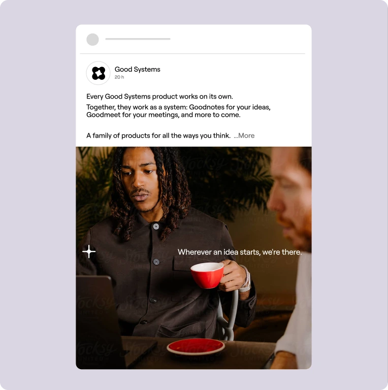
Three Instagram posts: Thinking moves, Where good thinking becomes good work, and a numbered product post LinkedIn launch post introducing the Good Systems family of products
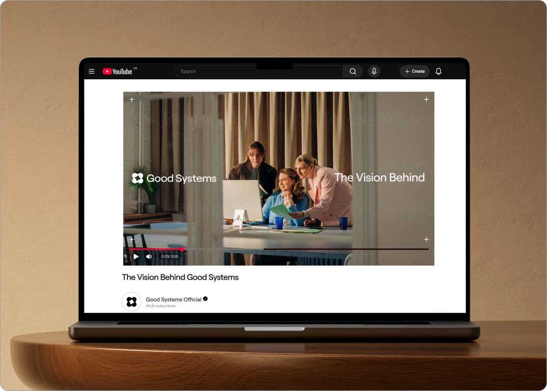
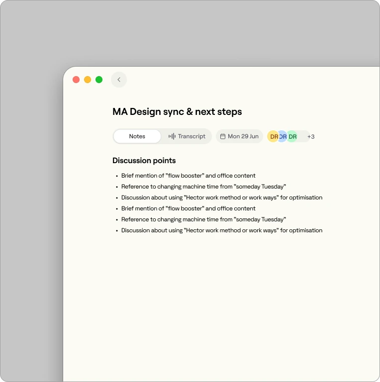
The Vision Behind Good Systems film on YouTube, on a laptop Goodmeet desktop app showing meeting notes in the system’s warm neutral

Social leads with the thinking, not the product: editorial type, candid photography and the sparkle as a quiet signature.

The brand film and product UI carry the same cues, so a viewer can move from YouTube to Goodmeet without a change in tone.

06 — Rollout

Further set the direction. We built it out in-house, across every touchpoint, in time for launch.

Its real value is structural: a framework that paves the way for a cohesive product suite, and a strategy that binds every product together.

Website

Designed, built and launched in-house.

Social

Launch assets from our creative studio.

Merch

A range made for the company offsite.

Environment

Brand graphics for the Paddington office.

Business cards

For the senior leadership team.

Email signatures

Rolled out company-wide.

07 — The site

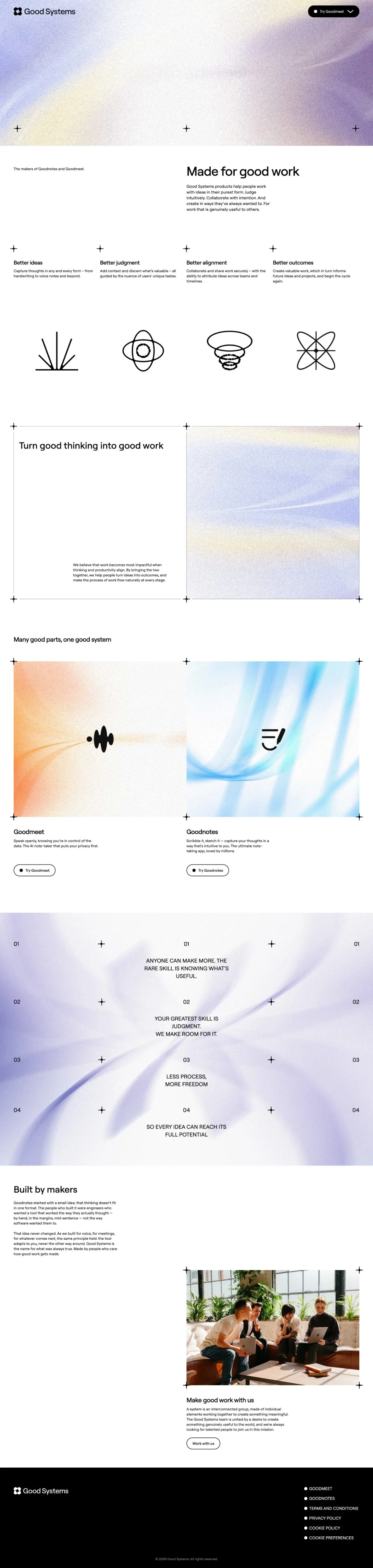
goodsystems.com — the house, the philosophy and both products in one place.

MacBook Pro
goodsystems.com homepage
Scroll inside the screen

The homepage puts the strategy to work: the four pillars as navigation, then a hand-off to Goodnotes and Goodmeet as parts of one system.

08 — Space & merch

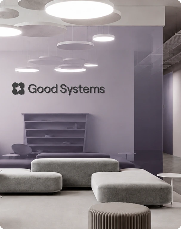
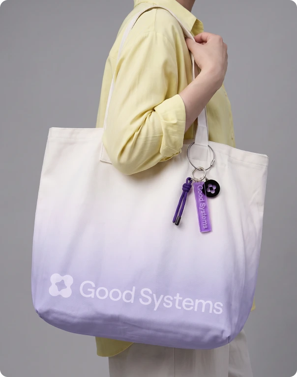
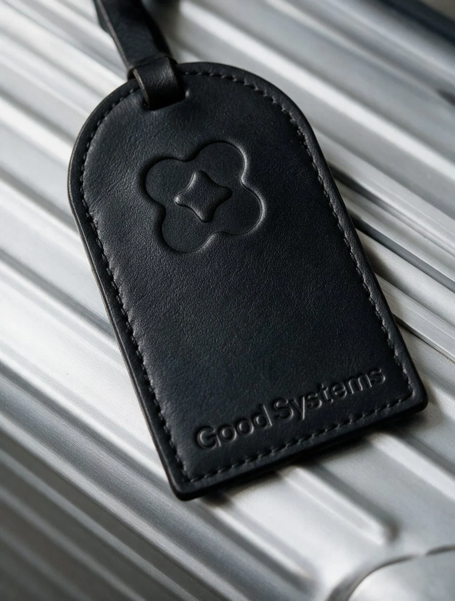
The brand off-screen: lilac in the office, a gradient on the tote. Merch is kept quiet and mostly black — the mark embossed, embroidered or printed small, with the wordmark held back for the reverse.

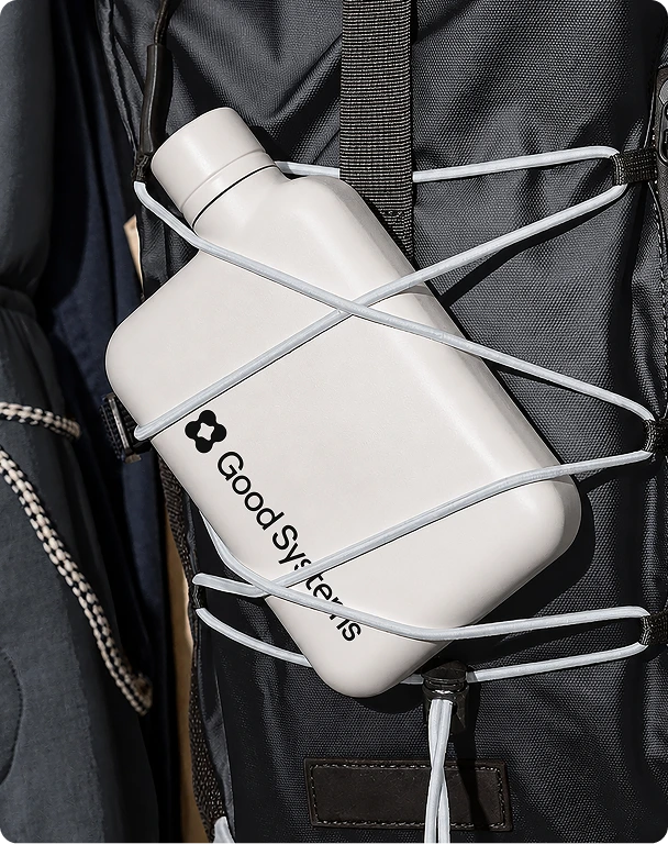
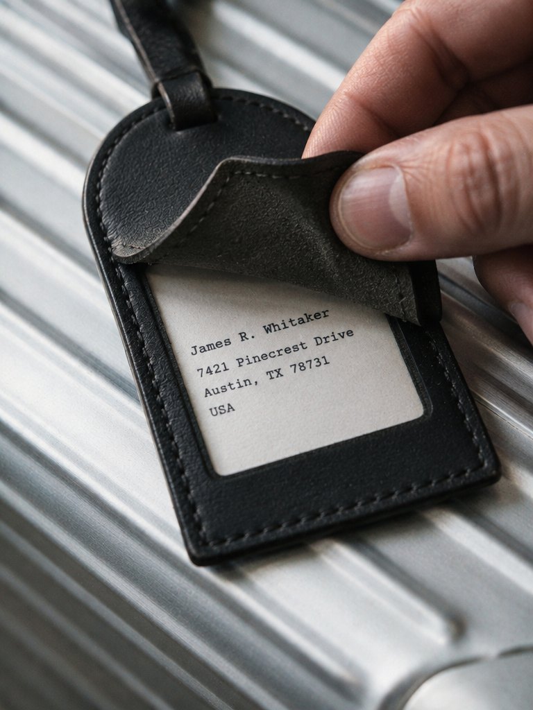
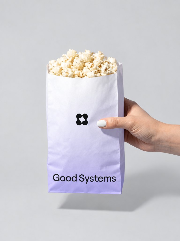
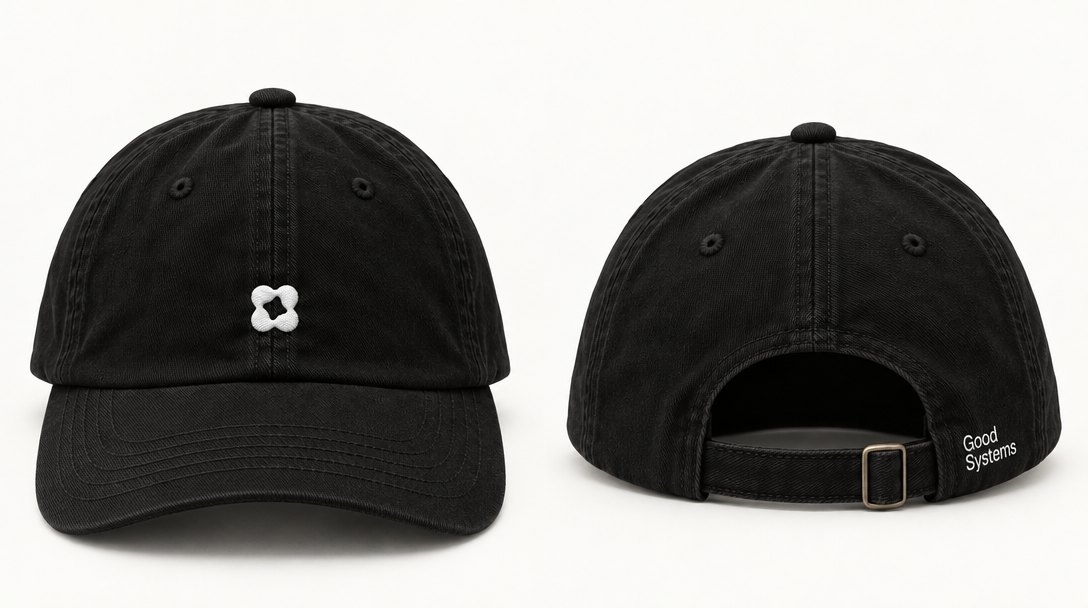
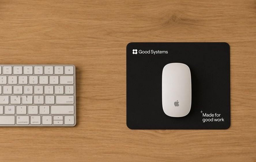
Good Systems wall signage in a lilac office lounge Lilac gradient tote with the Good Systems lockup and keyring White flask with the Good Systems lockup, strapped to a backpack Good Systems leather luggage tag with debossed mark and wordmark Luggage tag flap lifted to reveal the address card Popcorn bag with lilac gradient, mark and wordmark Black cap, front with embroidered mark and back with wordmark Black mouse pad with lockup and endline on a desk, beside keyboard and monitor
Related case studies
Goodmeet brand
Goodmeet brand →

A new product brand launched under Good Systems.

Goodnotes 2025 brand refresh
Goodnotes 2025 brand refresh →

The logo, colour and type refresh that launched with the September pivot.

Case study 03 · IdentityGoodmeet · 2026

Taking your notes.
Guarding your privacy.

Scope
Naming, identity, campaign, merch
Role
Client-side lead — agency and stakeholder management, strategic input, in-house implementation and roll-out
Agency
Further
Year
2026

An AI note-taker that puts your privacy first — and a brand that had to feel warm, calm and trustworthy saying it.

A fast add-on to the Good Systems master brand: six weeks with Further, from kickoff on 1 July to the full identity on 12 August, built to launch alongside the parent brand.

Goodmeet works like a cloud note-taker, but the processing happens on your device. The brand leans into that: a soundwave mark, a lowercase wordmark that sits with Goodnotes, and a soft white-to-orange gradient that reads as light rather than tech.

Brief

Give Goodmeet its own identity inside Good Systems.

My role

Managed the agency and stakeholders, led adoption, and chose the secondary fonts with product design.

Key decision

Build a system the Goodmeet team could run on their own.

Result

Launched alongside Good Systems; the Goodmeet team now handles most of its design.

01How it came in

Goodmeet — working name Paddington, the Meeting Assistant — started outside the agency’s scope and came back in as its own workstream.

20 AprA pilot

I asked Further to requote with one future product included, as a pilot for the master brand architecture.

27 AprKept in-house

We held the original scope. Brands for future products would be built in-house.

Late JunBack in scope

The Meeting Assistant returned to Further as a workstream of its own, running alongside the parent brand so the two could launch together.

02The brief

Further’s first presentation, the “Strategic Bridge”, set out the product truth, the market and the audience, and how the brand would work on its own, in the suite and under the parent brand.

Positioning

One positioning direction, three propositions for different contexts, and guidance on what to lead with in each.

Privacy first

It had to feel safer than the other AI note-takers. We reframed privacy as enabling safe expression and free thinking.

Brand model

A flexible product brand, following the “Good+” naming convention under Good Systems.

Design scope

Further took the website, social and out-of-home; the product team kept UI and UX.

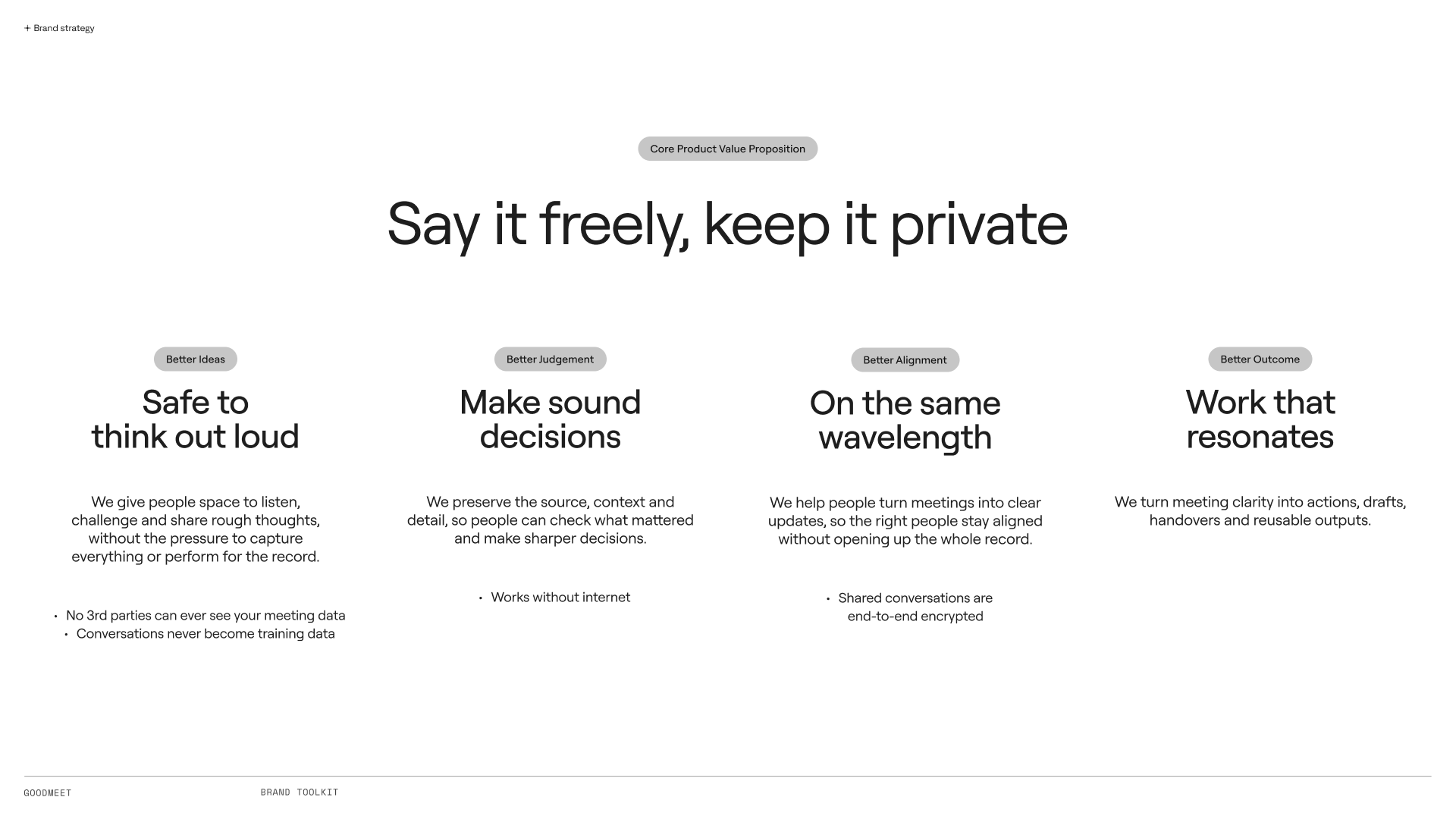
Core product value proposition: Say it freely, keep it private — with four pillars: better ideas, judgement, alignment and outcome

The core value proposition from the brand toolkit: “Say it freely, keep it private”, built on four pillars — better ideas, judgement, alignment and outcome.

03Six weeks

Naming, routes and priority assets ran in parallel with the master brand, with two reviews before the first delivery.

1 — 2 JulKickoff

Internal material, early builds and demos to Further; priority deliverables set: palette, a light homepage reskin and the wordmark.

14 JulNamed

After a week of debate over names in the “Good___” format, Steven and the product leadership confirmed Goodmeet.

23 — 24 JulRoute 2

Creative routes presented; Route 2 chosen with the CEO, product and design leads aligned.

31 JulPriority assets

Delivered, with the wordmark reworked to lowercase to sit with Goodnotes.

7 — 10 AugReveal and beta

Town hall reveal of Good Systems and Goodmeet, then a soft launch in beta. The full identity followed on 12 August.

23 SepPublic launch

Alongside Good Systems, with the launch video.

04The mark

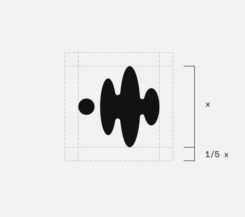
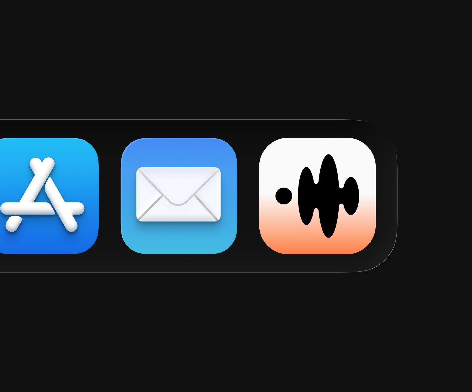
A soundwave mark: the shape of a conversation, reduced to a few soft forms. Fluid even when static, it comes to life in motion — and holds up from the app icon in the dock to a billboard.

Goodmeet mark and wordmark lockup on a grained orange gradient
Goodmeet soundwave mark Mark clear-space construction at one fifth of x Goodmeet app icon in the macOS dock
05A shared language

Parent and product side by side. Both marks are built from fluid, rounded forms, and both sit on soft grained gradients — Good Systems cool and lilac, Goodmeet warm and orange — so the family reads as one without the products looking the same.

The Good Systems symbol
Good Systems
The Goodmeet symbol
Goodmeet
06Colour and photography

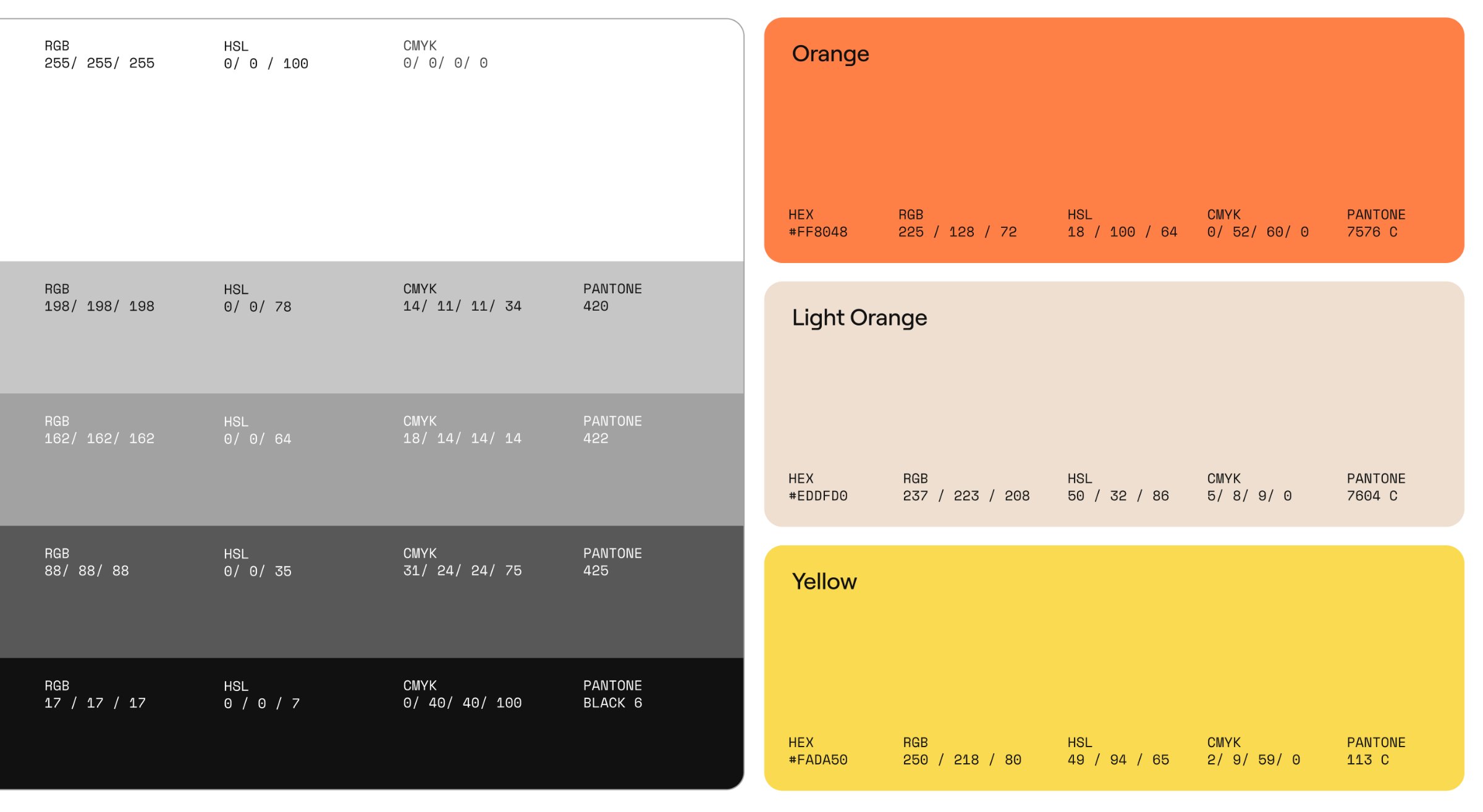
Greys and near-black do the work; orange, light orange and yellow bring the warmth. Photography stays candid, in warm natural light.

Colour palette: greyscale ramp with orange, light orange and yellow
Colour accessibility matrix: WCAG AA and AAA pairings across the palette

Colour accessibility: every pairing checked against WCAG AA, so the palette stays usable in product and campaign.

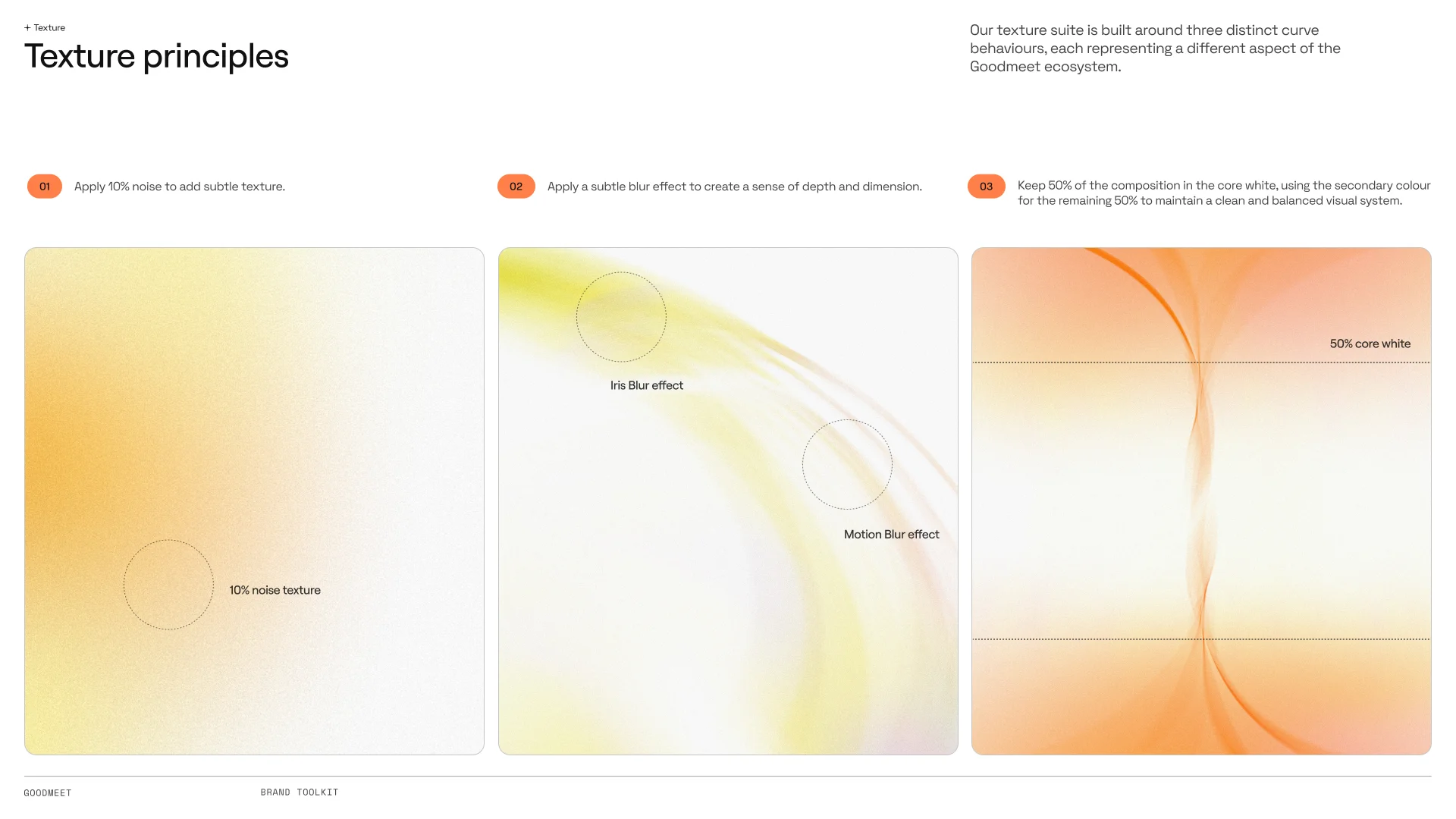
Texture principles: 10% noise, iris and motion blur, and 50% core white

Texture principles: 10% noise, a subtle blur for depth, and half of every composition kept in core white.

Photography direction: candid portraits in warm office light
07Campaign

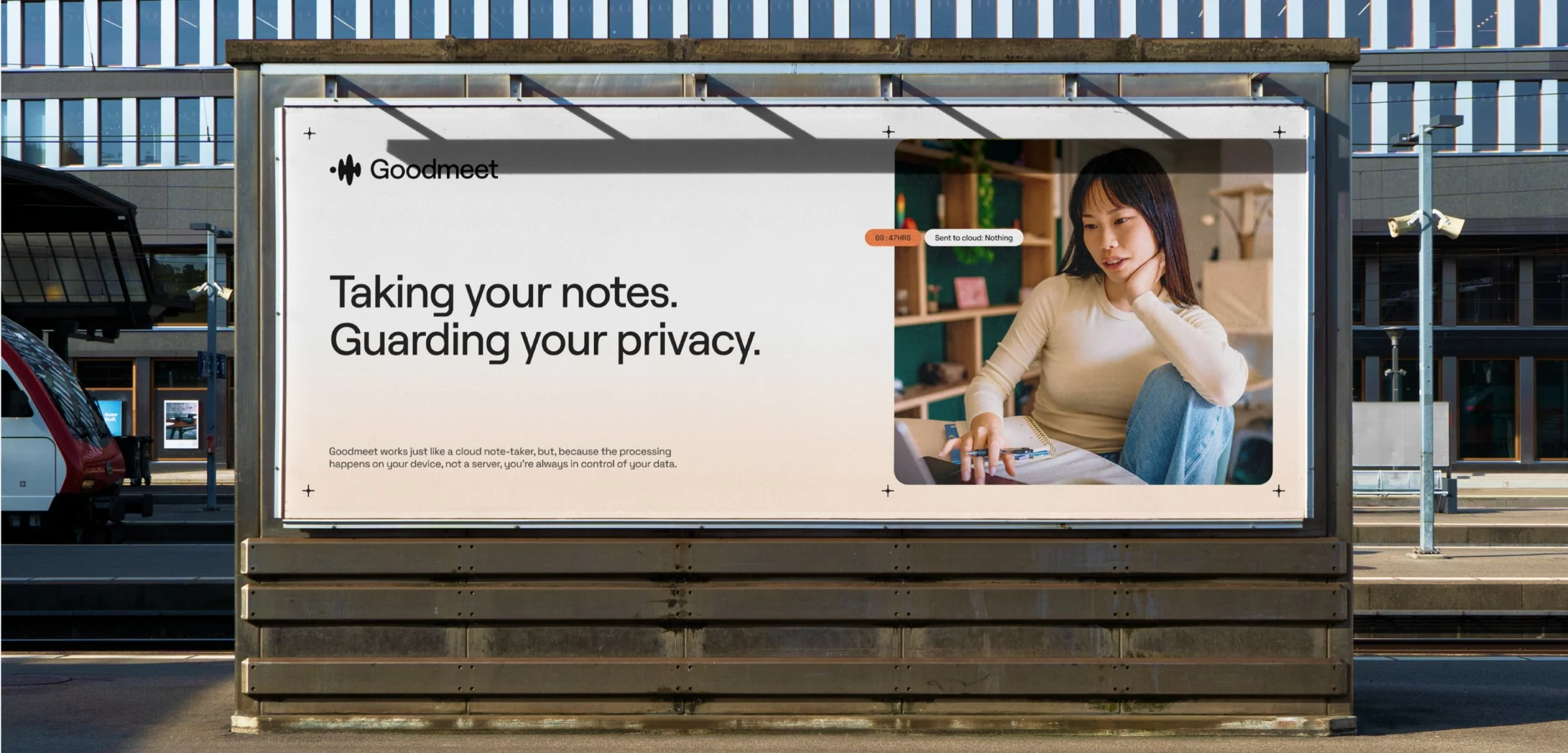
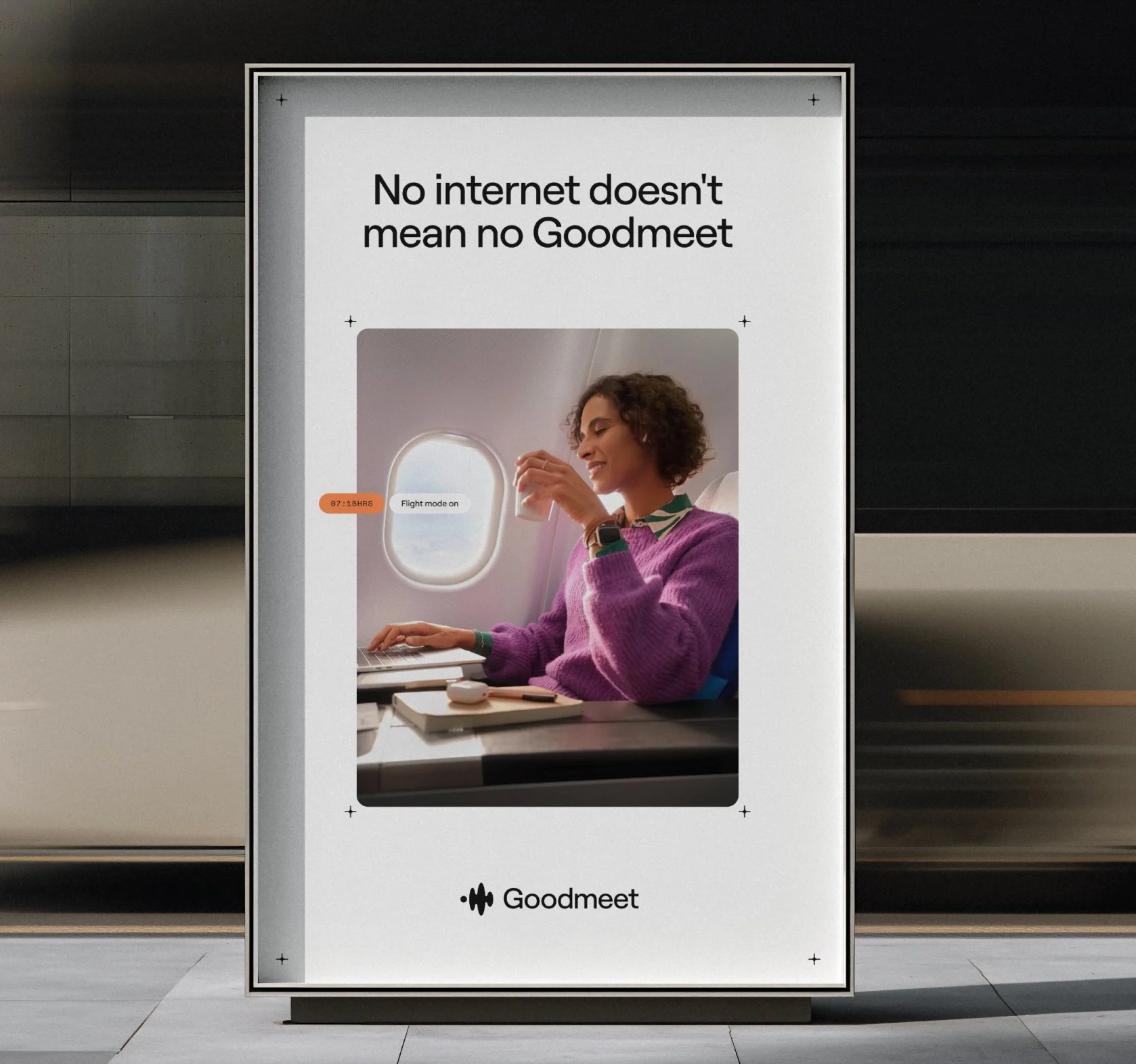
Out of home that sells privacy in plain words, with the timestamp chip as proof.

The launch video, released with Good Systems on 23 September.

Station billboard: Taking your notes. Guarding your privacy.Mockup
Portrait poster: No internet doesn’t mean no GoodmeetMockup
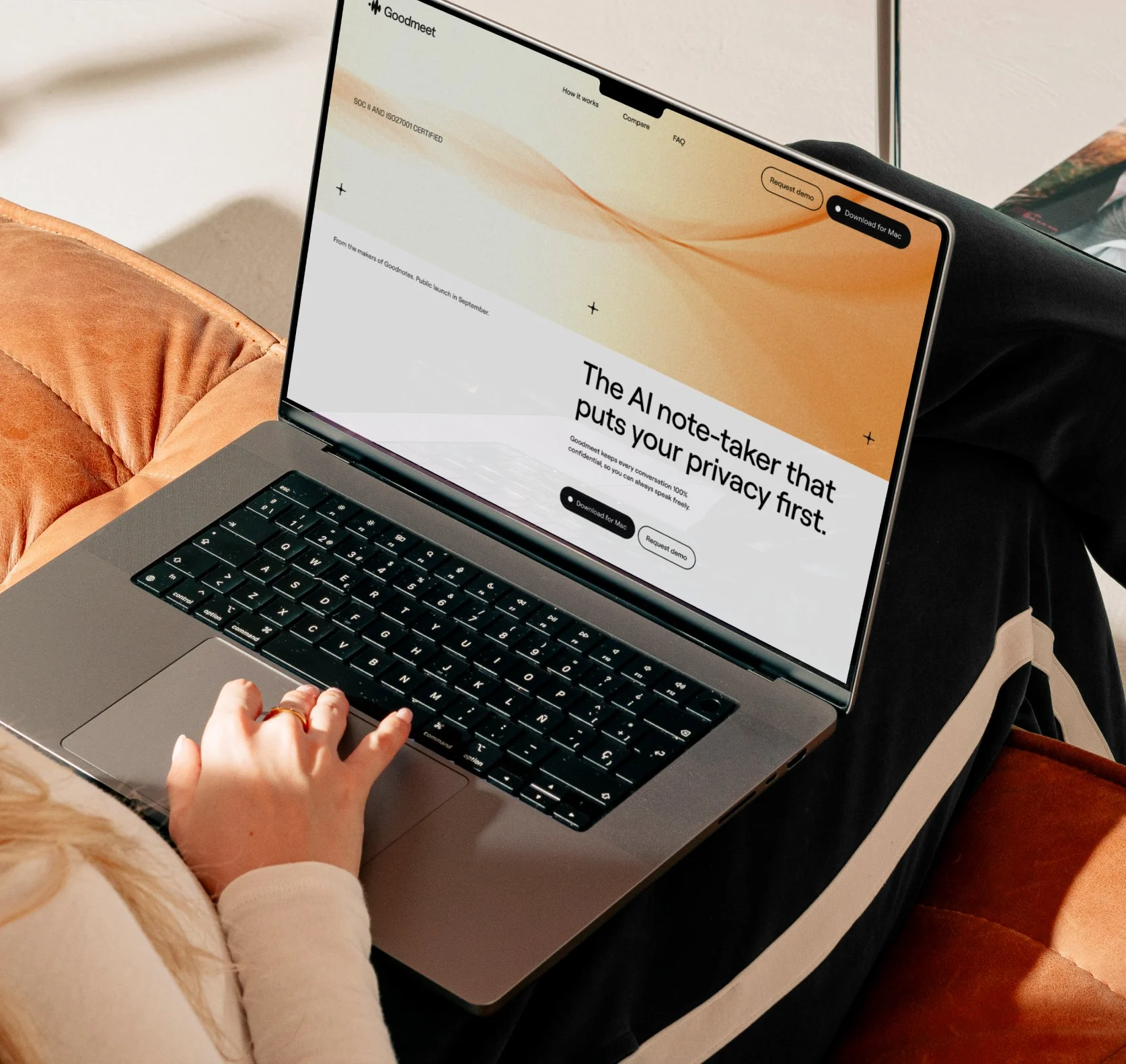
Goodmeet website on a laptopMockup

Billboard, poster and laptop images are mockups of campaign concepts, not photographs of live placements.

08Product and merch

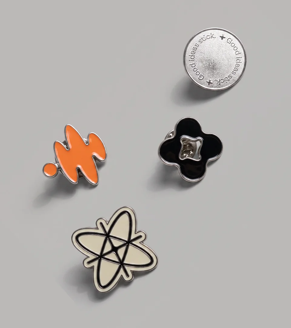
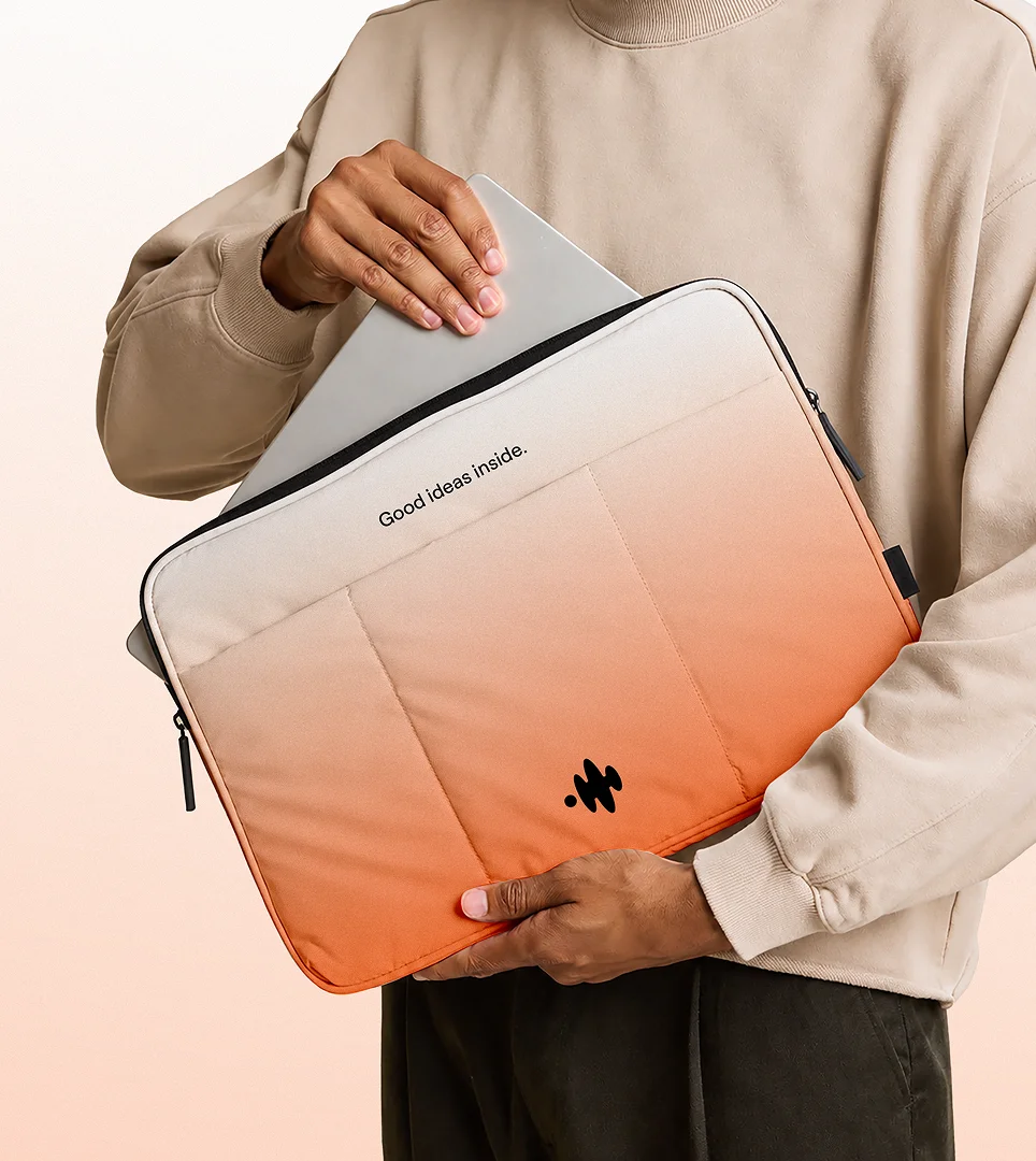
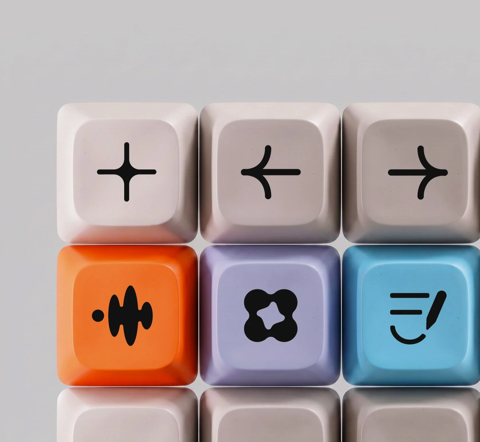
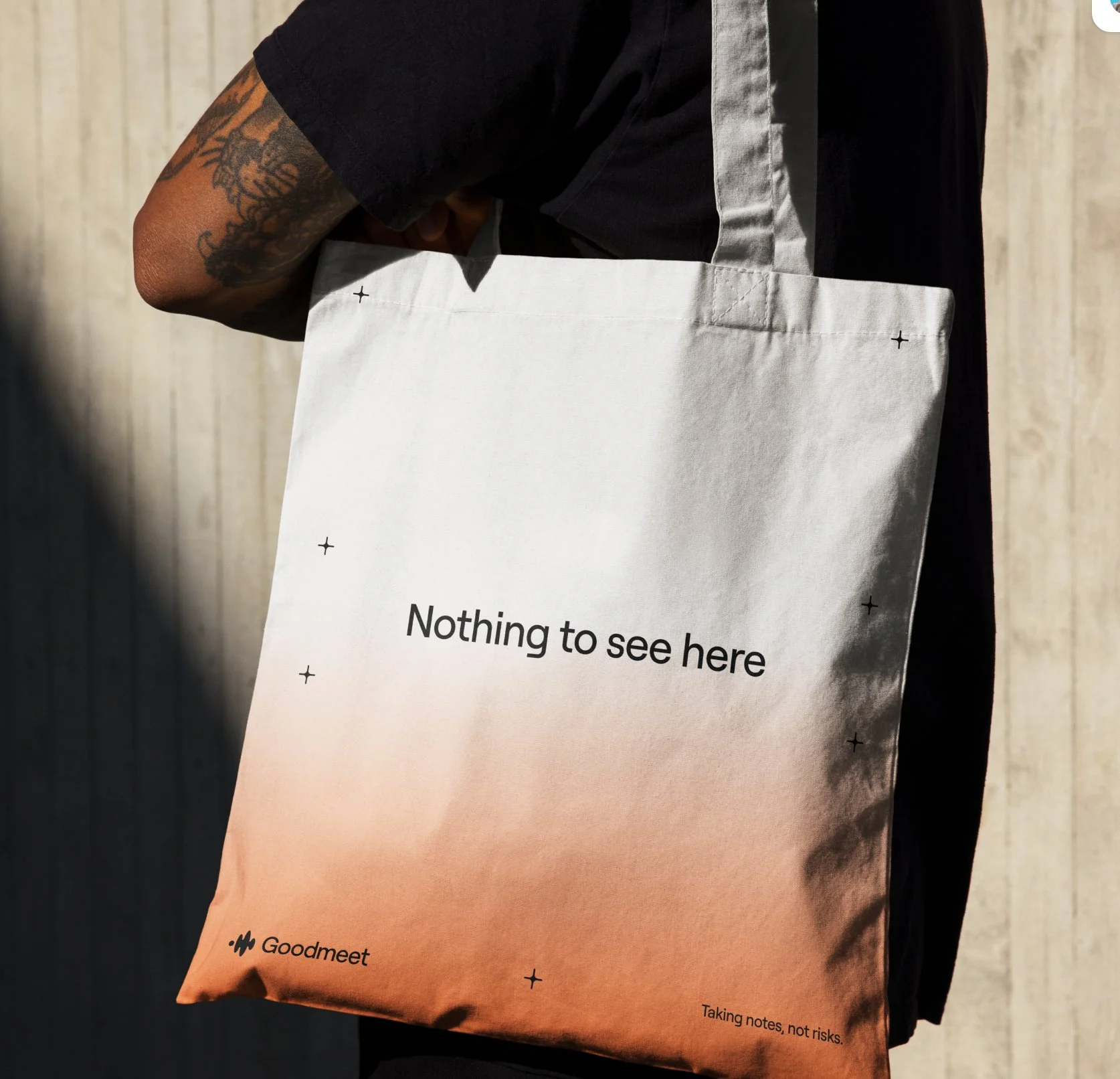
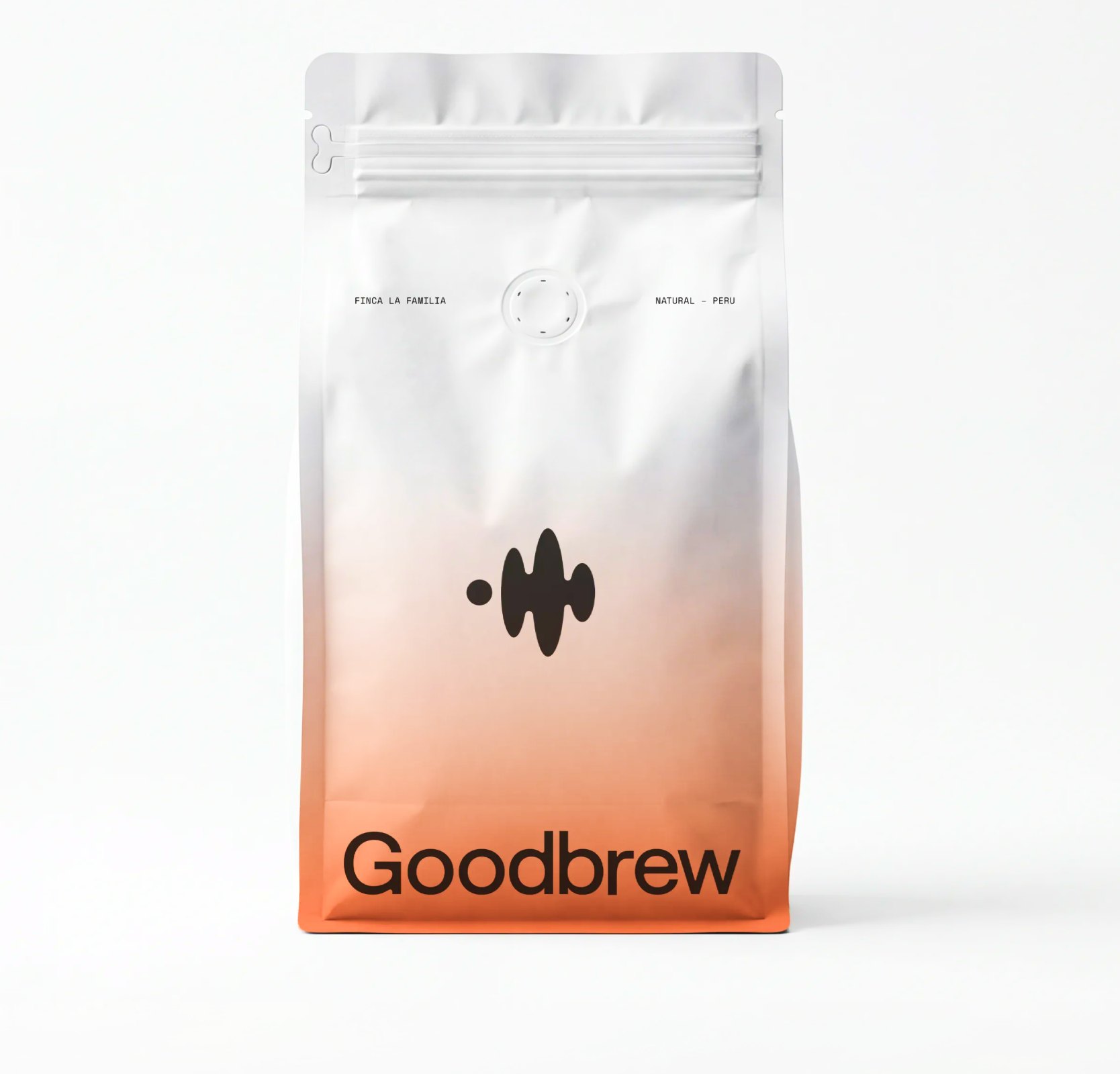
On the desk and out the door: pins, a laptop sleeve, a Good Systems keycap set, a tote and a house coffee.

Enamel pin set: the soundwave mark, a Good ideas stick badge and other brand forms Gradient laptop sleeve: Good ideas inside
Keycaps with the Goodmeet, Good Systems and Goodnotes marks Tote bag: Nothing to see here Goodbrew coffee bag with the Goodmeet mark
Related case studies
Good Systems master brand →

The parent brand for Goodnotes and its sister products.

Goodnotes 2025 brand refresh
Goodnotes 2025 brand refresh →

The logo, colour and type refresh that launched with the September pivot.

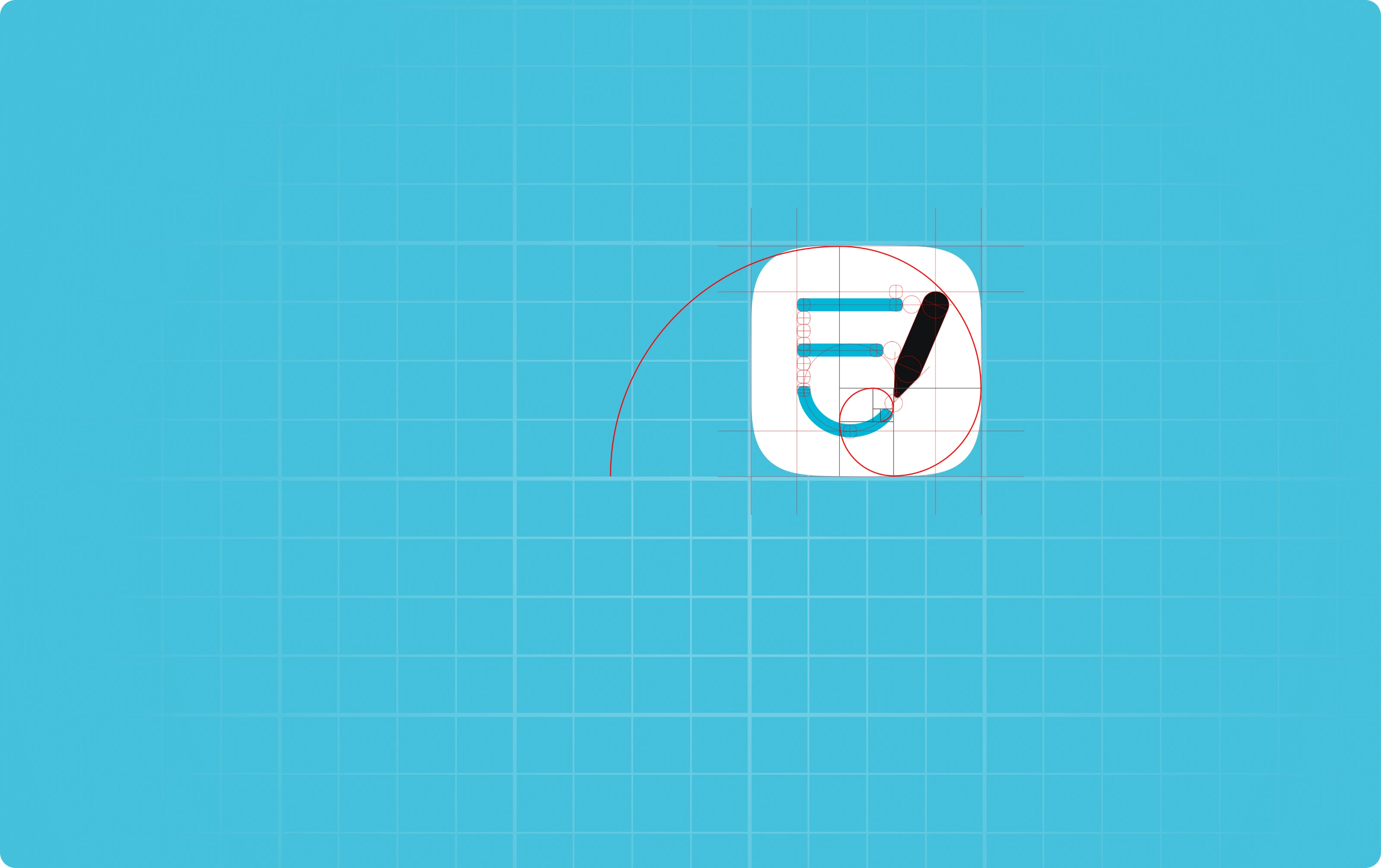
The redrawn Goodnotes icon on its golden-ratio construction grid, over the teal brand grid
Case study 04 · RebrandGoodnotes · 2025

Designing for evolution, not reinvention.

A refresh for Goodnotes as it grew from a notes app into a productivity platform.

Brighter colour, handwritten accents and a looser, more playful layer of stickies, cursors and diagrams, built to show thinking in progress rather than finished pages.

Brief

Refresh the brand in three months for the pivot to AI and professionals.

My role

Hands-on: redrew the logo, rebuilt the palette and directed Goodnotes Hand.

Key decision

Evolve, don’t reinvent: keep the smile, the stylus and the equity.

Result

Concept to live in 5 weeks, then adopted by ASO, CRM and product design tokens.

What the brand launched into · September 2025
75MImpressionsThe biggest launch campaign to date.
+61%B2C ARR YoYYear-on-year in launch month.
25MMonthly active usersA record high in September.
+104%iPad search impressionsYear-on-year in October, the first full month after launch.
01Why refresh

In September 2025 Goodnotes pivoted from a student note-taking app to an AI-powered platform for professionals as well as students. The brand had to move with it.

A new kind of product

Essential and Pro plans, more AI, a B2B focus and more platforms. The brief: signal the shift “to creating the best medium for Human and AI collaboration”.

Beyond the stylus

Goodnotes was expanding beyond stylus, beyond Apple and beyond students, so the mark could no longer be designed around a pen on a rounded square.

Refresh now, rebrand later

The choice was a refresh for September or a fuller rebrand by year end. We refreshed for September, and I was asked to run it: strategy, logo, colour and the launch campaign.

What came next

The refresh set up the 2026 Good Systems master brand, once Goodnotes was one product among several.

02The logo

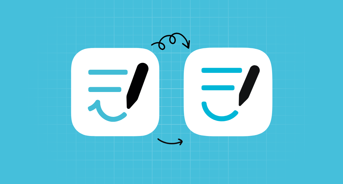
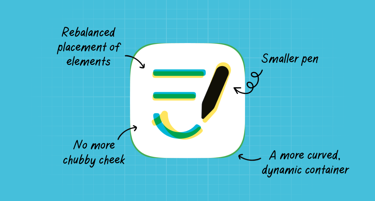
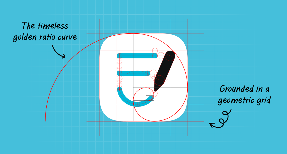
Redrawn by me as a confident evolution, not a reinvention. The smile stays as the brand anchor; the “chubby cheek” goes; the pen gets smaller, shorter and a slightly lighter off-black; the container takes a softer, more curved shape — all on a golden-ratio grid, built to work beyond the stylus and the rounded square.

The previous Goodnotes icon beside the refreshed icon
Annotated overlay of old and new icons: rebalanced placement, smaller pen, no more chubby cheek, a more curved container Icon construction on a geometric grid with a golden-ratio curve
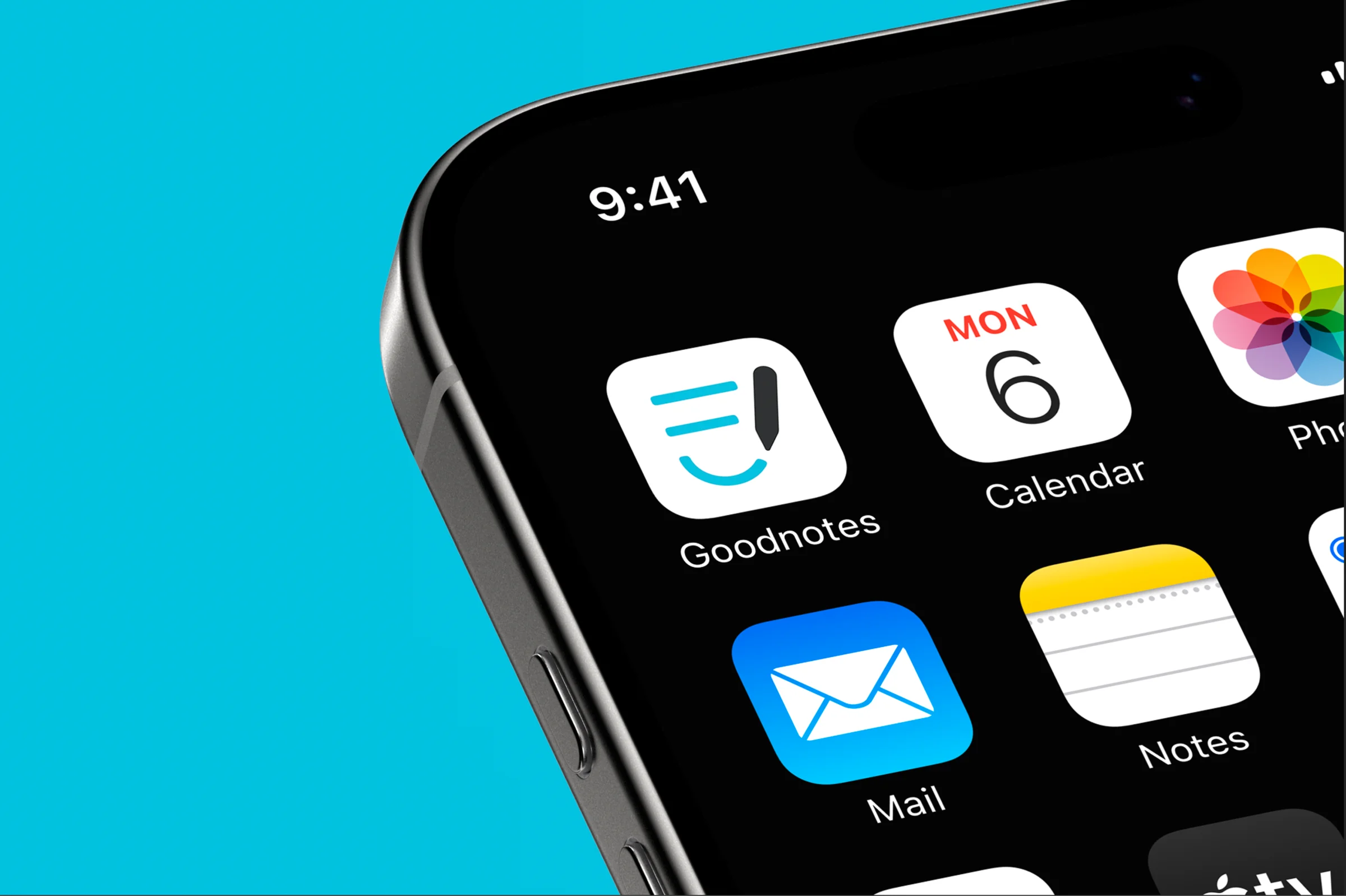
The refreshed Goodnotes icon on an iPhone home screen
03Colour

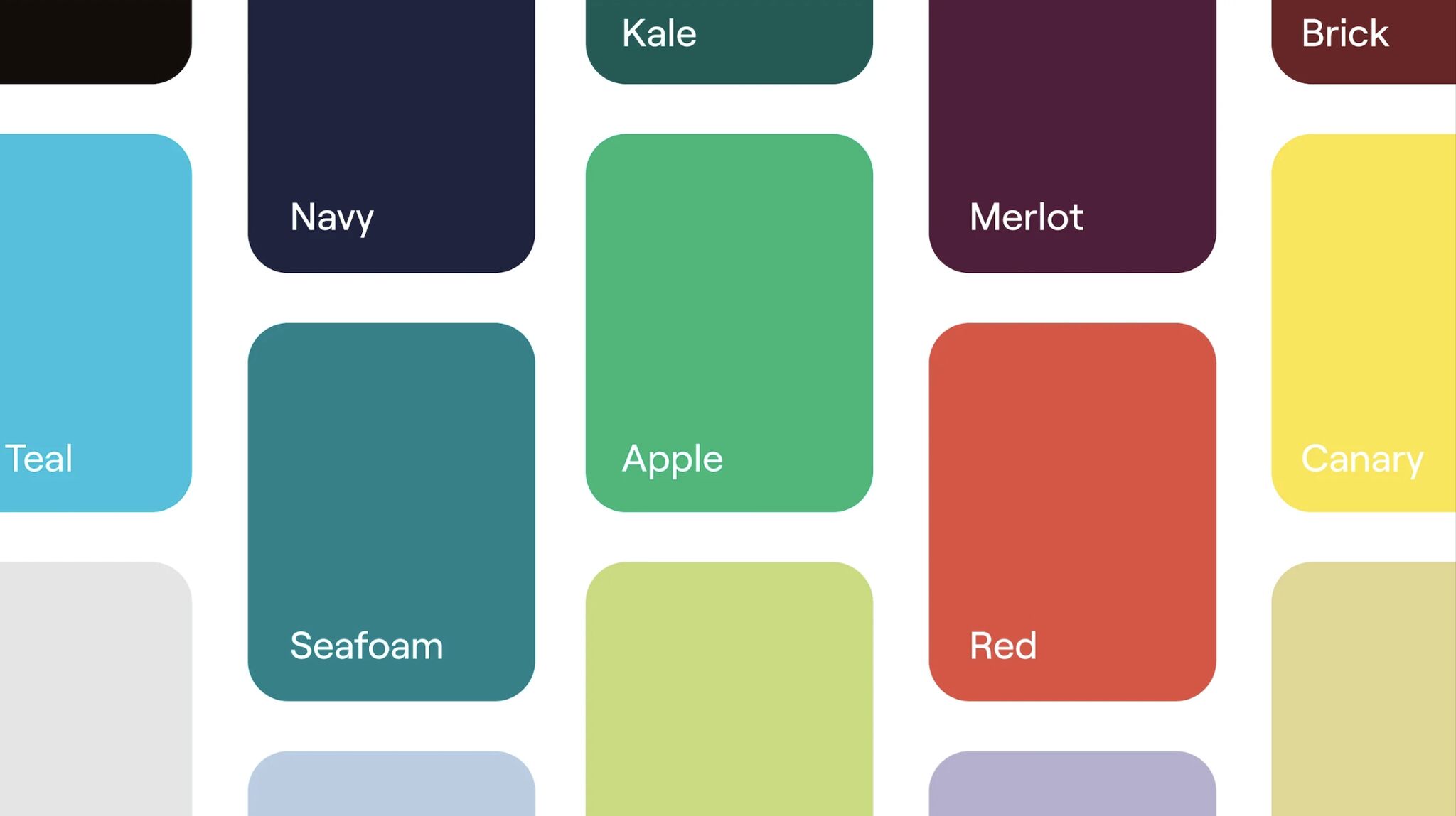
A wider palette I built out to replace colours that had started to look muddy. GN Teal stays the anchor, with inks and erasers for structure and brighter brights for play.

It had to work in the product too. I locked it before code freeze so it could ship in September, and the product design team rebuilt the UI base palettes and tokens on the same perceived-lightness logic.

In October I followed up with colour logic for a more professional audience: secondary colours became accents, the core palette took on more of the backgrounds, and navy moved from primary to secondary.

Accessibility, old palette → new
83%Pass AAA10 of 12 pairings, up from 8 of 11 (73%).
+23%Lowest contrastKale on Sky, from 4.87:1 to 5.99:1.
7 of 11Pairings improvedAll seven secondary pairings. Merlot on Lavender moved from AA to AAA.

Every pairing passes AA and none dropped a rating. The four core pairings lost a little contrast but all stay AAA, at 8.69:1 or higher.

The palette
Ink I17, 18, 19#111213
White255, 255, 255#FFFFFF
GN Teal I69, 191, 219#45BFDB
Kale32, 91, 92#205B5C34, 89, 86#225956
Navy37, 42, 77#252A4D31, 35, 62#1F233E
Merlot92, 35, 67#5C234378, 29, 57#4E1D39
Brick107, 40, 39#6B2827102, 38, 37#662625
Ink II44, 48, 51#2C3033
Eraser I249, 249, 249#F9F9F9
GN Teal II109, 217, 242#6DD9F2
Matcha220, 237, 135#DCED87203, 217, 129#CBD981
Sky201, 224, 250#C9E0FA187, 204, 224#BBCCE0
Lavender227, 211, 245#E3D3F5181, 176, 203#B5B0CB
Sand242, 230, 179#F2E6B3224, 213, 150#E0D596
Candy Floss247, 228, 239#F7E4EFNew in 2025
Ink III79, 83, 89#4F5359
Eraser II230, 229, 228#E6E5E4
GN Teal III153, 236, 255#99ECFF
Apple4, 194, 115#04C2732, 181, 119#02B577
Seafoam28, 132, 162#1C84A20, 128, 137#008089
Fire Engine235, 81, 60#EB513C214, 87, 70#D65746
Canary255, 229, 95#FFE55F
Bubblegum250, 181, 227#FAB5E3New in 2025
“I’ve always felt the current brand colours look too muddy. The new colours look a lot better.”
Steven ChanSteven ChanCEO and founder, on the palette walkthrough

My walkthrough of the palette refresh for the team, August 2025: the before and after, and the thinking behind each change. 13 minutes, with sound.

04Typography

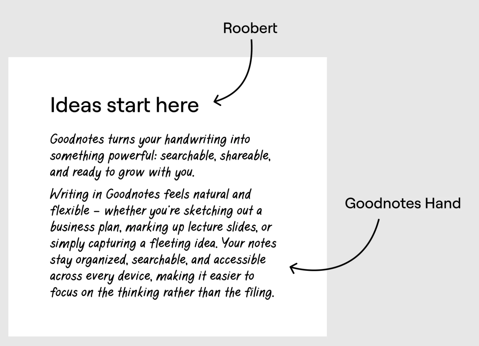
Roobert for headlines and body, Goodnotes Hand for handwritten accents — and two placeholder faces for when real words would get in the way.

Roobert stays as the main font. Goodnotes Hand, a new handwritten font designed entirely from scratch by our summer intern — who we later converted to full time — replaced Bright Clones — it carries the voice in notes, stickies and callouts, so layouts read as thinking in progress.

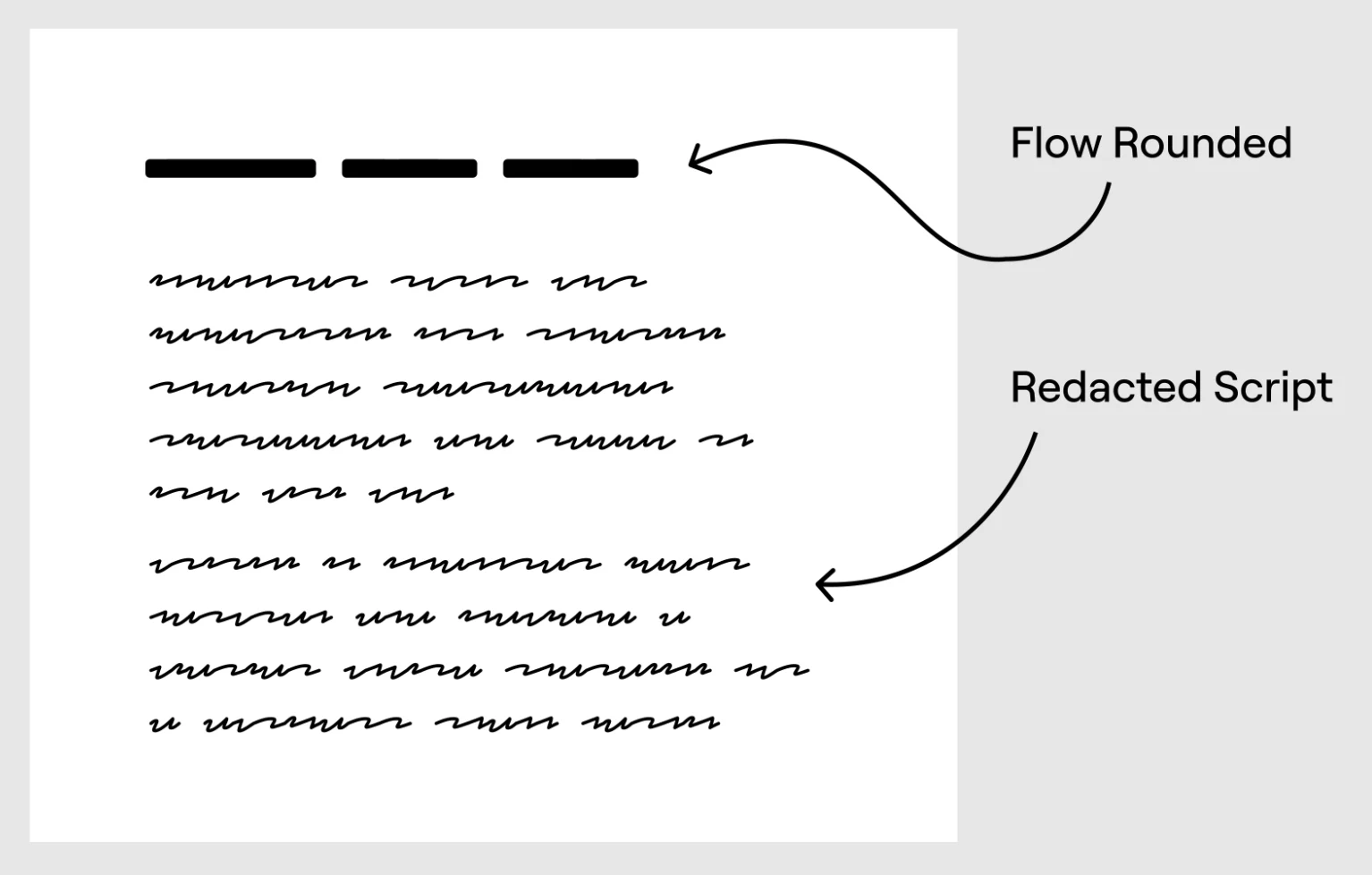
Flow Rounded and Redacted Script stand in for text in product and illustration scenes, used only when absolutely necessary, so the focus stays on the idea rather than the words.

Roobert headline and Goodnotes Hand body copy Flow Rounded and Redacted Script placeholder text
05Graphic elements

Journey lines and illustrations, developed in more detail for the refresh — with rules for how they combine, and where each belongs.

Journey lines

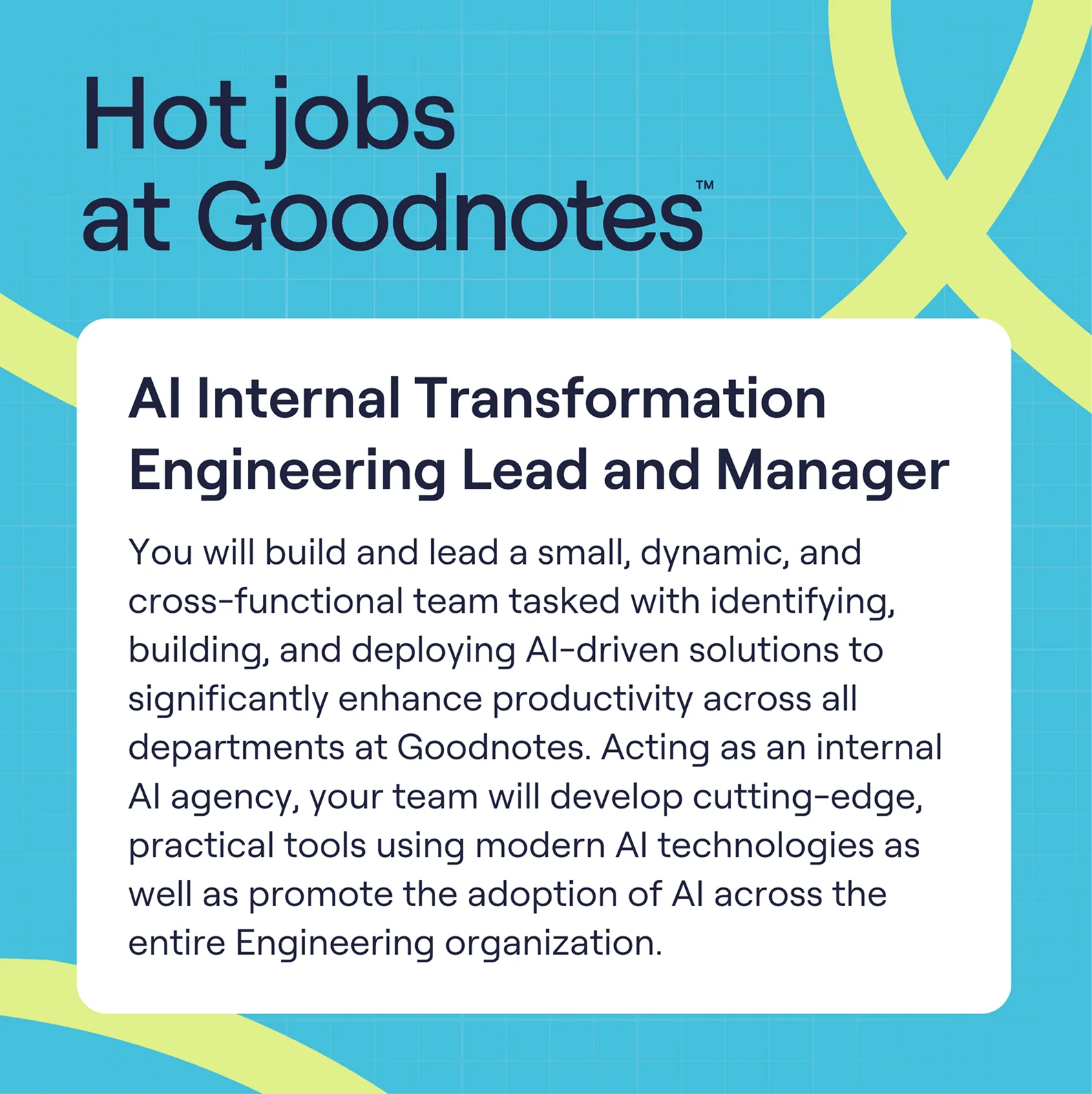
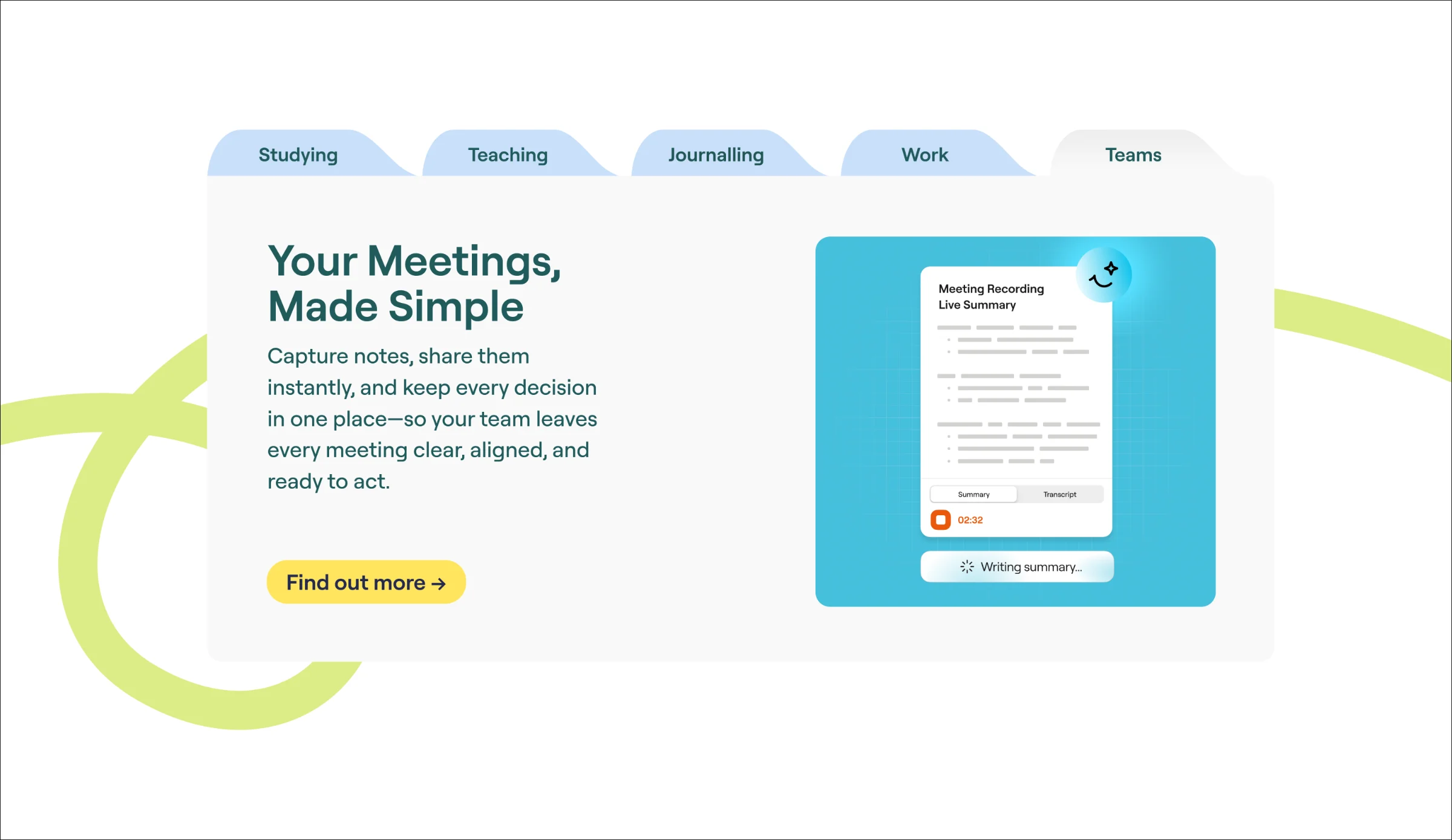
A simple line that adds movement to any layout. My rule for drawing new ones: it always flows and curves smoothly, like a stick of hard glue bending into a hot glue gun. Weight is the designer’s call.

Hot jobs at Goodnotes social post with lime journey lines on the teal gridWebsite module for Teams with a looping lime journey line behind the card
Illustrations + journey lines

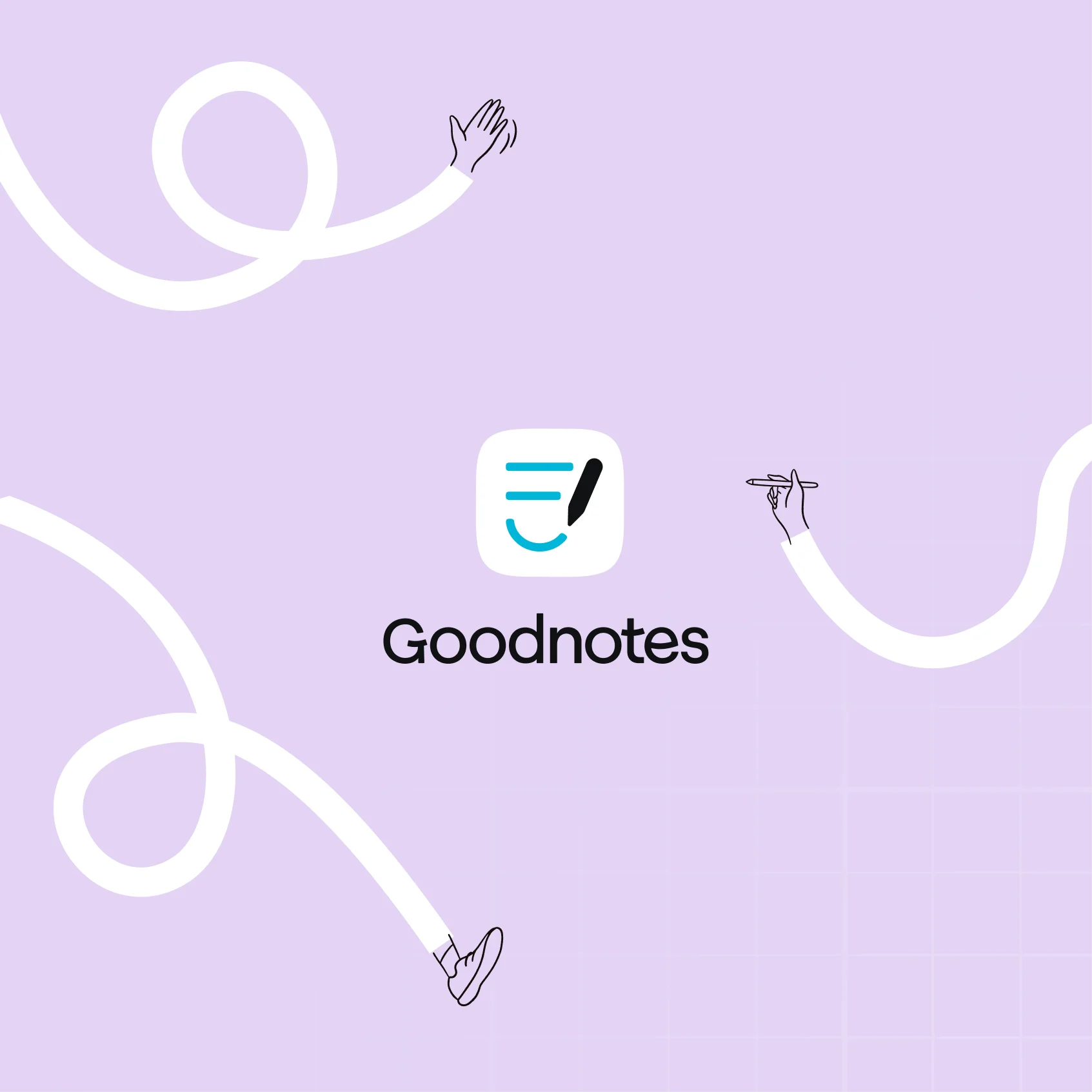
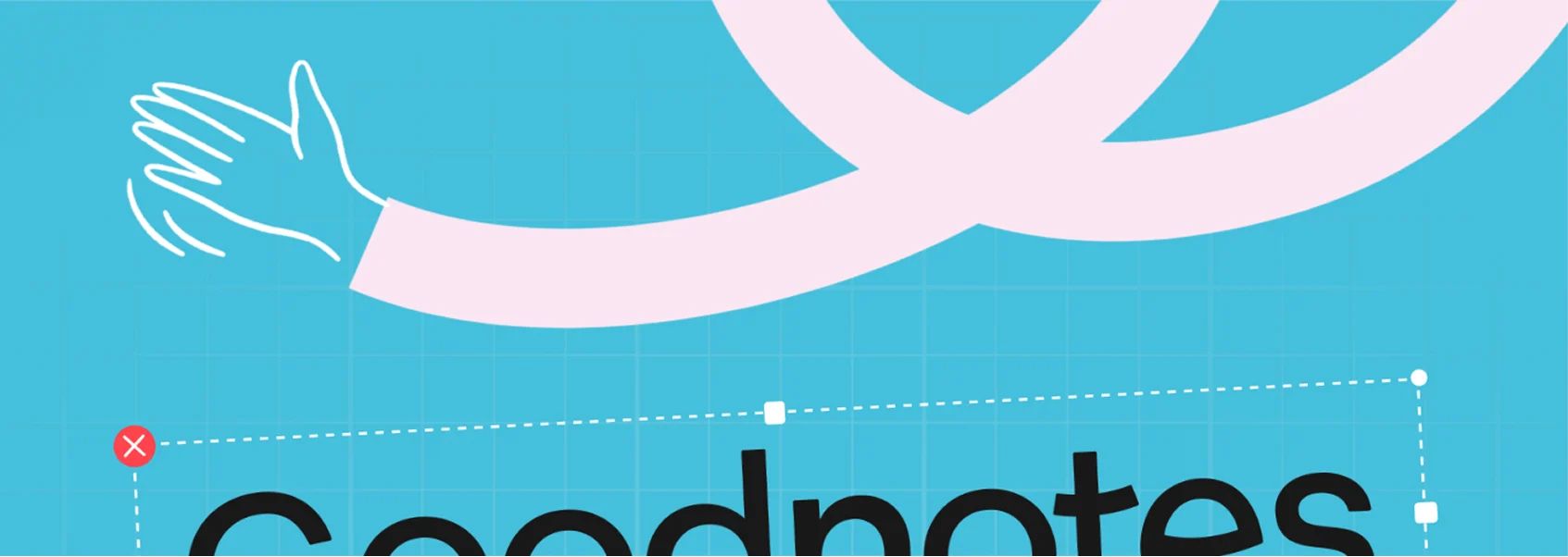
Add an illustration to the end of a line and it turns playful. Most often it’s a hand, so the line reads as a long, curvy arm, waving, writing or pointing.

Goodnotes logo on lilac with white journey lines ending in a waving hand, a hand holding a pen and a footPink journey line ending in a waving hand above the Goodnotes wordmark on teal
Illustration patterns

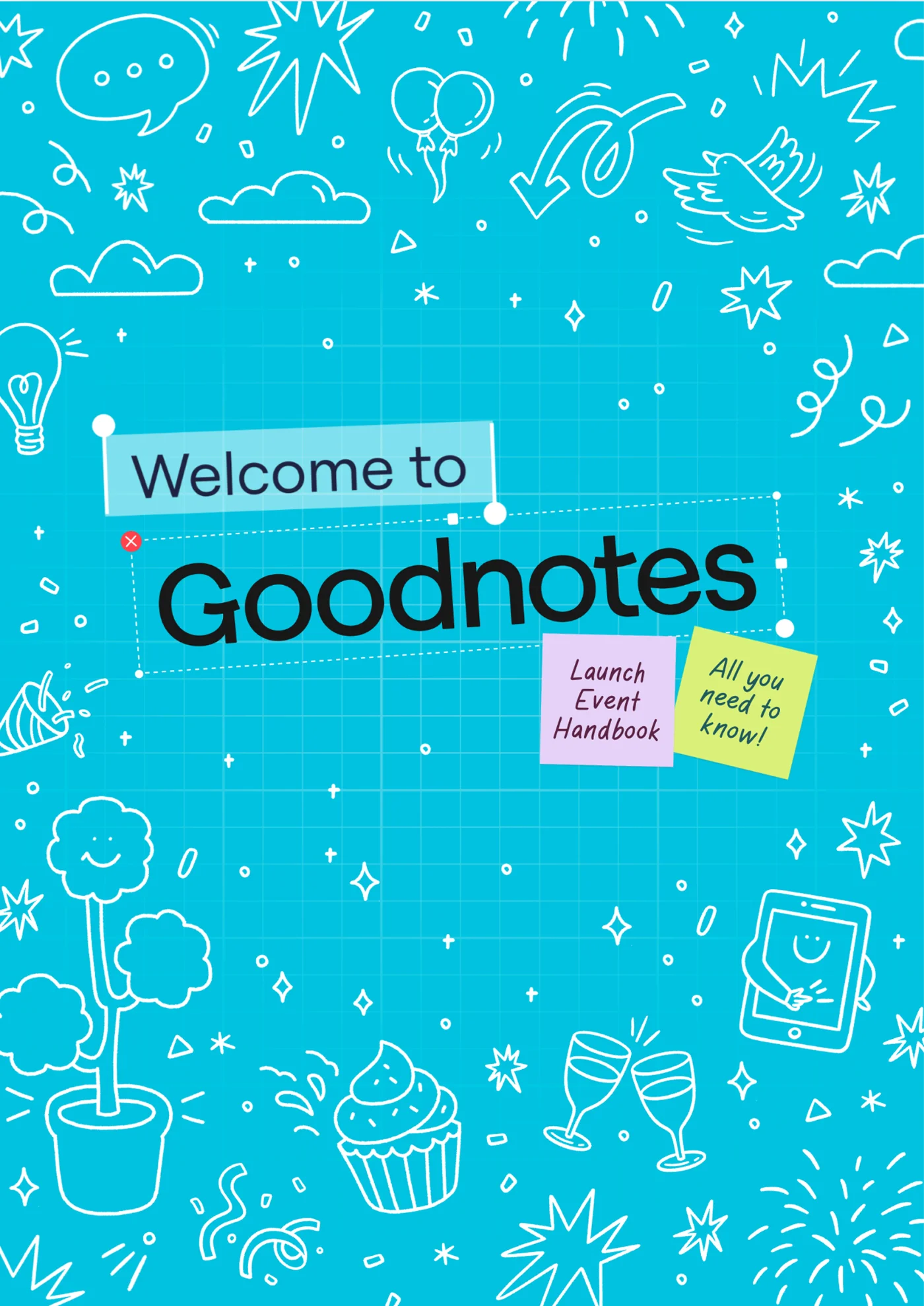
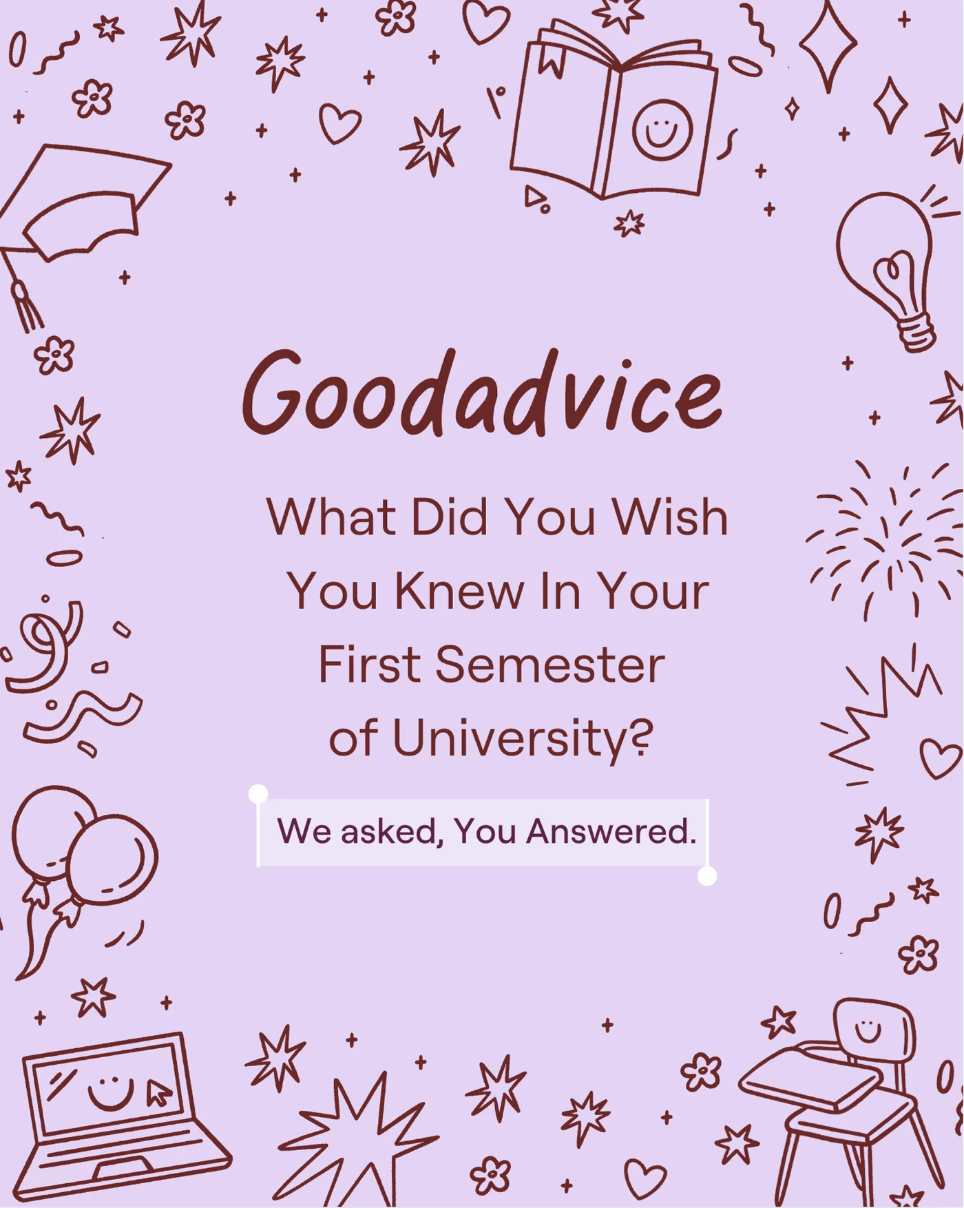
Illustrations tiled into a pattern, for student-facing marketing only: the brand at its most fun and whimsical.

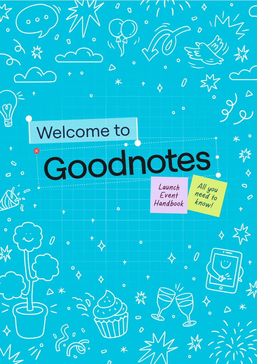
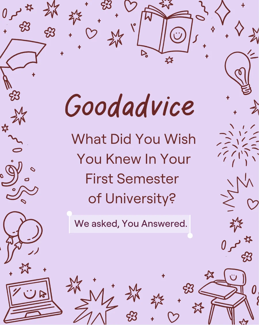
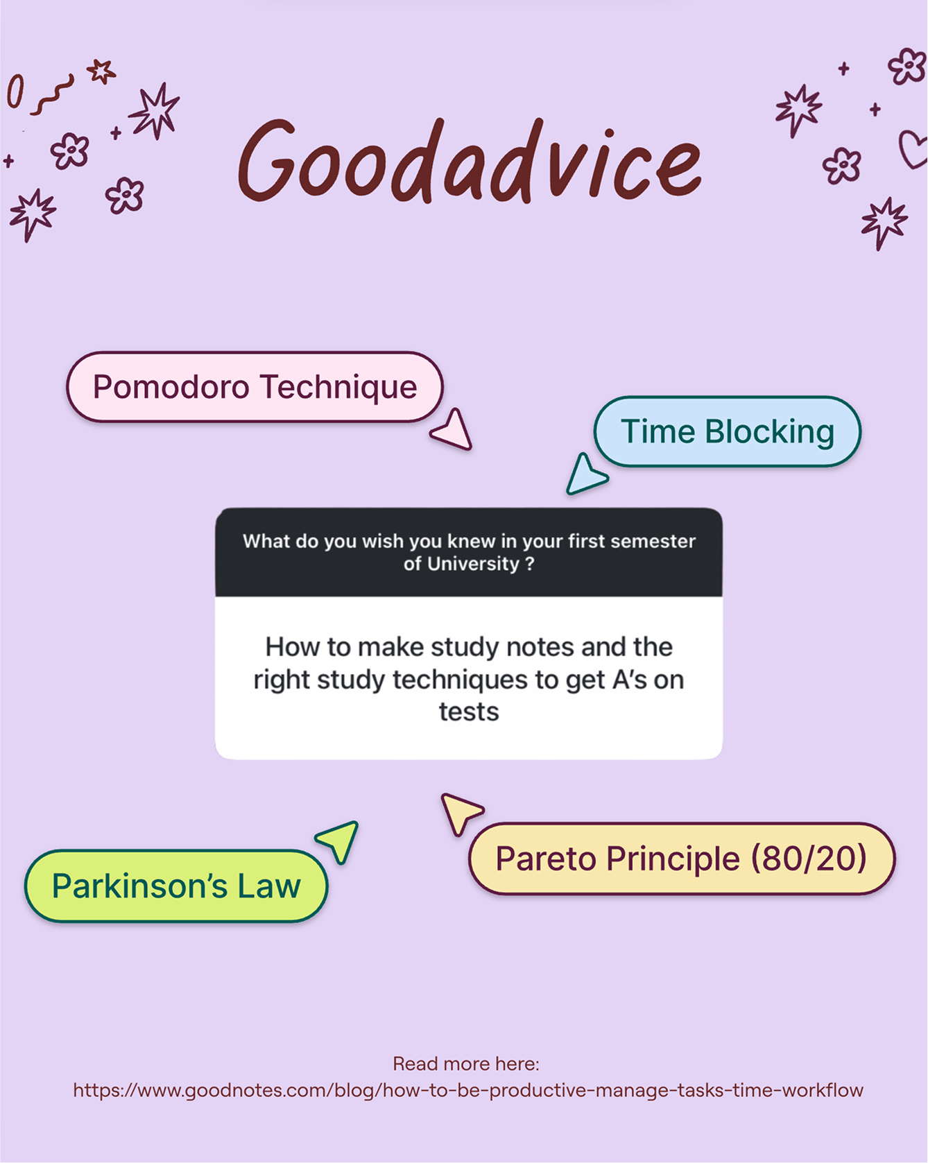
Welcome to Goodnotes launch event handbook cover with a white illustration pattern on tealGoodadvice student post with a maroon illustration pattern on lilac
UI elements

Pieces of the app lifted into marketing: stickies, diagrams, folders and collaborator tags. Floating UI free of device frames makes it feel like you’re inside a Goodnotes page, not looking at one.

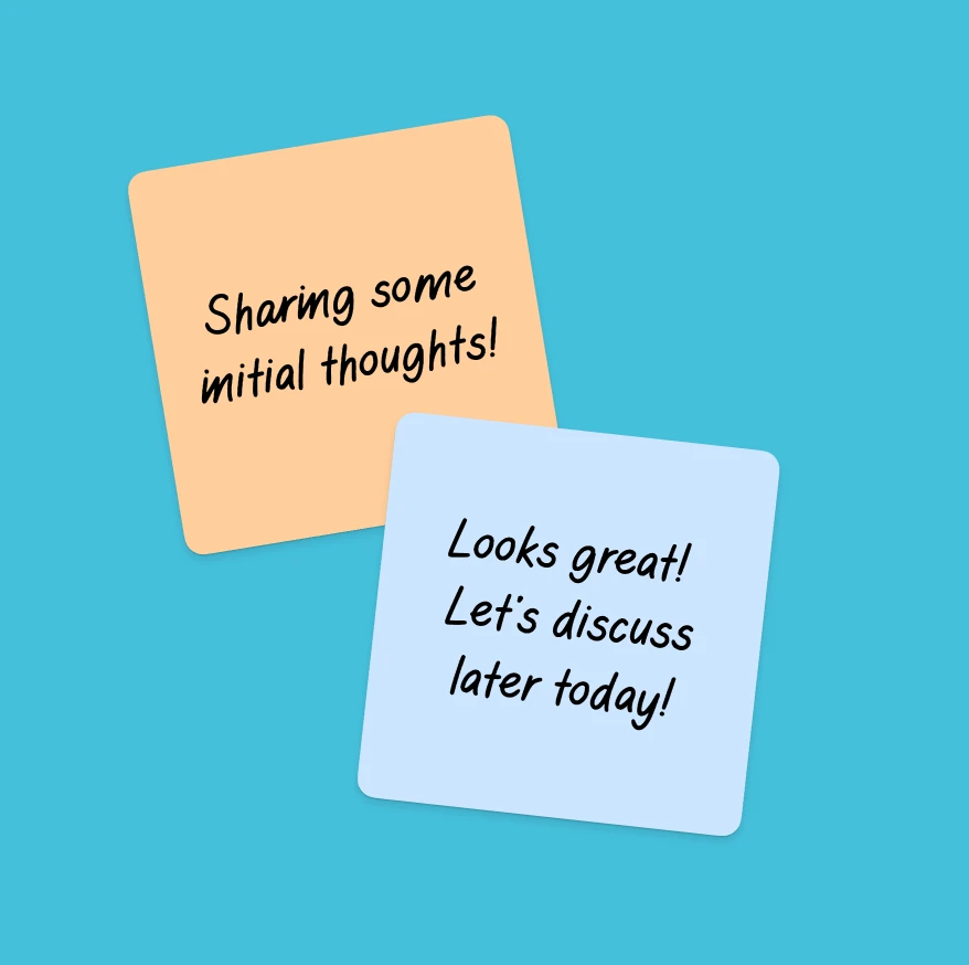
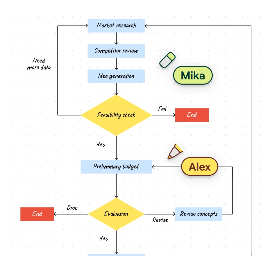
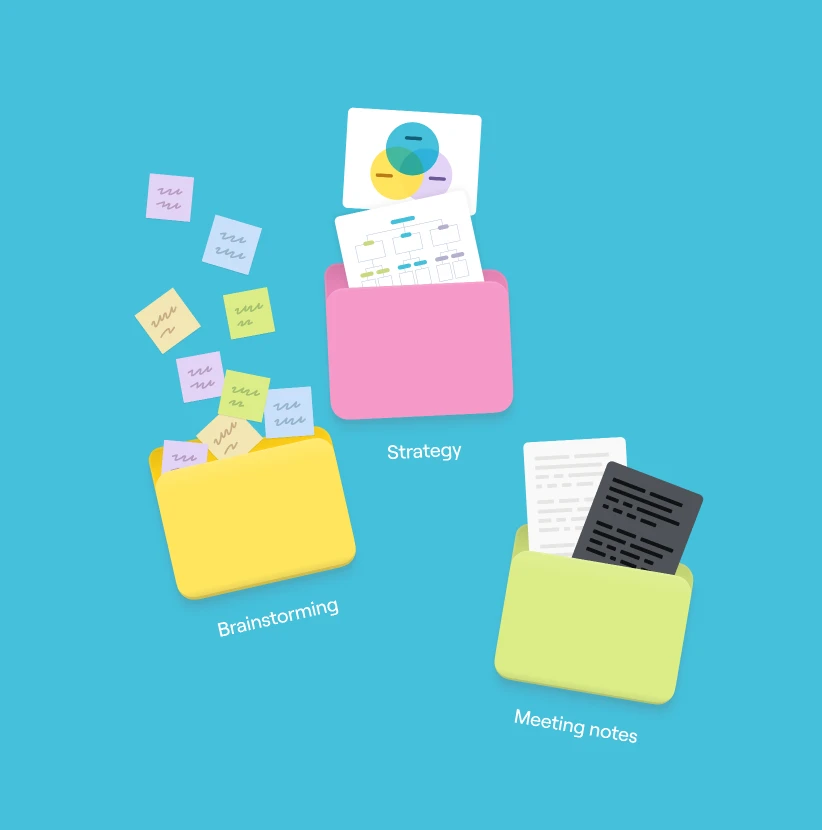
Two sticky notes in Goodnotes Hand on teal: Sharing some initial thoughts, and Looks great! Let’s discuss later todayHand-drawn flowchart with Mika and Alex collaborator tags, an eraser and a penBrainstorming, Strategy and Meeting notes folders spilling stickies and documents on teal
Goodnotes App Store profile banner with collaborator tags, cursors, the pen toolbar and stickies around the lockup
06Brand flex scale

A scale I created so the brand can flex its look and feel for different audiences without losing its core personality.

Why it was needed
The brand read as “student”

42% called it a note-taking app; under 2% said “ideas”.

In our 2022 research, 42% described Goodnotes as a note-taking app, and fewer than 2% used words like “knowledge” or “ideas”. Professionals still say “I used Goodnotes when I was a student”.

Users grow up with it

About a quarter of student sign-ups now use it for work.

About a quarter of people who signed up as students have since moved to work, personal or teaching use.

They use it differently

Professionals lean on AI; students on handwriting.

Professionals lean on Ask Goodnotes and are busiest in summer. Students lean on handwriting-to-text and peak at back-to-school.

The business was moving to B2B

B2B was the fastest-growing part of the business.

The pivot was into the professional workspace, and B2B was the fastest-growing part of the business. A consumer-app identity was capping its credibility.

It was already happening

I was already adjusting colour for professionals.

In the months after launch I was already adjusting colour for professional audiences: secondary colours as accents, more of the core palette. The scale made it a system.

Scroll →
B2C — Students

The most playful end: tiled illustration patterns, handwriting type, stickers and bolder colour.

Our brand default B2C — Professionals

The core look: the teal grid, stickies, cursors and product UI, with journey lines for movement.

B2B — Professionals

The most restrained end: navy leads and product UI and proof points do the work, with fewer doodles.

Welcome to Goodnotes handbook with a white illustration pattern on teal Hey Florida! Goodnotes campus tour post
Goodadvice student post with a maroon illustration pattern on lilac Back to school stationery promotion story
Goodadvice study techniques post
Goodnotes AI for Math tile Meet the new Goodnotes video thumbnail
Goodnotes AI Agent workflow tips post Thai back-to-school event poster with a creator
Turn handwriting into smart, searchable notes ad Create diagrams with Goodnotes AI post
B2B landing page: Goodnotes Teams and Enterprise, admin console and customer story
07How it landed

The refresh shipped as part of the September 2025 release, so its numbers are the launch’s numbers, and the picture is mixed.

What worked

Reach. US App Store impressions rose by about half month on month, and product page views were up more than 60% year-on-year. The new plans caught on fast: weekly direct Pro subscriptions grew more than 40× in three weeks.

What didn’t

Conversion. More people saw the app, but a smaller share went on to download or buy, and ratings dipped in the first month before recovering. The negative feedback was about the toolbar redesign, bugs, AI prominence and pricing, not the brand.

The refresh itself

Most people in pre-launch testing didn’t notice the logo had changed. For an evolution, that was the goal: maintain equity, refine the brand technically.

Related case studies
Goodnotes 2025 launch event
Goodnotes 2025 launch event →

36 creators, three days in London, and the unveil of the new Goodnotes.

Goodnotes 6 rebrand
Goodnotes 6 rebrand →

The full rebrand this work builds on, from agency to in-house rollout.